About the client
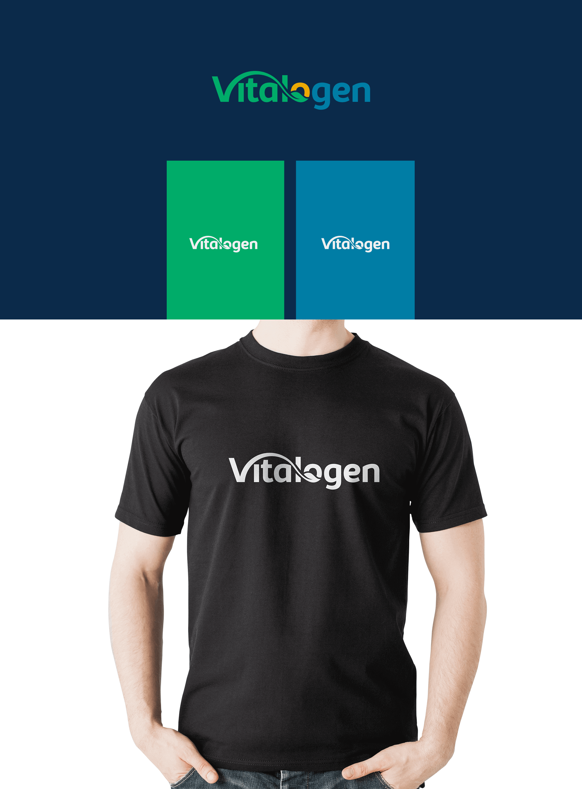
The name says it all. Vital meaning health and genesis meaning origin. Vitalogen is a brand that aims to boost the immunity of its customers by providing them with intra-oral vitamin products. Currently they offer vitamin sprays that can provide vitality and energy whilst improving the user’s immunity – something that the entire world is in dire need of especially with immunity levels sinking low due to the ongoing pandemic.
Brainstorming
The creative crew at Fullstop joined their heads together to come up with the best designing solution for yet another health-oriented brand. What we feared was getting too inspired from previous creations since every brand should have a unique identity, even though our client had already commended a lot of our prior designs. According to the requirements of our client we sought to come up with a logo that can have an artistic yet modern look without being gaudy. We needed to combine two contradicting elements: serious and artsy.


 We’ll get back to you in 24 hours
to address your needs as quickly as possible.
We’ll get back to you in 24 hours
to address your needs as quickly as possible.
 We’ll prepare an estimation of the project
describing the team compostition, timeline and costs.
We’ll prepare an estimation of the project
describing the team compostition, timeline and costs.
 We'll perform a free website review
If you already have an existing website.
We'll perform a free website review
If you already have an existing website.


