The end result was a more quirky design which maintained seriousness but would appeal to energetic individuals belonging to an SEC B+ and SEC A class which was the client’s intention.
Brainstorming
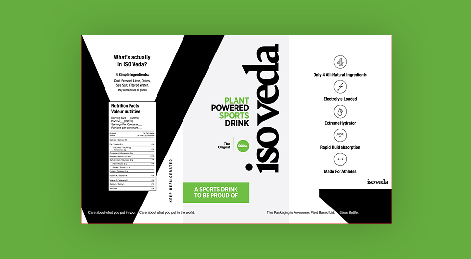
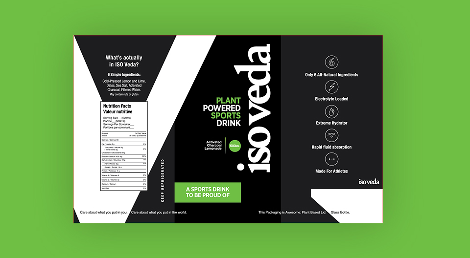
We started off with a few rough designs in their original color palette for the beverage packaging which was primarily green, black and white. After some deliberation we decided to make something which is subtle yet has an impact when the consumer first looks at it. First impression is the last impression when it comes to packaging!
Color Plate

 We’ll get back to you in 24 hours
to address your needs as quickly as possible.
We’ll get back to you in 24 hours
to address your needs as quickly as possible.
 We’ll prepare an estimation of the project
describing the team compostition, timeline and costs.
We’ll prepare an estimation of the project
describing the team compostition, timeline and costs.
 We'll perform a free website review
If you already have an existing website.
We'll perform a free website review
If you already have an existing website.


