King of Ceylon

Case Study

Brief

As the name suggests, our client wanted the tea brand logo to be one that looks royal and convey the message that their brand is actually the King of Ceylon – a new tea company soon to be a leader in the industry! They wanted a tea logo with an elite edge.

In order to exhibit the fusion of royal-tea, logo designers and the client, both opted for the colors; green and golden. Green signifying the color of tea leaves while golden to indicate that their tea brand is in fact the King of tea leaves. They required a logo which could infuse tea leaves and a symbol of royalty in a creative way and hence we put our design skills to the test!

The Design Table

Based originally in Sri Lanka, our client had a very clear idea of what they aimed to communicate through their tea logo: a top notch tea brand which manufactures and sells the highest quality of tea leaves and related products.

The client was originally a tea-leaves Production Company, owning approximately 60,000 acres of land where they grow and produce some of the world’s best Ceylon Black Tea. They envision to become a leading retail brand in the tea industry. Under the banner of ‘King of Ceylon’ the tea brand will sell tea bags, k-cups, loose tea as well as ready-to-drink bottled tea.

King of Ceylon is remarkably the sole tea company which sells tea from farm to table that is the brand itself carries out the processes from cultivation to harvest, manufacturing and ultimately producing a ready-to-consume product!
The tea brand’s short-term goal is to penetrate the U.S market with premium quality Ceylon black tea but they endeavor to become the king of tea brands once they have made their mark!

King of Ceylon Logo – Case Study

There are logos we make and then there are logos which make us feel proud once we’re done with them! One such logo design which we had the pleasure of creating was a this tea brand’s logo – the King of Ceylon and we enjoyed every sip of it (pun intended). The tea logo is amidst our most cherished works due to its ability to communicate the tea brand’s message in a simple yet creative manner.

Client’s Feedback

More than satisfied with the logo incorporating their entire creative brief while maintaining the element of simplicity, this tea brand’s logo was definitely a keeper and please allow us to once again exclaim how proud we are of it!

Launching a tea brand anytime soon? We’ll make sure your logo makes a lasting first impression!
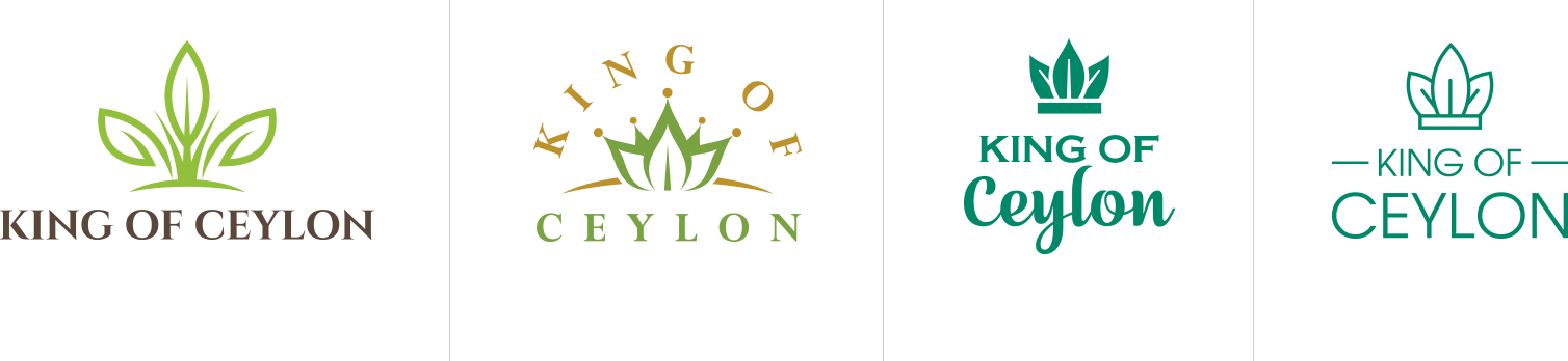
Color Palette


The Design Stage

While designing the tea brand logo we needed to focus on two major aspects:
1. Keep the design in accordance with the client’s brief
2. Keep the tea logo design creative and responsive

As the client requested we needed to craft an identity for the brand which tells their potential consumers that if they’re looking for a premium quality tea brand, King of Ceylon is their final des-tea-nation (just a pinch of word play).

After some drafts we heard our minds go Eureka! The final design was an arrangement of tea leaves (see the tea logo on top of King of Ceylon) in the shape of a crown, symbolizing that this is indeed the king of tea with the subliminal message that every sip of this tea will make you feel like royalty.

We used two color variations: dark green and golden for light and dark backgrounds respectively. Notice how the leaf-crown itself can be a tea logo even if the word-mark is removed! Responsive much? The font is serious yet dominating, giving the feel of a leading brand.


Some Other Logos We Presented


Are you interested?

Let's Talk You Rock!

Estimate your project

    Your name

    Your email address

    Phone number (optional)

    Tell us about your project


    • We’ll get back to you in 24 hours to address your needs as quickly as possible.
    • We’ll prepare an estimation of the project describing the team compostition, timeline and costs.
    • We'll perform a free website review If you already have an existing website.

    We've worked for: