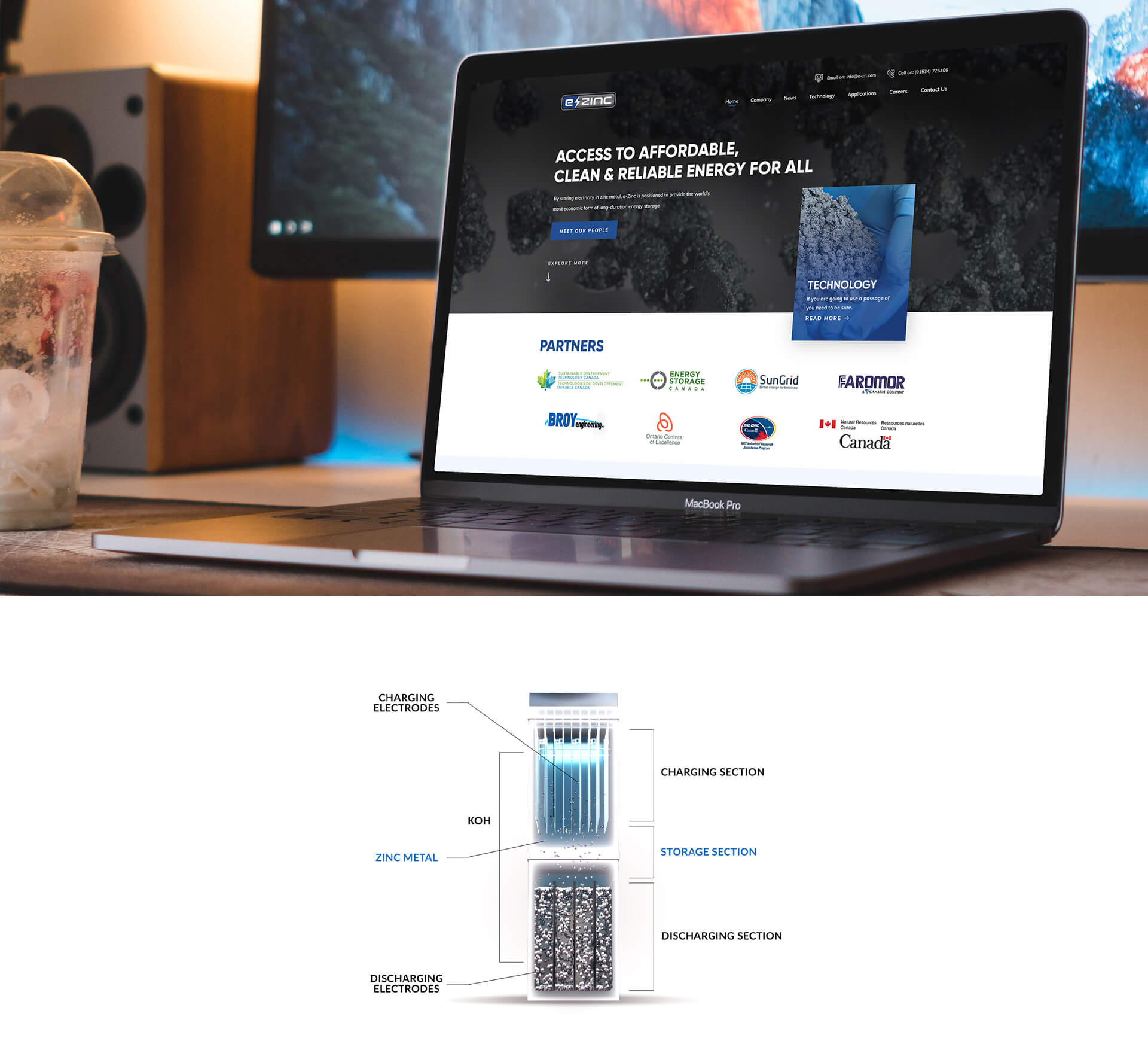
According to the brief, our client was not at all happy with the current website in terms of both, design and content. They required a tech website, designed using a consistent color palette that was synced with the brand’s identity and the colors of their logo, instead of a blend of miscellaneous colors. In a more elaborated brief, our client requested for a sharper illustration of the cell diagram in the Technology section along with a separate tab for Awards/Accolades and a complete 360 Degrees revamp of the entire website since they were now in their completion phase regarding their branding. In a nutshell, the look they required for their website was professional, approachable, and neat with a corporate feel since their target market would be either industrial managers or people with a serious disposition (at least professionally).
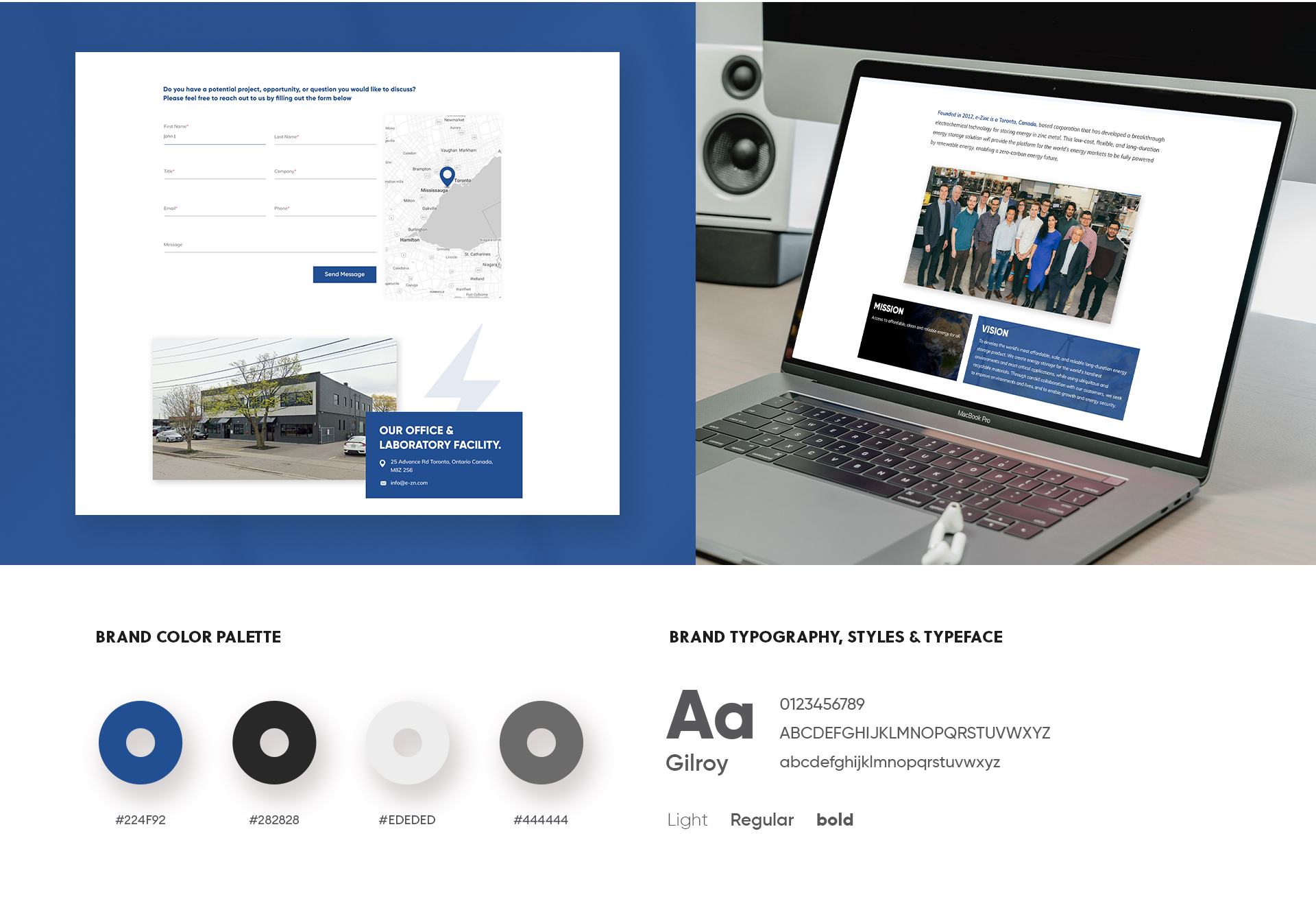
The challenge here was to stick to the brief which was to be extremely corporate while injecting our own aesthetic skills into the website. As requested by the client, we plucked the colors, blue, gray, white and black from their logo and splashed them onto their website design, adding catchy images and an introductory slider which showcases an image of zoomed zinc particles.
Our expert designers, created a detailed illustration of the cell (as requested) and designed sliders/banners that exhibited an attractive yet corporate feel without any divergence from the color theme. Throughout the website we used blue in subtle amounts but in areas where the color could make the entire website stand out. After the final version of our web design we can claim that we have taken a step ahead into adding “tech web design company” to our list of fortes.
Our client knew what they wanted but were a little vague about the design itself so we decided to put our own analytical skills to the test. According to their brief, they were looking for the best technology website, designed to cater to industries and professionals who would take their product/services seriously. The points that we needed to take into account were
Thus, we extracted colors from e-Zinc’s logo, researched on a few similar technology website designs and finally crafted our own little masterpiece.
We can’t help but boast about the fact that our client was more than just happy with the website design. With a promise to hand over more projects to Fullstop in the future, they admitted that we had exceeded their expectations and had truly given then value for money.

 We’ll get back to you in 24 hours
to address your needs as quickly as possible.
We’ll get back to you in 24 hours
to address your needs as quickly as possible.
 We’ll prepare an estimation of the project
describing the team compostition, timeline and costs.
We’ll prepare an estimation of the project
describing the team compostition, timeline and costs.
 We'll perform a free website review
If you already have an existing website.
We'll perform a free website review
If you already have an existing website.


