The Design Board
For Grimstad Yoga’s logo design, we had to portray that yoga at this studio is a medium of getting in touch with nature and relaxing the mind and body. Thus, we needed to incorporate both these essential messages in the yoga club logo.
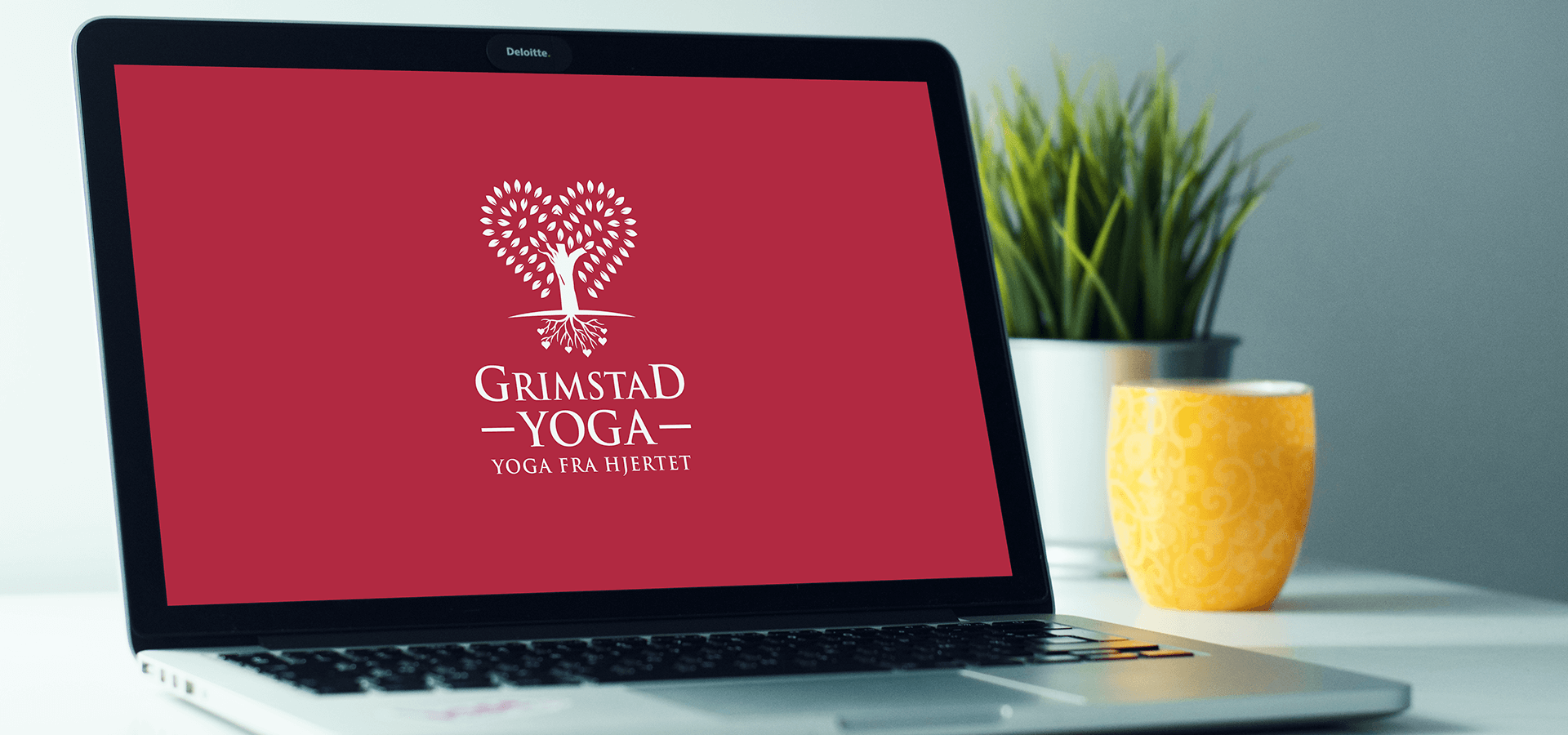
We initially sketched the outline of a tree and worked on options of how to appropriately create a responsive and minimal logo design while adhering to the client’s brief. After much deliberation and drafts, we accomplished this challenging task and landed on exactly what a yoga club logo should look like!
Observe how the leaf-vectors encompass the bark of the tree in a heart shape. The roots too have small hearts indicating that you grow what you plant. The font is minimal yet impactful and as requested by the client is “detachable” from the design. Keeping in mind the urge for a responsive logo the icon itself has been designed to convey the brand’s message without using any words.
This was just one of the many clients we’ve managed to satisfy and we don’t intend to stop! Do you own a yoga club or have a plan ready? Reach out to us for the perfect logo design!

 We’ll get back to you in 24 hours
to address your needs as quickly as possible.
We’ll get back to you in 24 hours
to address your needs as quickly as possible.
 We’ll prepare an estimation of the project
describing the team compostition, timeline and costs.
We’ll prepare an estimation of the project
describing the team compostition, timeline and costs.
 We'll perform a free website review
If you already have an existing website.
We'll perform a free website review
If you already have an existing website.


