Logo Similarity Risks: What the Famous 'Copycat' Cases Actually Teach Business Owners
Famous logos that look alike, the lawsuits they sparked, and the practical due diligence steps that protect your business from costly trademark disputes.

What happens when a successful brand discovers its logo looks uncomfortably similar to a competitor's?
After working with hundreds of branding projects since 2012, I see this concern surface constantly in client conversations. Business owners worry about accidentally copying someone else's design, getting sued, or discovering too late that their new logo has a twin somewhere in the world.
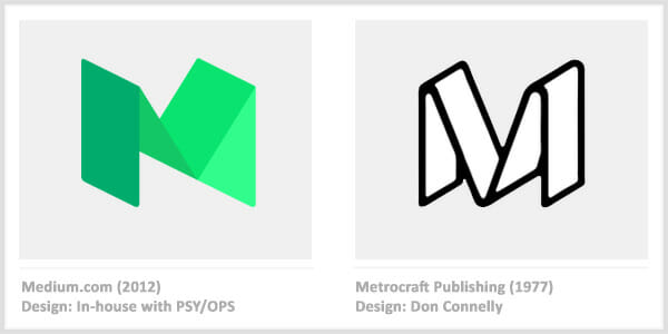
The internet loves to point out similar logos. Medium and Metrocraft. Airbnb and Azuma. Beats and Stadt Brühl. These comparisons make for entertaining design articles and social media debates.

But here's what those articles miss: the business implications. What actually happens when logos look alike? Do companies get sued? Who wins? And most importantly, how do you protect yourself before spending thousands on a new brand identity?
I went deep on this topic, pulling from 40+ sources including court rulings, trademark databases, and legal analyses to answer those questions.
Table of Contents
- Assess Your Logo Similarity Risk
- The Reality of Logo Similarity (It's Not What You Think)
- Famous Logo Similarities: What Actually Happened
- When Similarity Becomes a Legal Problem
- The Real Cost of Getting This Wrong
- Your Logo Due Diligence Checklist
- What To Do If Someone Claims You Copied
- FAQ
Assess Your Logo Similarity Risk
Wondering if your logo situation puts you at risk? Score each factor below to get a quick assessment of your trademark exposure.
The Reality of Logo Similarity (It's Not What You Think)
Let me be direct about this: similar logos exist everywhere, and most of them coexist peacefully.
Legal experts confirm that similarity alone doesn't create a problem. The standard courts use is called "likelihood of confusion" - would an ordinary consumer think these two businesses are connected?
Delta Faucets and Delta Airlines have operated with similar names for decades. Nobody books a flight when they're shopping for bathroom fixtures. Different industries, different contexts, no confusion.
What jumped out during this research was how often the bigger brand loses. I expected courts to side with the well-known company protecting their mark. Looking at the actual case outcomes told a different story.
Famous Logo Similarities: What Actually Happened
Here's what really happened with the most-discussed "copycat" logos - not just whether they look similar, but who sued whom and how it ended.
Before we dive into the cases, here are more examples of famous logos that share striking similarities:
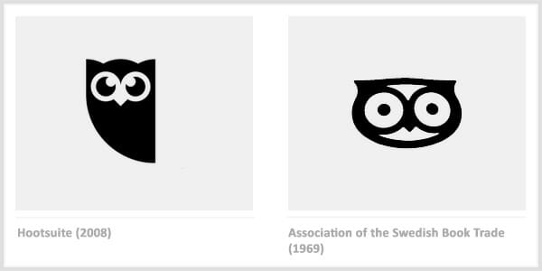
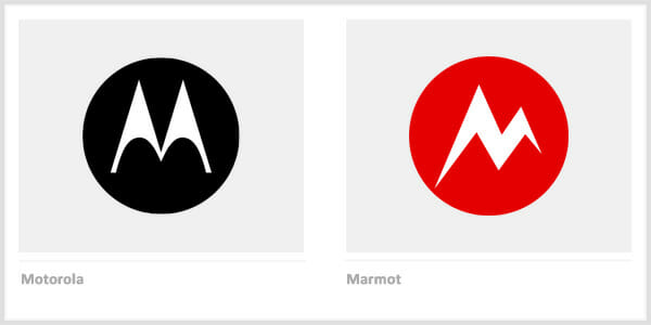
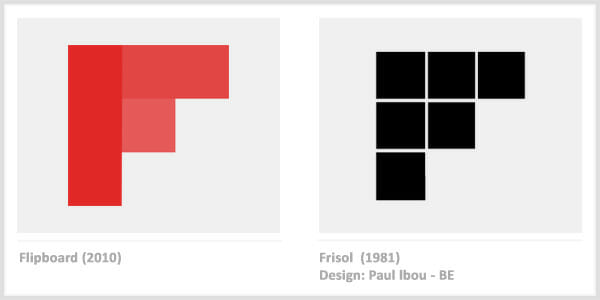

These visual similarities happen more often than you'd think. Now let's look at what happened when some of these cases went to court.
Airbnb's Bélo and the 1975 Japanese Logo
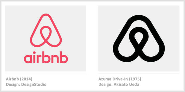
In 2014, Airbnb unveiled its new "Bélo" symbol, designed by London's DesignStudio after a year-long project across 13 cities. Within weeks, a Reddit user discovered an almost identical logo in a 1988 design book.
The original: a 1975 trademark for Azuma, a Japanese drive-in theater, designed by Akisato Ueda. The resemblance was uncanny - same flowing curves, same proportions.
What happened: Nothing. No lawsuit, no dispute. A drive-in theater in Japan from the 1970s operates in an entirely different industry, country, and era. This is exactly the kind of similarity that doesn't create legal issues.
Takeaway for business owners: Visual similarity between logos in different industries rarely triggers trademark problems. The Airbnb case shows that even near-identical designs can coexist when there's zero chance of consumer confusion.
Adidas vs. Thom Browne: The $7.8 Million Stripe War

Adidas filed suit in 2021 against fashion designer Thom Browne, claiming Browne's four-stripe designs infringed on their iconic three-stripe trademark. Adidas demanded $7.8 million in damages.
The case went to trial in January 2023. Adidas lost within hours. The jury found no infringement and no dilution.
Thom Browne's attorney delivered the winning argument: "Adidas does not own stripes." The court noted that Thom Browne targets luxury fashion at premium prices, while Adidas serves sports and fitness customers. Different markets, different price points, no confusion.
Adidas appealed and lost again in 2024. The EU also rejected Adidas's claims, ordering them to pay Thom Browne's legal fees.
The implication: Having a famous trademark doesn't guarantee you'll win. If your competitor serves a different market and doesn't cause consumer confusion, your lawsuit might backfire.
Lidl vs. Tesco: The £7.8 Million Logo Lesson

In 2021, German discount retailer Lidl sued British supermarket Tesco over their Clubcard Prices logo. Both used a yellow circle inside a blue square.
This is where the data contradicts what most people assume. Many expected Tesco - the larger company - to prevail. Instead, Lidl won.
The judge found internal evidence that Tesco's own team had flagged the similarity risk during development. They knew and launched anyway. Tesco lost on appeal in 2024 and now faces an estimated £7.8 million rebrand cost.
What this means for you: Operating in the same industry changes everything. Two supermarkets using similar blue-and-yellow designs creates exactly the kind of confusion courts care about. And internal documentation showing you knew about the risk makes your position much worse.
Chanel vs. Huawei: When "Similar" Isn't Similar Enough

Chanel sued Huawei in 2017 over their computer hardware logo, claiming it resembled Chanel's iconic interlocking C's. The case reached the EU General Court in 2021.
Chanel lost. The court ruled the logos weren't similar enough to cause confusion. Chanel's mark features rounded curves with horizontal orientation. Huawei's uses sharper lines with vertical orientation. Different industries sealed the decision - fashion house versus tech hardware.
Key insight: Subjective similarity isn't the same as legal similarity. Courts examine specific visual elements, orientation, and line quality, not just overall impression. Different industries provide strong defense.
Current vs. Facebook Calibra: Same Designer, Different Logo

In 2019, mobile banking startup Current discovered something unusual: Facebook's new Calibra logo looked almost identical to theirs. Both featured a tilde accent inside a circle.
The twist: both logos were designed by the same San Francisco firm, Character. Current CEO Stuart Sopp told CNBC: "We put six months of hard work into this with that design firm, which they basically reused for Facebook without changing much."
What happened: Facebook changed both the name (to Novi) and the logo. The lawsuit prompted action without requiring years of litigation.
The pattern here: Even tech giants will change course when facing legitimate similarity claims. Documentation of your design process and timeline matters. Current filed their trademark application before Facebook's launch, establishing clear priority.
Starbucks vs. Starpreya: When the Giant Loses

Starbucks sued Korean coffee chain Starpreya over their similar name and green circular logo featuring a woman's face. Korea's Supreme Court ruled against Starbucks in 2007.
I double-checked this finding because it seemed too surprising. But the reasoning made sense: at the time Starpreya registered their trademark, Starbucks had only six Korean locations. The court found Starbucks hadn't established sufficient recognition to claim priority.
Worth noting: Trademark rights are often territorial. A global brand doesn't automatically have priority in every country. First to register and establish local presence can win, even against a household name.
Louis Vuitton vs. Louis Vuiton Dak: The Fried Chicken Case

A Korean fried chicken restaurant called themselves "Louis Vuiton Dak" (playing on "tong dak," meaning "whole chicken") and used similar branding elements.
This time, the luxury brand won. The restaurant was fined approximately $12,750 per day for 29 days, plus additional penalties for non-compliance when they tried renaming to "chaLouisvui Tondak."
The contrast is clear: Deliberately mimicking a famous brand's name - especially with obvious wordplay - creates indefensible legal exposure. The closer you skate to intentional copying, the worse your outcome.
When Similarity Becomes a Legal Problem
Lining up these cases side-by-side made something obvious: the dividing line isn't how similar the logos look. It's whether confusion is likely.
| Factor | Lower Risk | Higher Risk |
|---|---|---|
| Industry | Completely different (faucets vs. airlines) | Same or adjacent (two supermarkets) |
| Price Point | Vastly different ($100 vs. $10,000) | Similar range |
| Geography | Different countries/regions | Same market |
| Customer | Different buyer profiles | Overlapping customers |
| Intent | Independent creation | Obvious imitation |
The real issue isn't similarity itself - it's whether a customer might think your business is connected to another brand. If the answer is yes, you have a problem.
The Real Cost of Getting This Wrong
The businesses that skip due diligence always pay more later. Here's what trademark disputes actually cost:
Litigation costs: $120,000 to $750,000 for a trademark infringement lawsuit in the US. For small businesses, the range is typically $50,000 to $250,000.
Rebranding costs: When Tesco lost to Lidl, industry estimates placed the rebrand at £7.8 million. Even for a small business, redesigning a logo, updating signage, reprinting materials, and rebuilding brand recognition can easily run five figures.
Daily fines: Louis Vuiton Dak paid approximately $12,750 per day while non-compliant. That adds up fast.
Prevention costs (for comparison):
- Trademark search and registration: $350-$550 DIY, $1,100-$4,000 with attorney
- USPTO filing fee (2025): $350-$550 per class
The math is straightforward: spending $2,000-$4,000 on proper due diligence prevents potential six-figure problems.
Your Logo Due Diligence Checklist
Before approving any new logo design, run through these verification steps:
Step 1: USPTO Trademark Search
Search the USPTO database for similar marks in your product/service class. This is free and takes 15 minutes.
Look for marks that:
- Sound similar when spoken
- Look similar visually
- Operate in related goods/services
Step 2: Reverse Image Search
Upload your logo design to:
- Google Images (images.google.com)
- TinEye (tineye.com)
- Bing Image Search
These tools scan billions of images for visual matches you might not find through text searches alone.
Step 3: Design Platform Search
Check design showcases where logos get featured:
- Logopond
- LogoLounge
- Dribbble
- Behance
Your designer may have inadvertently recreated something they saw years ago. Professional designers make this mistake more often than you'd think.
Step 4: Competitor Comparison
Search your direct competitors and compare side-by-side. Even if there's no legal issue, looking too similar weakens your brand positioning.
Step 5: Document Your Process
Keep records of your design development:
- Early sketches and concepts
- Design brief and strategic rationale
- Timeline showing when you started
- Working files with timestamps
This documentation becomes critical if someone later claims you copied them. Proving independent creation is a strong defense.
Need help ensuring your new brand identity is legally clear?
At FullStop, we've guided hundreds of businesses through branding projects since 2012. We include trademark due diligence as standard practice - not as an expensive add-on.
Book a free 15-minute call to discuss your branding challenges.
What To Do If Someone Claims You Copied
First, understand what you're dealing with. A cease and desist letter is not a lawsuit. According to the USPTO, receiving a letter doesn't mean you've been sued - it's a demand to stop using a mark.
Your options:
-
Evaluate the claim. Is the other mark actually registered? Are you in the same industry? Is confusion genuinely likely?
-
Gather your documentation. When did you start using your mark? Do you have design files showing independent creation?
-
Consider the business reality. Legal battles are expensive. Sometimes changing a logo costs less than proving you're right.
-
Get legal advice. A trademark attorney can assess the strength of the claim and your options. Initial consultations are often free or low-cost.
Don't ignore the letter. Courts may view silence as reckless behavior, which can increase damages if you're eventually found liable.
Frequently Asked Questions
Can I use a logo similar to another company if we're in different industries?
Generally, yes. Trademark protection typically applies within specific industries. Delta Faucets and Delta Airlines coexist because no one confuses plumbing fixtures with air travel. However, famous marks like Coca-Cola or Nike get broader protection. When in doubt, consult a trademark attorney.
What if my designer copied another logo without telling me?
You're still responsible for what your business uses. Before finalizing any design, run your own verification using reverse image search, USPTO database, and design platform searches. If you discover a problem after launch, address it immediately - continuing use after you know creates intentional infringement.
How similar is "too similar" for trademarks?
There's no bright-line rule. Courts consider the marks themselves, the industries involved, the price points, the sophistication of buyers, and whether confusion has actually occurred. The "ordinary observer" test asks: would an average consumer think these businesses are connected?
Is trademark registration required to protect my logo?
No. Common law trademark rights arise from actual use. However, federal registration provides stronger protection, easier enforcement, and the ability to recover more damages. For serious brand investments, registration is worth the cost.
How much does a trademark search cost?
DIY using the USPTO database is free. A comprehensive search including state databases, common law sources, and attorney analysis runs $500-$1,500. Given that litigation costs start around $50,000, professional searches offer strong return on investment.
The Bottom Line
Similar logos are everywhere. Most never cause legal problems because they operate in different industries, serve different customers, or simply don't create confusion.
The famous "copycat" cases that make headlines usually involve companies in the same industry (Lidl vs. Tesco) or obvious intentional mimicry (Louis Vuiton Dak). Independent creation in different markets - like Airbnb and Azuma - rarely leads to disputes.
Your protection comes from due diligence, not avoiding all similarity. Search before you design. Document your process. Register your mark. And if you're investing real money in a rebrand, work with professionals who treat trademark research as essential, not optional.
Related reading:
- 26 Rebranding Success Stories: What CEOs Can Learn - Companies that got their brand identity right
- What Legendary Designers Understood About Logos - Strategic wisdom for commissioning great design
Ready to build a brand that's distinctly yours?
FullStop helps growing businesses create brand identities that stand out in their markets - with trademark due diligence built into our process. We've worked with 1,000+ businesses since 2012.
Schedule a free 15-minute call to discuss your branding project.

Co-Founder & Strategic Visionary at FullStop
Co-Founder at FullStop, a branding, digital and software agency he started in 2012. Haris works across brand design, digital marketing, and custom development—helping businesses turn ideas into market-ready products.
Ready to transform your brand?
Our team specializes in strategic branding and digital solutions that drive real business results.

