About the client
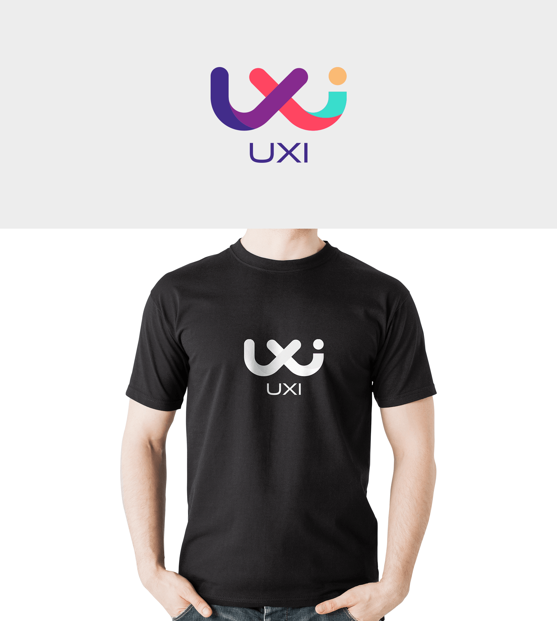
Our client, UXI is a tech company that provides creative solutions to other organizations and people using products every day. They believe that no matter how complex a product is, the UI or User Interface must offer convenience, should be simple yet creative and must solve a problem.
Brainstorming
Keeping in mind the client’s core requirements and the urgency of their project, we gathered up our creative thoughts and created rough sketches before finalizing an option. Along with every detail mentioned in the brief, our client wanted a word-based logo instead of any vector illustrations/visuals while keeping the feel corporate and high tech. With no time to kill, we finally came up with a design that could be the answer to our client’s problem!
Color Plates


 We’ll get back to you in 24 hours
to address your needs as quickly as possible.
We’ll get back to you in 24 hours
to address your needs as quickly as possible.
 We’ll prepare an estimation of the project
describing the team compostition, timeline and costs.
We’ll prepare an estimation of the project
describing the team compostition, timeline and costs.
 We'll perform a free website review
If you already have an existing website.
We'll perform a free website review
If you already have an existing website.


