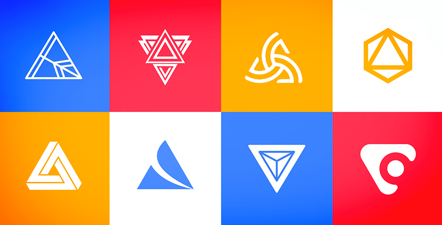
22 Famous Triangle Logos: A Business Owner's Guide
Why do Adidas, Delta, and Google use triangles? Research shows angular logos signal durability. Here's when a triangle works for your brand.
Most business owners choose a triangle logo because it "looks modern." That reasoning will cost you.
After working with over 1,000 brands since 2012, I can tell you the shape of your logo sends signals to customers before they read a single word. Get it wrong, and you're fighting your own brand identity every time someone sees it. Get it right, and the shape does half your marketing work.
The problem? Most advice on triangle logos reads like a design school textbook. Interesting for designers, useless for the business owner trying to make a real decision.
This guide is different. I pulled together research from psychology journals, analyzed 22 iconic triangle logos, and translated it into what actually matters for your brand. Whether you're launching a new business or considering a rebrand, you'll know exactly when a triangle makes sense and when it doesn't.
Table of Contents
- The Psychology Behind Triangle Logos
- Should Your Brand Use a Triangle? Decision Framework
- Triangle vs. Circle vs. Square: What Each Shape Signals
- 22 Famous Triangle Logos and Why They Work
- When Triangle Logos Backfire: A Cautionary Tale
- Frequently Asked Questions
This article draws from peer-reviewed psychology research, 50+ brand case studies, company press releases, and 12 years of branding project experience. Every claim links to its source.
The Psychology Behind Triangle Logos
Here's my honest take on why most "logo psychology" content misses the point: it tells you triangles mean "power" and "stability" without explaining what that means for your actual business.
The real insight comes from research published in Psychological Science. Researchers found that angular logos (like triangles) lead consumers to perceive products as more durable. Round logos, by contrast, signal comfort.
I didn't expect this finding to be so clear-cut. But the data was consistent: when participants saw angular logos, they rated products higher on durability. When they saw round logos, they rated the same products higher on comfort.
What this means for your business: If you're selling durability, reliability, or performance, triangles work in your favor. If you're selling comfort, warmth, or community, a circle might serve you better.
How Triangle Orientation Changes Meaning
The direction your triangle points matters more than most business owners realize:
| Orientation | What It Signals | Best For |
|---|---|---|
| Point Up | Stability, growth, aspiration | Finance, construction, athletics |
| Point Down | Sophistication, femininity | Fashion, luxury, hospitality |
| Point Right | Motion, progress, action | Media, technology, sports |
| Rounded Corners | Strength with warmth | Travel, wellness, community |
Should Your Brand Use a Triangle? Decision Framework
After helping hundreds of business owners through logo decisions, I developed this framework. Answer these five questions honestly:
Triangle Logo Decision Scorecard
1. Does your brand emphasize performance, innovation, or durability?
Yes = +2 points | No = 0 points
2. Is your industry traditionally associated with triangles?
(Construction, aviation, athletics, technology, finance)
Yes = +2 points | Partially = +1 point | No = 0 points
3. Do you want to project confidence and forward momentum?
Yes = +1 point | Neutral = 0 points | No = -1 point
4. Is your target audience primarily business/professional?
Yes = +1 point | Mixed = 0 points | Consumer/family = -1 point
5. Does your brand name contain an "A" or "V" that could integrate with a triangle?
Yes = +1 point | No = 0 points
Score Interpretation:
5-7 points: Triangle is a strong fit for your brand
3-4 points: Triangle could work, but explore alternatives
0-2 points: Consider circles or squares instead
Triangle vs. Circle vs. Square: What Each Shape Signals
Before committing to a triangle, understand how it stacks up against the alternatives. I've seen this comparison missing from most logo guides, which leaves business owners without the full picture.
| Shape | Primary Signal | Industries | Watch Out For |
|---|---|---|---|
| Triangle | Innovation, power, progress | Tech, athletics, construction | Can feel aggressive or cold |
| Circle | Community, warmth, unity | Nonprofits, food, wellness | Can feel generic or passive |
| Square | Stability, trust, professionalism | Finance, legal, enterprise | Can feel corporate or rigid |
According to Crowdspring, 75% of consumers identify brands by logo alone. The shape you choose becomes your first impression for three-quarters of your audience.
22 Famous Triangle Logos and Why They Work
I analyzed these 22 brands to understand what makes their triangle logos effective. Each one uses the shape strategically, not decoratively.
Guess
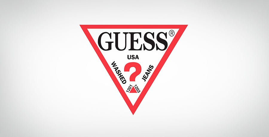
The inverted triangle in Guess's logo isn't just a design choice. It pulls attention downward, creating intrigue that fits a fashion brand perfectly. The sharp angles signal confidence while the question mark adds personality. For business owners: this shows how orientation (point down) can shift perception from "aggressive" to "sophisticated."
Partek
![]()
Partek empowers scientists in genetics and drug discovery. Their triangle communicates precision and stability, essential signals for a company handling critical medical research. The clean geometry builds trust in a field where accuracy matters.
Google Drive

According to 1000 Logos, each side of Google Drive's triangle represents a core service: blue for Docs, green for Sheets, yellow for Slides. The shape also resembles a Penrose triangle, an optical illusion suggesting the interconnected nature of the three tools. In 2020, Google flattened the design while keeping the core concept, showing how triangle logos can evolve without losing meaning.
Google Play
![]()
The right-pointing triangle mirrors a play button, an intuitive visual shortcut that's become universal in media. Google reinforced this with their signature colors, creating instant brand recognition while communicating action and movement.
Palace Skateboard

This logo uses an optical illusion to create a 3D "impossible triangle" (Penrose triangle). The technical precision matches skateboarding's core appeal: challenging, creative, and rewarding for those who master it. It's proof that triangle logos can feel playful rather than corporate.
FILA
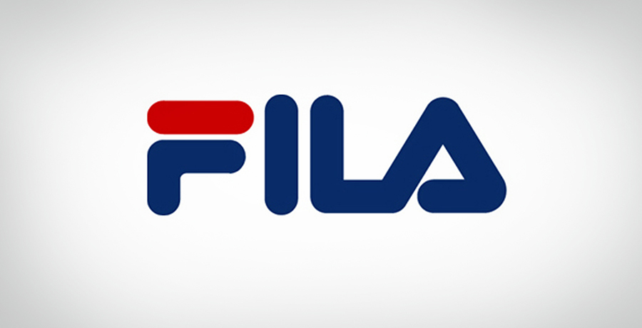
According to 1000 Logos, FILA's triangular "A" nods to the Alps, where the Italian company originally made clothing for mountain dwellers. The rounded triangle softens the athletic brand's image while maintaining strength. This is a masterclass in subtle symbolism: the mountain reference only becomes obvious once you know the brand's origin.
HGTV
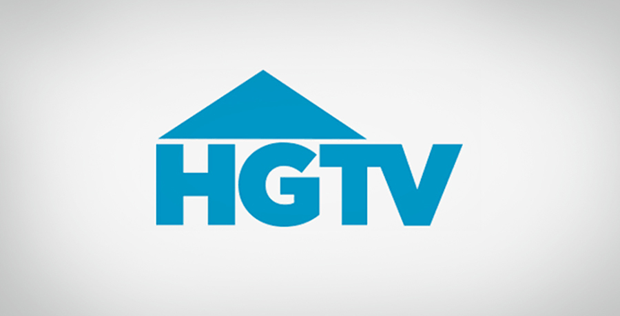
The triangle above HGTV's letters creates a house shape, connecting the network to home improvement without spelling it out. The blue color adds trust and intelligence. For business owners: this demonstrates how triangles can create recognizable silhouettes beyond their basic shape.
Airbnb
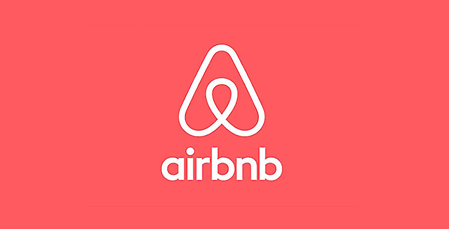
Airbnb's "Bélo" symbol, introduced in 2014, combines four elements: a person (inner shape), location pin, heart, and the letter A. According to Inkbot Design, London agency DesignStudio spent a full year researching and developing this concept after interviewing hosts and guests worldwide. The rounded corners soften what could be a harsh triangle into something welcoming. CEO Brian Chesky called it "a symbol of belonging."
Reebok
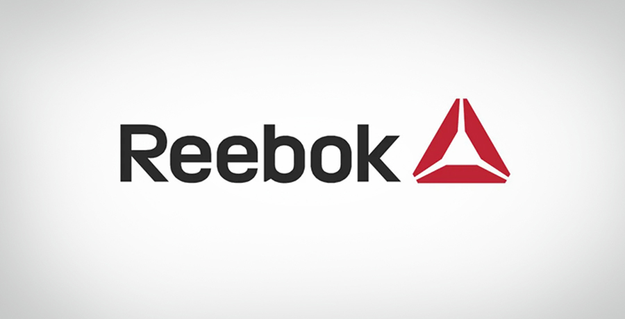
Reebok's Delta logo represented physical, mental, and social transformation through fitness. But there's a cautionary tale here. More on that in the next section.
Spire Holistic Health
![]()
The rounded triangle creates a leaf shape, connecting to natural and organic medicine. The green color reinforces wellness associations. This shows how softening a triangle's edges can shift perception from "powerful" to "nurturing" without losing the underlying structure.
Toblerone

Here's a fascinating case of logo evolution. Toblerone's mountain represented Switzerland's Matterhorn peak, with a hidden bear (Bern's city symbol) inside. According to NPR, when production partially moved to Slovakia in 2023, Swiss "Swissness" laws required removing the Matterhorn imagery. The brand now uses a generic mountain shape, showing how geographic symbolism can become a liability if your business model changes.
Qantas
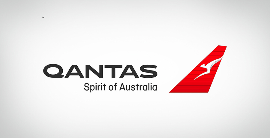
The triangular kangaroo tail replicates the actual tail design on Qantas aircraft. This creates immediate recognition at airports and connects the logo to the experience of flying. The shape communicates motion and upward movement.
CAT (Caterpillar)

According to Logos World, the yellow triangle under CAT's "A" symbolizes stability and innovation. The isosceles shape (two equal sides, wide base) communicates groundedness, perfect for heavy machinery. The yellow matches construction safety equipment, reinforcing the brand's industrial identity.
DLF Building
![]()
For a construction company, triangles carry special meaning. They're fundamental to architectural stability. DLF's stacked triangles represent building blocks while signaling the company's core values of strength and reliability.
Mitsubishi

According to Mitsubishi's official site, the name translates to "three diamonds" in Japanese ("mitsu" = three, "hishi" = water chestnut/diamond shape). The logo combines founder Yataro Iwasaki's family crest with the three-oak-leaf crest of his first employer. Since 1870, this design has remained largely unchanged, proof that simple geometric logos can achieve timeless recognition. For more examples of logos that stood the test of time, see our 26 Classic Branding Success Stories.
Delta Airlines
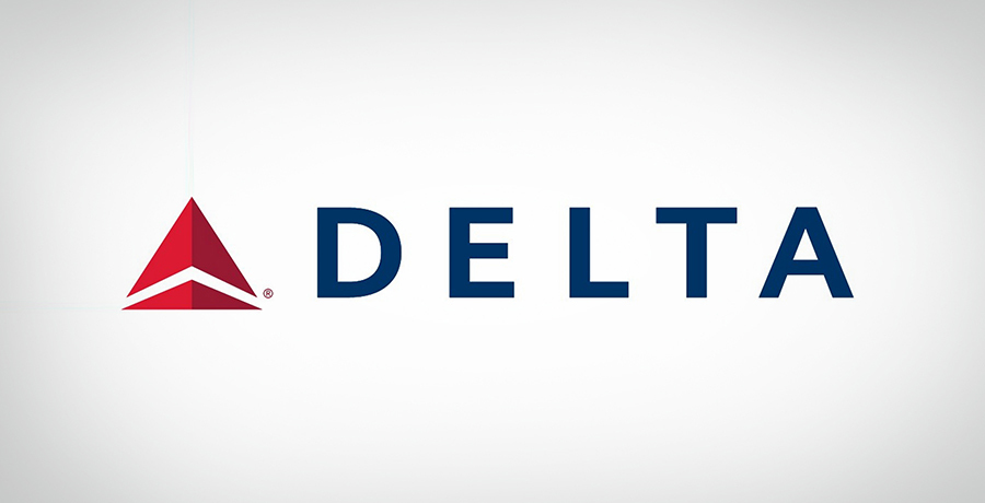
According to the Delta Museum, the "Widget" logo evolved from observing the triangular shape of jet aircraft in flight. The Greek letter delta (Δ) also connects to the airline's origins in the Mississippi Delta. The current 3D version, introduced in 2007 when Delta exited bankruptcy, represents a modernized "D" and the swept-wing appearance of a jet.
Adidas

According to 1000 Logos, the mountain-shaped Adidas logo represents challenges athletes face. The three stripes, originally purchased from Finnish company Karhu for €1,600 and two bottles of whiskey in 1949, now form mountain peaks symbolizing goals to achieve. Adidas uses multiple logo variations for different product lines, showing how triangles can adapt across brand extensions.
Kenwood
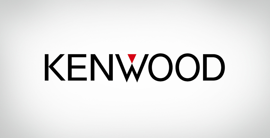
The simple triangle above Kenwood's wordmark creates instant recognition even from a distance. The name combines "Ken" (a common name in both USA and Japan) with "wood" (suggesting durability). The clean sans-serif font paired with the geometric shape communicates modern reliability.
HSBC
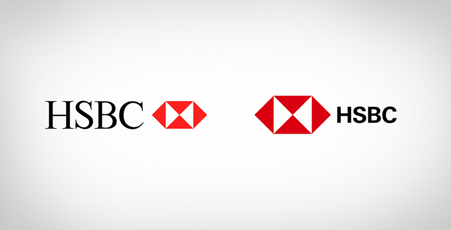
According to the HSBC History Exhibition, designer Henry Steiner created the hexagon in 1983 by adding two triangles to the original four-triangle house flag. The flag itself came from the St. Andrew's Cross of Scotland (founder Thomas Sutherland's homeland). The six triangles represent "eight directions" in feng shui, symbolizing business coming from everywhere. HSBC refreshed the brand in 2021 while keeping the core hexagon intact.
Alcatel
![]()
Like FILA, Alcatel substitutes a triangle for the letter "A." But instead of replacing both A's, they modified only the middle one, creating symmetry with equal letters on either side. This demonstrates how triangles can integrate into typography for a unique look that's still readable.
Ducati

Ducati's logo resembles an inverted triangle or shield, with the dark red color signaling Italian motorsport heritage. The rounded corners soften the aggressive shape into something premium rather than harsh. The curved line through the center reinforces the brand's focus on speed and motion.
Chicago Bulls
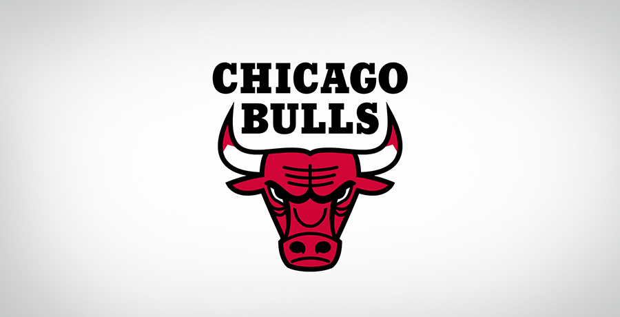
The bull's face naturally forms a triangular shape, projecting fierce determination. The red, black, and white color combination signals power, elegance, and energy. This logo shows how triangles can emerge from organic shapes rather than being explicitly drawn.
Need Help With Your Brand Identity?
FullStop has helped 1,000+ businesses develop brand identities that connect with their target audience. If you're weighing logo options or considering a rebrand, let's talk through your specific situation.
When Triangle Logos Backfire: A Cautionary Tale
I've seen enough rebrands go wrong to say confidently: a triangle isn't always the answer. And Reebok's Delta logo provides the perfect case study.
In 2013, Reebok introduced the Delta logo to reposition as a fitness brand. The triangle represented transformation across physical, mental, and social dimensions. The design was clean, the symbolism was solid.
But according to Inkbot Design, the rebrand had problems:
- Too narrow: The Delta appealed to CrossFit enthusiasts but alienated mainstream consumers
- Lost heritage: Reebok's classic Vector logo carried decades of brand equity that vanished overnight
- Confused positioning: Was Reebok now a fitness lifestyle brand or still a sports apparel company?
By 2019, Reebok announced a return to the Vector logo for most products. The Delta still appears on CrossFit and UFC-branded items, but the company learned an expensive lesson: a geometrically perfect triangle can't fix a positioning problem.
The takeaway for business owners: Your logo shape should clarify your brand, not redefine it. If you need to change who you are, that's a strategy conversation, not a design decision. For a deeper dive into when rebranding makes sense, see our CEO's Decision Framework for Rebranding.
Making Your Decision
After cross-referencing psychology research with real brand outcomes, here's what stands out:
A triangle works when:
- Your brand genuinely emphasizes innovation, performance, or durability
- You're in an industry where triangles carry positive associations
- The shape can integrate naturally with your brand name or story
- You want to project forward momentum and confidence
A triangle doesn't work when:
- Your brand is primarily about comfort, community, or warmth
- You're forcing a triangle because it "looks modern"
- Your target audience values tradition over innovation
- The shape doesn't connect to your brand story
The 22 brands above didn't choose triangles randomly. Each one found a strategic reason for the shape. Adidas represents mountains to climb. Delta represents the shape of jets in flight. Mitsubishi honors family heritage. The best designers understand this connection between shape and meaning, as we explored in What Legendary Designers Understood About Logos.
What story would a triangle tell for your brand?
Ready to Explore Your Options?
Whether you're starting fresh or considering a rebrand, our team can help you find the right visual identity for your business. We work with growing companies like yours every day.
Frequently Asked Questions
What does a triangle symbolize in a logo?
Triangles primarily signal innovation, power, and forward momentum. Research from Psychological Science shows angular shapes like triangles lead consumers to perceive products as more durable compared to round shapes. The specific meaning varies by orientation: upward triangles suggest stability and growth, downward triangles feel more sophisticated, and sideways triangles communicate action.
Why do so many tech companies use triangle logos?
Technology companies frequently use triangles because the shape signals innovation and progress, key attributes in a fast-moving industry. Companies like Google (Drive, Play), Adobe, and Qantas use triangles to communicate forward-thinking and precision. The clean geometry also scales well across digital platforms.
Is a triangle logo right for my small business?
Use the Decision Scorecard above to evaluate fit. Triangles work well for businesses emphasizing performance, innovation, or durability. They're common in construction, athletics, technology, and finance. If your business focuses more on community, comfort, or nurturing, circles might serve you better. The key is alignment between your brand values and what the shape naturally communicates.
What's the difference between sharp and rounded triangle logos?
Sharp triangles project confidence, power, and sometimes aggression. Rounded triangles (like Airbnb's Bélo) soften these associations, adding warmth and approachability. Many hospitality and wellness brands choose rounded triangles to balance strength with welcome. Your choice should match how you want customers to feel when they encounter your brand.
Can I combine a triangle with other shapes in my logo?
Yes. HSBC combines six triangles into a hexagon. Airbnb integrates a triangle with a heart shape. Many brands use triangles as accent elements rather than the primary shape. The key is ensuring each shape adds meaning rather than visual noise. Complexity rarely improves a logo.
How much does a professional logo design cost?
For small to mid-sized businesses, professional logo design typically ranges from $2,500 to $15,000 depending on agency experience and project scope. According to MTHD Marketing, professional branding delivers 2,000%+ ROI on average through increased recognition and customer trust. The cheapest option is rarely the best investment.

Co-Founder & Strategic Visionary at FullStop
Co-Founder at FullStop, a branding, digital and software agency he started in 2012. Haris works across brand design, digital marketing, and custom development—helping businesses turn ideas into market-ready products.
Ready to transform your brand?
Our team specializes in strategic branding and digital solutions that drive real business results.

