Logo Evolution: The Top 9 Famous Brands over the Time
Check out how the logo evolution of the world’s most famous brands brought more meaning and depth into their branding.
As a child, seeing the red and white stripes of KFC signaled a sense of elation that was incomparable to all. As adults on the run, the glistening green and white logo of Starbucks emits a ray of hope that caffeine rules the day. When luxury shopping for travel, the LV of Louis Vuitton has always symbolized luxe and glamour personified.
We have all become so accustomed to viewing the countless logos of numerous brands that rarely, if ever, do we ponder upon their evolution process.
Who or what was the brainchild behind Nike’s ever so popular ‘Just do it’? Were the colors ever modified or have they been classic since day one?
Its questions like these that really make one think about their entry into the market.
Just in case you’ve got questions similar to the ones raised above or have always wondered why a certain brand’s logo is the way it is, we’ve got some great news for you.
Below, we are unraveling the mystery that surrounds the logo evolution process of 9 of the world’s most trending brands ever. So let’s get right into it!
Unraveling the Logo Evolution Process of the Top 9 Most Renowned Brands in the World
Apple - More than just a fruit
![]()
Technology giant Apple needs no introduction whatsoever. The brand has managed to stay true to the concept of less is more by adopting simplicity into its logo design over the years. As a tech conglomerate,
Apple moved from ancient yet intricately detailed scenery in 1976 to one comprising of a multicolored apple in 1977.
As years progressed, the bitten apple logo had the brand’s name removed entirely. Today, we are left with a chic solid black colored apple emblem and there’s no complaining from anyone’s side.
VISA - Staying true to its roots
![]()
If you’ve ever dined at a restaurant and been short on cash or better yet, gone to a foreign destination with no currency exchanger nearby, the VISA logo is a sign of relief for many. This brand has stuck to its roots from day one, showing us all how consistency is done.
VISA started off with a pretty basic color palette and casual looking font style. As the brand gained popularity, it was time to drop down that striped affair.
Today, we appreciate a sleek design that solely has VISA standing alone as a sturdy typeface.
Baskin Robbins - Representing flavors galore

Favorites for both adults and kids, we all scream for ice cream. And one brand has managed to stay at the top for all the right reasons. Baskin Robbin’s logo has evolved from vintage themed glory to bubbly madness, not to mention creativity at peak.
That’s when the brand decided to disguise its whopping 31 flavor goodness range into the pink and blue BR we see today.
When you’ve got a logo that stands for a set of flavors for every single day of the month, what more can a happy consumer ask for?
Nike - a Symbol that needs no introduction whatsoever
![]()
Another brand in athleisure and sports goods that showed us all that even the simplest of logos can become impactful- that is Nike for us all Folks!
Staying true to consistency since 1971, the infamous swoosh is here to stay. But as the brand grew over the years, we witnessed the brand’s decision to remove its name from their logo as a whole.
Burger King - Reigning supreme for all the right reasons
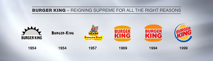
Succulent, juicy and oh so fabulous, Burger King has been termed as the heartthrob when it comes to global burger fanatics.
The burger franchise transformed from its mascot themed logo to a more subtle outlook with its explicit burger graphic image.
Over the years, the logo has seen tweaks here and there when it comes to font and hue.
Today, we visualize a more global appeal and feel to Burger King as it continues to dominate the fast food chain industry across the world.
Pepsi - a Dynamic series of evolution
![]()
Starting off as a beverage company in 1950, Pepsi always had big plans for its logo design. We’re talking a dynamic series of logo changes that surprisingly worked well.
We were first introduced to red script on a white background, closely followed by bottle cap symbol in red, blue and white greatness. Soon in 1961, the brand switched its fancy script and opted for solid black font design.
By 1972, we were shown a stylized circle that had colored stripes and the brand’s label all over. But today, Pepsi‘s logo continues to stand strong as a solo striped circle for the win.
Mercedes Benz - Luxury personified
![]()
Termed by many as a status symbol of the rich and aristocrats of society, automobile giant Mercedes Benz has been an unstoppable force when it comes to its launch of logos galore.
Things began rather simply in 1908 as the brand introduced a black oval with the label customized inside. In 1909, we were surprised to see their logo transform into a shimmering three pointed golden star that was memorable to say the least.
By 1933, the same logo was surrounded by a circle, after which it remained constant over the years. Today, we observe silver chic brilliance without the brand’s label being mentioned.
Starbucks - Waking up to smell the goodness
![]()
Well, we’re all pretty united on the fact that coffee is one of the greatest mood uplifters. And Starbucks being the world’s most renowned café, we aren’t surprised its logo has evolved to perfection today.
It all began in 1971, where the brand’s logo stated Starbucks Coffee, Tea and Spices complete with the standard brown hued mermaid icon.
In the following years, the brand renamed itself as Starbucks Coffee and adopted green as their go to color. Today, the signifying mermaid icon remains to steal the hearts of coffee lovers’ world over, even without Starbucks actually being written.
Google - Wordmark for days
![]()
Google’s love for color cannot be denied. Be it the year1997 to 2015, the letters of the label were whimsical to say the least.
Today, we experience a more modern yet playful appeal that hints at sheer creative bliss. It makes seamless use of a sans-serif themed typeface and a more subtle outreach in terms of color.
Did we mention the uncanny resemblance to their parent company named Alphabet?
As we can clearly see, logos manage to morph over a span of time. Some brands preferred changes that were drastic while others considered playing safe.
Whatever the change may be, it’s important for businesses to alter their visual elements as they expand and develop into the best version of themselves. And this in most cases begins with their logo design.
Infographics - Logo Evolution Process of Top 6 Brands
![]()
Embed This Infographics
Courtesy of: FullStop
How much would your Brand Logo change?
Since all these top brands knew what logo can bring into their brand image, they progress with time! Definitely, logo is the face of your brand, so it needs to morph as your business develops and grows.
You may need to upgrade your brand’s essentials and this starts with your logo.

Co-Founder & Strategic Visionary at FullStop
Co-Founder at FullStop, a branding, digital and software agency he started in 2012. Haris works across brand design, digital marketing, and custom development—helping businesses turn ideas into market-ready products.
Ready to transform your brand?
Our team specializes in strategic branding and digital solutions that drive real business results.

