16 Logo Redesign Fails & What You Can Learn from Them
Every company wants to look upbeat, relatable, and appealing to its consumers and they resort to a logo design for attaining this objective.
They invest in a fantastic logo design and keep it up-to-date to stay relevant in every decade!
But sometimes these logo redesigns bring creative disasters and branding catastrophes for the brand. Where they’re expecting to hear a “Wow” from their target market, they end up hearing “Ugh” and the backlash cycle starts which impacts on the brand’s reputation negatively.
The creative world has seen such awful logo redesign fails that left many lessons for us to prevent ours from experiencing the same.
Come, let me tell you the most famous ones that caught everyone’s attention and the company either had to revert back to the old logo or faced public criticism for months.
Famous Logo Redesign Fails in 2021
My intention was to give you a quick overview of how the big brands ended up with the logo redesign fails. And I’ve included a key lesson with each example to make things easier for you. If you’re interested to read more on any of the examples and their failed logo redesign adventure, I’ll cover them separately in another post some other day.
Let’s stick to the list and see which famous brand ruined its brand reputation with a logo redesign fail, below!
Animal Planet
Animal Planet thought of giving its logo an animated shape and replaced that iconic elephant & globe logo in 2018.
The channel wanted to give its logo design an easily understandable feel so they switched to elephant-only logo elements which was good but far from representing their brand.
It appears more of a toy store’s logo than representing a famous channel that’s known for its informative programs on different animal species.

Key Lesson
Don’t go for an extremely easy logo redesign approach that you fail to attach it with your brand’s core values.
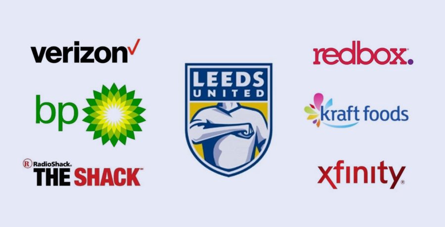
British Petroleum
British Petroleum is remembered to spend about $211 million on its logo redesign!
Wait for the surprise!
They did spend this awful amount on their logo rebranding but didn’t really receive any value in return against this investment.
Why?
They switched from the lettermark logo to a logo that contains Helios (a Greek god representing sun) to tell the world how they support eco-friendly initiatives.
But they trade in petroleum which is one of the causes of Earth’s destruction.
So, it backfired their logo redesign approach instantly.

Key Lesson
Don’t be too excited to experiment with your logo if you forget your products or core business that negates your creative claims!
Burberry
There’s a reason for adoring the old Burberry logo as it connects the brand with an era and gives it a classy feel. The new logo is good for the sake of legibility and memorability but it lacks the class which is its biggest mistake.

Key Lesson
Never compromise on your logo’s key design elements just to blend in to the trends!
Capital One
Capital One used a wordmark as its logo design until 1994 and then they made a slight change in their corporate face with a swoosh!
This little upgrade added a wow factor in their logo design which makes them an ideal example for this list.

Key Lesson
They spotted the flaw in their logo design and corrected it right away that gave their brand identity a boost.
Comcast
Xfinity (previously known as Comcast) was facing public backlash due to pathetic customer care standards.
They tried to rebrand the name and resorted to a logo redesign to fix their reputation!
It didn’t work as they planned and ended up in my list of famous logo redesign fails.

Key Lesson
A logo redesign is not a very good option to fix your company’s reputation until you work on your service quality.
Gap
Gap is one of the famous retail brands that’s known for its quality products and ideal prices!
Not very long ago they tried to benefit from a logo redesign but it only lasted for 6 days. Due to too much backlash from their loyal customers, they had to revert back the old logo. The new logo was also a wordmark but people still loved the old one so they had no other option.

Key Lesson
Never mess with your loyal customer’s feelings, ever!
JCPenney
If you’re a US citizen or live in Puerto Rico, you’d have visited the JCPenney store in your town!
This retail brand thought of giving its logo a nice redesign but ended up with public mockery and ridicule due to non-readability issues.
People started to complain about readability confusion for JCPenney’s new logo design and the management had to remove this new logo ASAP.

Key Lesson
Keep the legibility aspect in mind while investing in a logo redesign project for your brand!
Kraft
We all know Kraft for giving us one of the spiciest sauces, Heinz!
They resorted to a logo redesign to establish their brand as an international one but the logo told a different story.
They slightly got off the creative lane and became one of the famous logo redesign fails with an artistic design approach that tells anything of a relation with the food industry.

Key Lesson
Don’t risk your reputation while investing in a logo redesign project especially when you’re working on an international level.
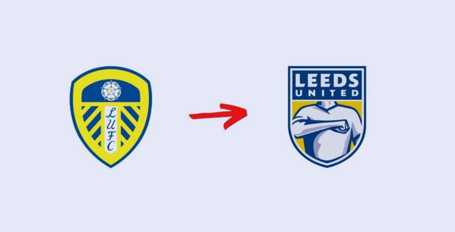
Leeds United
If you’re a football lover, you’d have seen Leeds United but this mention is not due to their winning streaks or wonderful history in the football world.
They opted for a logo redesign in the past and it backfired so badly that their fans had to sign a petition to demand for reinstating the old one.
The sports brands work a little differently than usual brands and you can’t mess with your fans with a slight change in anything let alone the logo design. And fans proved their importance when the club had to revert back to the old logo shortly after unveiling the new one.
Key Lesson
Keep your fan’s sentiments in view while opting for a logo redesign otherwise you’ll end up attracting hate speech towards the brand.
Mozilla
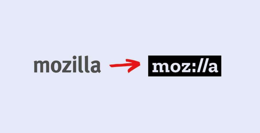
Mozilla, the company that owns Firefox, is known to have a distinct mission with its Internet for All approach got into a logo controversy when they tried to rebrand themselves with a new logo.
Where they were using a wordmark previously that states a proper brand name, they replaced it with Moz://a which was quite a challenge for people to read it properly.
And what added fuel to the fire was a statement from Creative Director, Tim, that claims everyone would guess it’s something related to the internet.
Key Lesson
You can’t leave your viewers with an open choice to form an opinion about your brand as it can have some negative or unfavourable consequences.
Myspace
Myspace could’ve been a famous social media network if Facebook didn’t steal their thunder 2 decades ago.
Maybe this led Myspace to regain the 1st spot when they opted for a rebrand and changed their iconic logo with a new, and rather confusing one.
They used a space to denote the word “Space” in their logo name and this didn’t go well in the user’s eyes.

Key Lesson
Don’t give your readers a hard time cracking your brand name and keep it understandable for the general public.
Overstock
Overstock, a leading furniture retail store, is a known brand in the US for offering luxury furniture. They decided to upgrade their brand image with a logo redesign. The plan was to attract everyone’s attention with a fantastic logo design.
But they ended up with a confusing logo design which initiated a whole different debate. And they had to revert back to their old wordmark logo.

Key Lesson
In your logo redesign quest, don’t forget to maintain the brand’s relation with your industry or else your customers may not be able to identify it’s you.
RadioShack
When the world was facing a financial crisis in 2008’s recession, RadioShack was struggling to regain its sales volume that was affected, too.
They planned to relaunch themselves with a logo redesign and replaced RadioShack with The Shack!
This strategy felt unappealing to the majority of their customers. They even resorted to keeping both old and new names but it couldn’t help them from facing the criticism.
And they moved back to the old logo design!

Key Lesson
Don’t confuse your brand identity during the logo redesign process so that your consumers can spot your confusion instantly.
Redbox
If you follow the design trends carefully, you might be wondering what happened to Redbox’s iconic logo design, right?
They tried to give their branding a boost with a logo redesign but the final result was something no one really expected.
They may have failed at maintaining the kerning between letters that creates legibility confusions. And this is where they got it all wrong along with a clueless purple dot at the end of their brand name.

Key Lesson
Stick with your old logo until it is completely obsolete otherwise you may risk your brand’s reputation.
Sears
Sears, a century old brand, wanted to relaunch itself with a logo redesign so they did it in 2019.
They kept the wordmark logo design but added an element next to it in hopes that it will add a wow factor in their corporate face.
It didn’t!
And they had to face criticism for such a step without thinking about the negative consequences.

Key Lesson
While you redesign your logo, try not to appear a copy of another established brand because people will be quick to notice.
And this could hurt your brand image!
Verizon
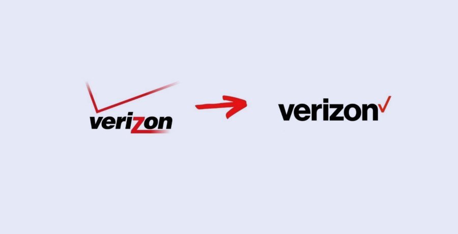
Verizon felt that their existing logo is not very attractive so they planned to redesign it back in 2015.
Their prime design plan was to shift the check at the end of the brand name!
But their adventurous project to rebrand their logo didn’t feel any different than the old one and this is where all their branding plans failed.
Key Lesson
If you opt for a logo redesign, make sure you do it properly otherwise it will just be a waste of time if your new logo design fails to appeal to the consumers.
Final Words + Pro Tip
So, these were some of the famous (and full of lessons) logo redesign fails that I wanted to share with you!
Let’s understand the basic need of a logo redesign first!
A company wants to portray itself as a supporter of change and to gain the trust of their consumers that they’re still relevant. But in doing so they must keep an eye on the redesign process and see if it remains inline with the brand’s core objectives and customer’s interest or not. Otherwise, you’d end up giving such a senseless explanation as Mozilla’s CEO did which will further give your customers a reason to mock you.
If you’re planning to redesign your existing logo, logo designers at FullStop can help you with their creative solutions. Adios!
Get a Free Quote
+1 845 3770255
Call on anytime
To discuss your project
