What If I Start a Business Without a Professional Logo Design?
Have you ever wondered what the most identifiable component of a business is?
Let’s sit down and think about it. There is a never-ending list of some of the most renowned names that portray iconic logos. These are recognized on a global basis by millions of viewers each day.
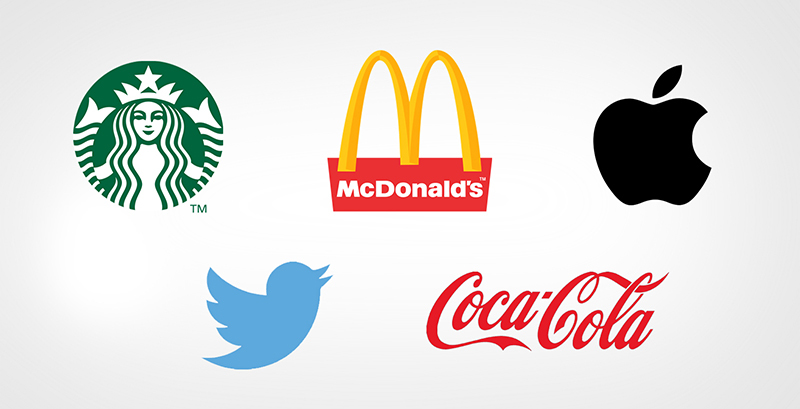
From the green of Starbucks, the yellow and red of Mc Donald’s to the ever so loved Apple logo, blue Twitter bird and not to forget Coca Cola’s signature red mixed with a white script- these are just some of the many thousands of instantly recognizable professional logos. Whether you’ve been an avid customer or user for the above-mentioned brands or not, there is no doubt the brand to which the logo represents.
Professional logo designs make up such an integral component of brand identity and corporate marketing strategies. Above all, to invest in a professionally created logo design means getting it right each time. And a decision like this could potentially lead a business generating huge returns on their initial investment.
What happens if you plan on starting your new venture without a professionally created logo design? Does it make a difference? To help you better understand this notion, we’re taking a closer look at comparing brands with effective logos and their competitors with not so flattering imagery. So let’s get right into it!
Logo design- The good vs. the bad
Before we jump into glancing over the examples of a professional and non-professional or bad logo design, it’s important to establish a clear understanding between the two.
So how do you define a professional logo design?
Professionally created logo designs are created by an individual or a team of specialist brand identity designers. They are simple, effective, and identifiable. Above all, they reflect the idea that arises behind the brand’s theme itself. These logos enable customers to instantly identify that particular brand.
Amateur or non-professional logo designs, on the other hand, are a whole different story. They are either too abstract, too sophisticated or simply those that fail to create an emotional connection with the target audience. No matter how modern they may seem, their complex nature perplexes onlookers.
Common everyday examples that necessitate the use of professionally curated logo design
To help give you a better understanding and clarity as to why many established brands emphasize professionally curated logo design, we’re comparing poor logos with their fabulous counterpart competitors.
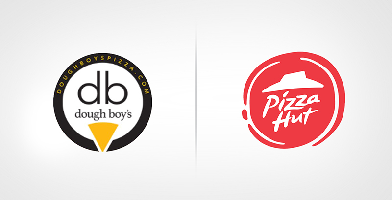
1. Dough Boys vs. Pizza Hut
The food and beverage industry has no bounds. And as more and more companies keep popping up as we speak, the competition is fierce. This is exactly why professional logo designers continue to reign supreme.
Dough Boys, a local US-based Pizza joint has a logo that leaves customers confused, to say the least. While the brand focuses on offering clients a versatile menu that features delectable salads, pizzas, sides, and more, their logo design is anything but unique.
The logo features an odd combination of shapes. While the aim of representing the DB from the brand’s name was the initial target, the amateur logo makes customers think twice before ordering from such a place.
Multinational food giant Pizza Hut on the other hand is the perfect example of a professional logo design done right. The brand has evolved over the years and so has its logo. The emblem today features classically suave script font and symbolic roof imagery that keeps clients longing for more.
Dough Boys vs. Pizza Hut
2. Shezan Beverages vs. Nestle
The names of Shezan Beverages and Nestle might be historic in the subcontinent but their logo designs are prime examples of how far a good logo design can take you.
The unveiling of Shezan’s logo can be described as ordinary. The brand’s logo was termed to be too simple to be remembered. All that it ever featured was an attempt at arranging fancy letters together as one. The result was mediocre, cheap and easy to forget.
Nestle, one of Shezan’s biggest competitors symbolizes the judicious use of well planned and simple professional logos at its best. Its range of beverages when putting side by side with Shezan is a whole world apart. Even when you are looking at the same apple juice, the Nestle branding looks more authentic and premium which urges you to buy Nestle over Shezan.
The professional logo design is bold, beautiful, and brilliant. The clever use of silhouettes representing life is a bespoke classic to say the least and one sure to be recognized from miles away.

Shezan Beverages vs. Nestle
3. Mama’s Baking Vs Sweet Southern
Mama’s Baking is a local brand that specializes in providing coffee, bakery, and confectionary items. A big impediment to the brand’s success is related to the mere fact that its logo is anything but appealing. Their poor attempt of designing a black and white silhouette featuring a female caricature with a flame on the inside is anything but innovative.
Sweet Southern Oven Bakery ,an international competitor that has made a mark in hearts across the globe, has a stronger and more professional logo design. The brand’s logo is well suited to the goods and services being provided, featuring a design that includes a creatively designed oven, holding the signature product with the brand’s tagline in modern vintage style, impeccably placed around it.
Sometimes less is more and that’s exactly why the brand continues to thrive in markets worldwide.

Mama’s Baking Vs Mamma Roti
4. Amazon vs. Motorola
Mobile lovers beware- the launch of Amazon’s Fire Phone was a dynamic unveiling but the brand’s logo left many fans puzzled. Giant, unappealing font, straightforward design, and the use of unattractive hues just didn’t cut the benchmark set up by other competitors in the industry.
Motorola, a leading US mobile and electric goods company is a stiff competitor. The brand’s professional logo design goes beyond the simple use of the font to deliver a message that resounds around the notion that it is here to stay. The high-quality incorporation of graphics, color, and diversity screams innovation. It’s a logo that’s fierce yet subtle, making a mark in more ways than one.

Amazon vs. Motorola
5. Yo’Good vs. Pink Berry
Frozen Yogurt is a healthy sweet treat that attracts the masses. However, when there’s a poor logo at stake, there’s only so much that can be done. Again, even if you provide the same level or products and services, still, your brand looks cheap and untrustworthy among your competitors just because of its brand identity and overall branding.
Yo’Good is a local frozen yogurt outlet whose logo incorporates unappealing slang and an unattractive color palette that’s sure to be forgotten. In comparison, Pink Berry seems to be acing the frozen yogurt market. And believe it or not, their logo and branding play a crucial role in doing so. Fresh color schemes that inherently coincide with the simple, clean and bold letters of the brand is just the type of vibes consumers search for. It’s a no-brainer when it comes to why its sales are leading in the competitive market.

Yo’Good vs. Pink Berry
As can be seen, a business’s true success has a lot to do with its professionally created logo design. The difference between a strong, cohesive, and creative logo can never be underestimated. Once the brand’s identity has a firm footing through a strong logo, only then can it expect to establish itself in more ways than one.
Get a Free Quote
+1 845 3770255
Call on anytime
To discuss your project
Featured articles:
Topic Categories
Interested In
Logo, Branding & Creative Work?


 We’ll get back to you in 24 hours
to address your needs as quickly as possible.
We’ll get back to you in 24 hours
to address your needs as quickly as possible.
 We’ll prepare an estimation of the project
describing the team compostition, timeline and costs.
We’ll prepare an estimation of the project
describing the team compostition, timeline and costs.
 We'll perform a free website review
If you already have an existing website.
We'll perform a free website review
If you already have an existing website.


