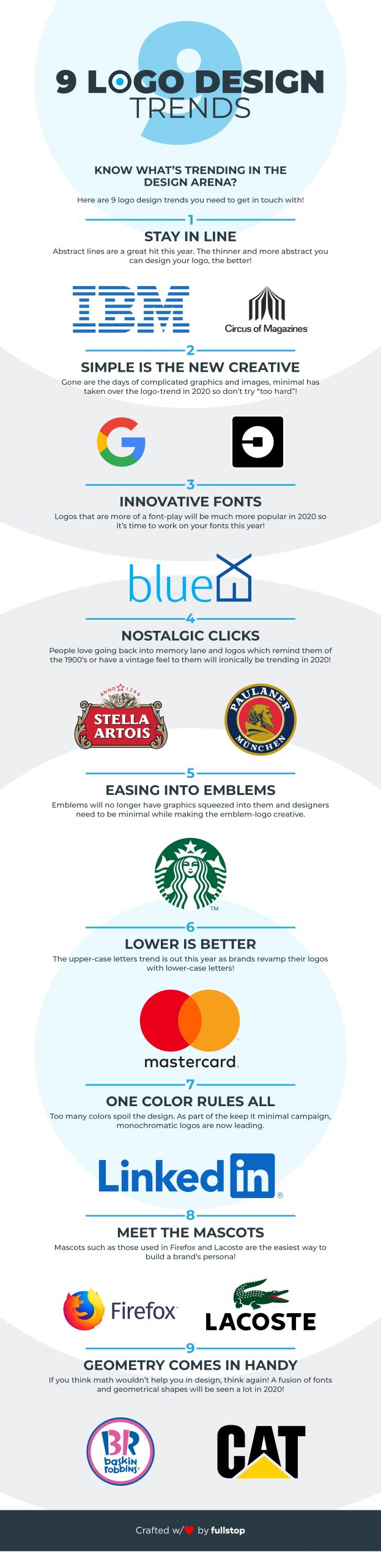
Top 13 logo design trends in 2020
Trends don’t only change in fashion and lifestyle; a lot keeps happening in the logo design arena as well. This design era is all about the new, the old, and the adaptable! As in any other profession, artists need to keep the trends in check instead of resuming their old ways and stubbornly grasping to their forte.
Comfort zones need to be broken and upgrades are significant. So, let’s hit the fast-forward button and look ahead instead of turning back: here’s all you need to know about the expected logo design trends of the New Year and beyond!
1. Stay inline
Lines have more than just vertical and horizontal aspects to them: they’re used to represent futuristic brands particularly ones that deal with technological advancements! The thinner and more abstract you can make your line logo design, the better your logo is bound to perform in the digital world. Since we’re rapidly hopping away from paper and press, logo design trends 2020 are more concerned with digital media.
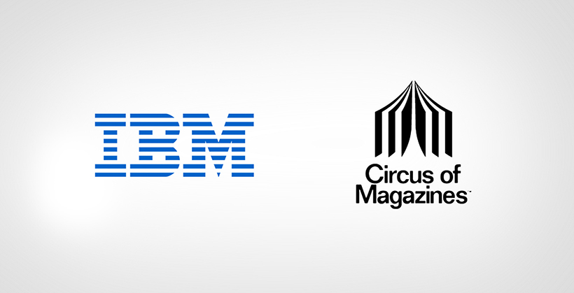
IBM And Circus of Magazines Logo
2. Simple is the new creative
Gone are the days of complicated graphics and images, minimal takes over the logo-trend in 2020! How do we know that? Ever noticed the rapid transformation of logos in the past decade? We’re not talking about just any brand we’re using the logo mafia, the dons in the design world as examples.

Google And Uber Logo
Ever noticed how logos of popular brands have altered with time? Elements have been eliminated (permanently or temporarily), leading towards simpler more adaptable designs (again a digital-oriented technique). Look at how these logos have evolved over time:
3. Innovative fonts
It’s no longer restricted to San Serif and Helvetica anymore! Word on the design-street is that 2020 will witness innumerable fonts that won’t remind you of any font that may have crossed your path. Basically, they won’t be fonts, they’re your logo! There are just so many ways you can be creative with your typography and these examples below might clear your perspective:
4. Nostalgic
Well, we need a dose of the past to escape the present at times and logo designers have been observing this change in human psychology since the circumstance changed from bitter to worse during these last few years, and let’s not even talk about 2020! So, people would love a blast from the past, and logo designs for restaurants, bars, or any related category can surely use an animated vintage logo from the 19th century! Here are a few examples:
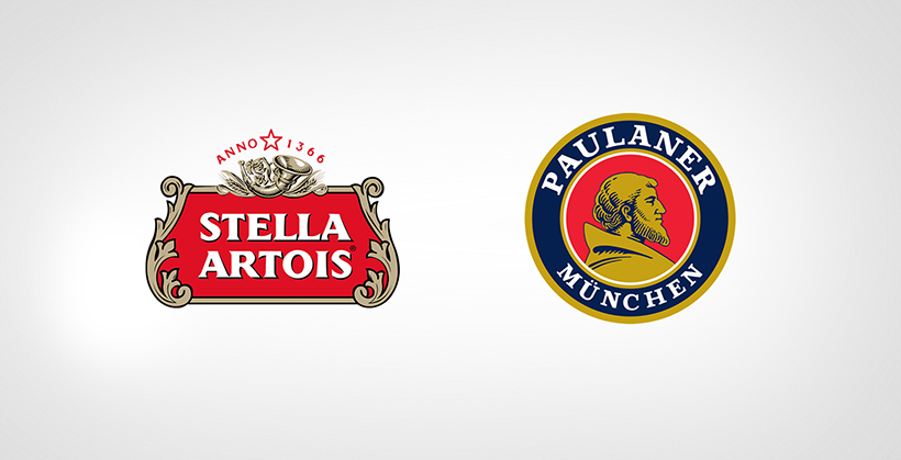
Stella Artois And Paulaner Munchen Logo
5. Chaos is cool!
Another noticeable logo design trend that’ll be a hit this year is logos which grasps attention with their distorted alignment and rule-breaker designs. You may take a minute to figure these logos out, but they’ve got your attention.
6. Easing into emblems
As we enter the era of minimalization, emblem logos will also be affected by a simple and subtle trend. So, what we’re looking at is a phase of logo designing where less is more. What may seem as complicated becoming easier is in fact a challenge for designers since they must create a masterpiece with limited tools! Remember what the Starbucks logo looked like up until recently? Here’s a refresher of the changes this logo underwent:

Starbucks Coffee Logo
7. Lower is better
Once upon a time, uppercase letters were an unbreakable rule. However, brands have started to realize that the constantly switched on caps lock in their logos is unnecessary and is not exactly a key player in establishing the “seriousness” of the brand. The weight has now shifted to lowercase letters as multiple brands have started to revamp their logo designs. Even brands that previously had logos with the caps lock on have turned it off!

MasterCard Logo
8. One-color rules all!
One logo, one color! Another extension of the minimal or less is more campaign, is a uniformly colored logo. We did witness the multicolored logos phase but we’re back to the monotones! Facebook LinkedIn, Twitter: they’re just a few of the smartest logos we’ve laid eyes on and all of them own one color with some negative space. The more colors you usually add to a logo (as the 2020 trend states) the tackier it might look!
9. Scaling
Well, we’re not talking about dental flaws here. The year 2020 may see a scale-play with the logo designs. By emphasizing certain elements of your logo more than the others, you’re giving a layperson the ability to see in between the lines and grasp the message you want to convey for your brand!

Linkedin and Facebook Logo
10. Closely knit
You can make clutter look great! The year’s all for overlapping logos and truly they are a work of art. You just need the right aesthetic sense and you can make clutter look better than any socially distant typography!
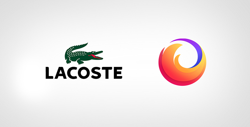
11. Meet the mascots
You may think at first: which brands have mascots as their logos? Ever used Firefox as your browser or used an android phone for that matter? Did you figure out what’s common in them? They both have a mascot assigned to their logo and be honest: as soon as you see them you know the brand. Mission accomplished. So the future of logo design may have more character (pun intended) to build a brand’s persona!
12. Gradients
If you’re a tad bit against logos which are too simple, there’s always a way out! Neon colors and gradients will add that element of fun to an otherwise boring design while keeping the minimal trend intact!
13. Geometry comes in handy!
Ever thought geometry might be useful in your artistic career? The new era welcomes designs that are a fusion of geometric patterns and text to give you a logo that is apparently creative yet simple and requires little effort and more creative thinking.

BR Baskin Robbins and cat Logo
Logo Design Trends 2020 – Infographic
Embed This Infographic
Ready for your next custom logo design? I can help.
Get a Free Quote
+1 845 3770255
Call on anytime
To discuss your project
Featured articles:
Topic Categories
Interested In
Logo, Branding & Creative Work?


 We’ll get back to you in 24 hours
to address your needs as quickly as possible.
We’ll get back to you in 24 hours
to address your needs as quickly as possible.
 We’ll prepare an estimation of the project
describing the team compostition, timeline and costs.
We’ll prepare an estimation of the project
describing the team compostition, timeline and costs.
 We'll perform a free website review
If you already have an existing website.
We'll perform a free website review
If you already have an existing website.


