All about Emblem Logos and why your brand needs one?
Logos logos everywhere and their significance can’t be stressed upon enough still! There’s a lot we all need to keep learning about logos and there’s something new to be discovered every year as trends change with technology and a many designs start becoming outdated or overused.
However, logos that still haven’t lost their charm are Emblem logos. These smartly designed logo that incorporate both, visual and words, are amidst the highest achievers in the logo design competition. Why? In a nutshell, these logos dominate every category and aren’t specific to any one industry but that’s just an understatement. Read more to explore more about Emblems and why they are desirable as a logo for any brand.
What are Emblem Logos?
Like their relatives, emblem logos too represent a brand’s persona; they are the identity of a brand. However, these come from a higher class of logos and are mostly used by brands that want to distinguish themselves from their competitors or brands that seek to establish an extremely professional image. Brands that mostly aim to merge their past and present or to show-off their ancestral background use emblem logos as their most effective tool to do so.
You may have come across these logos mostly for schools, an expensive wine brand or a prestigious automobile brand. Why do they belong to the elite you may ask? This is because emblems can give your logo the following touches:
- An expensive, contemporary and stylish look
- Simultaneously convey your organization’s vision and heritage
- Keeps customers emotionally bound to your brand
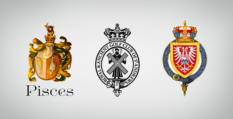
One characteristic is typical of an emblem logo and that is they fancy the round shape. This is mostly because ancient stamps or seals were mostly round and thus emblems keep the heritage alive, but there is no rule book which says emblems have to be round. There are multiple shapes such as a crest or shield which emblems can adapt to. A DC comic fan might remember the symbol for the house of El in Superman or a Harry Potter fan might recall the Hogwarts emblem.

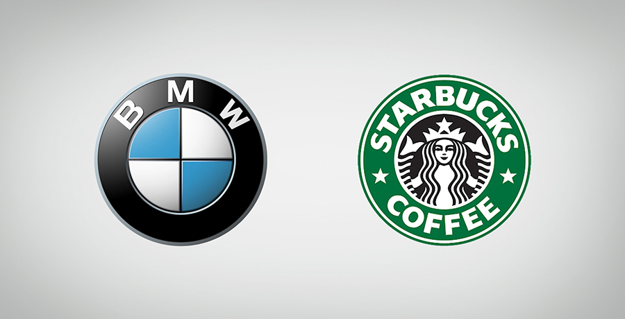
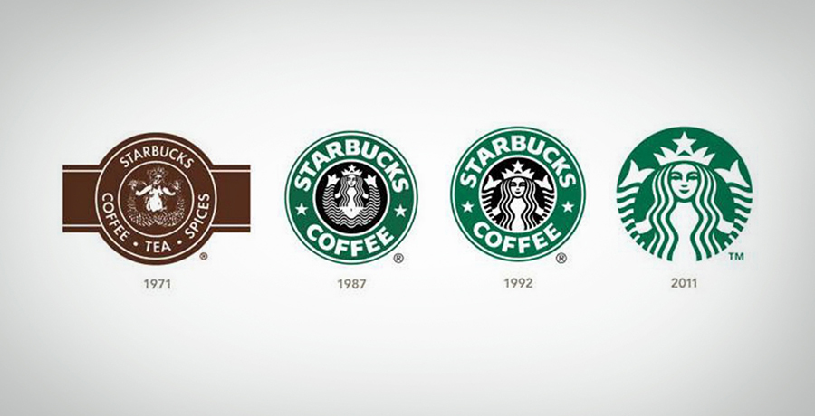
So what really is an emblem? These are logos which have the best of both worlds: the textual logo and the image logo both combine to form one great logo known as an emblem. Despite its traditional portrayal, many brands have managed to give these emblems a contemporary look such as BMW or Starbucks.
An image within a circle? Think that’s it? Try incorporating all that your brand stands for or wants to convey through its logo with a word mark within a tight frame. You won’t get a classic from a $5 designer. No offense.
Important for you: How to get your logo trademarked?
Key characteristics of an emblem logo: what are the main ingredients?
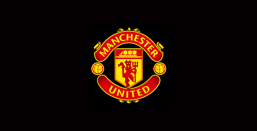
As explained in a nutshell above, emblem logos are a creative combination of text and image/vector and this doesn’t necessarily have to be a single image. No matter how much stuff you’d want to pack into your logo you need to stay within the defined borders for a logo to be considered an emblem. These borders could be invisible to the naked eye but they exist. For instance if you notice the MU logo, the two footballs on either end may not be within a visible frame or border yet all the elements are encapsulated within a defined area. Following are the qualifications required for a logo to pass as an emblem:
1. Easy to read
An emblem has a class and so the font would not only be bold but also easy to read instead of fancying up the text with French script or any related font. Sans serif is the most popular font which is compatible with emblems but it’s not the only one though.
2. Simplicity exudes class
I know you may have come across emblems with too much happening but have you seen the famous ones like Starbucks make some corrections? That’s because an emblem needs to be as less complicated as possible so that it doesn’t become unreadable when shrunk.
3. Right Colors, not bright colors
There’s no strict rule that emblems don’t or can’t have bright colors, but you’ll find them quite uncommon and even if there are any bright things there won’t be neon tints or flashy hues which can ruin the sophistication of an emblem. Since emblems are usually so full of themselves (pun intended), adding distractions to them increase their vulnerability to being a disaster for the brand in terms of first impressions.
4. Everything fits in place
Most importantly, above everything else, an emblem must have a defined area where elements of the logo all come together in a perfect balance. Remember your coloring techniques of creating a boundary with the same color pencil and then filling in: an emblem follows somewhat the same principles. Emblems are either round, shaped like a badge or seal stamps, like a shield or any other shape which can encompass all elements together.
Elaborating upon the purpose of emblem logos and how they stand out, I’ve outlined a few reasons clarifying why a brand should or shouldn’t opt for an emblem logo.
Emblem or Logo: What’s better for your brand?
The obvious answer would be: that depends on the personality that you want your brand to convey and which industry does your brand belong to. The emblem v logo debate isn’t really about egos, it’s about what your brand requires. So for instance a fast food brand which caters to SEC B may appear misleading when it uses an emblem as its logo or a brand which doesn’t need/want to exhibit its historical prestige.
It’s all about the impression you want to create as a brand or more correctly the first impression which is what logos are for. So which brands should jump into the emblem pool? As a brand you must pursue the vision of becoming distinguishable and most importantly would typically want to convey one or more of the following persona:
- A brand that is traditional and connects with customers on an emotional level such a soccer club
- A brand that wants to instill a feeling of nostalgia
- A brand that wants to portray a luxurious appeal
Additionally emblems may prove beneficial for the following brands/organizations:
- Any company/brand that enters the market/industry with the aim of standing out from its competitors can do so through an emblem. An example of this is again Starbucks which started off as a coffee brand but wanted its logo to be the center of attention and its brand to be a status quo for coffee lovers.
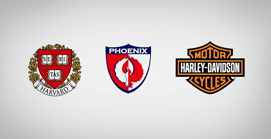
- As mentioned above, brands specific to certain industries such as educational institutions, sports and automobile companies may find an emblem to be the ideal choice for a logo.
- Remember reading above about how an emblem can take the form of a shield? This is the primary reason why safety/security agencies may represent their services with an emblem as their logo.
Not compatible with e-commerce brands
An emblem is somewhat less flexible as compared to a conventional logo so there’s little scope for alteration. A good logo designing agency might be the only option if you want an emblem which is adaptable to digital platforms. However, if you are solely an online brand, an emblem won’t serve your brand well since the size reduction would make your logo unidentifiable.
You may find it helpful: 9 Reasons why I think your start-up will fail without a professional logo?
Types of emblem logos: the Emb-Fam
As stated above, emblems may have numerous ways of being created (varying greatly with the creativity of the designer) and here are 5 styles which can assist you in determining how your brand’s emblem should look like:
1. The trendy vintage ones
Vintage and nostalgia mostly go hand in hand. If you want your brand to communicate a feeling of nostalgia or to have a vintage appeal for instance a wine brand, emblems are the best way to create your brand identity since they can symbolize quality and reliability.
2. The traditionalist
These emblem logos are for brands that wish to retain their heritage. I know what you’re thinking and the answer is: NO! Traditional emblems and vintage emblems aren’t in the same boat, they represent different types of brand identities.
A traditional emblem is one which doesn’t experiment much in terms of an emblem’s typical characteristics. They are confined to the original thought of how an emblem should look like instead of how it could look like. Nevertheless many brands have modified their logos overtime and entered the modern logo phase like Starbucks for instance:
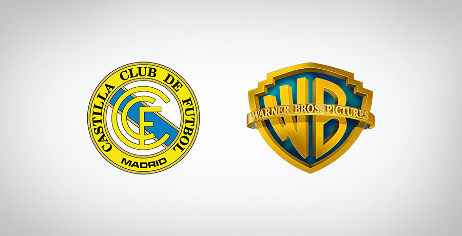
However the popular opinion for renowned brands would be to stick with their traditional Even though the Warner Brothers logo comes under the umbrella of shield emblems much related to royal, heraldic emblems , the logo still is one of the best examples of a traditional emblem which doesn’t step outside its territory yet retains a timeless feel.
3. Modern take on the emblem
Make way for the game changers! There are those who are rebels and love to step out of the box. These are the new generation of emblem logos with a twist in their design. They portray a more youthful or at times a much more professional image while being interesting at the same time.
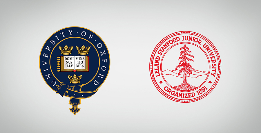
4. Academic emblems
Welcome the scholars! There’s nothing better than an emblem to represent an educational institution. Not only does an emblem depict a scholarly feel but it also gives an authoritative look, conveying professionalism and high standards.
To adopt an emblem as your logo you don’t necessarily need Harvard’s gigantic grounds, in fact you don’t even have to be a university/college. You can be that bookstore where all the bookworms visit or even a library and still use an emblem as your logo.
5. Medieval times
If you’re a fan of medieval films where the timeline rolls back a few centuries, you couldn’t have missed the mostly shield shaped emblems used to represent the house of royals. All noble families, popular or notorious, would represent their heritage with a heraldic badge (a type of emblem). This badge incorporates images which are representative of the particular tribe, community or kingdom, giving the identity a regal look.
So, whether you’re making a fantasy period film or are looking to open a Game of thrones restaurant make sure your logo as an emblem which locks in that royal charisma.
Even though the above information is based on research and experiences/examples, there is no law book which states that a modern brand with a funky feel cannot use emblems. As a matter of fact emblems can communicate a youthful identity when done so rightly. Take a look at this logo for instance:
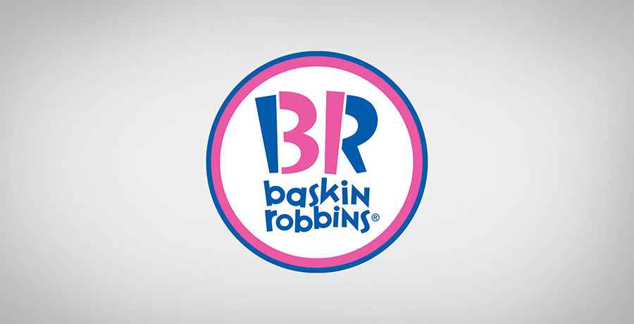
Not only does Baskin Robbins break the taboos of not using bright colors in their emblem style logo but they’ve also retained the traditionalism of emblems while making it look completely up-to-date. The inner font is bold as is the requirement for emblems while the font is also shaped like ice-cream cones and depicts that Baskin Robbins is famous for its 31 flavors!
Hope you’ve noted down the pointers for your brand. What kind of emblem would you want your brand to have? Connect with us and get the best Emblem logo for your brand.
Get a Free Quote
+1 845 3770255
Call on anytime
To discuss your project
Featured articles:
Topic Categories
Interested In
Logo, Branding & Creative Work?


 We’ll get back to you in 24 hours
to address your needs as quickly as possible.
We’ll get back to you in 24 hours
to address your needs as quickly as possible.
 We’ll prepare an estimation of the project
describing the team compostition, timeline and costs.
We’ll prepare an estimation of the project
describing the team compostition, timeline and costs.
 We'll perform a free website review
If you already have an existing website.
We'll perform a free website review
If you already have an existing website.


