Logo Design and Branding Color Guide: Make Your Brand Identity Stand out with 2021’s Latest Trends
So, the year 2021 has arrived with a bang. A new decade calls for some much needed changes and upgrades. And this is exactly why businesses are pulling out all the stops to branding success.
Ever noticed that whenever you come across the name of a renowned fashion label or glorified brand, you instantly go through a miraculous change? That change is your mind instantly conjuring the business’s branding and logo color combo. And within a fraction of a second, you’ve instantly related that color code to the brand.
Yes, that’s the power of color!
Hues manage to instill such a forceful impact upon our minds. When you come to think about it- hues you select for your brand’s logo is bound to give viewers certain feelings. And these feelings are all tied back towards your brand.
Below, I’ve selected some expert picks for color combos that are inspiring for branding purpose. Complete with a tad of color themed psychology, this is all the inspo your brand needs in 2021.
How important is color combination for branding success?
Studies show that your brand’s color will influence around 70 percent of the purchasing decision made by customers on a daily basis. Simply put it, color can make or break your product.
Keeping that notion in mind, you will want to and need to select the perfect color combo for your logo. This means paying heed to what works best when combined. The aim is to keep that logo simple yet memorable. Experts recommend putting a stop at 3 colors where either black or white is included in the ordeal.
Let’s take Starbucks for example.
The multimillion dollar global franchise is packed with visitors day and night. After all, who doesn’t love a good cup of coffee with a chocolate muffin? When you’re traveling, be it the airport or streets, the green and white signals absolute bliss.
For those who adore home décor, the vibrant yellow and blue mix of IKEA is reminiscent of all things homely and fabulous.
Did I mention the ever so popular red and white, reserved for fried chicken or KFC fanatics?
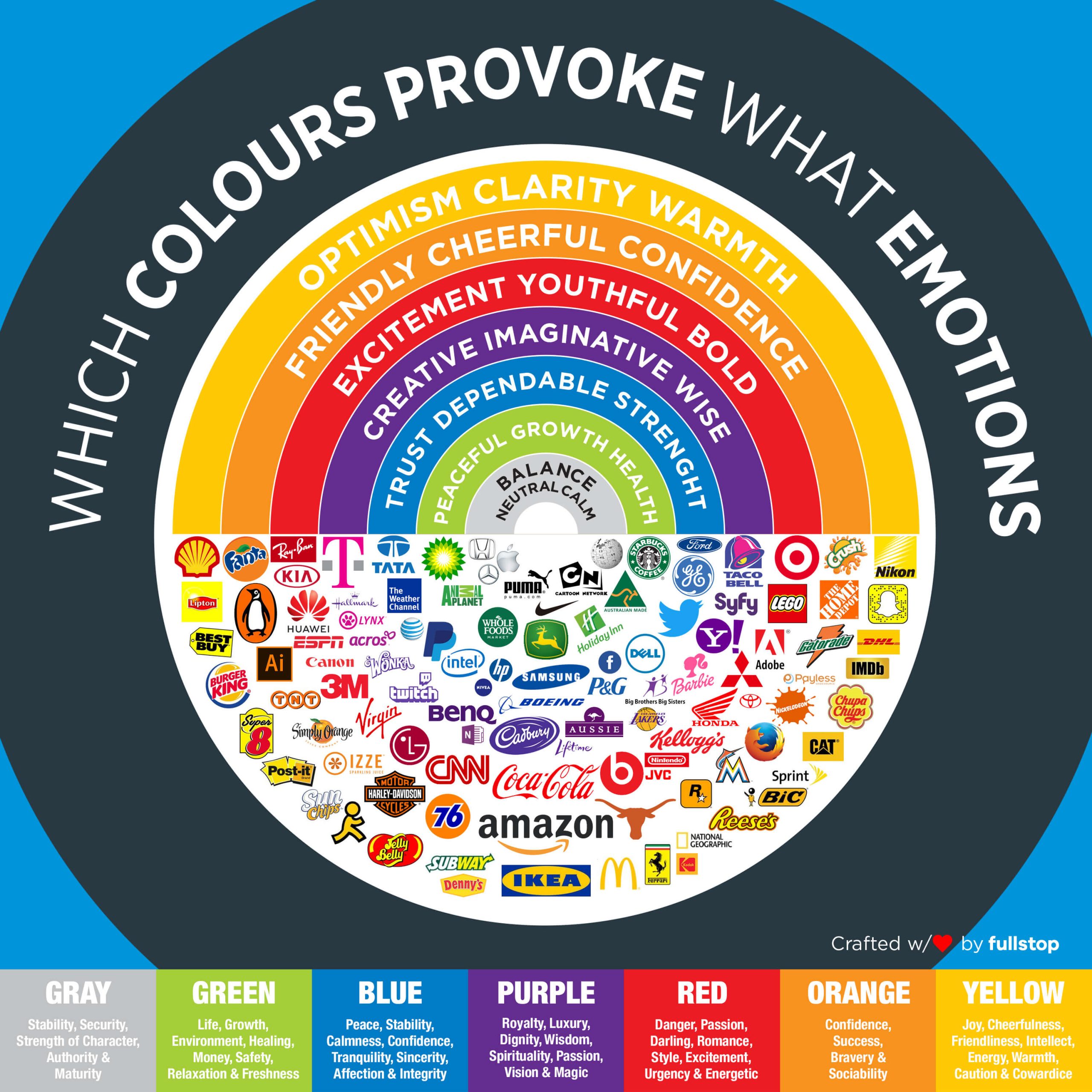
The power of a curated infographic: Understanding colors one step at a time

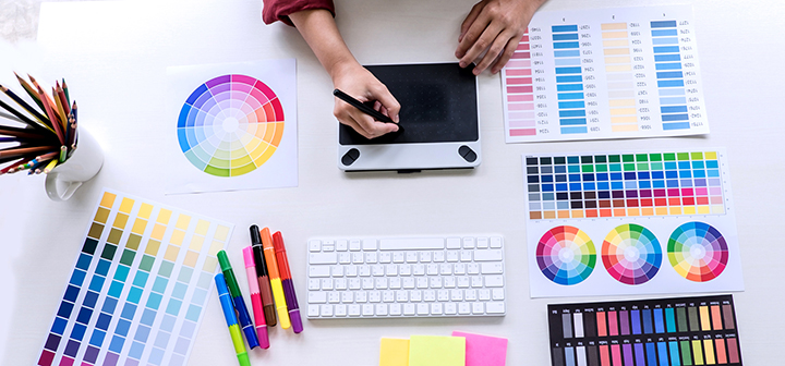
Curated infographics such as the one being showcased below is a vital tool that countless brands use. This revolutionary feature assists upcoming businesses in understanding that color matters. Be it your landing page, logo design, website theme, final product, and more –Integrating colors the right way is pivotal for your branding success.
Embed This Infographics
Inforgraphics behave as color emotion guides. It’s no wonder why some of the most influential brands integrate its use for their timely logo success. Every color brings about a unique sense of emotion. Let’s take a closer look at them.
Yellow:

Optimism, clarity and warmth –the addition of this vibrant element screams attention by all means. Yellow when used in a balanced amount is sure to integrate merriness and cheerful vibes all around.
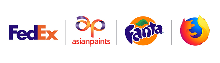
Orange:

Friendly, confidence –the impact of orange in the branding world is purely creativity based. Think along the lines of passionate bliss, accompanied by increased mental activity and happiness. It’s no wonder why many restaurant chains incorporate orange into their marketing campaigns.
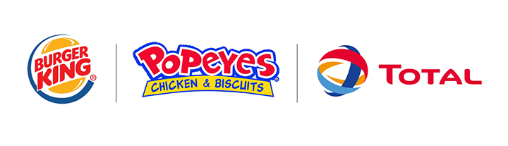
Red:

Excitement, bold, youthful –red is the warmest tone of all. Red illuminates, energy, desire and a whole lot of wanted attention. This dynamic hue spells alertness, making it a pivotal and diverse aspect for flags, hospitals, caterers and plethora of other brands.
Purple:
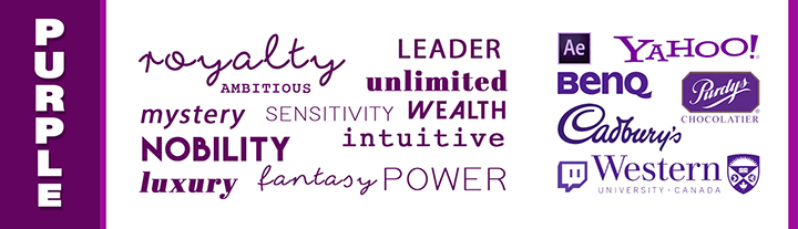
Imaginative and wise – purple is a go to color for precious, sacred and delicate ordeals. Being a symbol of vitality as well as luxury, it’s incorporation into your logo will elude glam of a whole new kind.
Blue:

Trust and strength –blue is popular for all the right reasons. It adds a true sense of balance while instilling tranquility and peacefulness. The use of blue in logos instills dramatic aura while adding a dose of dynamic feels. Remember that too much of blue may drag down a successful logo so balance is key.
Green:
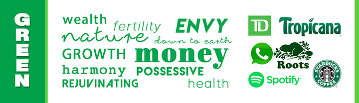
Peaceful, health –it’s no surprise why many nature and vitality related businesses opt for green in their logos. Green represents health, neutral stance and growth. It’s soothing to the mind, body and soul, terming it as ideal for branding.
Black and White or Grey:
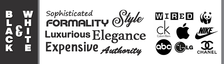
Balance, neutral calm –experts have always suggesting incorporating either black or white into the trio for brand logo design. While white symbolizes purity and coolness, black introduces class and sophistication. Black is a corporate tone, loved by all in search of power and mystery.
Not sure what combo works for your brand? Here are some Inspiring color combinations examples for a stellar breakthrough
Now that we’ve gone through the basics of what each color represents and why you should use them, let’s glance over some exciting color combos for 2021 branding success.
Yellow and Red
![]()
Bold and happening, this dynamic duo draws your eyes towards the center of the logo’s design. It manages to embark energy with that touch of playfulness, allowing your brand’s name to pop out by all means.
Black and Yellow
![]()
The brand CAT has a logo design for days and no one is complaining. The maestro use of vibrancy and mystic intrigue is a sure shot winner in branding books.
Pink and Purple
![]()
Are you on the search for warmth and that touch of ambition being wrapped in one? Take US based brand Claire’s for example. Pink manages to add sparks of energy while the hue purple behaving as the mature counterpart.
Blue and Green
Tranquility with that pop of energy is sure to come through with the use of this expert combo. Great for those venturing into the fashion or media industry, blue with strikes of green call for the best electric power house duo.
Orange and Purple
While uncommon color palettes tend to be on the riskier side, there’s no harm in experimenting, especially when they work! Elegant, unique and oh so happening- brands entering into furnishing and beauty get a green light from experts all around.
Red, Navy and yellow
If you can opt for three while making them work to absolute success, then why not? A dynamic trio of electric hues can give the brand confidence and oomph of power packed greatness. Experts recommend this option to be ideal for those starting an eatery setup of heading into entertainment.
Blue and Turquoise

Are you in search of confidence and intelligence for your brand’s logo? If the answer is answer, colors of the same family are sure to cut it. They are uniquely similar yet oh so different. But somehow, blue and turquoise are a complementary duo that is used quite sparingly in logos today.
In a nutshell, selecting the right color combination for your brand’s success can be daunting to say the least. But with good color coordination control and the psychology to back it up, making the right decision is super easy.
Just remember to select and mix hues wisely as it can turn into the trickiest of ordeals. Above all, strive to achieve harmony.
At the end of the day, delivering a logo that’s memorable and impactful is all you need in today’s competitive world.
Get a Free Quote
+1 845 3770255
Call on anytime
To discuss your project
Featured articles:
Topic Categories
Interested In
Logo, Branding & Creative Work?


 We’ll get back to you in 24 hours
to address your needs as quickly as possible.
We’ll get back to you in 24 hours
to address your needs as quickly as possible.
 We’ll prepare an estimation of the project
describing the team compostition, timeline and costs.
We’ll prepare an estimation of the project
describing the team compostition, timeline and costs.
 We'll perform a free website review
If you already have an existing website.
We'll perform a free website review
If you already have an existing website.


