13 websites I found with exceptional user experience
FullStop Team
July 14, 2020
Once upon a time, websites were just an existence of a brand on the World Wide Web (www). However, as the website industry progressed and people learned the significance of e-stores, digital marketing and an online presence, developing a website became much more complicated. What may seem as just another design actually takes a lot of thought process and exceptional skills to become a success!
Similar to a restaurant where customer loyalty depends on the service you provide and how easy you make their dine-in experience, a website needs to have a user experience which retains the visitor and doesn’t provoke them to switch to another website because maybe they just couldn’t find what they were looking for quite easily. But, that’s just one of the many issues which may repel traffic.
To give you a better comprehension of the elements that contribute to a great user experience or UX, here are 13 websites which I have shortlisted from my personal experience:
1. Revols
The cover says it all! You don’t need to penetrate deeper to know what they’re selling and that’s the beauty of this website’s home page. The brand offers custom-fit wireless earphones and they’ve cunningly used macro photography to make the home page product-focused. This stimulates the potential buyers to ultimately get interested in the product and they don’t need to search too much to know more!
 Revols
2. Medium
Presenting a website for those who can’t resist the urge to read! The moment you land on this website everything’s crystal clear! The online reading website doesn’t complicate things for its visitors. The topics you might be interested in are right there on the home page to choose from, the design is minimal and the lines are catchy enough for a book-worm to explore more!
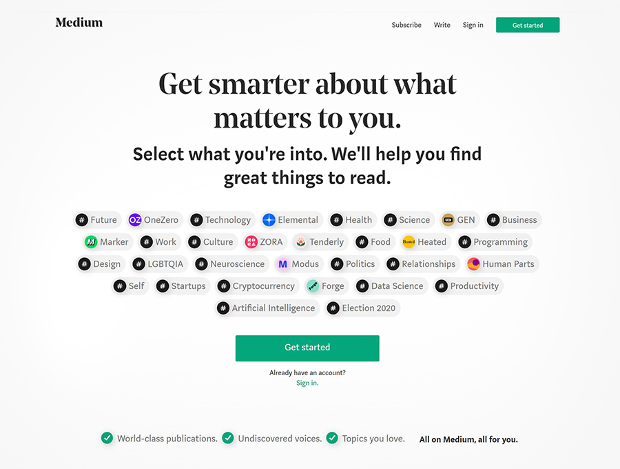 Medium
3. Wozber
This is a personal favorite! The resume building website has a clutter-free layout, the home page speaks what the website is about very clearly and there’s a simple “Build your resume” button which will take you further on a step by step process of creating your CV.
 Wozber
There’s no gray area for the job seeker concerning payment (as in most CV creating websites) since the home page spills the beans already – “completely for free”. Additionally sample resumes are available to view so that visitors can know what to expect.
4. Boosted
Number 4 on my list is this very subtle yet attractive website! Easy on the eyes and easier to use, this is an e-store that sells skateboards and their one of a kind scooter along with related products. The home page is entirely product focused with a brilliant photograph of two skateboards and a scooter. The gray and light blue tones make the orange CTA buttons highly visible. What I do believe could be improved though is the spacing between their logo and the tabs. Nevertheless, the website apparently serves its purpose: to stimulate a skateboarder’s interest in purchase.
 Boosted
5. Dropbox
Did that ring a bell? Almost all of us are familiar with this word and most of us may already be using Dropbox especially if we’re saving content for work. If you’ve ever had a chance to visit dropbox.com, you might already know how creative yet simple the website is!
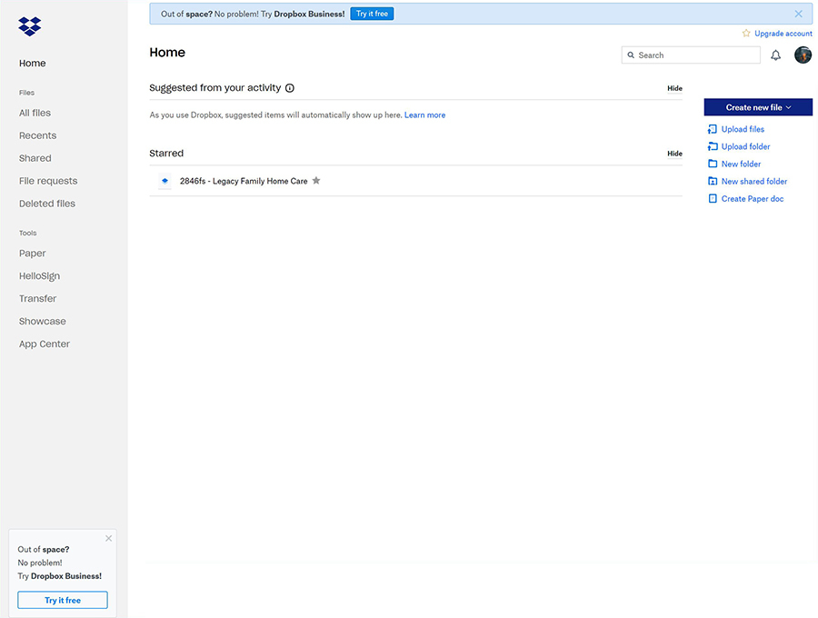 Dropbox
They’ve kept the atmosphere of their webpages as user friendly as possible, guiding freelancers as well as corporate teams to what options are best for them in terms of data storage and filtering. TBH, I’d say we’re not going in chronological order in terms of the best out of 13 so this definitely gives a lot of websites some competition.
6. Morgan Stanley
If you’re a U.S citizen you’ve most definitely heard the name Morgan Stanley whether you’re in the finance field or not. Morgan Stanley distinguishes its website from its competitors by providing information to the user as soon as they land on the home page.
 Morgan Stanley
The website doesn’t immediately start off with selling your wealth plan but instead gives you a few articles to read so you can have just the right information on economy and investment trends etc.
You simply have to scroll down to see what Morgan Stanley is all about and there are no excessive tabs to make you feel perplexed regarding your nest step.
7. OPUS Grows
Having no interest in farming or any curiosity about soils, I learned about this website from a former colleague, a designer who was given this as a reference to use when working on a similar brand’s website. I’ll pass on the favor to you. Had I been remotely related to the agricultural industry or had a keen interest in gardening, OPUS Grows would have added a customer to their list.
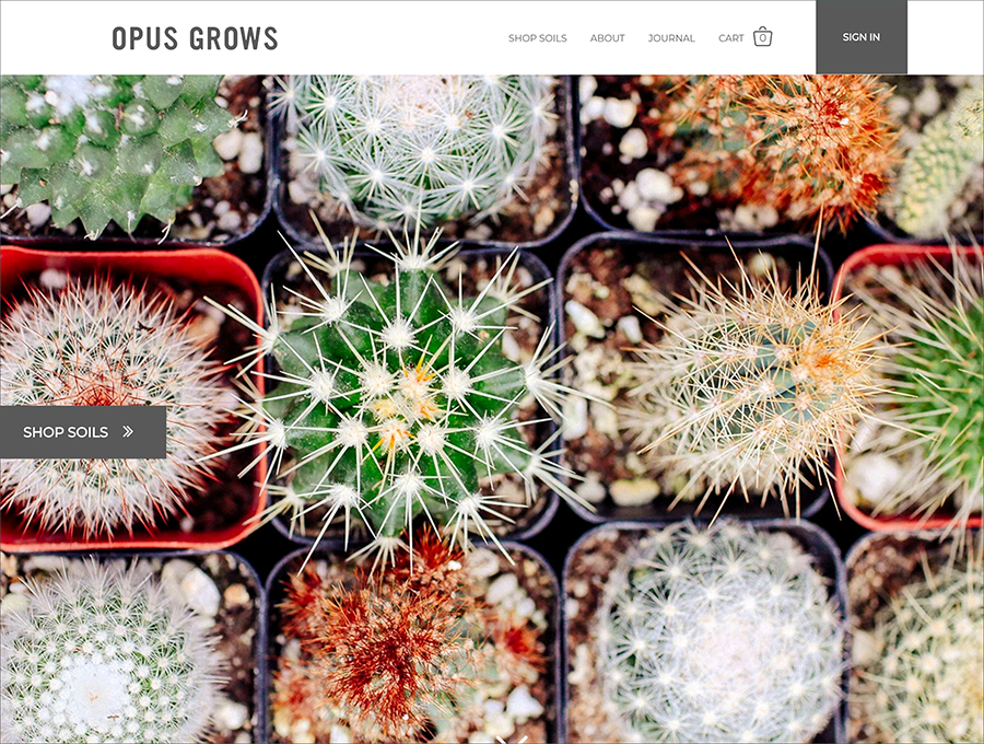 OPUS Grows
The website is not harsh on the eyes, the home page has a button which simply says “Shop soils” so you land directly where you want to be and scrolling down you can find all you need to know about OPUS by hitting the Read More option with 4-5 preceding lines to keep you hooked! Did I mention the color palette is just the color wheel used perfectly? See for yourself!
8. Work Stack
Work Stack’s gives you a platform where you and your team can join heads (not literally) and be on one page (literally). However I’m not here to promote them, there website’s what made it to my list of top 13, so here’s my analysis.
 Work Stack
The colors used for this website are a mix of corporate colors like light tones of purple and blue which are consistently used throughout the website maintain uniformity, while the home page is self-explanatory as to what the website is all about: team work! Additionally it is so well-composed that you won’t get distracted while exploring how this website can help your business.
9. Pitch
Firstly the name says it all! The website is built to help companies or teams create impactful presentations which they can pitch with confidence.
 Pitch
Pitch
We’re sorry PowerPoint.
Let’s talk about the website which itself is full of creative ideas and slogans. “All hands on deck”, the starting line says it all and if someone didn’t get that at first glance, there’s a simpler sub-heading which says “Pitch helps teams build better presentations”. What more do you need to know?
The website is one exciting journey with fun animations to keep the visitors grounded to the page and explore further. A concept has been assigned to each task for which Pitch might be needed by the user and you just can’t help but admire the creativity.
10. Campos Coffee
Beware! You’re bound to crave some coffee when you land here. Everything’s right there on the home page and you’ll end up trusting the brand completely owing to the HD photographs of their actual coffee beans and processes.
 Campos Coffee
Apart from being aesthetically so serene with a very coffee-like color palette, the website offers a user experience which makes it simple to make an online purchase and discover about the brand itself. The home page has a CTA right in the center which says “buy coffee online” and you’ll immediately find yourself scrolling through the variety of coffees with their respective information.
11. Sea Streak
This one’s for sea lions (pun intended). The home page welcomes those who have a wanderlust and wish to travel by sea. “Seastreak ferries”, the title’s not that confusing along with a slogan that says “The most civilized way to get there”.
 Sea Streak
The website has a brilliant user interface and will give anyone, who’s looking for a ferry cruise just what they’re looking for without going through a complicated maze. The navigation is fairly simple, the schedules and routes are right there without you having to swim too deep into the website and you end up knowing exactly what you want even if you didn’t know that beforehand!
12. Shademaster
All about outdoor roofing. Sounds boring? Visit their website and it’ll change your mind. The shade master’s website stimulates even those who think that a roof doesn’t need much thought, to explore more!
 Shademaster
The website displays some of their exemplary works, giving the users a clear idea of what they would like their roof to look like while also giving options for roofs of different types of houses. Additionally, visitors can design their desired roof and receive a quote based on their selection there and then. Hassle free much?
13. Toggle
First word that popped into my head when I took a peek at this website was CUTE! Believe you me, anything that’s visually adorable makes people go OMG and that’s what every website needs. This time management platform is a bundle of creative animations with cool colors and to-the-point information. So basically serious stuff is balanced by cute animated characters which don’t let you lose interest in the website. Of course it’s fast and easy to use which is why it made it to my list in the first place!
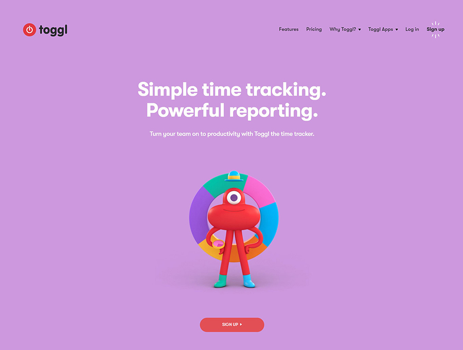
Furthermore the design is well composed so there is no clutter and the user finds it relaxing to use. Yes you read that right!