9 cliched logo design trends you should avoid!
Breaking news from the logo world: some design trends may have become obsolete or cliched so designers and brands pay very close attention to the next 1000 words.
For starters, here’s a question: while looking for inspiration to design a logo have you ever come across certain designs that aren’t exactly identical twins but could pass for that? What I mean to says is many times we (as logo designers or brands) may have encountered logo designs which make us wonder “Didn’t I just see that or maybe something quite similar?”
My friend, this is a clear indication of repetitive design elements being used in multiple logos, therefore, meaning that the logos have been designed without taking brand identity and personality into consideration.
You, as a brand or a designer may seriously need to avoid that! That’s another good reason out of so many, to be very picky about the hands in which you place your brand’s identity aka logo design. At the same time designers need to be updated and thoughtful about what has been entrusted to them instead of being clumsy or rushing into a senseless design (pardon the harshness but black isn’t really orange).
Whether you’re a designer who’s in the middle of a project or a brand owner, still unsure of whether or not to approve a certain design, here are 9 logo design trends (specific to certain industries as well as generic) that you should maintain “social distance” with, to prevent your logo design from being counted amidst the cliché list:
1. Don’t copy the celebrities!
We’re not talking Hollywood here, just our design world’s most distinguished celebs such as Pepsi’s red and blue ball or Nike’s swoosh. The logos per excellence. You need to be sure your logos don’t seem like they’re a step-sibling of the logos which have made their mark. A piece of advice: look for inspiration but try to keep it as original as possible. Afterall a logo is the face of a brand and every face must be different. So as a brand lose the habit of providing references and as a designer just be YOU!

2. Mix typography is a red signal
These logos are just out of the trend basket! They are irresponsive and will give you a very hard time in the future (as a brand). Even though mixed typography isn’t a piece of cake (quite the opposite), the 21st century has no room for it. These logos are ancient and don’t adhere to the “minimal is the new trend” principle.
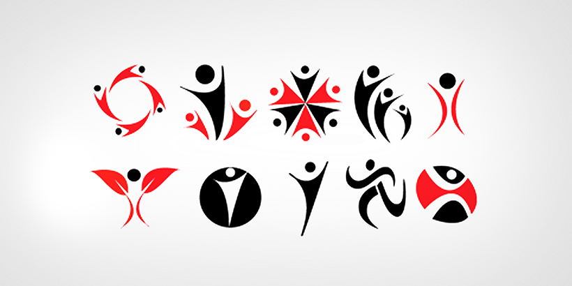
3. Break-up with the V guy!
This is the V-shaped abstract of a human figure you might have come across mostly in logos for social working organizations or any other service providing companies and while this shape can be adjusted into various forms it is such a been-there-done-that design that it has surpassed its expiry date and should truly no longer be included in your design portfolio.
4. The graphs are going down (in trend)
 Specific mostly to corporate logos, graphs pointing upwards to indicate the success of business looks cool when you’re actually using them in a presentation but to make a logo out of it now seems like a sheer lack of creative ideas. Of course, a corporate logo can’t have abstract florals or a fancy font, nevertheless, you must bear in mind once again that this design is a binding contract so choose wisely. The graphs are going down (in trend)
5. The arc needs to be recycled
Just go into rewind for a moment, I’m sure you must have seen an arc in 3 out of 10 logos at least! The arc, usually on top of a font, representing progress or a way forward or a leap has just lost its charm due to the numerous times it has been used.
Having said that, the arc is not entirely unartistic, and let’s not rule out the possibility that it may sometimes add a story-telling aspect to corporate logos in particular but we’re all artists, aren’t we? Figure out new and innovative ways to use this design element, preventing plagiarism or a clash with other arc-based logos.
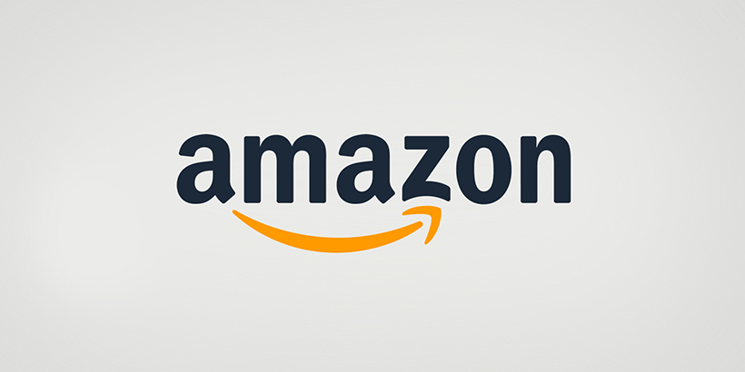
Amazon for instance has used the arc in clever, creative, and completely original way, making the arc look like an arrow which says: we have everything from A-Z!
6. The carts and tags!
Anyone up for filing a petition against the production of any more of these? No offense to anyone but shopping carts and price tags, representing of course any retail store just mock a great designer! Take Walmart for instance, the biggest retail outlet in the US with a logo that has nothing to do with a price tag, money, or a shopping accessory.
7. The overlapping is just not working anymore
You really don’t want to cross paths with a client who has keen knowledge about logo designs if you’re about to give them something which has been used so many times, it’s no longer considered creative. The logo where two letter overlap is outdated, overused, and as a designer you’ve just got to get out of that box and search for new ways to keep your client’s logo responsive yet creative.
8. Lose the tooth and minus the plus where you can
Medical logos don’t need to look like the service being provided. A dentist? The best logo would be an image of a tooth. Owner of a hospital looking for a “unique” logo? What better than the plus (aid) image?
Unless you’re not serious about creating a unique identity for your brand the “ideas” above are good to go. However, if you’ve paid your designer a handsome amount (meaning you’ve actually considered this a big deal), your logo design should represent your services without it being an “in your face” design.
This doesn’t mean you rule out the possibility of any medical element being present but using a complete image will just make your work easier (as a designer) and consequentially give your logo the “done and dusted” aspect.
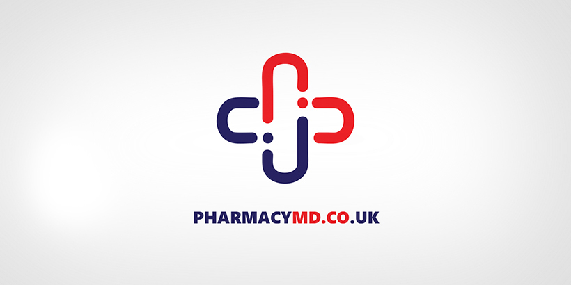
The above design is an example of how you can add a creative spark to a commonly used symbol.
9. The font-only logos
Before designers start protesting against me, I’ll clear the fog really quickly. Font oriented logos are some of the best there can be, they’ll be with us for a long time but they need assistance. Simply typing out a logo, thinking “oh this looks pretty good by itself” and not giving the client what’s worth his money is not the sign of a designer honest to his/her art, is it?
Helvetica for example is a font that we as designers have always considered a logo in itself at some point but we need to move forward and remember why this job has been assigned to us and not the software, we can think!
Give your designs some time. No great design is sketched overnight. Keep it original and innovative people!

Co-Founder & Strategic Visionary at FullStop
Co-Founder at FullStop, a branding, digital and software agency he started in 2012. Haris works across brand design, digital marketing, and custom development—helping businesses turn ideas into market-ready products.
Ready to transform your brand?
Our team specializes in strategic branding and digital solutions that drive real business results.

