32 Fonts Used By Famous Logos of The World
Have you ever thought about what could be the best combination of fonts to put forward your logo designs, alluring traffic towards it? The answer is simple. Just two fonts that will highlight each other can be considered an option. It isn’t easy to put together fonts that are either inviting or may feel like too incited. One of the best logo design service providers have used a combination of 2 to 3 fonts or made a font so captivating that the buyers find it attractive. So many tools and software are available online to make work easy for logo designers. It has come out as a shock for so many, that no specific training is required to build up a website and logo design. Any entrepreneur can learn this process, but what makes the logo designers stand out is its creativity. Read 9 cliched logo design trends you should avoid!
1. Centra
It is a geometric type of design with a modern touch, making it obtrude. The font became deliberately famous when it was used by Yahoo, giving it a look of a professional yet creative approach.

Centra
2. Myriad
Myriad is a sans serif typeface and makes various logos stick out due to its touching and productive style. Designers of the logo design of Walmart, visa, and adobe used myriad because of the artistic expression that this font enhances the motif.

Myriad
3. Avenir
Avenir is an interpretation of the future context that makes it fascinating to the eye. It has developed an attraction because Avenir creates a logo design no matter what the decade, but it is still intruding and visionary. Toyota logo is one of the popular programs; this logo gave a creative look.

Avenir
4. Gill sans
The font gill sans is typography that does not have small serifs in the design. It is the reason fashion company Tommy Hilfiger has used this font in the logo. It makes the logo look innovative, stylish, and somehow very pleasing to the eye.

Gill sans
5. Unisect
The brand famous for selling submarine sandwiches around the world has used Unisect font in its logo design. The company has made the logo more approachable and easy to read and forecast the marine style. The font is captivating and modish, making it visible from afar. In 2016, Unisect Black got more attention as compared to the past decades after the change in font style.

Unisect
6. Helvetica
If the graphic designer is looking to make the logo more approachable and modern with a slight touch of vintage, Helvetica is their go-to style. The Famous caterpillar brand has used simple Helvetica in its logo font. Energizer has used italic Helvetica to give it a more daring and adventurous look. Whereas, WhatsApp has used the same font in the nene style with a vivid and business structure.
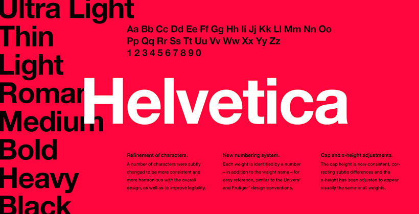
Helvetica
7. Arial
The closest font to Helvetica is Arial since both of these fonts have an equal width of the character. But what makes Arial unique? It is all in one. Arial will always win through its enthralling and striking flexibility. Skype logo is one of the famous provoking designs in which Arial depicts as a positive illustration.

Arial
8. Avante Garde
It is a precipitated sans-serif typeface that has most use in headlines and shortline texts. It is unique typography that is attractive, which is the reason famous brands like Adidas, and Calvin Klein have used regular, italic, and bold structures. It fabricates the logo with a more daunting and elegant look.
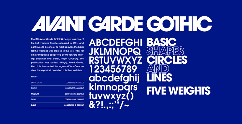
Avante Garde
9. LL Brown
It is one of the texts to look out for a while, noticeably perpetuating the characters. The logo designers of Airbnb have made an enticing yet vintage look for the company. The typography proffers inviting touch to the logo since the characters are all aligned to give the traffic an understandable reading from the artist’s impression.

LL Brown
10. Klavika
This font designer has gathered up a mix of prolific, contemporary, and prominent look with a light artistic impression.

Klavika
The flexible characters of this font are easily distinguishable without the audience’s eye embedding onto one typograph. The family of Klavika has gained considerable attention after the successful use of the famous Facebook logo.
11. Billabong
Billabong got the push for approaching the designers after it was used in the logo of Instagram. This font applied in the short lines and undertexts of logos is the reason many artist impressions have involved this typograph. You may also want to read You Are NOT a Designer If You Never Used These 41 Fonts

Billabong
12. Segoe UI
Segoe UI can be used in Microsoft Windows only, preferable Linux. It is the reason to bring forward the company’s font design, and it maneuvered in making the original logo of Microsoft, presenting it with a professional look.

Segoe UI
13. Bebas Nene
The famous online site for watching movies and series, Netflix has this font in outward form, according to the demand with enticing and inviting red color. This combination proffers an enthusiastic draft alluring and ultra-modern vision. The best logo design agency provides Bebas Nene as a use in the font for a modish glance.

Bebas Nene
14. Futura
The sans serif category has a diverse range of famous fonts that have growing demand by the logo designers. Nike and Cisco are famous fashion brands entitled with fascinating designs in the company’s logo with Futura as the font. As astonishing as it sounds, Redbull has plied the same typography in Futura BQ with dark and bold characters.

Futura
15. Alternate Gothic
Youtube has condensed letters in its logo. This type of font style is an Alternate gothic that is versatile with imaginative design leaving an artist’s impression. It is the digital enticement of the appropriate and prominent draft.

Alternate Gothic
16. Gotham
Gotham is a high costing sans serif style font. Like Spotify, many famous music launchers have used this font in the logo to give it a creative yet enchanting bold look. Similarly, Discovery Channel has fearlessly fashioned the characters in medium style for an adventurous approach.

Gotham
17. Freight Sans
Freight Sans is famous for its versatile black and bold, valiant gape along with the enticing characters used in the Reed & Mackey for a captivating look. It is the sans serif family also used in the text line of StarBucks.

Freight Sans
18. Pico
The letters of this font are in pixel form, with or without the filling inside. Many games, including Space Age, as well as the Star Bucks, boosted this font style by using innovatively.
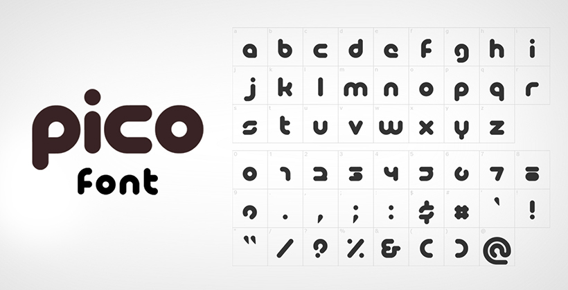
Pico
19. Gill Sans
Gill sans has become the modern san-serif typography with innovative yet elegant characters. BBC news has used a simple font in the design for a modern look whereas, United Colors of Benetton, a clothing brand, have used this font in a contemporary touch of regular style.

Gill Sans
20. Price Down
The Price down introduced through the game graphics of Grand Theft Auto has the characters that are bold, melting, and distinguishable, along with having to make it up to the productive impression of the available site. Although the font is made of condensed characters, the sign is still easily readable without clarity.
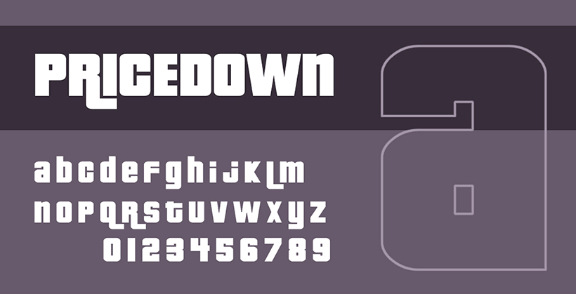
Price Down
21. Frank Furter
One of the reasons why Frankfurter has achieved the triumph is owing to the characters’ curved terminals. It has become an obsession for so many designers in a creative approach as well as the digital logo artists of Kickstarter implied this sans serif typeface for putting forward the real meaning of the brands business.

Frank Furter
22. Johnston
Johnston has distinctive diamond-shaped characters. The characters of the Underground are slightly spaced, meaning to give it an approachable look.

Johnston
23. Officina Sans
Officina sans has become an alluring entitlement for the users since it generates a captivating and eye-catching approach to the audience. At first glance, the font sights talk about the theme it is trying to promote and the specific characters that have established vividness. Amazon’s logo design is an example of this sans serif font, which is successful in every aspect.

Officina Sans
24. Debussy
The curved terminals and bold look of the font was the reason Dunkin Donuts opted for this logo. This style has conferred a go-with-the-flow look for the company. The doughnuts are ring-shaped, and the width is also more. The characters of this style are also round at terminals and more in the span.

Debussy
25. Didot
Didot has increased strokes of the characters and flat serifs. Emporio Armani, an international clothing brand, has made use of this style in the medium for the creative touch to the logo.

Didot
26. Trajan
The lines of some letters are in expanded form, as well the characters are roman type. Itis the reason Game of Thrones; the most-watched TV series has made the title more engaging for the viewers. The Trajan Pro has constructed a robust logo.
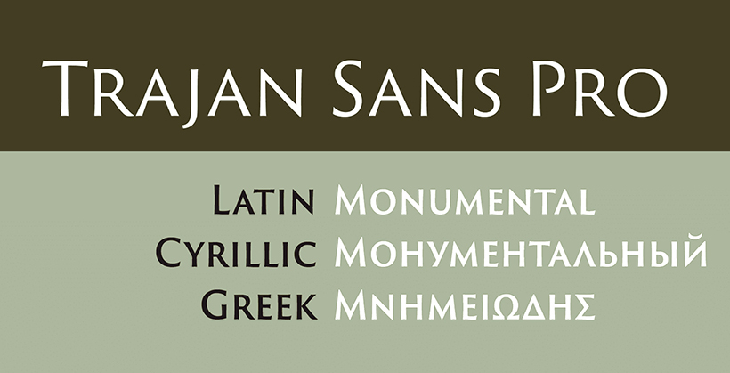
Trajan
27. Ff Mark
The characters of this font have an advanced approach to usage. It is considered by the designers while opting to make a stylish touch for headings on the movie. MasterCard is another business that has made its logo design by using this font.

Ff Mark
28. Corporate A
The famous san serif style typography, Corporate A, was made in the OpenType. Mercedes Benz is a famous user of this font style. Also applicable to the body text, this script stands out on printed paper.

Corporate A
29. Kabel
The German scriptwriter, Rudolf Koch, introduced Kabel and released it in 1927. The American game, Monopoly, has used this style in the bold logo designing of the famous game throughout the world. It has reached a height of well-appreciated and sophisticated regard.

Kabel
30. Clarendon
To give the title a more vintage look but at the same time, keep it updated with the on-going century, Rolex is one of the well-known brands that has used this script in the logo. The characters are in Roman design as well as versatile.

Clarendon
31. Interstate
Soundcloud has interstate font in its design since it is captivating with alluring characters. However, the custom logo design is a digital imprisoned character with an unflinching yet fascinating look going with the brand’s theme.

Interstate
32. Lovin’ Sans
The famous McDonald’s logo has this style looking chic. The characters are slightly curved at terminals, which look more captivating with a bold look.

Lovin’ Sans
Conclusion
Our team of professional logo designers has made the artwork more fascinating for the viewers. Either its a combination of the different fonts for the title and text line or just a custom logo design for the client, our creative designers make it look all possible. No matter how hard it may seem, it is never impossible.
Get a Free Quote
+1 845 3770255
Call on anytime
To discuss your project
Featured articles:
Topic Categories
Interested In
Logo, Branding & Creative Work?


 We’ll get back to you in 24 hours
to address your needs as quickly as possible.
We’ll get back to you in 24 hours
to address your needs as quickly as possible.
 We’ll prepare an estimation of the project
describing the team compostition, timeline and costs.
We’ll prepare an estimation of the project
describing the team compostition, timeline and costs.
 We'll perform a free website review
If you already have an existing website.
We'll perform a free website review
If you already have an existing website.


