11 Label Design Trends and Tips That You Should Follow in 2021
In this contemporary business world, brands are always looking for some fresh and new ideas to market themselves better. The better your labelling, logo, packaging is, the more you will have a chance to attract customers. The core purpose of most organizations is to increase their sales, and that is only possible if your customers are happy with you. Marketing is one of the ways that help the brands in tempting the customers into buying their products or services.
In the modern marketing system, product labelling is pretty essential; one can say it is as important as the product itself. In simpler words, it can be said that labels are used to attract future customers and share all the product details. A shrewd or catchy label design can make or break your product. There is no denying to the fact, no matter what industry you are working in, you will see hundreds of trends coming in and going out.
Each year bless us with the different kinds of trends; some trends stay here for a while, whereas the life expectancy of some is not really long and they seem to be on hit wonders. In a few cases, a few trends tend to shift and evolve as time goes on. To be a perfect marketer, you should have the know-how of all the current trends and why all the trends are on the rise—being knowledgeable about these critical points help in marketing the business better.
Everybody can agree to the fact that label design has always been a mean of communication of brand’s value proposition, what your product is, and why it is better and different from all the other brands in the market. In order to be the market leader, it is vital to be different from the competitors and being different is not enough; you have to be good different to survive in the market.
However, in the current increasingly competitive consumer product landscape the need to stand out in the market is the biggest inspiration for the markets to step out of their design label boundaries and try something new and exciting. No matter what aisle you are in or what online platform you are using to shop, you always come across a design label that keeps you hooked on to it for a while. The shelves on the stores are always packed to the brim with the colorful products. Such labels designs are always fighting to catch your eye.
Consumers may not give much importance to those printed materials that label the products, but in actual, it is incredibly opposite. Attractive label and packaging design play a vital role in helping consumers make the right purchase decision. It makes people aware and recognizes your brand in a simple way beyond other marketing campaigns like advertisements and commercials.
Based on the current product packaging and label designing on them, following are a few trends that are expected to dominate the remains of 2020 and the start of 2021 at least.
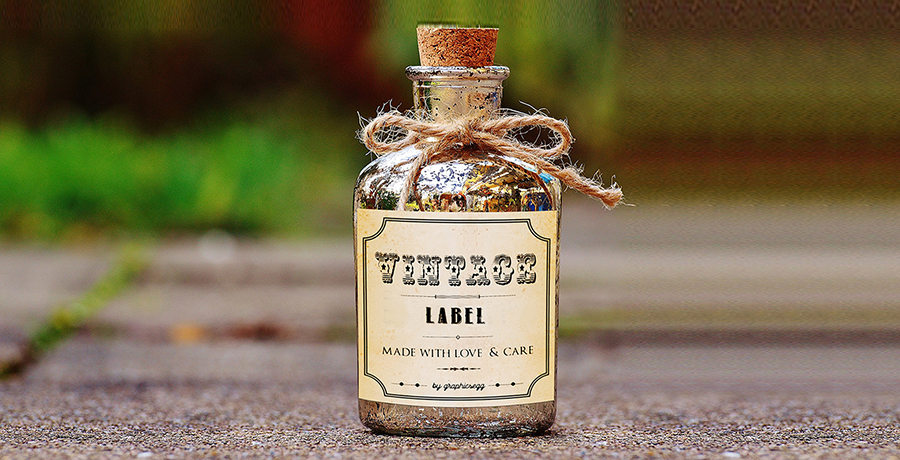
1) Vintage
One trend that has stayed forever and is more likely to stay for a couple of more years is the trend of using a vintage theme. No matter what fashion you are a part of, be it a clothing industry, design industry or even some marketing tactics, the vintage theme has always been a part of it. Consumers tend to be attracted towards it more than ever; it reminds them of their older self, good old time or maybe some people they were once associated with.
One thing that has withstood with time is undoubtedly the vintage designs and concepts. They frequently bring past styles and trends and make them relevant in the future. Such as imagine local barbershop, what do you see most? A picture of the old model stuck on the wall or some nearby pole, right? And people still use that pole today; you can say the same for labelling. The vintage style labelling frequently brings past memories and nostalgia, which gives a pleasant satisfaction to the product buyers. You can call relate to it too, right?
An interesting read for you: Modern Vintage Graphic Designs Are Classy – Here’s Why!
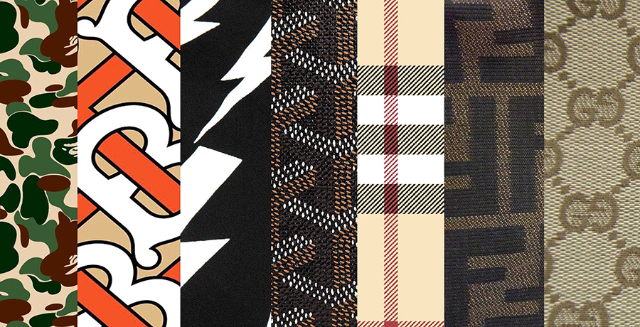
2) Repeated Patterns
Some businesses like to keep a standard theme for all their products, which is a pretty nice idea as it feels like they all belong to the same family. If you have decided on well-designed attractive concrete patterns that can be eye-catching, it is recommended that you must keep using the same patterns. You do not have to make different labels for everything.
The best approach, in this case, is to make slight changes in the color schemes for all the products; it can aesthetically elevate your brand and give your product a name as well. If you use the patterns smartly, this approach can be very catchy, dynamic, and memorable among the potential prospects and customers.
3) Use illustrations to tell a story
There is no denying to the fact a picture is worth a lot more than words if you are able to send across the message effectively through illustrations you are the real champion. The best way to attract the consumer towards your product is to make them feel connected to it. And there is nothing like some real or maybe some made up stories to make the connection with your consumers.
Apart from the use of shapes, colors, and words, you can use pictures as well to tell a captivating and an emotional story. As an example, some organizations have on-going commercials in which they use the same characters in each one. You can apply the same technique in product labeling as well.
Today most of the business organizations are incorporating the illustrations and stories in thier labels to give their brand an additional signature other than their logo or name. There must be some brand you also have been emotionally interlinked to only because you felt the brand speaks to you. The key is to make this kind of relationship with your customers and trust me; your brand will be a huge hit.

4) Die-cut labels
Most of the package contents are not visible; the main reason for this is nobody is really interested in reading the contents used in the product. Therefore, they are written at the back of the pack. Nevertheless, using the die-cut labels can help your product stand out. In most cases, these labels are used to mimic the logo of your brand, establish attractive and yet beautiful patterns, or maybe you can further form a humorous shape too.
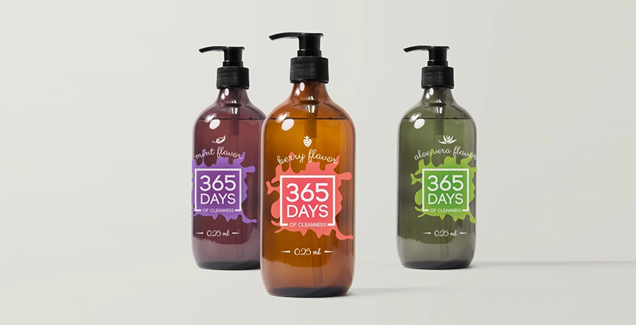
5) Color your labels
Everybody is pretty aware of the fact that all the colors have some psychological impact on the consumers. The blue color is used to portray peace and tranquility, whereas the reds are used in the labels and product design to show hotness and spice. If you notice the packaging of most of the hot ramen noodles, they all are in the red color. Colors are a strong force in all kinds of marketing.
A few of the colors entice certain emotions and hold various meanings. A more rudimentary example of colors is associating different colors to the genders is how everybody has been taught that the pinks are for girls and the blues are for boys. Customers can forget the brand name of the product, but they never fail to notice the color scheme, this is how important they are. Furthermore, you can also initially add the descriptive colors; it works the psychology of the customer in your favor.

6) Retro theme
As much as the vintage theme has always been in the market and has attracted millions of customers towards the brand, another theme that has always been the part of the labelling theme. It may seem like a counter-intuitive notion; nevertheless, retro and futuristic design can work really well together, which invokes both nostalgia and anticipation feeling as well.
The upcoming year will see the designers using the entire contemporary gradient trend as a jumping-off point to create packaging that integrates the elements of both futuristic and retro design. The combination of retro and futuristic themes create extraordinary designs that appeal to a massive range of consumers. The use of plenty of neon colors, bold gradients, and retro design can make one unexpected, unique, and on-trend ways.

7) Detailed Maximalism
2020 was the year of surprises for all of us, the big businesses had to shut down their operations, and many people lost their jobs as well. Similarly, with many experts forecasting an economic downturn in 2021, it is expected that the customers will seek out an aspirational sense of luxury, extravagance, and opulence in their products, which is why the maximalism will be all the rage in the upcoming years.
The consumers are expecting to see an emergence of the attention-grabbing, bold rich colors and heavier designs filled with the intricate details, patterned graphics as they look for beauty and high-end experiences that strengthen in the face of hard times.
8) Neatly Structured Layout
One thing that puts the customer off severely is the mess on the packaging. Customers do not like to squeeze all the information in their minds with a little difficulty. If you are not really direct with your customers, you are less likely to make an impact on them. Today in the design world, there is this new trend of more neatly structure and ordered layouts. This structurally satisfying trend of label designing is all about the typography.
The written texts that are generally comprised of a variety of different yet interesting font combinations are parted by defined lines that divide the space into balanced and neat spaces. The clear and uncluttered layout promotes easy readability and a sense of structure that the consumers appeal. It further allows the designers to take on more of the minimalistic approach for the rest of the design. While these typography heavy label designs are already all over shelves, you must expect this trend to hit its stride in 2021.

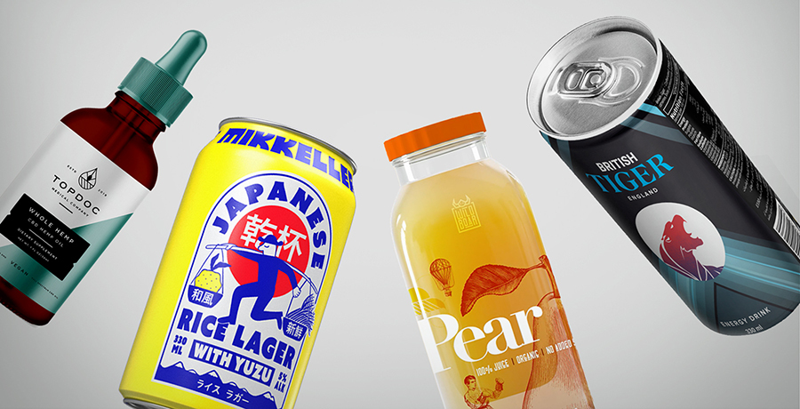
9) Transparent designing
Using the transparent packaging that gives off a little of the product’s color to the consumers is quite popular amongst skincare and beverage brands. In 2021, we expect a sudden surge in the use of this trend in other industries as well. Layering design elements of transparent materials and using the color of the product as a design feature allows the designers to add contrast and make these components pop once the product is added into it.
There is no denying to the fact that this trend is a win-win, as it allows the brands to follow the mantra of less is more and in other words, a minimalistic approach. It also places the product itself front and center of the customer experience without compromising on the visual impact.
You may find it helpful: Basic Elements of Design You Should Know About
10) Provide eco-friendly look to your label
In the health-conscious world that we are living in, most of the businesses are going green; you must also follow the path and choose the green color for your food label. In designing, designers need to use repurposed and recycled paper. They can use natural dye while printing your food label to give more of a green look.

11) Use white letters
To have a direct printing impact on your food packaging, you must apply the white lettering on clear vinyl. With the help of it, you can lower your packaging cost, which occurs due to printing on bottles and jars. Applying clear vinyl labels with white ink printing on bottles or jars is an attractive and excellent alternative. It brings out the great result with low design investment.

Tips for creative label designs
1) Make useable packaging
There cannot be anything better than making the product label usable in ways more than it is meant to be. A product label will make the product memorable if it remains useful for the customer even after it has been used multiple times. Make sure you are going for the re-useable design elements.
2) Make them product friendly
Every package is meant for a particular product only, so it should be designed in a way that it shows its friendly relationship with the product. If the label does not reflect its complementary relationship with the product, it can hamper the sales of the product. Product labelling should be done in a way that attracts the customers towards it; the best way to attract the customer is to add a catchy yet attractive phrase on it.
3) Make it readable
While you are designing a label, make sure the text is clearly legible through the color and font. Be smart and use the font size that is larger than the regular ones and can be read easily even by those who wear reading glasses. The text should be sized above 6 points at least, and if you can, you must try to design the label with the important information at 10 points and up.
Now coming to the colors, the font color must have enough contrast with the background too. If you can, you must choose a font color that has both intensity and value contrast so make the combo of bright+ light+ and dark+ dull. Bright colors tend to influence customers to buy. However, the color choice entirely depends on the kind of the product the brand has and its current visual brand style as well.

4) Use typographic pairing
Since label designs include not much information and space, therefore it is imperative to combine the typographic pairing. It is the way of creating a visual juxtaposition between various kinds of information in a design. Moreover, it further helps in creating a distinction between different things, which helps the viewer understand that all these information pieces are pretty different.
On the other side, you can use it to create continuity between information with the help of the same font or only a subtle difference with a little bolder or drop caps version of the same typeface.

5) Do not go for the well-trodden path with artwork
Some designs are bound to stay for a little while only; you cannot expect them to live forever because some themes are only meant to go down. The successful businesses can quickly get away with recurring themes and label designs. However, for the new businesses, they need to think out of the box as this is more likely to be the best and the only option.

Another interesting read for you: Embracing the Pastel Color palette
6) Create space using white space
Apart from the typographic pairing, your white space can be used to separate information and create the visual distinction too. The labelling of the Fic Ginger Ale is the perfect representation of using white space. The designer has used the white space and the minimalist type design to present the label information in an understated almost quite way. The white space always lends a design an open and calming feel.

7) Illustrate and decorate
Basic label designs without any illustration and decoration are pretty attractive, but some products call for attractive label designing. With the use of the right illustration, you have an option of creating the label design that fulfils the criteria of marketing the products.
You can also use the illustrative elements to tell your customers more about the product. The Evolution fresh project shows how abstract colorful inky illustrations are implemented to communicate the fruity flavor of every new juice.

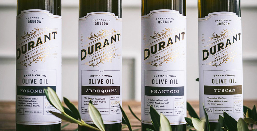
8) High-quality printing
No matter how good your label design is if your printing quality is not good, nothing is going to work. The key to print the label using quality card stock is to give it the most visual presence along with the panache. Whether you select a slick gloss, matte surface or a coated one, these are some essential factors that you must consider.
You may want to select something that is a slight difference and improves the overall look of the product like in the Llanos Negros label design, where gold foil and print layering techniques that are used to create a label design which is purely a work of art.

9) Luxury Metallic Embellishments
Metallic hot foil is a famous way of marketing that helps to enhance a label; not only does it make a product look more luxurious and premium, but the foil reflects the light differently. These luxury embellishments help the whole product become attractive. The fusion of optimal color palette with the print is the perfect label design.

10) Turn to touch with the texture
It is often the case that visuals are prioritized above all else when designing a product label but touch should not be forgotten about as this is an essential sense which is vital for communicating a feeling of quality. The use of textured and thicker papers, rather than the standard papers show a commitment to quality and the above-average materials.

Conclusion
With the substantial growth of digital prints in recent years, one can say it is not enough to have a full color print as the stand out design feature of your label. Moreover, if the package has a lot of emoticons and smileys, it makes the customers react positively., along with the hint of brown, the brand appears more friendly and approachable.
The marketers often do not pay much heed to the label designing as they think it is not much of importance; however, this is not the case. Accurate label designing is the key to attract a whole lot of customers towards the product. There will never be a shortage of the ways to persuade your buyers through a design, as long as you have the creative and component designers to design it for you, you are well settled.
The brand labels are an essential part of your product packaging. With the well packaging and excellent designs, the stickers attached to your product can leave a positive impact on your products. Your customers get attracted to it when they see such eye-catching labelling.
The clear designs and printing make it more comfortable for your customers to go through the details they are looking for. With professional support, you can make your labels more attractive and result oriented. You will easily stand out in the crowd and would apparently have more profits from your business.
Get a Free Quote
+1 845 3770255
Call on anytime
To discuss your project
Featured articles:
Topic Categories
Interested In
Logo, Branding & Creative Work?


 We’ll get back to you in 24 hours
to address your needs as quickly as possible.
We’ll get back to you in 24 hours
to address your needs as quickly as possible.
 We’ll prepare an estimation of the project
describing the team compostition, timeline and costs.
We’ll prepare an estimation of the project
describing the team compostition, timeline and costs.
 We'll perform a free website review
If you already have an existing website.
We'll perform a free website review
If you already have an existing website.


