Top 10 Iconic Sports League Logos & Their Evolution
Sport has a place in our hearts that cannot be vandalized by politics, hate, or other currently prevalent conflicts in these stressful times.
We unite through sport and when we’re watching that dunk, that volley, or that homerun, all the Hitlers in the world combined couldn’t divide us.
This list is a complete countdown to the most unique and iconic sports league logos from every sport of the planet.
10. Major League Soccer

I am starting my list with a bit of football, as I rank the MLS logo with the 10th place in the list.
The MLS logo was redesigned in the twentieth season and it was said that the logo “embodies and represents the next phase of Major League Soccer’s vision to be among the best leagues in the world by 2022.”
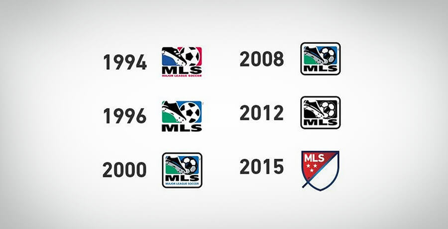
It is far from the best league but who knows what the future holds.
The MLS logo has faced significant changes from its original look. The original logo had a red and blue color scheme – which matched all the other domestic sports league logos in the country.
It was designed to establish the fact that the United States was indeed a suitable place to host the 1994 world cup.
The logo was changed to blue and green in 1996 and the bottom text vanished. Thereafter, it was tinkered-with along the way, until 2015.
In 2015, the logo was changed entirely and a beautiful design was created with a red and blue color scheme. The logo is minimalistic, smooth, and modern, which is why it is included in my list of best sports league logos.
You may find it interesting: Logo Evolution: The Top 9 Famous Brands over the Time
9. Major League Baseball

Let’s move on to another American logo which happens to be our 9th favorite sports league logo – The Major League Baseball logo.
A truly historical design that hasn’t changed much since its inception. Surely, the colors have darkened a little and the logo has modernized a bit, but it remains the same overall in terms of design, color, and concept, as it was when Jerry Dior created it.

The logo was made in a single afternoon and was made to ensure that it remains distant from local politics and racial discrimination. This is what makes it simple and artistic, but also very patriotic due to the color scheme.
A truly remarkable logo that is deserving of a place on the list of best sports league logos.
8. Women’s Cricket Super League

The next best sports league logo is from a cricketing event – The Women’s Cricket Super League. It also goes down as the best logo among all cricket league logos.
The WCSL logo is on my list, not because of its history, but because of its simplicity and overall aesthetic.
The tournament held its inaugural edition in 2019 and is the youngest league on my list. And since I am talking about the best sports league logos in the world, I am going to include it in the list.
Most of the logos in cricket leagues have been plagued with either outrageous color schemes or a superabundance of sponsors.
However, the WCSL is neither of those. It has an extremely minimalistic design and only involves two colors, but due to its design, I am putting it up on the list as the 8th best sports logo.
Sports fans are often termed boring. The WCSL Logo is evidence of the fact that sports fans do appreciate modern concepts – If they are good.
An interesting read for you: Here’s What You Need to Learn from Baskin Robbins Logo
7. Bundesliga

Let’s now head towards Germany, as I rank the 7th rank to Bundesliga in the list.
The Biggest football tournament in Germany, the Bundesliga logo involves a white silhouette of a footballer, catching the ball against his foot, on a bright red background.
Bundesliga is one of the most popular leagues on the planet and enjoys the highest average appearance among all football leagues. The logo is revered by football fans around the globe especially the Germans.

The initial logo embodied a generic football encircled by a twister of orange, black, and yellow.
Then, in 2002, the logo was changed and the wordmark was emblazoned underneath the new logo.
The logo has seen different variations of the same design till the present but it still appears ahead of its time.
6. NFL
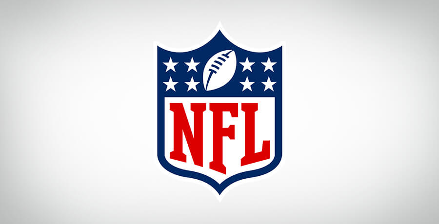
The big daddy of sporting events is number 6th on the list.
It is tough to find someone in the world, who hasn’t seen this sports league logo. Just like other sporting leagues inside the nation, the NFL logo has the colors of the US flag on it.
It is quite patriotic, with an oval ball placed in between the stars that resemble the US flag.
The logo is deeply historical and a symbol of unity and identity among the American people and fans.
It is one of the most recognizable sports league logos in the world.

Even though the NFL started in 1920, the current iteration of the logo was first designed somewhere in the late 1930s. However, the shield crest dates back to the 20s, when the American Professional Football Association became NFL.
The 1984 logo saw some major changes, even though at first glance it looks similar to its predecessor. Upon closer inspection, you can see that the outline of the logo has widened which became the foundation for the current logo. The current logo was first presented in 2008.
The number of stars has varied over the years. Initially, there were 25 stars on the crest, after which the number changed to the number of teams competing in the season. Currently, the eight stars represent the eight divisions.
The font is cleaner and bolder in the final version, while the colors have also brightened intensely.
5. MotoGP

As we take a ride towards the 5th logo, we’ll talk about the most thrilling sport on the list.
MotoGP, previously called, ‘Grand Prix motorcycle’, has a logo that resembles the ‘chequered flag’, which is waved at the beginning and end of a motorcycle race.
It looks like a very simple design, but one that is recognizable from afar.

The logo above is the one that was used by MotoGP until 2007
The current logo of MotoGP was presented in 2007. The wordmark was completely red this time around, although a brighter red than before.
A more rounded font was used in the new logo while the edges of the flag were also softened and rounded a bit more.
A uniquely designed logo that is clean and minimalistic – One that deserves a high rank on the list of the most iconic sports league logo designs.
You should also read: Logo Redesigning- The do’s, the don’ts the how’s’ and why’s
4. UEFA Champions League

The fourth place on the sports league logos list goes to the greatest league football prize in Europe – The “UEFA Champions League”. It is the grandest stage in association football and its logo is proof of its significance.
The Champions League was introduced in 1955, and was known back then as the ‘European Champions Clubs’ Cup’. The tournament was then rebranded and was renamed as ‘UEFA Champions League’.
We saw a lot of changes after the restructure of the tournament, such as the eligibility of four teams from the top leagues in Europe. But the biggest change of all was the launch of the logo of the reinvented tournament.

The initial logo did not bear the UEFA wordmark upon the “Champions League”
While the logo hasn’t changed much overall since 1992, the font of the wordmark has come a long way from the original look.
The clubs, when competing in the Champions League, have to wear a special emblem on their kits that indicates the previous record of the respective team in the tournament.
The most recent champion also has to wear an emblem on the sleeve, representing the past year in which they won the trophy.
The logo is truly remarkable and is one of the best sports league logos in the world.
3. NBA

It is time for the big 3. The third best sports league logo has to be the NBA logo. It is as iconic as the sport itself.
The NBA was formed in 1946. Back then, it had only 11 teams – Today the number has reached 30 and each of those pays its players no less than a king.
The Logo has seen significant changes since its inception, ranging from a wordmark to now being one of the most recognizable emblems in world sports.

The best word to describe the original logo is “BAD”. They improved the logo by giving it the shape of a basketball after two years of its inaugural but made it more generic after 9 years.
Then, in 1969, Alan Siegel was given the responsibility of the Logo, and a marvelous piece of art came into being. It had the classic colors of the American flag and a silhouette of a basketball player, who was later to be identified as ‘Jerry West.’

The NBA logo was slightly updated with more vibrant colors and thinner font, but for the most part, it remains as it was created by Alan Siegel.
2. NASCAR

National Association of Stock Car Auto Racing, popularly known as NASCAR, is one of the most popular sports in the world. The association was founded in 1948 by Bill France Sr.
It is followed in 150 countries and today different circuits of the tournament are held all around the globe.
The current NASCAR logo is essentially a minimalist version of the previously iconic NASCAR logo which remained the embodiment of the tournament for 40 years.

It all started in 1948, with a classic sports league logo that was reminiscent of the era – Two stylish cars facing off against each other. The cars then morph into wings at the back, which signifies the display of speed.
The two cars are standing in front of a couple of flags, which are crossing each other. There are mainly two colors in the original design which changes as the logo is updated, in 1956.
In 1956, the logo was updated to represent the oval racing track. The two cars remain intact but the flags are pushed behind the tracks.
The 1964 design can be termed as the worst of the lot, as it removes the racetrack and places the two cars on top of a grill of an older car, which is largely unidentifiable. The color scheme is also demoted to a bland grey, blue, and white.

Then, in 1976, the logo was entirely changed and simplified to only the wordmark. But it did keep the colors used in the previous designs.
The NASCAR logo, we all recognize, was finally changed after 40 years, because of a sponsor shift, to a more basic version of the retro design of 76’.
1. Premier League

It started with football and it ends with football, because why not? – It is the biggest sport in the world, after all.
The ‘Crowned Lion’ is one of the most memorable and historic sports league logos of all time.
The Premier League is the highest flight of the English association football and is widely considered to be the most competitive sports league in the world.
The current version of the logo was unveiled in the 2016/17 season, by ‘DesignStudio’, who described the change as a need of time, since the previous logo had no inverted version and was not usable as a touchpoint for an app.

The first logo for the premier league was created in 1992.
The lion wears a crown and places its paw on a football. From a closer look, we can see that the lion has droopy eyes and has a worried look on its face. The Words, “F.A Premier League” are scribbled in white in front of a green background.
The 2003/04 season saw a change in sponsorship and color scheme, but the logo remained pretty much the same.
In 2007 the logo was reinvented and the lion, this time, turns its head to face us. The lion looks much more regal and its crown has a more geometric design than before.

The current version of the sports league logo is a stylized head of the previous logo. It is made for digital devices primarily, which is indicated by their choice of RGB colors.
The new logo was an instant hit among the premier league fans and the pundits as it is incredible in terms of respecting the heritage while also being modern at the same time.
You may also want to read: New Premier League logo: Learning from their mistakes
Final Thoughts:
Sport is a medium of expressing our competitiveness and in that process, we are entertained. Therefore, we must cherish every bit of joy that comes our way through sport.
This list has some of the best sports league logos present in the world. Some are colorful, some have a retro design, and some are made for digital devices.
However, they all have one thing in common i.e. they are beautiful and are a reminder of why we enjoy the sport in the first place.
Every person has their own choice when it comes to sports league logos, but it is important to keep in mind that you should never forget why it exists in the first place – To relish the experience of the adventure.
Get a Free Quote
+1 845 3770255
Call on anytime
To discuss your project
Featured articles:
Topic Categories
Interested In
Logo, Branding & Creative Work?


 We’ll get back to you in 24 hours
to address your needs as quickly as possible.
We’ll get back to you in 24 hours
to address your needs as quickly as possible.
 We’ll prepare an estimation of the project
describing the team compostition, timeline and costs.
We’ll prepare an estimation of the project
describing the team compostition, timeline and costs.
 We'll perform a free website review
If you already have an existing website.
We'll perform a free website review
If you already have an existing website.


