25 logo blunders that will make you laugh
A company strives to build its identity, its image, and its impression on the public. For this purpose, it emphasizes the brand identity elements i.e logos, brochures, flyers, bags, websites, and other items that create a relationship with the customer. Logo designing has always played a crucial role for graphic designers, likewise, the blunders in the logo leave a long term and almost unerasable impact.
History has seen many of the blunders by graphic designers in the logo designing a task that has failed the brand in creating a significant visual impact. Instead, it has left people laughing out loud while seeing those logos. Here, we have listed a few such blunders that will give you too a moment to laugh.
1. Bureau of Health Promotion:
BHP (Bureau of Health Promotion) presented a logo with an inappropriate image drawn inside the circle. It has shown a threesome that is not even justified if the forum is dealing with sexual health and sexual education. No such picture was required to grab the public’s attention. Such acts result in losing the brand’s reputation. People wondered about what kind of health promotion was performed at the organization.

Bureau of Health Promotion Logo
2. Pepsi:
Lawrence Yang drew this Pepsi logo and gave a new perspective to the customers. It is so impressive that nobody will look at the original logo in the same way as it is. This viral drawing gave the public a new dimension to think about Pepsi and what it does to your health. This guy’s tummy will stop many people from buying Pepsi, considering the consequences. Though it produced a horrible impact, Pepsi never reacted to this drawing, nor did it change its logo.

Pepsi Logo
3. A-Style:
This logo is not the depiction of a clothing business at first glance. It is an example of a bad logo and even funny for some people. This logo was marketed under the “Guerilla Marketing” strategy before the actual business was started. On the roads of Italy, these yellow stickers were placed, which made the logo a hot topic of guesses about the business. But definitely, the guess of the clothing line was not on the list—the two heads with the letter A present two people in a buzzing act.

A-Style Logo
4. London Olympics:
The London Olympics held in 2012 brought this logo before the event. It was attacked with criticism on several points. Firstly, it looked like the character Brat and Lisa from The Simpsons Family. It was also said that the picture looks like the spelling of the word “ZION” which represents pro-Israeli conspiracy. Moreover, it was spelled as the year 2012 but the numbers were shaped in the way that the year was not apparent. The logo is not relevant now and has remained unchanged because the event has been passed.

London Olympics Logo
5. Catholic Church’s Archdiocesan Youth Commission:
A church’s logo is meant to be designed for conveying the message of protection of a child by a priest. But if it looked in the other way, the meaning is just the opposite and fails the logo badly. Even if it was launched at a time when people were looking at things with positive minds, it should still be popped up in somebody’s mind.

Catholic Church’s Archdiocesan Youth Commission Logo
6. Office of Government Commerce:
The logo of the Office of Government Commerce is straightforward and decent at first glance. It remains simple until you shift your head or rotate the logo. If you do so, it is a freaky picture of a man with a sketch that a dirty mind can only think of. This has given the designer another point to consider while designing the logo: to shift the image when done, to see if it is as simple as it was.

Office of Government Commerce Logo
7. Junior Jazz Dance Classes:
This logo also seems fine when you look at the two dancers that are dancing beautifully. You have figured out the problem if you have a mind that is wired differently and can not see two dancers here. The designer might be feeling naughty while drawing the figure of a beautiful woman creating an optical illusion.

Junior Jazz Dance Classes logo
8. Aldershot & Farnborough Twins & Triplets Club
An organization with the message of providing information and products for twins and triplets should not do this to a triplet. Like, come on, just look at the placement of the third kid. It is a mistake and unavailability of a professional designer.
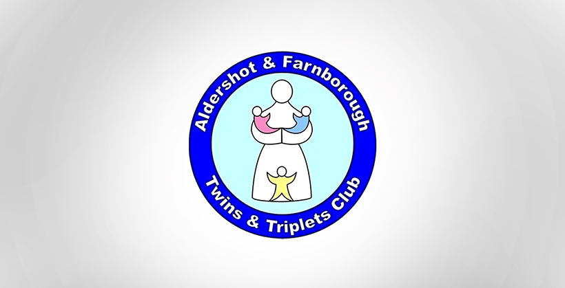
Aldershot & Farnborough Twins & Triplets Club Logo
9. Dough Boys:
Though the boys of the brand want to promote their dough related stuff but, the letters d and b here when combined in the above position, are giving a dirty picture. Would you like to buy anything to eat from here? It’s super creepy, and one of the funniest logos fails.
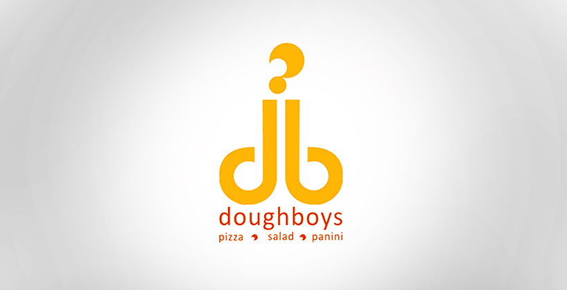
Dough Boys logo
10. Locum:
This is the most creepy and yuck logo you must have ever seen. It is the LOCUM logo, a Swedish property management company, but the designer has tried his best to keep people away from such dealers. The designer seems to be a woman who has designed the logo with the letter L looking like the letter I and the heart in replacement of letter O and then the remaining letters making the word cum. Would you still like to deal with such property managers?

Locum logo
11. The Computer Doctors:
The Computer Doctors have shown their creativity by adding a computer mouse in replacement of letter U. It might be a good idea, but it turned out really bad. Maybe the choice of the picture of the computer mouse went wrong, and it looked like a man’s private body part that was made even worse with the wire connected to the mouse. It will only let people refrain their computers from such doctors.
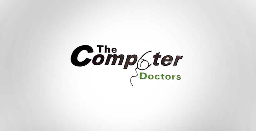
The Computer Doctors Logo
12. Kudawara Pharmacy:
The above logo is of Kudawara pharmacy. Everybody is aware of the kind of business a pharmacy does, and it has clearly nothing to do with the people in the logo. Nobody knows what the designer thought when he put the heads on the two edges of the letter K. This was an unwanted move that made the simpler and decent logo a cheap, funny, and indeed a bad one. Two people having a fun time together in the letter K of a pharmacy logo does not make any sense.

Kudawara Pharmacy Logo
13. Clinica Dental:
People who have been to a dentist or not been to this picture may seem uncomfortable to them. The position of the dentist with the patient is correct in real terms, but for the sketch or an outlook, it is inappropriate and might force people to think once more before paying a visit to the dentist. Again, a funny and a failed logo. Weird for those who are not in need to visit a dentist but worrying for those who need to.

Clinica Dental Logo
14. Click Lovers:
This is an excellent example of improper spacing in the logo. Often designers do not consider spacing as an integral part of the logo design, but indeed, this picture will let them know how wrong spacing between letter “c” and letter “l” can make the letter “d” and change the entire meaning.

Click Lovers Logo
15. Mont-Sat:
Some logos go wrong unintentionally; some go wrong when they are rotated or tilted, but some are designed to be creepy and troll the public. This one is of the latter kind where a dish antenna is clearly holding a man’s private body part and is shown delighted to have him that way. This is the logo that gets even worse with every sight.

Mont-Sat Logo
16. Arlington Pediatric Centre:
The designer of this logo seems to be a pedophile. He designed the logo of a pediatric center in a way that discomforts the child. The way in which the adult in the picture is looking towards the kid and the position and posture shown in the image has made the logo merely disgusting.

Arlington Pediatric Centre Logo
17. MegaFlicks:
Just like the logo of Click Lovers, the logo of MegaFlicks is a flop. In both of the cases, the designers are unaware of the Kerning method, which is adjusting the spacing between the letters to give a pleasing look. The inappropriate Kerning has made the words Flicks as the word Fucks, which is readable as the latter from any distance. This is an example of unprofessionalism.

MegaFlicks Logo
18. Kids Exchange:
This is just another example of improper spacing between the letters. If there are two words in a logo, they should look like two and should be readable as two. If they do not, then the reader is free to make as many words as he likes out of the text. As many combinations will come forward as possible. Here the words “Kids” and “Exchange” have written without spacing that has given a chance to be read as “Kid Sex Change.” If the person reads it as “Kid Sex Change,” there is no chance that he will enter the store.

Kids Exchange Logo
19. Brazilian Institute of Oriental Studies:
This logo was meant to be an image of a building in yellow color and a sun rising behind the building. But unfortunately, it turned out to be something else in the big picture. It is clearly an image of a sexual act in which something is getting inserted in a woman’s body. Now no matter how beautiful the thought behind the picture was, it became a big fail.

Brazilian Institute of Oriental Studies Logo
20. Vermont Pure Maple Syrup:
Vermont Pure Maple tree got a considerable disaster when it got a resemblance to a man rather than a maple tree. Undoubtedly, the brand was trying to show purity by depicting the extraction of juice directly from the tree, but it went wrong as the picture looked like a man urinating in the red basket.

Vermont Pure Maple Syrup Logo
21. Mama’s baking:
This logo is of a small bakery in Greece that has the logo of a woman who has a fire in her. The text right beside the picture has got us to know that this woman is a mama; this fire has got curious. This fire can be for baking as she runs a bakery, it can be for her work, but it can also be for her personal desires, including sexual ones. Such an ambiguous logo is a fail attempt.

Mama’s baking Logo
22. Catwear:
Catwear was not expected to do such stuff. Showing an animal’s body parts for completing your letter “A” while putting up the cat’s picture was a bad idea.

Catwear Logo
23. Kostelecké Uzeniny:
This is the logo of a Czech company named Kostelecke Uzeniny that makes sausages that are shown in the logo. Though the sausages are good in taste and are represented in the logo, they do not look like sausages. The logo could have been much better.

Kostelecké Uzeniny Logo
24. Kraft Foods:
The logo of the company should be aligned with their business and their agenda. Some brands need to work with their designers to tell them what their business is and how the customer sees it. The logo of Krafty food does not look like a logo of a food company; there is no decency in it; nothing food-related content is there. This colorful logo can be useful for a summer camp or an amusement park but not for a food company.

Kraft Foods Logo
25. Safe Place:
Safe Place has provided people with this ironic logo that says precisely opposite to what it actually does. Safe Place is meant to be a shelter where people can find safety to survive. But the logo is depicting the image of a man grabbing the other in the way he is trying to catch him forcefully, which does not give peace to the mind. The purpose and the logo seem to be contradictory.

Safe Place Logo
Final Words
Sometimes, over creativity leads to disasters, and this is what we have tried to show in the above list of “Funny Logos that go miserably wrong.” And being a leading logo design agency, we know how to walk a thin line between creativity and over creativity. Let us know which one do you find the funniest in the comments section below.
-

Waqas D.
Waqas D. is the co-founder of the branding and website agency, FullStop™. He supercharges brands by crafting memorable logos, brand identities and engaging websites. Besides thousands of startups and medium-size businesses, FullStop has worked with likes of Microsoft & L’Oréal. View our portfolio or get in touch.
Get a Free Quote
+1 845 3770255
Call on anytime
To discuss your project
Featured articles:
Topic Categories
Interested In
Logo, Branding & Creative Work?


 We’ll get back to you in 24 hours
to address your needs as quickly as possible.
We’ll get back to you in 24 hours
to address your needs as quickly as possible.
 We’ll prepare an estimation of the project
describing the team compostition, timeline and costs.
We’ll prepare an estimation of the project
describing the team compostition, timeline and costs.
 We'll perform a free website review
If you already have an existing website.
We'll perform a free website review
If you already have an existing website.


 -->
-->