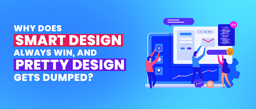
Why does smart design always win, and pretty design gets dumped?
Oh, I remember how awful I felt….
I was served Play-doh mixed with sugar in the name of a delicious cake.
Sigh! Rest in peace, my taste buds.
If you have ever felt the same, you must have guessed that I am talking about fondant cakes.
Pretty they look, but are pretty cruel to the taste buds.
A pretty design is akin to fondant cakes – justified to be dumped.
Don’t get offended, you artisans; I am not saying that you shouldn’t make a pretty design. Merely trying to clear the point, in the world of designs, “smart one's rules.”
This doesn’t mean smart designs are not pretty – they are. Sometimes, designers go overboard, skip all the points, and concentrate mainly on “Aesthetics.”
It’s insane to overshadow the functionality and concentrate on making it visually pleasing.
Tell me something: You own a brand that sells sneakers. You have an impressive collection in your store. The designs are visually pleasing, but… those sneakers are not comfortable to walk in.
- What will happen?
- Will people buy the fact that your design is pretty?
They won’t! Your customers will dump your “OH-SO-PRETTY” design.
Now you finally got it! Functionality matters. Talk about web and app designs; they need to be well-thought-out.
Remember one thing here:
“People choose those things that bring ease to their lives.”
Web designers and app designers need to concentrate on making intuitive designs rather than something that looks good for the art gallery.
Why don’t we care about the impact?
Recently, I came across a tweet, and it totally made sense to me.

People are so much rooted in understanding UX design that they tend to forget about its impact. Again, designers forget to ask this question to themselves, “Will this design serve the purpose well?”
Are you still roaming around the orbit of aesthetics? I am here to help you see the big picture. Let’s get started.
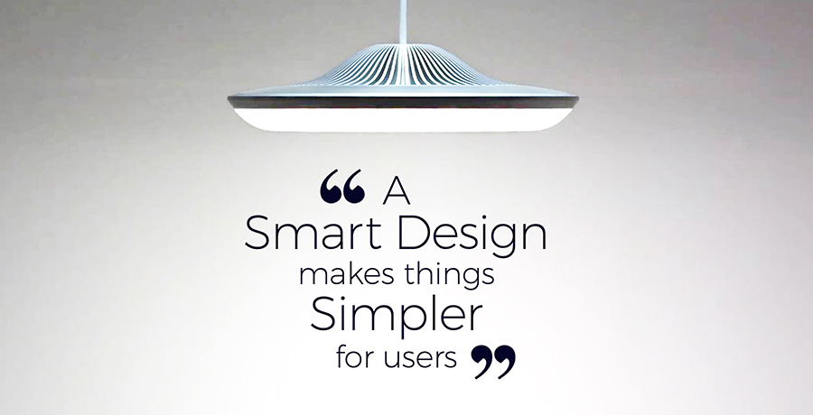
1. A smart design makes things simpler for users
In the hustle-bustle of life, people don’t have time.
It’s highly insane to offer them a design that is hard to navigate and is a burden to their eyes.
Understand it like this: You enter into a mart. It looks beautiful, but there is no kiosk, nobody is there to guide you. What will you do?
You will get agitated and leave the shop. Similarly, your users leave your digital front when it is a pain to their eyes – where it is the hurricane of a task to get to a specific thing.
Users always appreciate it when you care for their time.
We impatient-beings always gravitate back to what serves us faster. Understand the real catch here.
2. Smart design is always balanced
Achieving balance is a challenge. It’s like to cut a cake and make sure all the guests are served a fair share – more about giving an equal piece to each.
Smart designs don’t tip to one side, and there is a sheer balance. Let me show you an example:

Can you see that this design isn’t about trendy swatches, patterns, likes, or dislikes?
This web design is about a fine hierarchy and order.
Here we have achieved a delightful mingle of aesthetics, functionality, and fine taxonomy.
The design doesn’t tip to one side; the proper arrangement of elements has offered it the tiara of balance.
Point to ponder: A smart design talks about a brand personality. Don’t vanish it with your sword of “unbalanced design.”
Designs that concentrate on aesthetics too much, end up painting a picture of an unbalanced design that sends potential buyers far away.
Be mindful about how you plan to lay things as your little mistake can cost you a lot. Usually, in the form of an unbalanced, unpleasing design.
In the race of making design playful, don’t overshadow the key point – balance.
It’s clearly not about the number of elements, but the arrangement. Mate! Nobody likes to see a room that has a stack of pretty clothes here and there. Similarly, nobody prefers a messy design.
3. A smart design reduces the complexity
Do you have time to solve the digital Rubik's cube?
If not, then never aim for “just pretty design.”
The only thing that people don’t have is “Time.” Don’t hand over them another piece of the puzzle that makes them leave your website.
Anything complex loses its worth no matter how pretty it looks. Talk about UX; people want you to break the cords of complexity.
Things that are there on your website should have a defined goal. Anything present there unnecessarily should be removed.
Smart design doesn’t distract a user. It provides ease and helps you get to the desired thing real quick. Let me share an example:
Every time when I visit Entrepreneur Magazine to get some digital wisdom, I stop by and start applauding the design.
They have no blingy feature that distracts a user. They have made defined sections for readers. It’s quite obvious – they don’t want users to waste their time. Within a matter of a few clicks, you get to your genre.
When you concentrate on making a design pretty only, you highly ignore the functionality that cost you massive in the long run.
Hath business people understood the importance of smart design; the digital world would be heaven.
4. Smart design always have well-thought-out non-distracting graphics
Would you like to mix chips with porridge?
Don’t think that I am acting crazy here—a huge round of applause for knowing the art of making visuals.
P.S: Slow claps if you don’t know how to make well-thought-out graphics and its usage.
Repeat after me, “I’ll never commit the mistake of including all the visuals into my design merely to please myself.”
Not everything you create has to be a part of your UX. Visuals and information go hand in hand. They need to be aligned with each other.
It’s sheer stupidity to make your design noisy in the name of “I am trying to make a pretty design.”
We human beings don’t have the capacity to absorb all the visual information we come across. Therefore, always serve them what conveys the message well.
A smart design always complements the message you want to convey. Visuals on your website should add to the feel and look of your website if they don’t just omit them.
People don’t like distractions. When you bombard them with a considerable chunk of visual info, they run away. Your message loses its essence. To keep the momentum intact, take the help of smart design. It conveys your message well and saves you from embarrassment.

Look at the feel of this website. It has no distracting visuals. Pictures that are there on the website has a purpose. Everything is just so perfect there.
Be it graphics, or pictures, and smart design, always have meaningful ones. While pretty design just cares for how pretty the graphics are, no matter if they are aligned with the message or not.
5. Smart design tells your brand story

Visuals tell the story when the words don’t serve the purpose right.
I highly advocate my above statement. Design is the only language that is far away from all language barriers.
Every brand has a story to tell. Immersing that story in the framework of design is a tricky thing. Here, the smart design comes into play.
Smart design always gels well with the users – it explains the key differentiators. This is where pretty design lacks. The pretty design is just about making things visually pleasing. There is no story, no emotional connection that grabs the attention.
There is so much goes into a smart design that includes:
- Understanding your customers from an aesthetic front
- The brand message
- Understanding of buyer persona – that actually reveals a lot of things
- Carefully done taxonomy
- Arrangement of elements
Well, here I have stated some of the important ones while there is a lot more to the tale.
Smart designs are prepared with a defined roadmap, while a pretty design is based on assumptions and what pleases you.
Still, you ask why smart design wins? I reckon this shouldn’t even be a question now.
6. Smart design has a defined hierarchy
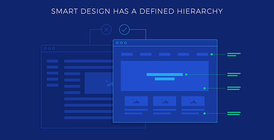 Everything present on Earth has some role to play in solving a problem.
Hear me out: There is nothing like PRETTY!
Talk about web design; you just can’t run away by using the word “pretty.” Your creation should serve the purpose.
Smart design is crafted after taking the following things into account:
- What do users find more appealing?
- What are their likes and dislikes?
- What persuades them to make a decision?
- What are those factors that stop them from buying a service or product?
All these questions help you come down to a balanced perspective. You get a roadmap for how you should design it and what its impact would be.
This defined roadmap paves the way to get rid of over-developing features. After understanding your audience's needs, you arrange things based on the importance.
It’s more like a priority list. Through your web design, you set an information hierarchy based on what needs to be shown first, what should be secondary and tertiary.
This way, you make it easy for users. You direct their attention to the primary message first, then secondary, and the list goes on.
The result is always an aesthetically pleasing and functionally sound layout. Talk about pretty design; you don’t put in so many efforts into knowing your customers.
This is precisely why smart design wins, and pretty design loses the battle.
6. Smart design has a class
Imagine: You enter into a grocery store, and there isn’t enough space for you to walk...
How would you feel?
Your first reaction will be, “They should have planned properly before designing the store.” Out of suffocation, you will leave the store.
Similarly, when you think about making a pretty design, you forget the element of “negative space”. This is precisely where you brutally killed the word “class.”
 With & without negative space
On the contrary, the smart design offers enough breathing space. The elements don’t feel heavy there; in short, they look and feel classy.
To make an element stand out, it is essential to add some white spaces. A jam-packed Ocean of visuals or typography sucks the real essence of your design.
Inexperienced designers tend to forget about the real message of a website. Make sure that the design elements support your message rather than overshadowing it.
How to achieve a smart design?
By now, I am sure you must have understood why smart design always wins. Now, let’s talk about how to achieve a smart design.
Go through some of the well-thought-out bullet points:
- Smart design is story-driven. Before designing a website, think of how you will immerse a story in the framework of visuals
- Take the buyer persona into account and get to know in-depth about your customers.
- Every website should be designed with a clear goal in mind.
- Smart websites look good regardless of the screen size and the device on which they are getting opened up.
- Make sure that you have a well-defined taxonomy
- Prepare a hierarchy of information to make things easier for a user
- Don’t throw a lot of visuals that make it way too complicated for a user to understand
- Exclude all the design elements that are not aligned with your brand’s message as they just add noise.
- Everything on the website should bring a user to one unified message. Be assured; all the elements share the same synergy.
It’s a wrap
If I were to write a book on smart designs, I guess even a year wouldn’t be enough. The day people start focusing more on the impact and functionality of a design, their brand’s fortune will change for good.
If you feel that your website isn’t smart enough, it’s not too late to welcome a new dawn. Change it rather than keep regretting it.
Next time, when you design a website, “forget about the word pretty.” Concentrate more on functionality, and tie your brain to one goal of providing ease to users.
This way, you will end up creating the epitome of classiness – worth applauding.
I have covered a vast chunk here. If you want to present your two cents, the comment section is all yours! I’d love to see things coming from you.
Co-Founder & Strategic Visionary at FullStop
Haris Ali D. is the Co-Founder and Strategic Visionary at FullStop, a full-service branding, digital and software development agency he co-founded in 2012. With expertise spanning brand design, digital marketing to custom software development, web and mobile applications Haris has helped hundreds of businesses transform ideas into market-ready solutions. He's passionate about AI innovation and helping SMBs compete with enterprise-level digital presence.
Ready to transform your brand?
Our team specializes in strategic branding and digital solutions that drive real business results.