Which 9 Fonts I ABSOLUTELY LOVE as a Logo Designer
Designing the right logo that speaks value for a brand doesn’t come easy. It might seem like a no brainer task, easy to complete in minutes to a layperson. But, it is actually a tedious job that requires a lot of hard work and time. Not only do you need to design a logo that represents the brand — but your selection of color scheme and fonts should also complement the overall design.
Designing the right logo that speaks value for a brand doesn’t come easy. It might seem like a no brainer task, easy to complete in minutes to a layperson. But, it is actually a tedious job that requires a lot of hard work and time. Not only do you need to design a logo that represents the brand — but your selection of color scheme and fonts should also complement the overall design.
Being a designer myself, I can recall those days when I used to be stuck at one thing a lot: choosing the right font, which can go well with my design. And it is the part where most of the intelligent amateur (I say intelligent because stupid amateur put any font they are able to lay their hands on) or even experts get stuck. To this end, I’m here to help you save your countless hours, searching on the web or through your collections. So, below is my curated list of 9 fonts that absolutely love using, and any designer should give them a whirl.
1).Brandon Grotesque
Brandon Grotesque ( a successor of Sans Serif family) is perfectly named for historical mysteriousness. This font has a functional look with a touch of architectural warmth. It is from the font family of six weights with matching italics. The font may look like a masterpiece from Pharaoh’s time, but it was actually designed in 2009 by Hannes von Döhren.
It is designers’ go-to fonts for sophisticated and professional typography -something with which you can do wonders when used in your contemporary looking logo designs. This font is based on geometric forms, optically corrected for more enhanced legibility.

Brandon Grotesque
2).FF DIN®
The FF Din belongs to a font family of whopping 20 weights plus a rounded font variant. They vary from light to black in regular and condensed styles, including italics.
This font delivers advanced typographical compatibility with features like case-sensitive forms, super and subscript characters, fractions, and style alternates. Looking for an example? Check the logo design created by David Edward Clark.
This font was added to the MoMA Architecture and Design Collection in NY back in 2011.

FF DIN
3).Proxima Nova
If the whopping number of FF Din styles wasn’t your thing, here are the 48 styles of Proxima Nova.
Calling it, massive collection fonts might do justice with it. After all, style options give you a variety to supplement uniqueness in your design.
It is a complete reworking of Proxima Sans(dated back to 1994) in which original six style fonts were expanded to 48 fonts. The font comes with three widths: Proxima Nova, Proxima Nova Condensed, and Proxima Nova Extra Condensed, and each consists of 16 fonts —seven weights with matching italics.
In terms of style, Proxima Nova balances the gap between typefaces such as Futura and classic sans faces.
This results in a hybrid blending humanistic proportions with slight geometric features.

Proxima Nova
4).Gilroy™
Gilroy is a contemporary sans serif with a geometric finish. It has twenty weights, ten uprights, and its matching italics.
It’s a gorgeous geometric, subtle, and minimalist font.
The Light & ExtraBold weights are free of cost so that it can be your choice for your center content.
This simplistic font design is ideally a good fit for any design, especially if you are designing brand marks.
You can easily use it for web, corporate identity, and signage.

Gilroy
5).Mont™
The other name for Mont is geometric sans serif. It is a minimalist font that consists of ten weights. It ranges from Hairline to Black with matching italics.
This font is compatible with Greek, Cyrillic, and Extended Latin — up to 130 languages all together.
The offset feature of Mont with unparalleled details, such as the pointed “t,” and the famous x-height perks it up for a good choice for logo and brand identity.
Mont font has a variety of OpenType features, which include tabular figures, high-level typographic characteristics such as fractions, ligatures, case-sensitive forms, superscripts, and subscripts, etc.
The versatility of typeface and qualities make it strong to counter any graphic design problem — web, logo, print, motion graphics, etc.

Mont
6).Avenir Next®
Avenir Next Pro is a new version of the classic face —it is the result of a project with the goal of taking a nicely designed sans and improving it.
The modification was made in a way that its technical aspects exceed the status quo. This leaves all of us with an iconic and superior sans family.
This family isn’t only a mere modification, though. It is actually the development of the initial concept that takes the Avenir Next to the next level of superiority.
Aside from standard styles that range from ultra-light to heavy -this 32-font set renders condensed faces to rival any other sans on the market in on and off-screen readability.
The heavyweights can pair well with serif body types –a perfect selection for branding.
All in all, the design of the family looks clean, simple, and works marvelously for blocks of copy and headlines alike. Akira Kobayashi worked with Avenir’s valuable creator, Adrian Frutiger, to bring Avenir Next Pro to life. It was his ability to come up with his unique finesse and ideas for the development of the project while being true to Frutiger’s original intent, that makes this not just a modern typeface, but one ahead of its time.

Avenir Next
7).Cera Pro™
The Cera Font is a result of sheer geometry artistry and simplicity to its core. This font family has the bestselling Cera Pro, its stenciled counterpart Cera Stencil, Cera Brush(the hand-made display companion), and Cera Round Pro.
It comes with 6 weights, thoughtfully slanted 10 degrees, a clean italic, dingbats, and arrows to rock any design.
Cera font is a staunch companion when you need to have clean text and headlines on screen, in print, and in multiple languages.
For great on-screen results, the TrueType files for web and desktop fonts have been manually suggested.
This font supports hardcore geometry and will sure to leave an impact when used correctly for logotypes.
The languages it supports are Latin, Cyrillic, and Greek scripts.
With more than 980 glyphs for each weight, Cera frets about localized letterforms and keeps the OpenType features to match.

Cera Pro
8).Panton
The Panton font family owns 36 weights -in which ten are uprights, ten italics, and 16 icon sets as a bonus.
It is distinguished by exceptional legibility in both print and web areas.
It takes inspiration by the classic grotesque typefaces -Panton stands out because of its unique style, expressed in supremely softened geometric forms.
From optimized kerning, an exceptional geometric, excellent legibility for logos –it has it all that makes it my kind of font.
This font family is a good choice for headlines of all sizes, and text blocks with both maximum and minimum variations.
Panton font styles are applicable for any graphic design in web, motion graphics, print, etc. and a go-to font for t-shirts and other items such as logos and posters.

Panton
9).TT Commons
TT Commons is a universal sans serif with little to no contrast of strokes, geometric shapes of characters, and a closed aperture.
The typeface’s design was created for the broadest range of tasks with which any top-notch corporate font is needed to cope.
The memoir of TT Commons dawns on the new TypeType logo, which surfaced back in 2016 as part of the rebranding scheme.
Ideas set in the logo made the foundation of two thoroughly refined faces (regular and medium), which was in early 2017 made the standard corporate typeface of the TypeType Foundry.
Minimum contrast of strokes and equalized tracing of letters makes TT Commons classic for branding.
While this may be true, the exclusively refined design of each glyph makes it fitting to apply it favorably as a display font.
The typeface purposely does not have unique decorative features. On the other hand, it manages to win hearts with laconism, plainness, and sharpness of forms, which have given heights to the seasoned corporate style for years to come.
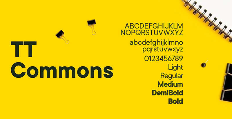
TT Commons
Final Words
A well-designed font with all the essentials in check is a sure way to rock any logo. The first and foremost rule of typography suggests the font you choose should be easy to read with little to no complexity. It is especially true when it comes to logo designing for brands; if the brand name isn’t legible because of a disastrous font, the designer is to blame. So, if you have any such designer, let us help you with our exceptional team of graphic designers on board.
Get a Free Quote
+1 845 3770255
Call on anytime
To discuss your project
Featured articles:
Topic Categories
Interested In
Logo, Branding & Creative Work?


 We’ll get back to you in 24 hours
to address your needs as quickly as possible.
We’ll get back to you in 24 hours
to address your needs as quickly as possible.
 We’ll prepare an estimation of the project
describing the team compostition, timeline and costs.
We’ll prepare an estimation of the project
describing the team compostition, timeline and costs.
 We'll perform a free website review
If you already have an existing website.
We'll perform a free website review
If you already have an existing website.


