10 Cool Tips to Design Creative Menus & Some Inspirations For You
Restaurant and food businesses are one of the most profitable companies in the world. People around the globe spend more money and time on food than anything else. Let’s give you an activity, think of the five most visited places in your city. I am sure three of them would be the food places. Nevertheless, one does not think about it enough, but how much do you believe menu designs have an impact on your food choices or your experience of the restaurant? After the ambiance of the restaurant, the first thing that can help you judge the restaurant and its food is the menu.
How the restaurant presents the menu, and the creative menu design has a massive impact on the impression they are leaving on their customers. Not many restaurant owners put much of their thoughts while designing the menu card. Menu design ideas are a real thing, you may disagree with me, but the attractive menu and the creative menu design makes the customer order more of the dishes. It compels them to think if the menu card is so creative how excellent the food would be, and they end up ordering more than they were planning to. That’s the trick behind a cool menu design.
Whether we like it or not, we cannot ignore the close relationship between psychology and marketing, they have been friends for a pretty long time. So there is a possibility that behind every design that you see on logos, menu cards or any other places, there is a lot of thought put behind to make you feel a certain way. Call it what you want unintentional messaging, suggestion power, manipulation but organizations are continually looking for the way to control your decision making, and it includes restaurants as well.
You may not know it yet, but the restaurant industry has their own toolbox of the psychological strategies, which is called as menu engineering. The purpose of menu engineering is to develop creative menus to attract more customers to the restaurants. You would not believe, but there are a few employees [read; menu engineers] dedicated to research the verbal and visual psychology behind why people order certain items and then use that information to design the menus.
If you are in a restaurant business, you may already know that creativity is the key to keep your customers happy. This is true that the food you serve and the design of your menu tend to either put off the customer or make them happy. You have the decision power here; you can make the customer happy by firstly providing them with the attractive menu card and then offering them the delicious taste as well.
Let your creative juice flow and design an attractive menu for your restaurant; it is one thing that can be easily and quickly developed. The better the design is, the more food you will be selling, which translates into more success of your restaurant. Even if you are just a beginner rest assured that you could create a gorgeous menu card in no time and effortlessly.
If you are looking for some menu design tips and techniques, no worries, I have got you covered here. So let’s jump onto it.
1) First impression value

The menu engineers are very well aware of the first impression value, you and I can agree to the fact that reading the menu seems like a big task, so we just scan the menu, right? This means that the menu card has minimal time to impress you. One thing that the restaurant owners must focus on is they make easier to scan menus by using clear section, easy-to-find dish titles, heading and other visual techniques as well.
You may like: The art of package design: A comprehensive guide on product packaging
2) Analyze your reading patterns

According to different researchers, when the customers scan the menu, their eyes gravitate first towards the upper right corner of the menu, which in the restaurant language is known as ‘sweet spot’. Therefore, you would see the top-selling items of the restaurants placed on the sweet spot.
To attract the attention of the diners, the best approach is used to large, bold typography rather than using illustration or graphic and draw the eyes towards the sweet spot. Moreover, the dishes mentioned there are happened to be one of the most expensive dishes on the menu.
3) Emphasis on some particular menu items
Just like you must have noticed how magazines and newspapers use ‘call-out’ quote to focus on specific bits of information similarly menu highlight a few items that the restaurant wants you to order using what the pros of industry call ‘eye magnet’. The term ‘eye magnet’ is self-explanatory; anything that attracts the eye is an eye magnet.
You can add an image of your best seller dish, illustration or graphic or any source of getting attention. Many famous restaurant owners incorporate decorative frames and pointing hand graphics to attract the attention of the diners to certain menu items. It is not much of a widely known fact, but the nostalgic emotion can get your diners to order a lot of food and pile up their billing section. Nostalgia is a pretty powerful emotion in terms of getting people to order certain dishes.
If you are planning to design your menu and divert the attention of your customer towards a particular section, then try using a box or frame to focus on some dishes and take it one step closer by combining some of the expensive menu items together. This grouping, along with the embellished box illustrations, draws the eye and encourage the customer to order form that section.
Well, one of the cleverest strategies that you can adopt for your menu is that you can add an eye-catching red box to emphasize on the second most expensive item on the menu box.
4) Use of right colors
You may already know that, but people have an emotional connection with some colors; therefore, they respond to them in emotional ways often unintentionally. For this particular reason in the product packaging and advertising, the marketers use color theory to make critical decisions. For cool menu design, red and blue are thought to trigger appetite.
The most attractive approach to create a creative menu is to choose either blue or red colors as accents, adding these colors strategically attract attention to a few areas of the menu and establish a hierarchy for the layout.
Moreover, if you are a seafood restaurant owner, then what better color can you use than blue? The blue color perfectly depicts the seafood-centric restaurant bringing to mind fresh, and ocean-caught fish. But again it is all connected to psychology. If people like linking their seafood with the crashing waves and salty ocean air, then it gives the restaurants an idea to make design choices that reinforce such associations.
5) Use photos sparingly

Whether you should add the images of your dishes on the menu or not it entirely depends on the type of restaurant you own. Adding a picture with every dish is the trend practiced by cheap and low-end restaurants. The high-end eateries do not follow this practice. Most of the menu engineers believe that one photograph per page can increase the sales by 30%, which is quite a significant number.
If you happen to have come across the menu of Applebees, you would see the perfect photos in the menu. The eatery is pretty affordable, casual with the ideal sports bar-like atmosphere. The restaurant follows the perfect practice of adding one photo per category and also uses brackets to highlight certain dishes.
The trick is to use place images cautiously in the menu and choose the high-quality images that play up the dish’s ingredients, textures and the colors. This technique is all about making the menu item as attractive as possible to compel people to order it. Adding a low-quality image or unappetizing pictures can defeat the purpose.
On the other hand, you can also opt for the illustrations to highlight your menu more. Most high-end restaurants go for illustrative menus or even at more casual eateries. For a pizza eatery, a vintage-style illustration with the small graphic per pizza flavor can be a huge hit.
Important for you: Basic Elements of Design You Should Know About
6) Use descriptive language
The descriptions and the names on the menu card are literally the heart of the menu; it is the information on which the whole order of the diner is based upon. This is the main reason why menu designers, copywriters and engineers work tirelessly to get the diner’s taste buds tingling with phrasing that is delicious, suggestive and attractive.
The research says sales go up to almost 30% when the menu card has an excellent and engaging description. Moreover, the study proves that the detailed menu results in customers feeling more satisfied with their meals. In turn, it allows them more favorable comments assuming that the item lives up to their expectations.
Here is a pro tip for you, while you are writing down the description of your dishes make sure you are adding terms like “succulent”, “tender” and “satin” or maybe adding some geographical names as well such as “Italian” and “Cajun“. The study reveals the addition of such terms results in increasing sales by 27%.
Nevertheless, it can be said that restaurants that put some thought in creating the titles and descriptions for their mouthwatering dishes will reap the rewards as well. Menus that are the significant hit usually have an engaging and conversational copywriting style in general, but they are also attentive to making their certain dishes shine. Moreover, you can add a quick process of the dish preparation as well, which allows the diners to appreciate the dish more.
7) Making you feel nostalgic

Some restaurants are smart enough to add one dish in their menu that can evoke the nostalgic feelings of their customers. A few of the restaurants currently are going for the geographic approach and name their dishes according to the area they are living in. The power educing nostalgia in a menu is pretty strong and profitable. The thoughtful approach includes reminding the diners of the “good old days” when the times were more straightforward, and the terms like “homemade” and “traditional” were pretty common. Moreover, it also involves humanizing the dish regarding the restaurant owner or the chef or maybe the background of the recipe.
By humanizing the dish, you are taking out the essence of food being a commodity only Ms Bertha’s She Crab and Chef’s Issac’s Gumbo is the perfect example of giving the dish name a friendly and conversational tone.
Nevertheless, there cannot be anything more emotional than arousing the feeling of enjoying food with friends and family memories. It is the match made in heaven, most of the people reminisce the happy memories of cooking and eating together with their siblings and friends. The nostalgic menu designs bring back the memories of baking cookies with the Mom or enjoying the Christmas dinner with the friends. The use of nostalgic terms compels the diners to feel the sentiments and maybe order the dish as well?
8) No use of currency signs

Pricing the product rightly is one of the challenges that most of the business owners come across; similar is the case with the restaurant owners as well. These owners have the responsibility to strike a perfect balance between making a profit and not scaring the customers off. The right approach of adding prices to the menu is to remove the dollar sign or any currency.
Only the mere presence of the currency signs remind the diners of the pain linked with the spending money which eventually leads to them ordering only based on the price rather than choosing on the basis of quality and taste. The research shows the diners order more freely when they cannot see the dollar sign aligned with the menu items.
9) Hide the prices
As a restaurant owner, you want your customer to order the expensive dishes, to make them do that the best practice is to hide the prices somewhere at the bottom of the description. It’s human nature; when they come across the cheaper dish, they would go for it.
While designing a creative menu, make sure your menu prices are not much visible, place the prices subtly beneath the item descriptions, you will have bonus points if you leave off the dollar signs.
Another pricing trick to follow is that most eateries often work on their menus to shift the attention of their customers from the prices, which is known as “decoy”. The most expensive item on the menu is called decoy the purpose of listing this dish in the menu is to make the other things look cheaper. An average person with not much knowledge about the pricing and marketing can never grasp the psychology behind these tricks.
You may also like: 31 color combinations that every designer must know about
10) Go for friendly numbers

You may not know it yet, but most of the organizations capitalize on the number psychology, and it is easier to fall under this influence. The fusion of different numbers says a lot, such as all the prices ending with 99 connote value but not necessarily premium quality. On the other hand, the prices ending with 95 means friendliness. Moreover, the menu prices ending with .00 seem stuffy, and the 0.95 seem more inviting.
Top restaurants with creative menu cards
The Clifford Pier- Singapore
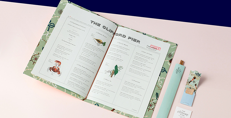
There was a foreign policy on the Clifford Pier legacy as the bustling port in the 1930s for a lively branding project which includes the thoughtfully illustrated menu. Stylish retro with the emphasis on the visual elements includes ginger flower motifs, architectural details, and classic postage stamps perfectly evoke the pre-war atmosphere of Singapore.
Toko- Dubai
Toko is one Japanese restaurant located in downtown Dubai with its strong and loud interpretations, playing with the flavours and shapes of food, and its visual identity creatively reflects the vibe of the eatery. The fusion of typical Japanese culture, which is a modern subculture and conventional painting techniques established the identity and marbling inspired the overall menu.
El Kapan- Varna
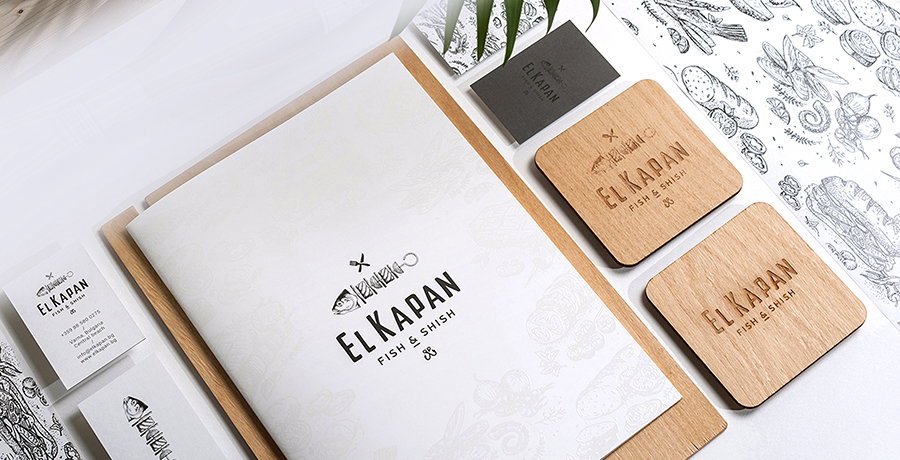
The restaurant is situated right at the central beach in Bulgaria; it is one bold and active eatery that aims to keep the young and lively lifestyle of the young people alive and offers the exciting fusion of barbecue and seafood. Its menu is the perfect representation of the cafe, with the stunning and colorful food photography and the typography you can get the vibe of the place.
You may find it helpful: All you need to know about business cards design and business cards size
Vera- Saragoza

This famous restaurant is located in Spain; the printing team is responsible for the thick wooden and beautiful menu design for the cafe Vera. The color of the menu font, which is white, is usually printed in the house press. Moreover, the owners of the restaurant have been pretty smart with the pricing, as they printed them on the stickers so that they can be easily updated.
Sano Juice- Barcelona
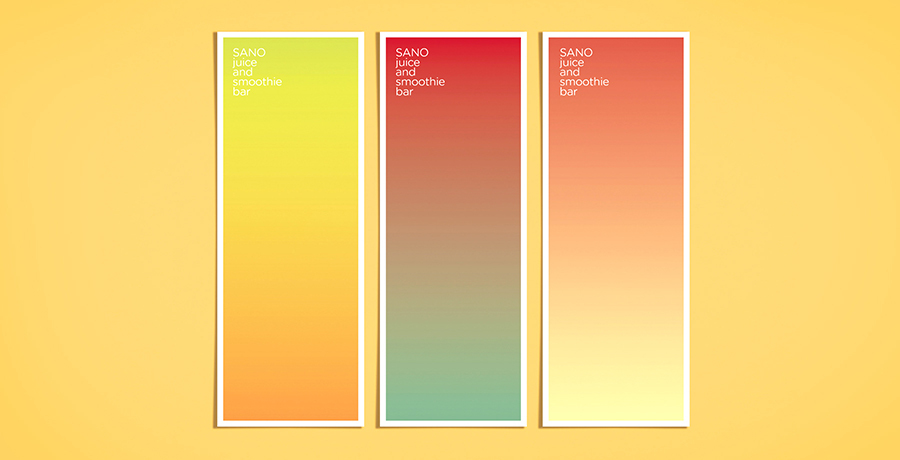
Not living the ever so beautiful and natural menu of the Sano juice, the creative menu is mainly designed by the Marina Soto. She has used some gorgeous and super attractive color gradients on one side of the menu; the other side is as appealing, which features the mono-weight illustrations along with the rounded sans serif type. The overall menu is so pretty that you cannot stop yourself from ordering there.
Ragu cafe- Novosibirsk

The overall cafe was designed by a vast team of the Russian designers, but its menu is somewhat different and attractive than the others. They have used the minimal yet lively photographs to alert diners about the look of their food before they order them. Well, this is the trick that most designers must adopt it today.
Hubbly Bubbly- Orlando
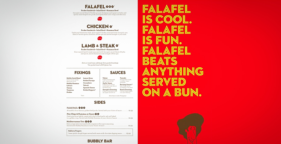
The adorable menu of Hubbly Bubbly was created and designed by the famous Florida based designer Mark Unger. Hubbly Bubbly is the famous falafel restaurant in Orlando. The designer has made the use of creative colors, and other aesthetics are simply perfect for the local and small business.
Interesting for you: How to Create a Strong Impression by Using the Visual Hierarchy Principles?
Montero- Mexico
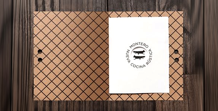
One of the most known branding agency Anagrama designed the menu card for the Montero; the result of their creativity would stun you and is the proof of the agency’s good work. The designers glorified the traditional kitchen values by taking the full advantage of the local raw materials.
Holy burger- Spain

The main idea behind creating the menu for Holy Burger was to develop a real America style brand with a new mix of style reference. The immediate references came from the various old school handwritten American typographies that are presented in the old shop windows and a banana leaf wallpaper that was designed in 1942.
Conclusion
A very little thought has always been given to the menu designing from the customer’s perspective. However, the menu designer and the restaurant owner has to put in a lot of thought and take a lot of things into consideration before finalizing the one design. Each design has one purpose behind it, which is to make the customer order as much as they can.
The main idea behind this article is to help the amateur menu designers and the inexperienced restaurant owners create an alluring yet minimalist menu for their restaurant. Attractive menu designs can improve the dining experience, help diners make better choices and arouse appetite. Nevertheless, a menu is a lot more than just a list of dishes the cafe serves; it is a tool of advertisement which communicates the identity and drives profit of the restaurant if it is designed correctly.
Get a Free Quote
+1 845 3770255
Call on anytime
To discuss your project
Featured articles:
Topic Categories
Interested In
Logo, Branding & Creative Work?


 We’ll get back to you in 24 hours
to address your needs as quickly as possible.
We’ll get back to you in 24 hours
to address your needs as quickly as possible.
 We’ll prepare an estimation of the project
describing the team compostition, timeline and costs.
We’ll prepare an estimation of the project
describing the team compostition, timeline and costs.
 We'll perform a free website review
If you already have an existing website.
We'll perform a free website review
If you already have an existing website.


