How To Make A Creative Brochure Design
Wondering how to make a brochure? Here’s all you need to know about how brochure designs work. This will help you understand industry best practices.

Disclosure: This article may contain affiliate links. We earn a small commission at no extra cost to you.
Making a creative brochure design that aligns with your marketing strategy is essential to creating brand awareness and getting leads.
A brochure is one of the many ways you communicate with your customers.
What makes the brochure a different platform is that it provides physical space to present your entire brand personality, what you have to offer, and what you stand for in one place.
Other channels support one aspect or another, but hardly all together.
The question is, how do you utilize that space well enough to bring in customers?
There are many steps to it, and we’ll outline all of those here, starting with the first and foremost step of the journey, knowing your customers.
Know Your Buyer Persona
Making a creative brochure design is a part of your marketing, which means you have to do the same groundwork for a brochure design that you might’ve done for the whole strategy.
Knowing your buyer persona is the first step of every marketing plan, whether it is a multidimensional marketing strategy, a linear journey, or a simple graphic design that you want to put out there.
So what is a buyer persona?

A buyer persona is a representation of your ideal customer – the one that will most likely buy your product or services, or the one that you intend on selling to.
It is not something you create out of nowhere. You have to step out there, research which type of people want your product or service, and map every detail you can get about them.
Let me list down some of the main questions to start with once you have identified people who would buy your product or service. These are brochure specific questions.
What compels them to buy your product or service, or any of its alternatives?
What are their favorite colors?
What kind of personality are they attracted to?
What kind of style or tone do they expect from you and sellers of similar products or services?
What type of brochures do they come across in their daily lives?
Do they like most of those brochures?
Do they like more text on the brochure or the visuals?
What type of brochures do they keep the longest?
What makes them want to keep a brochure?
What turns them off when it comes to a brochure design?
What kind of attitude do they like?
There’s a long list of questions you might need answers to, but the ones above can serve as a good start for you. Knowing what your customers or target audience wants is crucial to creating a good brochure design and developing an attractive brand personality.
Align Your Brand Personality With Buyer Persona
Once you’ve done your research on buyer persona’s preferences, you need to align your brand personality with it.
Now you may be wondering what brand personality is. This is a very interesting aspect of your marketing strategy.

Brand personality is what makes your brand appear human, relatable, and interactive.
It is the aspects of your presence that set you apart from other brands and make others perceive you as another fellow despite being a whole big organization.
In other words, it makes an entity appear sentient. And if you’re not aware of it already, that makes you approachable and relatable to your buyer persona.
So when setting a tone for your brand, consider what human attributes your target audience is drawn to the most, and then adopt them.
Do your customers like a witty and mischievous tone? Or do they like a more sober impression of you? Do geeky things appeal to them? Or are they more into carefree and casual settings? Do they like sass? Or do they expect a humble tone?
The personality type they are attracted to the most is the one you need to be, and that is what you have to portray through your brochure design.
Draft Your Message
I know it sounds too early to create content for the brochure, but creating a detailed draft helps you figure out what type of brochure will do best for your value proposition.
Outline the text you want to write on your brochure, and keep the common format in mind. The front page normally carries an introduction or the name, and the back cover has the contact information.

Highlight the points you cannot compromise on because this content will be tweaked and edited to fit the brochure design along the way.
You can decide what needs to be on the front page and what should be on the back at this stage. The clearer the outline, the better idea you will have about the type of brochure you need.
Types Of Brochure Designs
You know your buyer persona, you’ve aligned your brand personality with their taste, and you’ve drafted your content for the brochure.
Now let’s check out some common types of brochure designs so you can pick yours or come up with something new.

There are many different ways you can present information through your brochure. You can make a single page flyer, or you can create many surfaces out of it and divide the content into sections.
You can create folded brochures, make booklets out of them, or you can also make entire folders if you get more creative. Let’s talk about as many possibilities as we can.
Flyers
Flyers are usually one-page brochures that aim for brand awareness. As the name suggests, they are light weighted and often found flying around.

Their distribution method is quite a random one. They are handed over to people, slipped into doors, windows, and every place a human can find them at.
Despite the randomness of their distribution method, being discreet and targeting places that have more people interested in the offer is always the best strategy.
Flyers have very limited space and are targeted at people with a really short attention span, so the front page has to be very catchy and bold.
Most of the important information has to be communicated in a single glance. And you can always utilize the backside to include more details for those who are intrigued enough to turn it over.
This brochure design requires your call to action to be on the front side and prominent enough to be seen from a few feet away.
You may like: 21 Stunning Font Combinations For Flyers
Folded
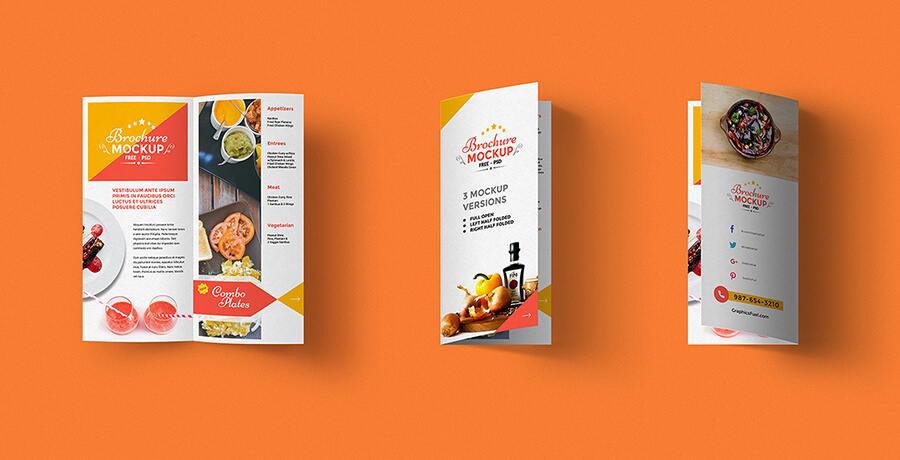
When you need more space while keeping the brochure compact, folded brochure designs are the go-to. There are many uses for folded brochure designs, and many creative ways to design them.

You can fold your brochure in many different ways and make sections out of it that complement your design.
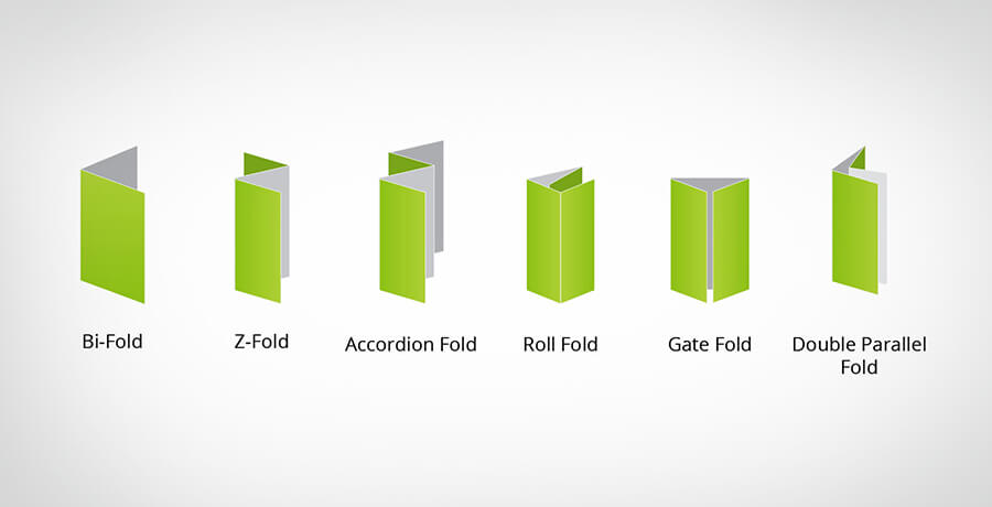
Some of the most common types of folded brochure designs are Bi-fold, Tri-fold, and Z Fold.
Bi-fold
The Bi-fold brochure design is named that way because it consists of two sections that open and close like a book.
The most common type of bi-fold brochure is the one where it is parted from the middle and folded into two halves.
This brochure-type allows you to double the amount of space you could’ve had with a flyer. The catch is that it is not meant to fly around.
The ideal way to distribute this one is to hand it to people or keep it in places where it will be noticed but not mixed with trash – for example, tables, bookstands, near magazines, or countertops.
A bi-fold brochure design has room for both, text and creativity. Ideally, it contains a list of products and services you have to offer on the inside. But you can put anything in there so long as it effectively conveys the message you want.
The front cover contains your name and visual representation, while the back cover contains your contact information.
Tri-Fold
A tri-fold brochure design has three sections, and it can be folded in more than just one way. The standard sheet used in this is 8.5 inches long and 11 inches wide.

Normally, the three sections are equal, but you can choose another size if you have a different plan in mind.
This type of brochure can fit into a letter envelope and can stand upright on a tabletop by using its three sections as support.
As the number of folds increase, so do the ways of folding a brochure. There’s more than just one way of folding a tri-fold brochure.
For the sake of simplicity, we’ll talk about the three most common ways of folding a tri-fold brochure.
Roll-Fold
You can make a roll-fold by folding the third section in and then cover it with the top section over it. It is called roll-fold because the brochure is in a sense rolled in.

This works very well especially when all of your sections are equal in size and appearance. Your space is tripled, and there is weight in your brochure.
This style is also known as the letter fold because that’s how letters are folded to fit in a smaller envelope.
That’s all well and good, but what if you didn’t want all three sections in your brochure design to be equal? That’s what we’ll be talking about next.
Open Gate Fold
An open-gate-fold is the type of tri-fold brochure design where you fold two sections inwards to rest on top of the middle section. As the name suggests, it looks like a gate that’s being opened and closed.

This is done by keeping the middle section double in size compared to sections on the sides to make sure they fit when closed.
You can get creative and add designs on both “gates” to complement each other while the middle section contains important information.
Or you can utilize all sections with different combinations of visual and text content. Sounds great, doesn’t it?
What if you wanted all sections to be the same size but still look a little creative? Roll fold can sometimes look too mainstream and dull.
Z Fold
Z-fold, also known as the accordion fold is a brochure folded in a zig-zag manner. This brochure design makes you look perky and thoughtful.

A brochure design for this type of fold can be tricky in terms of predicting which section will fall on what side. It is better to test it out on a blank sheet first.
French Fold
French fold helps you create a very compact, pocket-friendly brochure design. It can be folded to a quarter of its original size.

It is created by folding a sheet into two halves and then making another fold to divide it further into quarters.
In more complex French folds, the sheet has a grid of folds. It can be divided into six, eight, twelve, or any amount of sections practically possible.
These types of brochures come in handy when you have a lot to say, or many diagrams to show, for example, an instruction manual, or a step by step journey outlined on paper.
Each section can target a different customer segment of yours, and it can be folded into a small piece of paper without ruining its style.
Multiple Folds
If you’re into origami, you can turn a simple piece of paper into a work of art. And that skill, in particular, will take your brochure places.
You can get a little playful and print out a brochure design made to be folded into something magical. Possibilities are endless when you push the boundaries.
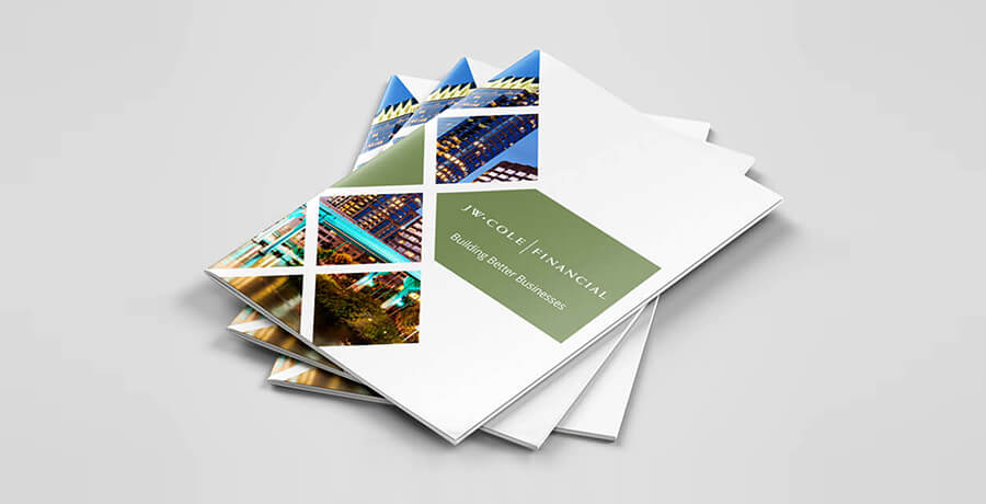
Booklet
When you bind some bi-fold sheets together, it forms a booklet brochure design. It can start from just two bi-folds – giving four pages of space – and go up to any number you deem fit.
That means you can possibly form a twenty-page brochure for your company or business.

It is lengthy and expensive, but it can be worth all the resources in certain situations. For example, you can use it for events like exhibitions where you’re looking for long-term business clients or partners.
A booklet of this kind comes in three different bindings. These are important to know because such details set your tone and brand personality.
Saddle Stitch Binding
A saddle stitch binding is where you pass a thread or stapler pin through the fold of your booklet.

That means you take an open booklet, with all the pages aligned, and pass a needle with thread through the middle of it – or staple it from there.
This type of binding is almost invisible, and it appears like a pamphlet most of the time. Though the threads and pins can be felt and seen when picked up.
Perfect Binding
Perfect binding is much more subtle and it is completely invisible. It requires a cover in most cases.

The bi-fold pages in the booklet are glued together to form the perfect binding. It is a delicate process, and the booklet has a higher chance of falling apart.
It complements a brochure design when it is meant to be kept in a finer environment with high maintenance people handling it.
Spiral Binding
Spiral binding is by far the most durable type of binding. All the pages of your booklet are aligned, punched holes in, and a wire spirals through them to bind them.

This type of binding allows free movement of the pages, making it easier to handle, read, and keep. It is common among notebooks for the same reasons.
Folders
The brochure folder leaves a solid impression on the audience. If you’re a company that offers long-term deals or high-end packages, like an institute, law firm, or real estate company the brochure folder will do you justice.

This brochure design not only offers your information but also convenience. It has room for carrying other documents. You have the opportunity to include a whole package of promotional materials in it.
It is useful, neat, and long-lasting. If your target audience consists of people who deal with a lot of paperwork, a brochure folder is likely going to be in their possession for as long as it can last.
Be Sure To Leave Margins For Each Fold
Every crease on paper takes up some space. If you don’t keep that in mind while adding content to your brochure, a lot of your content will be hard to read when parts of it will be hidden in crevices or the folds.

The best way to prevent your content from disappearing into the nooks of your brochure is to leave a margin on each side of the fold as a part of your design. That will give a clean, centered copy.
You don’t have to leave white space in the margins, your entire brochure needs to have a continuous design as a background for content, but the format of your content shouldn’t overlap the margins.
If you’re planning to get a booklet, be sure to leave a good margin for the binding so people don’t have to stretch it out for better visibility. It will prevent holes from being punched into your text or headlines.
How much of a margin should you leave on each side of your folds? That depends on many variables. This is why you should always test it out on a mockup sheet.
What Suits You – Test On Paper
If you want your results to look exactly like what you’ve designed on screen, or even if you want to experiment and come up with ideas, get a mockup sheet.
The paper you are handling should have the exact same dimensions as the brochure you’re planning to design or print. The quality too should be as similar to the original one as possible.

Start by folding different sheets up in styles of your planned brochure designs, be it bi-fold, tri-fold, French-fold, or any other design you’ve chosen.
Once you’ve done that, observe the points where the paper starts to straighten out and mark how far away it is from the crease of the fold.
Draw a margin on that point, and repeat the process for each fold. Generally, the measurements turn out the same, but you can’t be so sure about the ones where creases cross or overlap.
Either way, to be on the safe side, go for the maximum distance it takes for the curve or the crease to end, or for the paper to straighten out after the crease, and use that measurement for the margins on your digital brochure designs as well.
With margins outlined, you can finally get a better understanding of the amount of space you have for your content.
You can draw blocks or types of content on the mockup sheets to see what looks better on paper, or you can just try it out on your software.
A mockup design will help you understand which sections of your digital brochure designs will fall on the cover page, what will go inside, and how the back cover will look.
Speaking of looks, you should definitely focus on a good color scheme!
Color Scheme
When choosing a color palette for your brochure design, you have to keep a few things in mind. First and foremost of which is your brand’s theme. What color is your logo? Which colors do you usually use to identify yourself?

If you have a certain set of colors in your brand’s theme, you should make sure the colors of your brochure match that theme and identity.
If you haven’t already, you should consider the two most important things while deciding the color scheme for your brochure design.
- Your buyer persona’s favorite colors.
- What emotions you want to trigger.
Adding your buyer persona’s favorite colors would help you catch and retain their attention.
Keeping emotions you want to trigger through your brochure design in mind will naturally pull you towards a set of colors that evoke that emotion.
But you have to keep their backgrounds and theory of color in mind. Which color evokes the emotions you plan to target in the particular group you want?
A brochure is normally quite simple when it comes to colors. Ideally, it is made out of two to three colors. Anything more than that seems too distracting or mixed.
So the choice of color needs to be narrowed down, and if you’re still going through a dilemma when it comes to a few color schemes, you should resort to A/B testing for accurate and bias-free results.
Fonts
Just like every other detail in your brochure design, fonts play a massive role in developing the impression you want to give off. The right choice of fonts can provide a seamless experience to the reader while still appearing impressive.

When it comes to a brochure, you should choose no more than two typefaces or fonts – one for headlines, and the other for normal passages of text.
Your font should be clear and readable. Its color should have a good amount of contrast with the background to make it easy on the eyes.
The size of your text should be big enough to accommodate weak eyesight. In fact, it should stand out enough to be read from a fair distance.
One experiment you can carry out to test that is to place the written copy on a table the height of your knee, stand up, and try to read it.
If you find it difficult to read, you should probably make the text a little more prominent and readable to make sure your targeted reader doesn’t have a hard time with it.
You should check: You Are NOT a Designer If You Never Used These 41 Fonts
Visuals And Imagery
Visuals and Imagery is the basic and most important part of every brochure design.
You can’t make a catchy and impressionable brochure without good pictures and aesthetic visual elements in it.

Some brochures have images and design elements in between or immersed with the content, while many others use photos as background for their brochure designs to appear more interactive, realistic, and modern.
Many graphic designers use combinations of both types of imagery in their brochure designs to keep viewers interested.
Either way, you have to use attractive pictures to draw them in, and those pictures must be relevant to your audience, brand, and business.
This is where insight from your research on the buyer persona will help you a lot. It can make you choose images, textures, and designs that your target audience finds relatable, appealing, and intriguing.
Aside from that, your visuals should align with your strategy. They should precisely target certain feelings that you plan to evoke. This is an important part of making the right brochure design.
How To Make The Right Brochure Design?
By now, you are aware of the common types of brochure designs, and the variable aspects of most brochures you come across.

The decisions you make from this point on will determine whether your efforts will be fruitful or not.
You don’t just have to create a beautiful brochure, but also make sure it is apt for what you aim to do.
A tech business targeting laymen for their high-end products should focus on visuals that common people from their targeted groups perceive as futuristic.
In comparison, the same business will have to focus more on the accuracy of its design elements when targeting tech geeks for their products.
Moreover, you have to make sure your design carries the message you want to convey. There’s no use for immersive pictures when they don’t reinforce your message.
For instance, if you offer a solution for a common problem, depicting what it’s like to have that problem solved through your product is better than flashy images of complex glowing machinery.
This is part of how consistency makes brochure designs more effective.
Keep It Consistent With Your Brand
What are the key identifiers of your brand?
Is it your color, a certain stamp, a font, a specific shape, a style, or an object? The key identifiers of your brand should remain consistent in your brochure.

Your brochure design should match your overall brand’s theme and personality. The theme used in your merch, digital profiles, logo, physical premises and every other space owned by you should be the one for your brochure.
Keeping is consistent shows ownership of the brand and reinforces the brand’s association with the key identifiers.
Along with that, the brochure design should match your brand’s personality. If you’re a playful brand, you should show it in your brochure through round curvy objects and a witty design.
If you’re formal, go for a more organized and professional approach. Your brochure design determines how the viewers perceive you, and the first thing they look at is the front page – which is your cover.
You should also read: Color Theory and why it is Important
Make Your Cover Page Catchy
The front page of your brochure needs to be very attractive to make people turn the page or look at it for long enough to register all the details.
There are many ways you can make your cover eye-catching. One of them is to make it look like a portal into the world you have to offer through a vibrant picture covering most of the page.
Another way you can make your cover stand out is through a bold approach. You can come up with one of the most striking contrasts, and use that on your front page.
For example, take a hue from the theme of your brand and darken it, then pair it with another color of your brand or simply white color.
With that palette, you can use one color as a background and another for text, shape, patterns, or design. The use of bolder fonts will come in handy. Or you can mix and match pictures and your color palette to deliver the result.
A good way to check how well a job you’ve done is to put your brochure on a rack or a table with many other brochures beside it, then leave the place for a little while and forget about the design.
Come back after some time and see whether the brochure catches your eye from a few feet away among all the other brochures of your competitors.
Does it stand out enough for your hand to automatically prefer it over others when reaching for a brochure?
If your answer is yes, well done! If it’s a no, tweak it, or redesign it. Your brochure design needs to stand out among all the brochures it will be around.
Be Different
Every brochure design is different. And it is our little quirks that make us unique. Those unique traits attract people who enjoy the differences.

Being different at random is not what you should be doing unless you’re in an experimental phase. You have to be discreet about the traits you want to adopt to appear unique.
Is your brochure unique in terms of functionality? Does it have a certain design that no other brand has ventured far enough to adopt?
Is it useful in terms of other aspects to stay longer in a receiver’s possession?
This is another reason why you should know your customer. The insights from your research should be able to guide you in terms of what kind of differences appeal to your audience.
Keep Your Customer In Mind
If you want to give off a certain impression, you should pay close attention to your target audience’s perception.
Want to appear crazy? How do your customers define crazy? What type of crazy do they like? What will pique their interest?
These are not the only questions you should be asking yourself. Since brochures need to offer a set of perks to stick around in a purse for longer, you need to know what perks will work for you.

If your target audience is tourists in the city, having a map and useful information on your brochure will make many of them keep the brochure for longer to assist them in navigation.
But the same map might not work for locals who know most of the routes like the back of their hands. In that case, the brochure may end up in the trash after just one look.
For locals who frequently go on trips, you can add time tables for places on their peak in terms of tourism, and offer fun facts about them.
If a group is religious, you can help them out by outlining timings or ways of their ceremonies or mark their places of worship on a map as a guide for them.
Make sure the perks you offer align with your theme or the culture your brand represents. Your brochure-type should be able to accommodate the added benefit.
Choose A Brochure Type That Complements Your Content
The content you intend to put in your brochure design should look like it fits the brochure naturally. It should never appear forced, or worse, inadequate.

If you choose a picture extending over all the inner sections of a trifold brochure, you may want to opt for a roll fold to make things simpler.
If you want your brochure design to appear more interactive, you can use a gatefold, and style both gates with patterns completing each other, while the inner section acts as a window to a new place.
The content you have and the brochure type you pick should fit perfectly well with each other. Most importantly, it should drive your customer to action.
Focus On CTA
Call to action is the entire point of your brochure. Make it as prominent as possible without appearing spammy or desperate.

Since your brochure is mostly distributed physically, you can’t give links to websites, or provide options to click on certain buttons.
But, you can give out shortened URLs, contact information, and addresses for customers to pay a visit. You should state your call to action clearly for the viewer to know what they have to do.
If you’re a restaurant, you’re most probably inviting them to dine in or order from you. The call to action should be there on the front page and repeated periodically throughout the brochure in subtle ways.
This applies to all types of brochures, whether they are flyers, folders, booklets, or any other. You can make the call to action more elaborate in your brochure design by placing them thoughtfully.
For instance, if you are a restaurant, you can place ‘Order Now’ around the menu, or on an arrow at the front page guiding the customer to turn it over. You can use your creativity like that in all aspects of the brochure design.
Get Creative In All Dimensions

When we think of a brochure, we tend to focus on the 2D design of it. But creativity can extend to all dimensions of a brochure.
The final product of a brochure design is three dimensional and has a lot going on than we think. Apart from folds, there are certainly many physical aspects of brochure designs that we rush through or tend to ignore.
Getting creative in those can make your brochure stand out, help you reinforce your theme, emphasize on message, or add some quirks of your own.
You can talk to the printing service provider and choose the inks of your liking from the available options and it will add quality to your design.

This will only work if you’re aware of how the inks work and have the background knowledge needed to make that decision or deviate from the standard.
Another aspect you can explore is the paper options. Some are cheap, some are expensive, but the price has nothing to do with what aligns with your strategy.
Paper thickness, weight, and quality in general are the factors you need to focus on.
The thicker the paper, the deeper the crease will appear, and the wider the margins around the creases need to be. Then you can decide whether you want a glossy finish or a matte look.
These are some of the common things you look out for, but there’s more to physical design than that. Explore different types of print finishes and you will know what to choose.
Some are embossed while others add an opposite effect with letterpress. Many types of print finishes are capable of leaving many different impressions on paper and the viewers’ minds.
You can go for a textured design if it is related to your theme or message.
If you want to go over the top and give your brochure design that extra look, you can experiment with and choose different kinds of papercutting to fully make your brochure design three dimensional.
When it comes to design options, there’s no end to delicacy and style. You can just go on and on and still have a lot to try out.
What matters is whether it’s feasible for you, or whether it’s worth all of that. You do have to impress the customers, but also remember how temporary brochures are for them.
You need to find your balance when it comes to brochures.
You may also like: 10 Cool Tips to Design Creative Menus & Some Inspirations For You
Final Word
This discussion aimed to give you a holistic view of how brochure designing works in as simple of terms as possible.
We touched on all the aspects of brochure designing. Now it’s your time to connect the dots, put the pieces together, and get creative with it!
We talked about how important it is to have a detailed buyer persona in front of you as a starting point. Aligning your brand’s personality with the preferences of that buyer persona is the best strategy.
Or better yet! Develop your entire brand personality around what attracts your target audience. Once you’re sure about your brand personality, it is time to draft your content.
Your content goes through many edits, tweaks, and changes throughout the brochure designing process, the idea is to outline what you’re going to put in there, and the message you want to convey through it.
When you have the content ready, you can choose a brochure type that goes well with your content and message.
There are many types of brochures. The most common ones are flyers, folded brochures of different kinds, booklets, and brochure folders.
Make sure to leave a good amount of margins for your brochure types to make your content accessible and readable to the viewer.
Test your pick on a mockup sheet, and make sure to choose the colors that align with your theme and buyer persona’s preferences.
Your fonts play a massive role in maintaining consistency and leaving a subtle impression. Pictures are a crucial part of your brochure design. Use them wisely.
Use all of the information to make a brochure design that gets along with your brand, business, and serves the purpose you actually want it to.
Now that things are much clearer to you, you can start experimenting with different designs. I’d be proud to see you unleash your creative side.

Co-Founder & Strategic Visionary at FullStop
Co-Founder at FullStop, a branding, digital and software agency he started in 2012. Haris works across brand design, digital marketing, and custom development—helping businesses turn ideas into market-ready products.


