Which 7 Fonts I Hate As a Brand Identity Designer?
Discover the worst fonts that every designer avoids to use when it comes to brand identity and logo design projects and save your brand’s identity.

Disclosure: This article may contain affiliate links. We earn a small commission at no extra cost to you.
When it comes to web or logo designing, many people don't give a second thought to typography, not even readers. This sounds like Okey Dokey. Text fonts are the same as the audio in a movie — you don't notice it until it is disappointing.
Font selection is vital to any brand image, and most amateur designers lack this sensitivity( or worse, don't give a damn). However, it is essential to think which fonts can make people feel aesthetically pleased and which fonts make people think, "I hate that, but I'm not sure what's bothering me."
Whether they are overused, dated, or simply look ugly, these fonts need not be chosen ever by you; delete them from your life the same as the phone number of your ex, drunk-texting you.
What is Typography?

Typography is the virtual part of the written word (check this source). As a skilled graphic designer, typography is one of my most cared about elements of a design. Likewise, it is also the one thing that triggers my "irritated mood." when I see blunders and font disasters.
Typography is the art of fonts and typography styles and how they are used in the design.
Excellent typography will take your content and elevate it to a higher level of understanding and significance.
Bad typography will mess up or lose the message altogether.
Unfortunately, I usually come across numerous cringe-worthy typography issues in my line of work. This is most likely when brands are DIY-ing their graphical branding.
I have nothing in particular against Impact or Comic Sans as fonts, but there is a big deal wrong with the way of using them in almost all the situations. The ten fonts below are highly overused and patently irritating. Read the good reasons to stop using them below:
1. Impact

While Impact stands as one of the world's most famous header fonts, there are few things to hate about it when it comes to designing. Though, it's great for instant attention, thanks to its quality of being more comfortable to read and striking. But, It has been misused so often that only a handful of designers bother to acknowledge its existence anymore, choosing to use other high-visibility text fonts.
Here is why you should avoid using it: It is too thin, way also focused, and looks amateurish to stand out.
Impact is the standard pic for office handouts and amateur mailing list things, and you should not use it for a professional logo or public document. Simply avoid it, and go for a typeface that’s more aligned with the values and icon of the logo design.
2. TheSans Basic
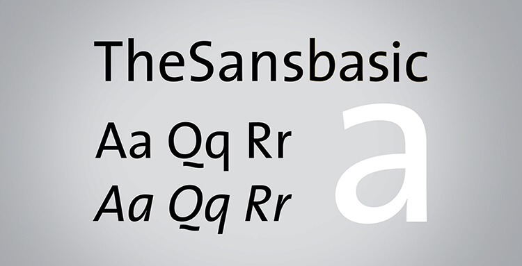
It's not an easy thing to hate TheSans. This font style being accurately spaced and delicately styled, it looks like the flawless font for digital content and brief, snappy copy.
Unfortunately, it gets ruined by the uppercase 'Q,' which isn't styled correctly for such a unique generic, yet versatile and widely used typeface.
Creativity in typefaces looks fantastic: It evokes life into otherwise dull fonts, its flourishes are able to change bland documents, and it even enables designers to focus on individual letters.
But the 'Q' here just isn't right at all. It went overboard with style and ended up looking silly as part of a typeface that's usually of a good standard.
3. Trajan

Trajan, along with the 'laurel leaves' icon, has been dramatically overused in movie posters and other film marketing stuff.
From la-la-land fantasy to indie movies, marketers have been choosing this dynamic combo to create authenticity for some time, and it is starting to take its toll on an otherwise lovely font.
Here's why NO Trajan: It's shipped with nearly every edition of Adobe's Creative Suite, making it most accessible for any designer next door. However, it is an excellent font for occasional headings and small touches, but as an all-purpose font, it is getting to lose its charm a little.
4. Arial
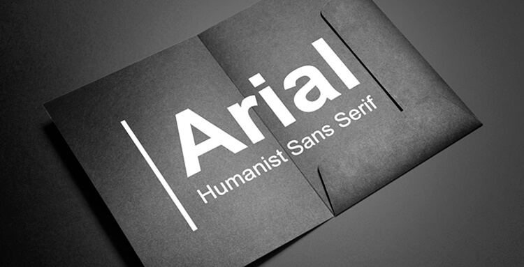
Thankfully, Arial was replaced by Microsoft with Calibri as the default font of Microsoft Office 2007. Arial had enjoyed its peak time for a long time and was once the standard font in all Windows apps. This made it the go-to text font for amateurs and easy-way finders.
Microsoft initially preferred Arial to skirt licensing problems with the older, imperceptibly more favorite Helvetica.
By going with Arial, it bypassed the licensing charges. It got a font that was very comparable to Helvetica, with only small changes, numerous of which are improbable to find when the font is used in body text.
5. Comic Sans
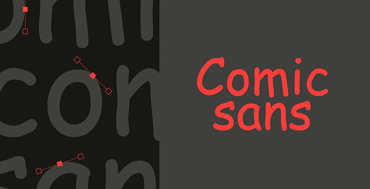
There are little to no fonts as reviled as Comic Sans. This whimsical text font really doesn't do that bad if used aptly. Out of misfortune, the whole corporate world seems to choose it for "Do not enter' signs, product release, and even scathing sports rebukes.
Comic Sans is excellent for kids' products, party invites, and (gasp) comic books. It isn't the best font for product announcements, funeral invites, and termination notices. This is a classic case of a reasonably fine font gone bad because of over-usage, outright, and misuse with sheer stupidity.
6. Franklin Gothic

I totally get it: You want your website to resemble a newspaper theme. Franklin Gothic is a supreme font with so much potential to look good. But, it is all too frequently misused by newbie designers who want to make their website look all "classic" or bloggers who are desperate for credibility.
Franklin Gothic is fantastic for headlines, short questions, and other small design elements. You should never use it for a whole website. While this genuinely exemplary offline font, Franklin Gothic is overused too frequently to be a staple of the web.
7. Helvetica
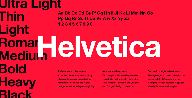
Only a few designers would put Helvetica on this list. This font was designed back in 1957 and used by some world's tech giants such as Apple, BMW, and NASA. It is one of the most visible sans-serif typefaces in advertising and print.
For most logo creators, that is a statement to its value and versatility. But it's also a reason not to go overboard with it.
Like others listed, Helvetica has become too overused that it lost its uniqueness. When you intend to grab attention or emphasize some words, Helvetica is no longer your go-to font. Having said that, the font is still great if used correctly.
8. Bradley Hand (and Other "Handwritten" Fonts)
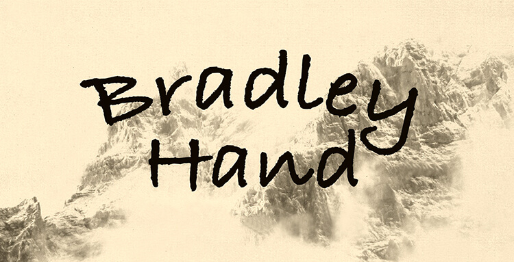
The reason why handwritten style fonts are introduced is that these fonts depict personality in a very natural way that fonts such as Arial cannot. Speaking from real experience, they come off as kitschy and inauthentic in some styles, which ultimately says a lot more about your taste than your content. This means your worst taste in font overshadows your quality content, even if your words are full of wisdom.
This font is one of the worst offenders to date: A very cheap font, used in too many invites and personal greetings to slip under the radar. But, all those other handwritten fonts are annoying on an equal level, same as many tacky-script-style fonts used in party invites and gift-shop signage.
9. Courier and Courier New
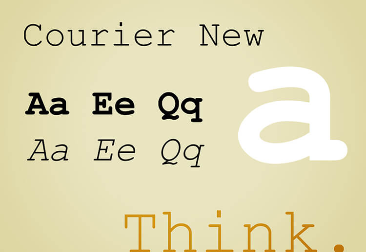
Courier looks suitable for specific uses: screenplay, plain text documents, and codes. But it's typewriter aesthetic and disproportionate lettering make it inappropriate for web designers. Don't think it is a design element font, just don't. If you want paramount readability, such as in code, then it is good to go with Courier. But, when it comes to the web, it reeks of a 12 years old angst-ridden Geocities site mainly set up in neon color.
10. Papyrus

Papyrus surpasses all the bad fonts and holds the status of the king of awful fonts. More childish, kitschy, and next-level irritating, this ugly piece of typography has made its way into everything from movie posters to logos for credit unions.
It is seen as a universal annoyance that now there are several anti-Papyrus blogs out there.
As with Comic Sans, don't use this typeface if you want your content to be taken seriously. Unlike all those other typefaces, though, Papyrus isn't the king of bad fonts because it is overused. But, because it just doesn't look right or is a pain in eyes for readers. Cheap, kitschy, and vile, this font has no place in your design.

Co-Founder & Strategic Visionary at FullStop
Co-Founder at FullStop, a branding, digital and software agency he started in 2012. Haris works across brand design, digital marketing, and custom development—helping businesses turn ideas into market-ready products.


