Famous Fonts you need to know about!
Do you find it difficult to choose a font? Let’s begin discussing famous fonts for your branding and design matters and create something appealing and beautiful.

Disclosure: This article may contain affiliate links. We earn a small commission at no extra cost to you.
Their significance in design cannot be ignored and they can easily make or break your entire piece of art! Though fonts may have used writing as their platform to introduce themselves, their era of fame began when brands and designers realized the importance that fonts possess with regard to their design!
As a designer most of you might know about famous fonts, their names and where they are used like the back of your hand. But where did these fonts you’ve gotten so familiar with actually come from? Not out of thin air of course! No Big bang theories apply here and hence the real credit for making your design-life easier goes to the font creators. Here’s the irony though, many of these typefaces were initially created only for newspapers or word documents. Who knew they’d be ruling the design arena as well?!
Some of the most iconic fonts have a rather interesting history with dare devil font creators who bequeathed their masterpieces to us.
Let’s begin the Font Tour with some of the most iconic fonts and their inspiring font creators:
Times New Roman
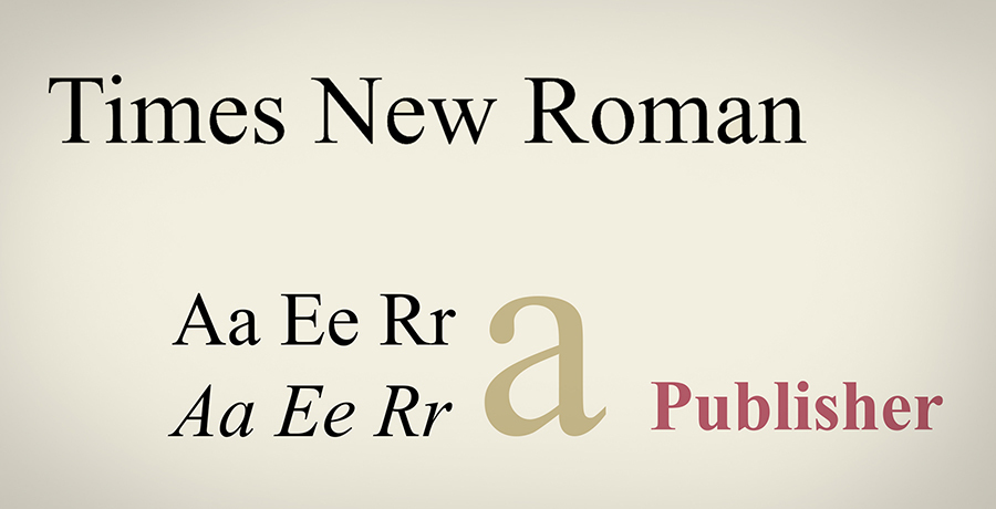
Typeface style: serif
I thought of changing the font here as a tribute. A much adored font by writers and designers alike, Times New Roman has been here from time immemorial! Or so it seems due to the fact that we’ve known this famous font since the day we had our first typing lesson. However, let’s time travel back to England, 1931 because that’s where and when this font actually came into being.
You’d be delighted to know (especially if you’re someone who doesn’t refrain from dishing out relevant criticism), that the Times New Roman was originated after Stanley Morison, pointed a finger at the Times newspaper, claiming that their font had poor readability. Morison, together with Times’ designer Victor Lardent thus created Times New Roman, a font which was easy to read and classy to look at. Don’t we all agree?
Popularity status: Microsoft never lets go of it as the font is included in every version (new and old), authors may use this font often for their novels while it is amidst the most iconic fonts, used by newspapers worldwide!
You may also like: 27 Best Cool Minimalist Fonts for Professional Design
Helvetica
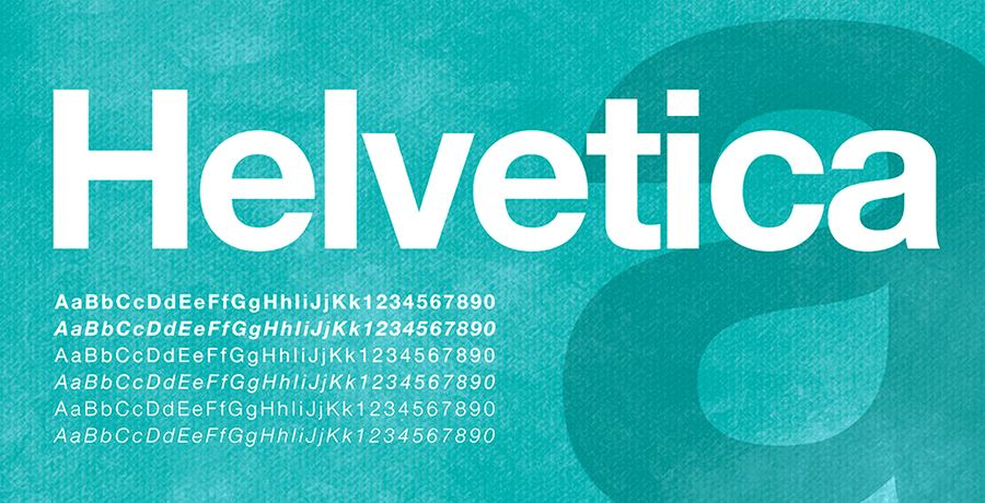
Typeface style: sans-serif
Let’s take a trip to Switzerland, 1957 when Max Miedinger, the co-creator of this famous font was pursuing to be a painter but was discouraged into becoming one, by his father. Miedinger switched to type design and 30 years later, along with his partner Edouard Hoffman, became the originator of one of the most iconic fonts which serves multiple purposes in advertising today!
Quick trivia: the font was originally known as Neue Haas Grotesk and really the font isn’t that complicated.
Popularity status: Helvetica has been unofficially awarded as the font we see most due to its utilization in various advertising mediums inclusive of logos such as the Crate & Barrel logo, the public signage such as the New York Subway, part of brand identities like Nestle and the airlines Lufthansa, as well as technology (the new Apple versions use Helvetica Neue as their primary font).
Bodoni
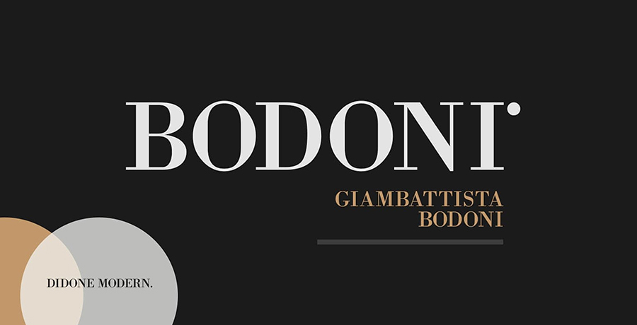
Typeface style: serif
We’re going to the place that’s not just famous for Pizza! Italy is home to one very famous font, renowned for its elegance and named after the creator himself, Giambattista Bodoni! In 1978, Giambattista was bestowed with the noble position of typesetter to the dukes of Italy. Yeah! The font you’ve been using for all your luxury artworks is actually royal in descent. Coming back to Giambattista, the dukes were so in awe of his works that they persuaded him to start a printing press. Soon he earned the title of “Designer to the king and king of designers”. Soon after his demise, his regal typefaces were combined to create another iconic font, Bodoni.
Popularity status: ever laid eyes on the very famous Vogue magazine? That’s how famous this font is! In advertising, Bodoni gained a very prominent position as SEC-A focused brands such as CK / Calvin Klein, Giorgio Armani, Elizabeth Arden and many more used Bodoni as their primary font for their magazines or advertising campaigns. This one’s literally a STAR!
You may want to see: Designers Most Hated Fonts
Futura
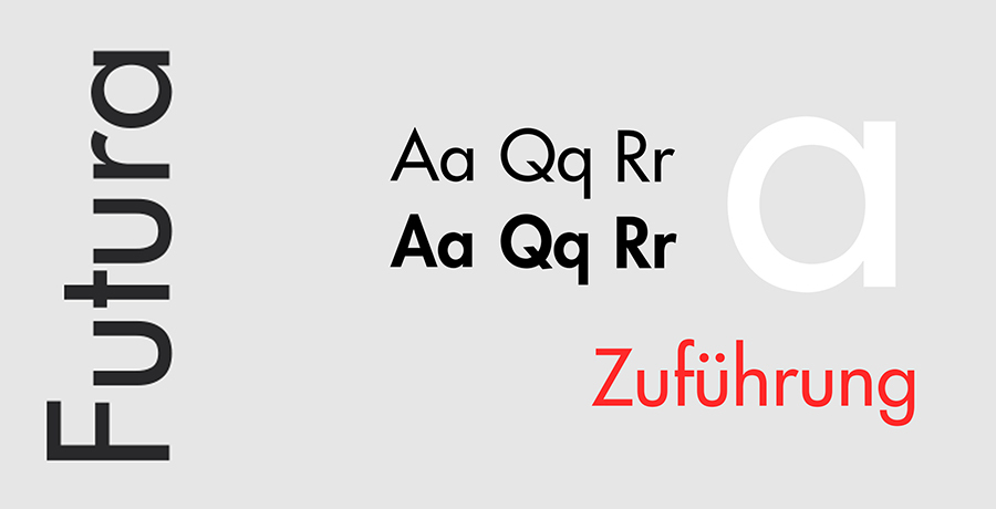
Typeface style: geometric sans serif
Moving on to Frankfurt, 1927 where the Futura font was created by Paul Renner, the font was amidst the first geometric sans serif fonts to be invented. Having said that, the font was derived from the Erbar font, an original by the Ludwig and Mayer foundry. Renner designed Futura as a result of his despise towards fonts which were unbalanced, grotesque or just old-school. Hence, aiming to create a font which was futuristic and could be used for times to come, Renner designer the Futura font as a contribution to the new Frankfurt project.
The font is truly a work of art, based on simple geometric forms (Triangles, squares and circleS) with finely even stroke weights with the exception of some letters such as lowercase a. The Roman capitals make it standout from other geometric san-serifs, giving Futura an elegant and distinguished look.
Popularity status: The font has been used in a wide variety of graphic design material such as logos and websites but its popularity is more evident in being the go-to font of famous movie directors such as Wes Andersen and Stanley Kubrick. The font has also been used in the recent Oscar winning film Interstellar. The font has made it to the Oscars people! An inspiration for font creators, Futura has left its mark in the fashion industry as well! Calvin Klein’s logo uses light Futura while Dolce and Gabbana’s font too is a variation of the original Futura font.
Popular much?
Garamond
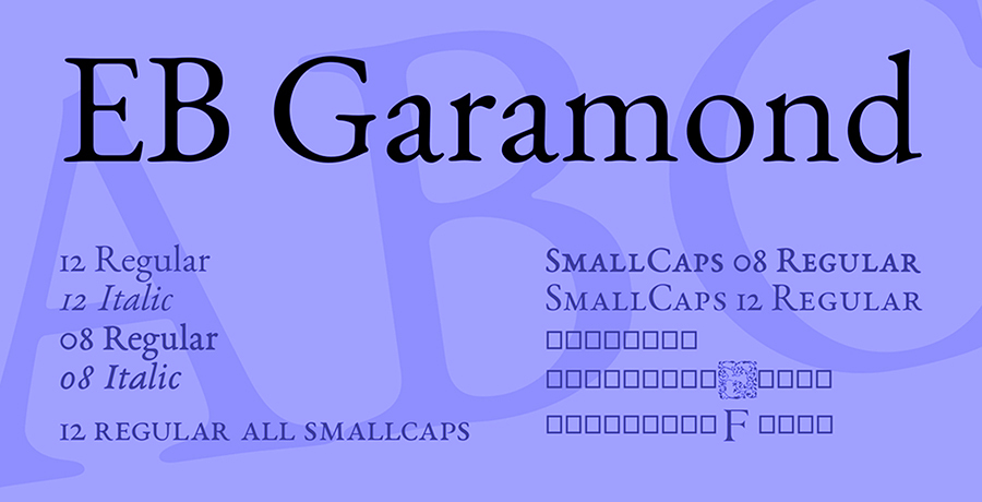
Typeface style: old-style serif
Taking a trip centuries back into the 1530’s, a font in France proved that some works of art are timeless! Garamond is amidst the oldest typefaces and of course amongst the most iconic fonts, used till date. This was a time when social and political disruptions were aplenty in the country and so novel typefaces were required to create an impact. After the font creator Claude Garamond passed away, the font was adopted as a means of effective communication by the French and German and has survived the test of time.
What’s worth noticing is that the Garamond fonts we see today (yes plural) are actually variations by designers, of the original font created by Claude Garamond back in the early 16th Century. If you’ve ever come across a period film you may notice the writing had a very calligraphist look. Claude on the other hand created a typeface which was simpler and more readable.
Popularity status: Though variations have emerged, they all sprout from the same seed: Garamond! Font creators have been designing multiple versions of Garamond like Adobe Garamond and Garamond ITC. The font is still used widely in copies for advertising, books and even political campaigns.
Interesting for you: 32 Font Combinations to Design Outstanding Business Cards
Univers
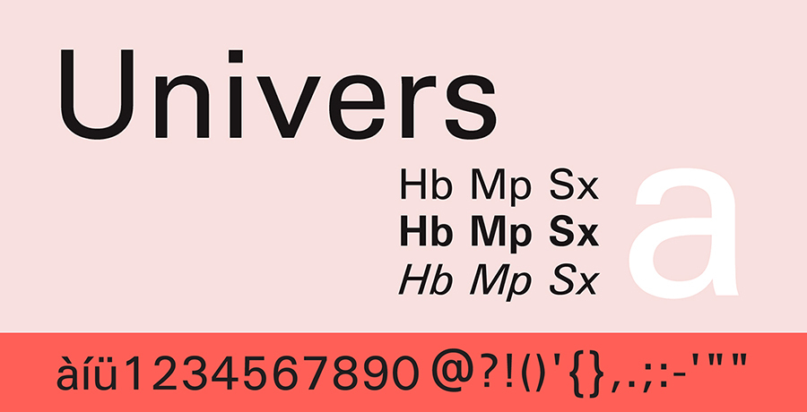
Typeface: sans-serif
Amongst the many famous font creators, is Adrian Frutiger a Swiss Designer who created a family of multipurpose fonts which are used quite often even after more than a century of their creation. Designers may not be unfamiliar with the very synchronized and “corporate” font, Univers. Initiating his work is 1954, Frutiger completed the design in 1957 and presented a font to the world which had great potential and versatility. The Univers font is now a family of 44 variations, used for several purposes. The latest iteration of the Univers font was revealed in 2010 by the name of Univers Next.
Popularity status: Being quite a decent font with no unnecessary adornments to the letters, this font finds itself more noticeable amidst a serious ambiance and amongst the most famous fonts used in corporate branding. Not just that, the font has also made its way into technology used widely in consumer electronic devices. It is also the main typeface which is used by Germany’s Frankfurt International Airport.
Frutiger
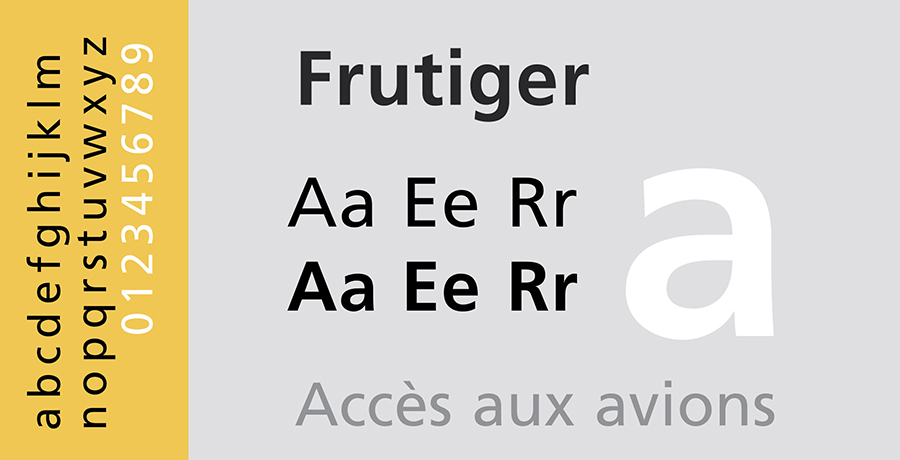
Typeface style: sans-serif
You guessed it right! The name says it all. Adrian Frutiger has been accredited as the creator of another famous font, still in use today, known as the Frutiger font. Seems like France is a font-favorite. When the Charles De Gaulle Intl. Airport at Roissy (France) needed a new directional sign system, it was Adrian Frutiger who was appointed in 1968 to change things. The task was simple but Fruitger was an artist and instead of extending the Univers font family he simply designed a new font altogether. He thus created Roissy in 1975 later to be known as the Frutiger font family.
Popularity Status: Due to its contemporary yet simple design, Frutiger is used in a variety of advertising content and is also an official font for many universities or colleges such as Claremont McKenna College and University of Southern California amongst others. Other areas where Frutiger has gained popularity include the corporate identity of Raytheon, the National Health Service of England, the Canadian Broadcasting Corporation or CBC and on road signs in Switzerland. However, the real claim to fame comes from its presence on Euro notes used by the European Union! The font’s rich (pun intended).
Looking for flyer fonts? This resource can help you: 21 Stunning Font Combinations For Flyers
Akzidenz-Grotesk
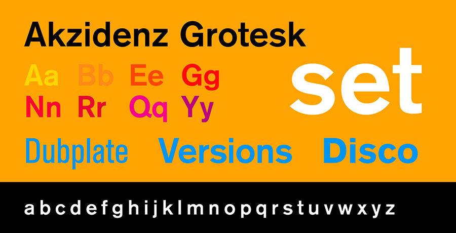
Typeface style: early sans-serif
Many font creators have been given credit for designing this font which is a real tongue twister to pronounce if truth be told, but nevertheless the fact remains that it is indeed one of the most iconic fonts and remains to be amidst the best fonts created till date. Date of origin and the originator are both an unraveled mystery, yet it is claimed that the font was created in 1898 by a designer (unknown) at the Berthold Type Foundry. In 1950 the font was revised and redesigned into the typeface we use today, by the director of Berthold, Gunther Gerhard Lange.
Popularity status: The font is so versatile that it has been used across various industries from medical to sports to advertising! It is the official font for American Red Cross as well as the word mark font for Brooklyn Nets Basketball team. Not just that, it was the most iconic font used in Volkswagon print advertisements in 1960s!
Avenir
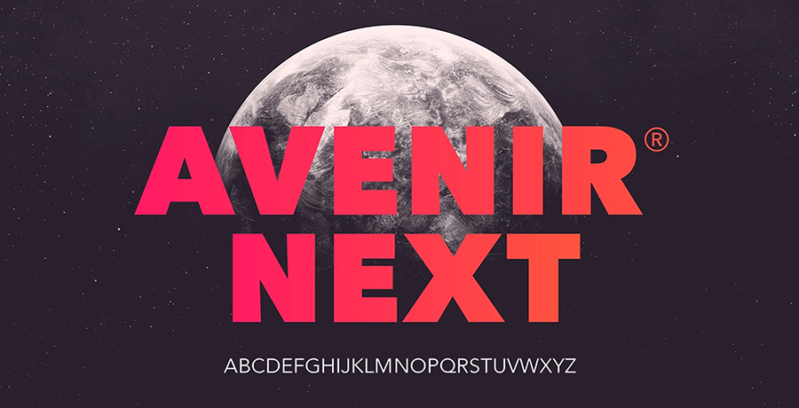
Typeface style: geometric sans-serif
There was no stopping this man! Taking inspiration from geometric sans-serif typefaces such as Futura, Adrian Frutiger couldn’t help but create another font in his later years and thus designed Avenir in 1988, which he himself claims to be his best work.
Popularity Status: The Lord of electronic devices, Apple uses Avenir as its font for maps while a special version called the Avenir Next for Best Buy was created for Best Buy!

Co-Founder & Strategic Visionary at FullStop
Co-Founder at FullStop, a branding, digital and software agency he started in 2012. Haris works across brand design, digital marketing, and custom development—helping businesses turn ideas into market-ready products.


