21 Stunning Font Combinations For Flyers

Disclosure: This article may contain affiliate links. We earn a small commission at no extra cost to you.
Flyers are an essential medium of conveying a message to the public. Whether the message is for marketing or for a public service message, it's appealing nature would make it useful. For making it more compelling, the appropriate use of fonts and characters is necessary. If your flyer has creative images and beautiful background, but the message is not readable, the flyer will lose its purpose. This is the reason why choosing fonts has been a significant task for designers.
Font combinations should be used after analyzing the flyer's overall theme and design to match the fonts with the theme. Before choosing the right font, you have to keep in mind;
- The audience of your flyer
- Your brand identity and recognition
- The aim and message of the flyer
Here, we have listed 21 stunning font combinations that can make your flyer more appealing and attractive. Some of them are for logo designs that can be used by logo designers while others are for the flyers' message, which is the purpose of flyer distribution.
1. Acre and Allura:
Acre belongs to the sans-serif font family and has geometric typeface. Allura is a stylized font and is legible. It's apparent to read. They both work best together while creating a nice, decent, and contrasting look. Sizes of the fonts need adjustment for creating consistency with each other. Logo designers can use this combination while making a custom logo design for the clients.

2. Ayres And Proj Jorge:
Ayres is a font of the sans-serif family. It fits best for the logo designs and flyers related to weddings, fashion, etc. Prof. Jorge is a handwriting font that works well when struck with Ayres. Though it is an uncommon combination and hence riskier too. But, if used correctly with adjustments of the sizes, it looks great.
 Ayres And Proj Jorge
3. Caviar Dreams and Shorelines Script:
Caviar Dreams is a font of the sans-serif category and has geometric typeface. Shorelines Script has a wavy structure and looks like a stylish signature. It is an elegant font that looks good with a restrictive use. Therefore, it gives beauty to the logo design. Shorelines Script has got imbalanced heights and spacing, which provides the logo with a natural look. Caviar Dreams fits best with it for giving the logo a distinct and unique look. Professional logo designers can use this pair for custom logo designs.
 Caviar Dreams and Shorelines Script
4. COM4t and Liberation Serif:
COM4t is a font of sans-serif family and has a decent and straightforward look. Liberation Serif is a font that matches the metrics of Time New Roman and Arial. This combination of the logo designs works as a signature and elegant style. This pair may be an expensive combo of fonts to be used but will give a luxurious look when tied together.
 COM4t and Liberation Serif
5. Dynalight and acre:
Dynalight is a script font that has got a lot of curves and soft turns. It is a great script font and is used for concise messages in flyers to make them more readable. Acre belongs to the sans-serif font family and has geometric typeface. This pair of sans and Script works best for graceful logo designs.
 Dynalight and acre
6. Futura Bold and Souvenir:
Futura is a sans-serif typeface and has a geometric structure. It is excessively used for logos and flyers (main heading and body). Souvenir is also a serif font with a soft and light look. It revolves between thick and thin lines and rounded serifs. This combination is pleasing for the readers besides the fact that the two fonts belong to two different ages created with different purposes.
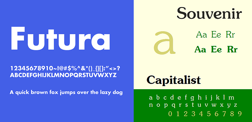 Futura Bold and Souvenir
7. Rockwell and Bembo:
Rockwell is a serif typeface with geometric construction. It has aligned weight and height, which makes it usable for displays. Bembo is also a serif typeface and has an old and classy look. Rockwell can be used as a bold font for main headings that need to grab the attention while the Bembo can be used in flyers as the main body font.
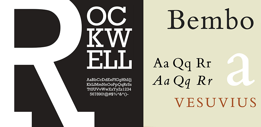 Rockwell and Bembo
8. Helvetica Neue and Garamond:
Helvetica Neue is a sans-serif typeface with a tall x-height and tight spacing between the letters, which makes it easy to read from a distance. Garamond is a font of serif category and has a beautiful cut that invites the reader to stay at your flyer and read it till the message has been absorbed. If the pair is used for the flyer, weights and sizes need to be adjusted for giving an appealing look.
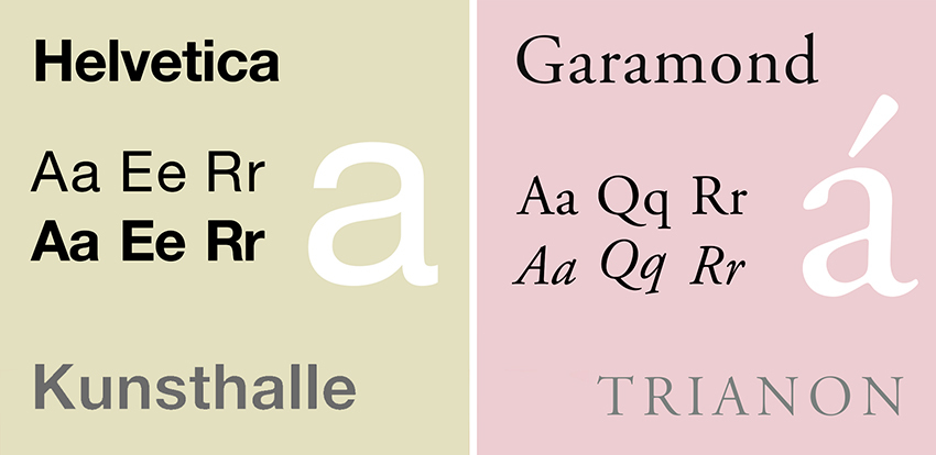 Helvetica Neue and Garamond
9. Calvert and Acumen:
Calvert is a slab serif typeface named after Margaret Calvert, its creator. Pair Calvert Pro in bold-variant with sans-serif Acumen. It works well for the beautiful display and maintenance of sensitive sizes for the flyer.
 Calvert and Acumen
10. Montserrat and Courier New:
Montserrat is a sans-serif font and is a google font. It means it has been created recently for online use. Since it has been created, its use has been widely spread and became incredibly popular. On the internet, for all marketing tools and social media mediums, it is used. Courier New is a serif typeface and has heavier letters that perfectly combine with Montserrat for giving a perfect look to the text of your flyer.
 Montserrat and Courier New
11. Playfair Display and Source Sans Pro:
Playfair font is a stylish design font, while Source Sans Pro is a sans-serif font created in the new era. Playfair is a serif font that is usually used for larger fonts such as headings or attractive punchlines in flyers. By pairing it with Source Sans Pro, the text remains grounded, modern, clean, and easy to read.
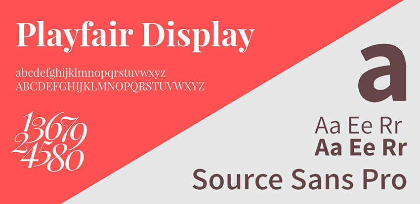 Playfair Display and Source Sans Pro
12. Source Sans Pro and Times New Roman:
Source Sans Pro is a sans-serif typeface and is a google font. It is a font of this era, while Time New Roman is a standard font of Microsoft Word. Though it is an old font and has been played with a lot, it still works best when combined with Source Sans Pro. If the flyer has some popular theme or the slogan, it would be perfect to use Times New Roman for the traditional theme with a modern effect of Source Sans Pro.
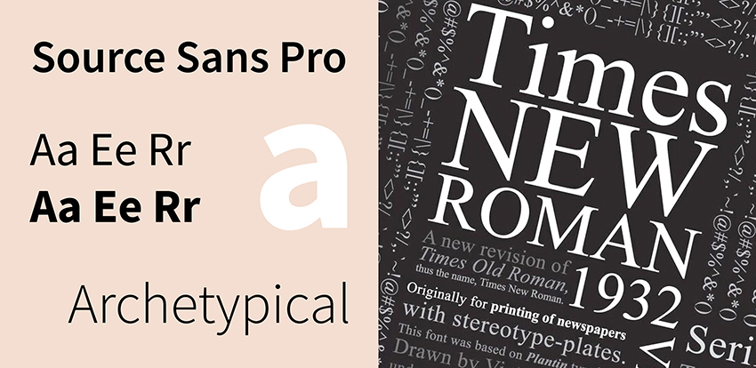 Source Sans Pro and Times New Roman
13. Raleway and Lusitana:
Raleway belongs to a sans-serif typeface family. It is mainly used for large size fonts and headings. It is popularly paired with Lusitana that is the font used for small fonts and large texts, usually paragraphs. Since both of the fonts are of the new era, this combination would give you a trendy feel. If you are branding in a trending manner, this pair is for you, but it is not for you if you are stuck at marketing traditional slogans.
 Raleway and Lusitana
14. Century Gothic and PT Serif:
PT Serif is a serif family font that is created to be used with PT sans fonts. PT Serif has different variants with a large x-height and modest stroke contrast, whereas Century Gothic is a sans-serif typeface and a geometric structure. It also has a large x-height. This combination of serif and sans serif is beautiful and looks elegant.
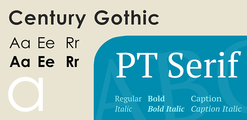 Century Gothic and PT Serif
15. Amatic SC and Josefin Sans:
Amatic Small Caps (SC) is a handwritten web font. It is simple and is used for small texts. Josefin Sans is a geometric and elegant font to be used for larger texts such as headings. It has got an unusual proportion of x-height. This pair is unique and stylish. It works best for logo designs for a music industry or an artistic company. It should be kept in mind that Amatic SC is for small texts, and Josefin Sans is for larger texts. This arrangement needs to be followed.
 Amatic SC and Josefin Sans
16. Super Grotesk and Minion Pro:
Minion is a serif typeface and is an old font released in the 20th century. It is a legible font designed for body texts. Super Grotesk is a sans-serif typeface and a modern font that needs minimal effort to give beauty to the flyer. They indeed make a classy pair.
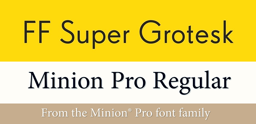 Super Grotesk and Minion Pro
17. Microgramma and Avant-Garde:
Microgramma is a sans-serif font that was designed in the mid 20th century. This font is always used in the bold and extended variants. While Avant-Garde is the font of logo designs, it is a sans font and gives a premium look to the logo design when paired with Microgramma.
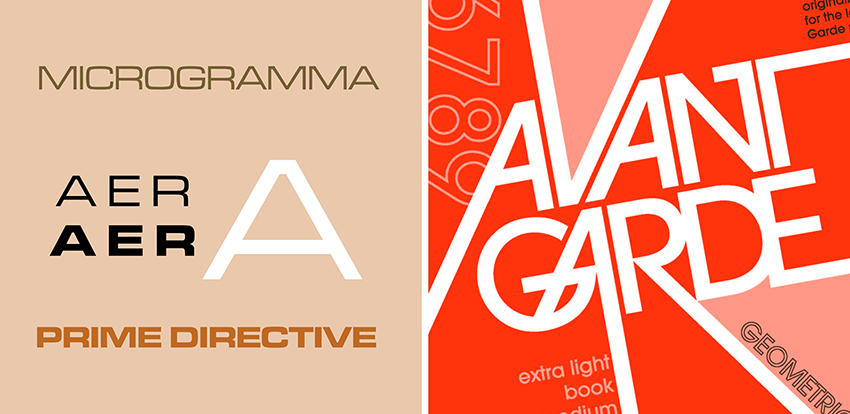 Microgramma and Avant-Garde
18. League Gothic and Montserrat:
Montserrat is a sans-serif font and is a google font. It means it has been created recently for online use. League Gothic is a sans-serif font and is a revival of an old classic and all-time favorite, Alternate Gothic. Both of the fonts have a classy and graceful look and works well for straightforward logo designs.
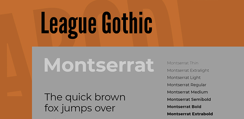 League Gothic and Montserrat
19. Dax Bold and Caslon:
Cason is the serif typeface named after its creator William Caslon. While Dax is a sans-serif typeface widely used as a branding font, it serves the purpose of the bold headings and slogans. Simultaneously, the Caslon's neutrality makes the underlying text legible and appealing to read.
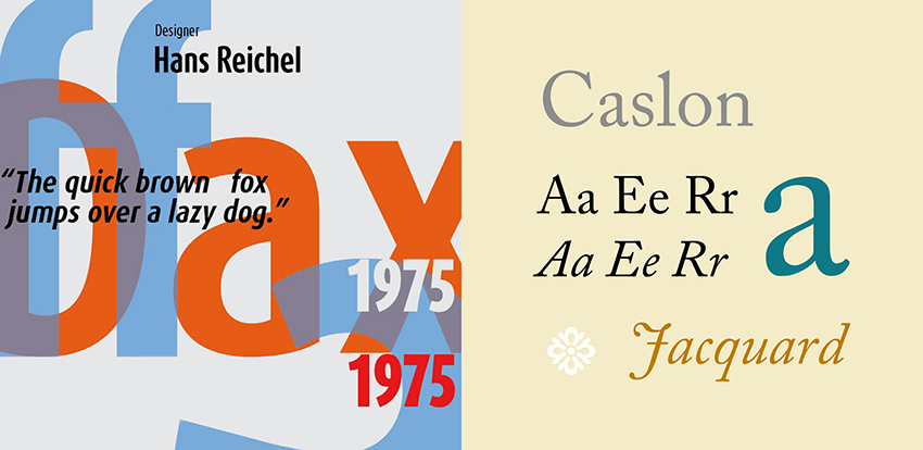 Dax Bold and Caslon
20. Gilroy and Jura:
This is a pair of sans with sans. Gilroy is a sans-serif typeface of the modern era with the geometric structure. Jura also belongs to the sans-serif family and comes with different variants that allow the professional logo designers to adjust it according to the requirements of the logo. For the flyers, if you want your readers to get a feel while reading it, use Gilroy with the extra bold variant for the headings and Jura light for the remaining text to offset its impact and give a trendy look.
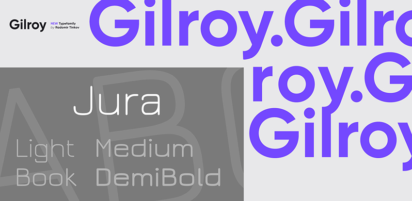 Gilroy and Jura
21. Skolar Latin and Proxima Nova:
Skolar is a serif typeface primarily designed for academic purposes. It has a large x-height and low contrast that makes it a suitable font for the texts. Proxima Nova belongs to the sans-serif family. It is an extremely popular and widely used font in the industry. It is available in different widths and weights and is a perfect choice to pair with Skolar while designing the flyer.
 Skolar Latin and Proxima Nova

Co-Founder & Strategic Visionary at FullStop
Co-Founder at FullStop, a branding, digital and software agency he started in 2012. Haris works across brand design, digital marketing, and custom development—helping businesses turn ideas into market-ready products.


