15 Exciting poster designing tips for the amateurs
Good design posters are a sight for sore eyes, today, business owners all over the world are looking to design the posters that can keep the viewers hooked for a while which can often result in customers ending up purchasing the product as well. New businesses are giving as much importance to the designing and packaging of the product as they give to the product quality and quantity. Poster designs are the central aspect of the product launch event or any other kinds of the event. What one must keep in mind is that your poster is going all over your audience before the actual event day, you would not want to put off your audience with the dull and boring poster.
Not only for some particular event, I am sure you used to have the giant posters of your favourite superstars or the heroes you had a crush on, on your cupboards and walls. Good old teenage days where people used to express their love for the superstars like that. And not only that, people still like to post creative posters with the motivational quote at their workplace, study table or in their rooms to keep them motivated and running towards their goals.
There is no denying to the fact that creative posters are loved everywhere. If your poster design is bold, innovative, pleasing and can trigger healthy emotions, then you are on the right track, particularly for the business organizations. Some design posters get you excited, like the event posters or other music launch posters. On the other hand, some posters are full of information; they can be some advertisement poster for the awareness programs such as breast cancer awareness, sexual harassment awareness or any other kind of events.
Nevertheless, if you are new in this field and want to design your very first poster, then you may be bombarded with the millions of questions like how to make good advertisement poster or how to make posters at all. Well, the answer is the key to have effective poster design is to find the perfect balance with the copy, logos, headline and images. When you have found the right momentum then Viola! You have got the ideal poster for your event or whatever your purpose is.
Posters are one of the most tried, oldest and significant marketing type, as they are a valuable way of drawing attention to your fundraisers, sales and events. While there is no hard and fast rule to make the right poster, there are still a few rules that can make your graphic design posters hit in the market.
One thing that you must keep in mind while designing a perfect poster is you must know your audience; it is one of the critical information while creating a poster. This will be followed by the reaction, mood or emotion that will lead to graphics, colors, fonts that can complement the right information.
To make a poster designing easier for you, I decided to make a checklist or guidelines for you. If you are an amateur (I was once too, there is nothing to be ashamed of) and want to learn designing from scratch, you are in the right place.
So without any further ado, let’s jump into it.
1) Right colors can evoke the mood and energy
It’s a pretty well-known fact that colors tend to induce different kinds of emotions in a person; people all over the world use various colors for the marketing purpose. Blue represents peace and stability; Orange shows the lively nature of the product, and red indicates passion and bold choice of the consumer. The choice of color entirely depends on the purpose of the event organizer and the kind of message they wish to send out.

This is one aspect of the poster design that is not really restricted. There is no denying to the fact that the colors create energy, elicit a mood and are pretty attractive to the eyes as well. The colors can be romantic, subtle or bold, entirely depending on the subject poster. Your poster can go really all out with any color.
If you are planning to design a poster for a music festival, then there cannot be any color better than using springtime and soft colors. It gives the message that the event is not indoors, but it’s an outdoor event with the soft charming music, the viewers must not expect anything bold or rock concert.
On the other hand, the use of solid colors also truly sends out the purpose of the event; however, the graphic designer must make sure the colors he/ she is using complement each other. The right combination of the colors can provide a striking and attractive background. Or you can also limit the color palette, with a few colors lie red and black you can create a bold and enthralling poster design and obviously with the right method of the poster you can convince the audience to attend your event or buy your product.
2) Must be readable from afar

One of the topmost priority of every graphic designer’s should be to make the poster that can be read from a great distance. What is the purpose of having a poster when you have to come real close to read it? The primary purpose of the poster is to expose an event or a product to someone; therefore, it is essential to have critical information in the bold letters. Remember all the information on the poster should be easy to read from a distance. Nevertheless, when it comes to poster designing, there is a little pattern that is recommended to follow to make the text as evident as it is supposed to be.
Your headline is the main text element in the design, you can further add art to it, or it can solely be an art element as well. The best practice would be to go for the readable typeface that is interesting and catchy.
Next step of designing the perfect poster is to add up all the details, answer the basic W questions like what, where and when. Dedicate your second level to these questions. Make sure you include all the information that you need to send through your poster. Your viewers are not interested in reading long stories, so be sure everything is concise and briefly written. As far as sizing is concerned, you have two options; you can drop the size to half of the main headline. On the other hand, you can use a larger size and use another contrast technique.
The fine print is the final stage of your poster designing process, this is generally seen on posters for the movie promotions, and this print shows everything that should be on the poster. However, the size of the fine print should be small and must be kept out of the way.
Important for you: How to Create a Strong Impression by Using the Visual Hierarchy Principles?
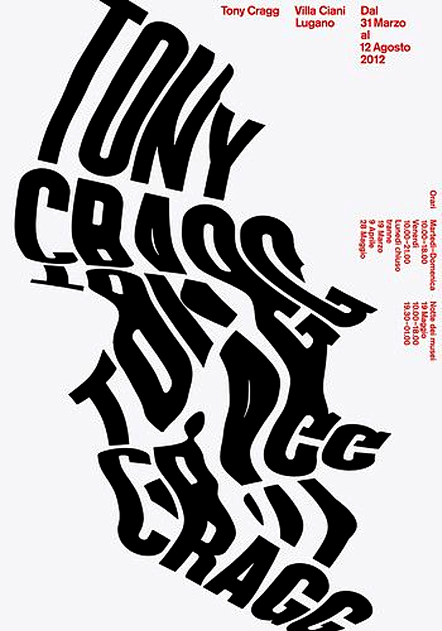
3) Typography experiments
You can say a lot from the poster just by using the right font; people do not give much importance to the fonts and end up using the small unreadable typographies that do not really serve the purpose. All your hard work and creativity goes in the vain only because you chose the font that leaves the viewers poker-faced because they cannot read it.
If the purpose of the event is a bit serious than go with the bold sans serif, looking to put in some elegant touch use an italic serif. Or in case you are looking to be a bit funny or add a playfulness to your posse then go with the loose handwritten font. While you are selecting the font, choose different fonts for the headlines and the body copy.
Experiment with the typography to create a better and more significant impact, if you are going for some food-related posters then what’s better than adding an attractive and catchy image of food with the sizzling hot copy. The perfect composition of both things can give the audience a real taste of what to expect. However, if you are planning to experiment with the typography and images, then you should ensure the fonts you are using are clean and straightforward.
4) Level up the contrast
You have hardly a few seconds to get the viewer’s attention if your poster is worth a second glance only then they will give it. With the high contrasts, you can get your viewers hooked on to it. Using the single tone color palette with the soft gradients is pretty old fashioned, its time you go bold with the color and experiment with the typographies. The poster designing is the perfect time to try out a new typeface or color palette that may be too crazy for the tedious or serious projects.
Most regular posters have a white canvas, which is pretty standard and is used all the time. Its time you go a little out of the box and try on the high color backgrounds with the full bleed to make your poster stand out from the rest because you are in the market to lead not to be led, right?

5) Create a visual hierarchy
It has been discussed above how posters should grab your attention and be a quick read. You can mark the information in order of importance. If the poster does not have an exact copy, then you can go for a bold typographic along with the simple graphic photo. However, if you have lots of information to share then have the type be your focus. Start with the big headline along with the group information into chunks.

6) Think about the right location and size
It is one crucial aspect, where are you planning to post your poster? Various factors should be considered while you are planning the location. Such as the poster size, the visual stuff gathering around the poster and does the poster has a call to action?
Knowing where the design will go and who will be the audience can help you a lot while making the choices. Not only the visual contrast important for your design it is one essential and deciding factor as well. Suppose you are hanging your poster on a bright red wall, you would probably want to go with the contrasting color of the poster, so the design does not hide and come off really bad because of the striking red background color.

You may find it helpful: 10 Cool Tips to Design Creative Menus & Some Inspirations For You
7) Make the right use of the negative space
Well, not everybody can do this, taking the full advantage of the white and negative space is the skill not everybody possess; however, there is no harm in trying, right? The result is worth all the hard work honestly. You can create an absolutely attractive food poster by creating a glass from the fork prongs.
Another right way of using the negative space is to draw the eye into a small, focused object that has a lot of white and negative space around it to allow the viewer’s eye to breathe. You can add the copy in the open space; however, it is best not to fill it.
8) Create a mini version
Well, it’s a pretty common fact that poster design is primarily a print project; however, you should make the mini versions that can be used as the pamphlets as well. You may be aware of this marketing principle already, but let me remind you a person needs exposure to something at least 20 times to remember it.
Make the mini versions by scaling down the image, which can be easily shared on your social media. You can also make a postcard or letter size to hand them out to the passerby people. Make one mini version for your landing page of the website as well and last but not the least, create a version that can be sent via email as well.

9) Use of large visuals
Everybody is pretty aware of the fact by now that posters should be readable and to do that it is essential to make the correct use of the large visuals. Whether you choose an illustration, text, photo or a dominant image, go with the bigger pixels.
While you are still at the designing, make sure you are thinking tight, close up crops of elements or faces, common sense with the sharp focal point, single item illustrations and innovative typography with the high trick. Once you have selected the visuals, you should be mindful of the layered elements. There has to be enough contrast in the image and type so that they can be read independently.

10) Less is more
Gone are the days when people used to pay attention to the minute details of the posters and read all the information mentioned on them. Today, nobody has enough time to spare to the posters and read each and everything about them. Therefore, less is more mantra is followed in all the designing processes.
The less is more approach intrigues the viewer, a single but the right word or the dramatic image can communicate so much more than a lot of irrelevant pictures or illustrations fail to do. You must not add lots of pictures and words only for the sake of filling the space. One of the best practice is to write one word of a sentence in bold to draw the attention of the viewers, use a standard and straightforward color combination, and you are good to go. Minimalistic and simplicity goes a long way; however, that does not mean going out of the box and trying out bold colors is a bad idea.

An essential read for you: Basic Elements of Design You Should Know About
11) Do not forget Call to Action
Well, what do you think is the primary goal of the posters? To attract the audience? Right? To expose information to people and to convince them to either visit the store or attend the event. No copy is complete without any CTA; it’s a must everywhere. Most of the posters involve inviting someone to something such as movies, product launch events or concerts. While you are designing the poster, make sure you are highlighting the CTA, it like reminding the viewers what they are supposed to do.
However, there is a bit difference between the web design call to action and poster call to action, the web design CTA is pretty simple, persuading the visitors to sign up for their newsletter. Whereas the poster design CTA includes lots of information or the contact point. Once you know what the users are supposed to do when they see the poster, you design the poster accordingly.

12) Create focus with typography
You have good news here, while you are designing a poster you have an excellent chance to experiment with the typography. Some of the best posters have only text and right colors; they stand out even without the illustrations and images.
Make sure you are following the same typography principles that you would follow in the other projects, this isn’t the time to use the ten fonts in one location only. However, you must experiment with the different kinds of typefaces such as bolder, broader and bigger as they may make you feel comfortable.
Make sure you are following one single tone for the overall project, use different types that can communicate the right mood for the event. It may be pretty challenging at first, but it can be a refreshing exercise.

13) Go with the cool printing technique
Well, your printing technique entirely depends on the poster’s location and audience. Remember what works on paper does not necessarily has to work on digital projects. Therefore, this can be the perfect time to try out things like screen printing, use of UV layer, letterpress or maybe foiling as well. In case you are looking for project management templates.
Most of these technique are used in the higher-end projects and events only that has some kind of prestige. The best way of going a little out of the way printing technique is to talk the printer person in advance and state all your requirements to them. The size you will be needed, the printing type and everything.
However, when it comes to the printing technique there can be some money restrictions as well. Some of the printing processes are pretty hard on the pocket, so make sure you have enough room with the massive budget before you think of going for the unique printing technique.

14) Go with the smart composition
Once you think you have everything you need for the poster like the illustration, photos and information, its time you think about how you break it up and put it all back together, so it is both attractive and readable to your customer. Put the pieces of information together like a puzzle; you decide how the viewer will read the poster and get the message. Make sure you are paying attention to how the graphics are interacting with the letters and words.

15) Have fun designing
Do not make this fun job a boring job by taking it all as a burden; designing is quite an exciting thing to do, you have a chance to let your creative juice out and create an innovative and exciting piece. While there are a lot of limitations in the poster designing, there is an area when you can break the rules and go a little crazy with the design.
So go for it, and try something that you have wanted to take, this is your opportunity to be creative, stretch your imagination and bring on something new and fresh.

Conclusion
In this contemporary era, while there is a lot of information available online for the website and application design, there is relatively less information about the poster design. Poster design can be a pretty exciting thing to do and give you plenty of room to stretch your design muscles. Each project works differently, there is no one rule for all in this case. Posters work in the hundreds of ways, and they are a great promotional tool as well, make sure you are giving it a lot of thought at its designing phase. This comprehensive guide will help you send your message across without any discrepancies. Have fun designing!
-

Waqas D.
Waqas D. is the co-founder of the branding and website agency, FullStop™. He supercharges brands by crafting memorable logos, brand identities and engaging websites. Besides thousands of startups and medium-size businesses, FullStop has worked with likes of Microsoft & L’Oréal. View our portfolio or get in touch.
Get a Free Quote
+1 845 3770255
Call on anytime
To discuss your project
Featured articles:
Topic Categories
Interested In
Logo, Branding & Creative Work?


 We’ll get back to you in 24 hours
to address your needs as quickly as possible.
We’ll get back to you in 24 hours
to address your needs as quickly as possible.
 We’ll prepare an estimation of the project
describing the team compostition, timeline and costs.
We’ll prepare an estimation of the project
describing the team compostition, timeline and costs.
 We'll perform a free website review
If you already have an existing website.
We'll perform a free website review
If you already have an existing website.


