A complete guide to visualisation of Shades through this Color Thesaurus
Are you familiar with different color shades when it comes to design? Let’s understand all the color names that you’ll be dealing during your creative project journeys.

One of the most complicated steps where most designers get stuck is while making decisions about color combinations. It can go on and on without complaints from the clients. Occasionally, it happens that some shades of red that you like may not allure the client. Maybe they want something unique, something that will stand out in the logo, bring out positivity, or answer all consumers' questions.
In other words, enticing colors that make your logo stand out are pretty hard to find. No matter how much you know about combinations, it will always struck you hard. In your free time, mix combinations, find shades that will bring out the creativity in you. You can start with proficient hues of neon or glaze. Relaxing pigments of some shades intermixed with peaceful tints of another, provide a warming welcome to the audience.
Demanding logo attracts full attention. Some brands have plain black with gold linings, or maybe with multiple rainbow configurations, or asking the client's preference can become an ultimatum.
If you find yourself stuck in shades of blue and red, black and white, or even pink and purple intermixing, this article is for you.
Tans
Tan is a shade of skin, most preferred in the western continent. It is a lighter shade of brown color, dull yet magnificent for the logo. The color goes best with black and blue to bring out the warmness of it. Since it was first brewed from the oak bark, tannum, it mostly furnishes the improper tints of any shade. Most preferred shades of tan are parmesan, sandcastle, buttermilk, and shortbread.
 Shades of Tan
From dark hazelwood to lightest sand dollar, tan can mix with a black hint and a moderate shade of blue. It is a shade of complicated feelings. The client may ask for a hazelnut to go with eggnog or oyster to combine with biscotti, some other shades of tan with brown, or undertones of pink with tan, warming the hues, to form sepia and latte. Different tan shades are beige, macaroon, granola, oat, fawn, sugar cookie, etc.
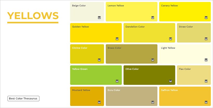
Yellows
Yellow is the lighter shade or hue of gold. There are no reasons to clarify why yellow signifies fire. Most designers use it to bring out the enthusiasm for the brand's products. A canary is an intermixing of yellow and tint of orange. In contrast, honey is a composite of orange with a tone of yellow. The best shades of certain yellows can bring out liability for the clients. These shades work best for animal or pet store logos.
 Shades of Yellow
Lemon and dandelion work perfectly together for a light and medium hue. Some tints of butterscotch have efficient measures at considerable positivity targets. Other yellow shades include corn, flaxen, mustard, dijon, Tuscan sun, pineapple, medallion, and banana. An alluring fusion of blonde with darker lining dandelion is perfect for winning the hearts of your consumers.
Oranges
The color orange, coming between the darker shade of yellow but lighter hue of red, imposes a more significant and vibrant touch to the design. Mostly, the color has the utmost importance when rust goes with a black, implying an energetic look to the logo. The tangerine is a medium hue of orange going perfectly as the outline with cider.
 Shades of Orange
Some tint of pink shade with orange forms, cantaloupe, that magnifies when combined with sandstone, dull hue of the same tone. Medium shades of orange are apricot, carrot, squash, tiger, marmalade. The darker ones, including spice, clay, cider, amber, bronze, attract more attention than any other orange shades.
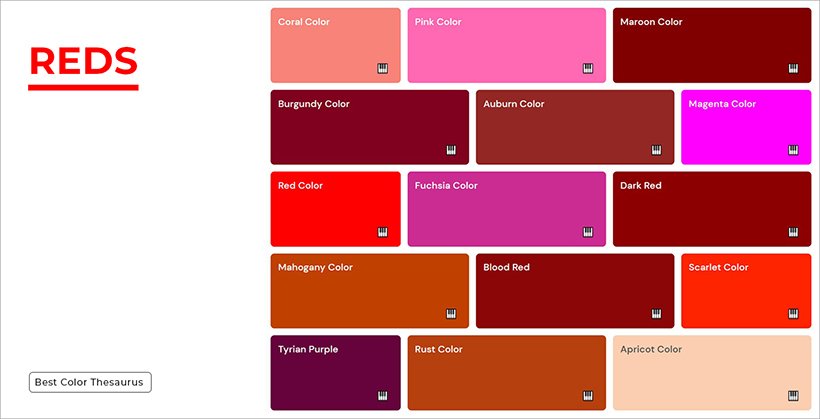
Reds
Red is the color of boldness since the bold has energy and rage. It deepens with the time and naturally finds its way in wine, and blood. The berry and cherry go side by side in emblem foreseeing prosperity, and judgment. Rose and candy are almost similar, yet extinguishing softness and politeness.
 Shades of Red
Some other red color shades revolve around dark tints like merlot, mahogany, jam, garnet, and currant. The light hues are blush, the mix of more pink, with little red, and brick, tints of brown and red in equal amounts. For putting forward a more diverse proficiency of the design, some designers prefer scarlet, crimson, ruby, and sangria.
Pinks
Pink is considered the color of love. Rose, a shade of pink color, is famous for the flower, which signifies affection and compatibility between two people. Mostly, the clothing brands, wanting an eye-catching label, provoking clients by gaining their trust, use rosewood in emblems with light hues of punch.
 Shades of Pink
Flamingo mixed with bubblegum exhibits potential and warmth, whereas ballet slippers with hot pink reveal devotion. Magenta and other pink shades like crepe, coral, salmon, strawberry, and rouge are all light, distinguishing, and approachable. The designers may suggest light hues of fuchsia to reveal positivity in the brand.
Purples
The Shades of purple color elaborate loyalty. Some modish designers want to manifest a hint of luxury though mauve or lavender. For a marriage proposal or setting, the designers usually prophesize the exotic mulberry with lilac. Periwinkle conveys a sophisticated message, whereas grape prospers the client's remarks.
 Shades of Purple
Orchid, iris, heather, and amethyst are lighter hues of purple, all expressing nobility. The dark shades, involving sangria, boysenberry, plum, raisin, jam, indicate power and motivation. Purple is the shade of remarkability, and designers usually use it to engage consumers with the retailers. Eggplant, violet, wine, and magenta are shades of pink and purple colors intermixing.
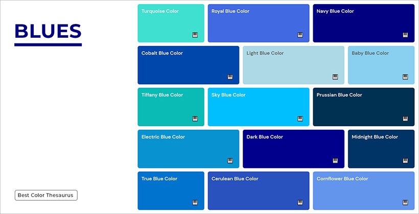
Blues
The blue color is the shade of power. It instigates loyalty and enrichment. Cobalt associates love with harmony, while the sky is the color of peace. Anything that mixes two tones of berry and sapphire prophesied tranquillity.
 Shades of Blue
Some dark blue shades, like indigo, spruce, denim, peacocks, and navy, integrate relaxation and calmness for the consumers. They grasp a hold of the client's attention without further exaggerating protocols. Slate, stone, and teal is a mix of blue with grey. Whereas the ocean, cerulean, and Augean are combinations of green and blue.
Greens
Shades of green color, including truce, olive, and fern, exhibit nature and growth. The green color is the tint of harmony. Some designers use pine, pickle, juniper, crocodile, basil, seaweed, and moss for elaborating the concept of money. These shades are a mix of green with brown.
 Shades of Green
Pistacchio, mint, and seafoam go together with blue while shamrock, parakeet, and emerald work out significantly with a tint of glaze. Pear is outlined with sage, dark, and light since they intimate harmony and freshness together. Occasionally, shades of green color present softness and development.
Browns
The brown shades incorporate reliability and stability. Gingerbread, syrup, and pecan are autumn colors, whereas carob, walnut, chocolate, and brunette are tones of winter. There are no arguments that cinnamon and penny exhibit warmth. These colors are used in the logos of coffee shops or restaurants, providing breakfast all day.
 Shades of Brown
The tortilla is the lightest hue of the brown signifying presence of peace and harmony. Umber, tawny, mocha signifies earth, wood, and stone. Other shades of brown encompass hickory, wood, peanut, caramel, and cedar, the color of brown and grey hints.
Greys
Grey is the middle color between black and white. Since it is called achromatic, shades like graphite, ash, fossil, pebble, and dove, are plain yet without any specific shade. The pewter, slate, and smoke tones are neutral and peaceful—hints of black in greys like shadow and charcoal, exhibit euphony. For instance, the shades of grey color, lead, fog, anchor, and porpoise are neutral, emotions, and mood of the consumers. Light shades of grey include cloud, flint, and coin.
 Shades of Grey
Blacks
Black is the mood since it is the darkest and most preferred color in the designer world. The client mostly likes to see ebony, crow, or charcoal for the outline of the logo, or midnight, ink, raven, and oil for the title text.
 Shades of Black
In addition to grease and obsidian, the retailer's attention is quickly caught by pitch and sable. Black is mixed with brown to initiate soot, leather, or blue to give onyx and grey to provide coal and metal. Other shades of black included jet black, jade, and spider.
Whites
White is a no color, an achromatic. For some designers, the shade of ivory, chiffon, and linen may be the color of the character's skin tone. But, in some cases, blue in white like frost, snow, or pearl will give away the iris color. Some designers use these shades for the skin tone like salt, bone, porcelain, parchment, alabaster, and coconut.
 Shades of White
Every shade of white improvises innocence. The color is ethical, and keeps the consumers hooked to small details. Lace, powder, and rice are a few other white tones that engage the clients with brand scenarios.
Final Thoughts
When you cannot explain your idea, and rather make the client frown upon your sense of colors, get ideas from the color as mentioned above thesaurus. Every name of every shade that is preferred by professionals is mentioned in this article. Foreseeing your brand's likeness and implementing your tone can cost you a job. But using the right shades, that put forward the exact plan of action, will work out in benefits you.

Co-Founder & Strategic Visionary at FullStop
Co-Founder at FullStop, a branding, digital and software agency he started in 2012. Haris works across brand design, digital marketing, and custom development—helping businesses turn ideas into market-ready products.
Ready to transform your brand?
Our team specializes in strategic branding and digital solutions that drive real business results.


