You Are NOT a Designer If You Never Used These 41 Fonts
There are some designer fonts that go with every design project and you may’ve encountered some of the fonts for designers that can add a wow factor in your work.

Disclosure: This article may contain affiliate links. We earn a small commission at no extra cost to you.
Do you know the main difference between websites that attract more traffic than those who are just amateur looking is? It’s preferably all in the small details that lure the audience towards your web content.
Many aggrandize towards artistic attributes rather than non-professional looking designs by the web developer. Thanks to font designers, now we practically have thousands of fonts to choose from without any hesitation. It is popular among the competitors of the digital market that while the other designers are busy making offset edits in logo designs, adding relative photos, the successful designers look at the bigger pictures. They entice the spectators through convincing font style. Read why you need a professional logo before starting your business here.
If your title is unique and makes the viewer feel that the content is giving an enthusiastic vibe, it will outdo all other minor aspects of the web. If the designer has proposed a better heading trend, the person hiring the developer will get a better idea regarding the designer’s energy and efforts.
Now I will mention 41 fonts that have practically become any designer’s best friend.
1. Open sans
This font Comprising almost 879 characters, was first ascertained by Steve Matteson. It has been mostly used as an opener or in the title of the website.
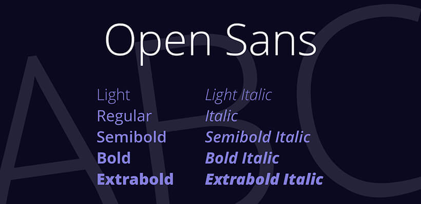 Open sans
2. Lato
This font family is a mix of transparent as well as strong characters. Endowed by Łukasz Dziedzic in the summer of 2010, it elaborates on the dark backgrounds and works in a charmless manner on the light frameworks.
 Lato
Lato
3. Lora
A look of contemporary touch, made to enhance the body texture beautifully, was first designed by Cyreal. It was created to magnify the content for the reader. Also, it helps the designer make it up to the client’s standards of acceptance. It was recently updated with new characters in 2019.
 Lora
Lora
4. Georgia
Georgia, one of the oldest and most calligraphic types designing the font, has been accepted as the most favorite among the logo designers. Aesthetic, charming, and delightful for the observer.
 Georgia
5. Myriad pro
It is one of the most welcomed fonts with various adobe boosting artistic look. Some of the best logo design agency have drastic use of this font as its elicit and appears friendly.
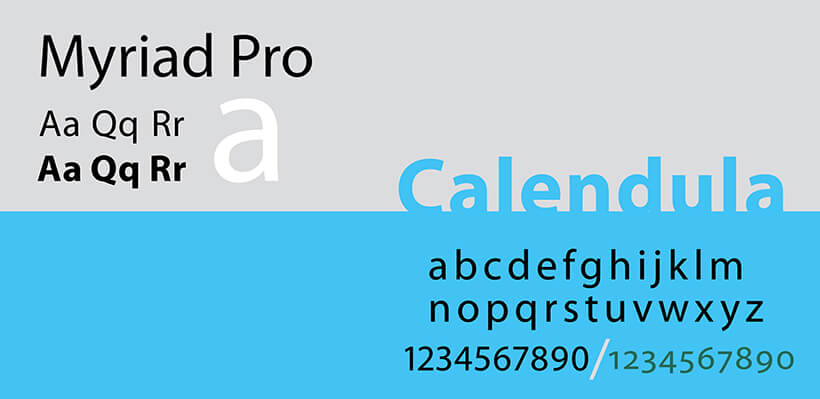 Myriad pro
6. Eurostile
While looking out for an individual text style for both heading and body narratives, Aldo Novarese, in 1962, published this font for the preeminent time. It gives the text an experimenting incitement between italic and thick typeface along with a dramatic style to the content.
 Eurostile
7. Scala
Scala is a mix of small capital letters, alternate characters, and bold forms. It can give the content a very decorative look.
 Scala
Scala
8. Syntax
Hans Eduard Meier wanted to give a humanist touch to a font style, and in 1968, he became successful by introducing syntax. This font has variable characters that evaluate the content by bold, clean, and sturdy look.
 Syntax
9. Joanna
Eric gill was motivated to give the text a more elaborative gaze for the viewer and, thus, in 1930, introduced joanna. This text font is simple, understandable, and unpretentious.
 Joanna
10. Fleischmann
The characters vary from each other in digital form. If the designer is opting for a digital marketing glance for the viewer, this font is the perfect fix.
 Fleischmann
11. Palatino
It is one of the top ten most used font styles for designers. It was introduced in the form of book text but gained its popularity through rapid and distinctive characters.
 Palatino
12. Baskerville
If the designer is opting for a well readable on-screen text, Baskerville is the best choice. It marks its significance with more comprehensive characters, taller height, and lesser contrast.
 Baskerville
13. Fedra
Fedra, founded by Peter Bil’ak in 2002, emerged as a particular that evolved in the digital as well as book text. This font gives a multilingual contemporary glance to the text.
 Fedra
Fedra
14. Gotham
Gotham has electronic setting characters that the designer can fluctuate according to the demand. Not only this, but the developer of the website can bring forward a unique and elaborative style that will make the viewer feel the future.
 Gotham
15. Lexicon
It is one of the most expensive fonts, but considering the art that evaluates and differentiates it from other fonts, is highly worth it. The designers who have used it in the creative logo design have earned a reputable name.
 Lexicon
16. Hands
Let terror initiated this creative concept in 1991. The characters are imaginative hand characters varying in different styles.
 Hands
Hands
17. Metro
Metro, comprising almost 1001 characters, gives the content an engaging and a captivating effect.
 Metro
Metro
18. Didot
It is similar to Times New Roman, but the letters in this font are more curved. The characters are subtle but at the same time, have a stylish look for the text of the body.
 Didot
Didot
19. Formata
This graphic design font was brought in use by Bernd M llenst dt in 1984. The primary reason any logo design company will use this font in the styling of the web content is just for a detailed view of the text. It is made explicitly for headlines and outlines.
 Formata
20. Caslon
William Caslon, in 1725 introduced this charismatic typeface in 1725. This stylish font is a mix of quality and ambitious concepts and kept as a format for texts of journals, and newspapers.
 Caslon
21. Cooper Black
Oswald B. Cooper, in 1919, launched the ultra-bold containing characters that emerged by earning its name as most usage in title names and outlines.
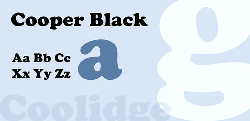 Cooper Black
22. Peignot
This typography is a combination of multicase and small capital letters. It was not until 1937 that it gained popularity through books and journal texts.
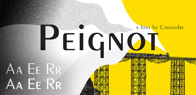 Peignot
23. Bell Gothic
Bell gothic, introduced in 1938, for use in phone book text and other related work due to its attractiveness and easy to read availability.
 Bell Gothic
24. Antique Olive
The characters in this font are a mix of condensed, medium, bold, italic, extra bold. The uniqueness of the characters enhances and beautifies the text more than other fonts and mostly preferred by professional designers.
 Antique Olive
25. Wilhelm Klingspor Gotisch
The font has a calligraphic touch. Gotisch, initiated by the chief designer of Klingspor, audited as a typeface attracting an audience for the impressive look of the body text.
 Wilhelm Klingspor Gotisch
26. Dax
The most popularly used character design in marketing and advertising is Dax font. Since its launch in 1995 by Hans Reichel, it has forever evolved and gained popularity through engaging outlines and title styles.
 Dax
Dax
27. Proforma
For a sophisticated and classy look to the logo design, this font has gained acclaim. Also, this font will advertise through its contrast colors in a demanding fashion.
 Proforma
28. Today Sans
Volker K ster designed this font to give the characters a creative look in 1988. It was made to elaborate the typeface glancing a nostalgic and decorative spin.
 Today Sans
29. Trade Gothic
This font style appears as an irregular style for the title and has different prevalence due to it’s striking charismatic touch for the font.
 Trade Gothic
30. Swift
If the designer is opting to fabricate a creative logo design for a financial or non-profit organization, this font will come out as the best choice for such brands.
 Swift
Swift
31. Copperplate Gothic
Frederic W. Goudy launched a design that compelled the audience through a combination of style and legibility.
 Copperplate Gothic
32. Blur
This font style gives an electronic texture to the title and blurry vision. If the designer is visualizing a powerful yet elegant theme for the title or outlines, this typeface is the best choice.
 Blur
Blur
33. Base
Zuzana Licko instigated this font style in 1995 for HTML design for giving the logo a tender and optimistic touch. The typeface is an old school vogue trend.
 Base
Base
34. Bell Centennial
The characters belonging to this font are very bold and bright and have optimizing effects on the logo text. The viewer will be astounded by the surface undertone of the imaginative creation.
 Bell Centennial
35. News Gothic
This font style is another type of newspaper and journal text design that became immensely popular after its launch in 2008 by an employer of Benton, who was the actual mind behind this loud but polite flair.
 News Gothic
36. Avenir
Vintage, classy, buoyant, all these will explain this font as chic. This captivating yet beguiling design has possessed the clients with its charming urbanity, which the designers prefer above all.
 Avenir
37. Bernhard Modern
If the client’s incline towards bespoke services for a wider audience, this font is the perfect choice for any designer.
 Bernhard Modern
38. Amplitude
Christian Schwartz, in 2003 released an astounding modern chic that became the reason for the rise in the competition regarding the designer’s outlook on the broader aspects.
 Amplitude
39. Trixie
There are five styles to this font, light, plain, text, extra, and cameo. It entices the logo design through the legalized look and used for office advertisements.
 Trixie
40. Quadraat
Quadraat is a mix of roman and italic modish characters, which benefits the designer by giving more familiarity to the logo’s readability rate.
 Quadraat
41. Neutraface
Christian Schwartz released this geometric font in 2002. It plays the principal purpose in newspapers and journal outlines and body text due to easy readability and simple, understandable characters.
 Neutraface
Final Thoughts
As mentioned above, those are just a few fonts that have embarked on the success journey over the years through continuous preference by the designers of the titles and creative logo designs. Advancing time, more variety, and diversity in the font designs will raise the competition in the graphic designing market. Fearing challenges is not a trait of a successful designer. More fonts and typefaces are expected to be introduced in the future.

Co-Founder & Strategic Visionary at FullStop
Co-Founder at FullStop, a branding, digital and software agency he started in 2012. Haris works across brand design, digital marketing, and custom development—helping businesses turn ideas into market-ready products.


