39 Best Animated Logo Inspirations in 2021
Have you thought about using logo animation td up your brand’s standard? Well, here’s a quick list of awesome logos and cool animations that you may consider.
Starting from 2019 till the year 2020, we have witnessed a drastic increase in animated logos which create a more impactful visual for customers especially if a brand is either purely an e-commerce brand. However, animated logos may also be created out of the initial design, intended for digital advertising.
To give you a dose of inspiration we’ve shortlisted (there were just so many we loved), the best animated logos (in our opinion) in the year 2020!
1. Cub Studio by Fraser Davidson
This really cool animated logo starts off with the studio’s name “Cub Studio” and eventually transforms into an abstract of a cub which is not only creative but also so cute that you’d want to watch the logo again and again! Being an animation studio, it was incumbent upon them that their brand identity reflected their work.
 Cub Studio by Fraser Davidson
2. Giant Owl Productions by Alphabetical
Ironically, wildlife plays an integral part these days in brands created by humans. Nevertheless, this is one of the best logo animations we have come across in 2020! The animation depicts two show reels which are constantly moving and give the illusion of an owl’s eyes. A concept which would certainly not have been possible with a static logo.
 Giant Owl Productions by Alphabetical
3. Ikea by Nikita Melnikov
Another animated logo that falls under our list of cool animations. Even though there isn’t really a concept behind the logo such as in the former two that we just discussed, there is a fun element which doesn’t really need a lot of “creative” thought! It’s simple, funky and eye-catching.
 Ikea by Nikita Melnikov
4. 500px by William Kesling
Now here’s a logo that really clicks (pun intended). 500px, the photography studio recently revamped its logo into a really cool animation. Starting with the brand name, the logo evolves into a focus symbol (for pictures), turning into the number 5, the interior of which gives the image of a camera lens when it turns off.
 500px by William Kesling
5. 99 designs by Maria Dziadziulia
Almost every designer must have gone through their blogs. Their animated logo isn’t a setback either. It has fun colors and swirls that’ll start off with bouncing balls and eventually turn into the 99d animated logo.
 99 designs by Maria Dziadziulia
6. Zoom by Maria Dziadziulia
Yes, she got two in a row! The designer’s make such awesome logos with cool animations that we couldn’t help including another amazing work. Since Zoom brings people from different locations together through video calls and conferences, the ‘O’ has an icon which moves in a circle with an airplane icon, indicating diverse travel locations.
 Zoom by Maria Dziadziulia
7. Google by Adam Grabowski
So since the last couple of years Google has been making its mark in animating its logo on special occasions such as anniversaries of renowned personalities or international/national days. Google’s own basic logo too has been animated to for a G which incorporated a cool animation, turning into a microphone and then sound bars. Rock on!
 Google by Adam Grabowski
8. Rocketgraph by Tony Pinkevich
We’ll call this one a super cool animation! It has the element of surprise where the logo begins as simple shapes eventually shooting up as a rocket, ending to create the original logo with a blue backdrop. We’re in love with this one!
 Rocketgraph by Tony Pinkevich
9. Sello by Latham Arnott
Many of us might be familiar with this app but for those who aren’t, Sello allowes you to take a picture of literally any product, assign a price to it and share it on social media platforms. Sello’s animated logo is as creative as it is simple. At first glance you see a simple Sello typo. The ‘O’ eventually changes into a headphone, a ball and a ring, indicating that you can sell anything through Sello!
 Sello by Latham Arnott
10. Hype Film by Misha Petrick
Another one of our favorites, the animated logo for Hype Film smartly blends typography and design by creating an image of a director’s microphone with the letters H Y P E. Now if that’s not an awesome animation we don’t know what is! One of the best animated logos for sure.
 Hype Film by Misha Petrick
11. Firefox by Lathom Arnott
Another masterpiece by Latham Arnott after the Sello logo animation. The firefox logo in itself is a module of creativity where the image of a fox gives the illusion of a fire element, hence a perfect illustration of the name. The animation is very simple and that’s the beauty of it. A simple ball of fire evolves into the fox logo and that’s all you need to see.
 Firefox by Lathom Arnott
12. Sidecar by Alex Sailor
A remarkable animated logo which perfectly illustrates the name “Sidecar”. You can see the vector of a man’s head, a helmet drops over it and the head just speed away revealing the name of the company. A brilliant way to attract clients.
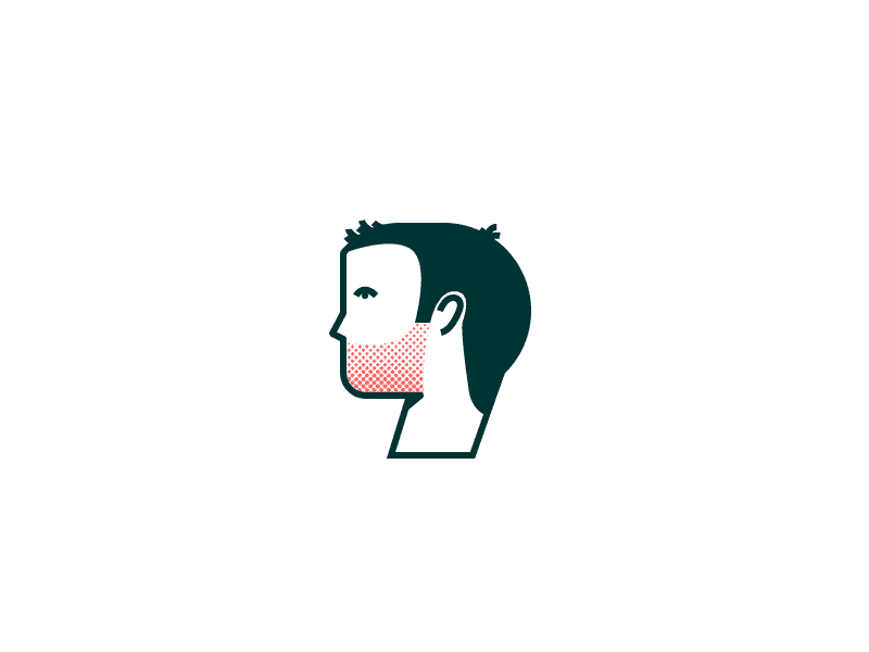 Sidecar by Alex Sailor
13. Judo chop by Victor Kolb
This awesome animation has nothing to do with the name but rather with what the brand provides. The logo animation is a stop watch with a vector of an actual human hand instead of a needle which moves to the right supported by the line “A performance testing framework”.
 Judo chop by Victor Kolb
14. Sunrise App by Jason Zigrino
We all know the sunrise app but its animated logo is totally worth acknowledging as an extremely cool animation. We’re familiar with the original static logo with a sunrise but the animation is in fact an illustration of a sunrise as you can see below. Reminds you of Lion King’s beginning, doesn’t it?
 Sunrise App by Jason Zigrino
15. Tyba by Dangerdom
The website for jobseekers and career beginners has an awesome logo animation. The animation begins with blocks that form a T, eventually revealing a typography with TYBA while the T forms a small block made up of colorful little ones.
 Tyba by Dangerdom
16. Rain Wine by Misha Petrick
Even if you aren’t aware of the brand name, you can’t help but get amazed at the logo animation. Illustrating the brand name, the animation shows an umbrella, while it rains in the shape of a wine bottle! Talk about being creative and animating it wonderfully.
 Rain Wine by Misha Petrick
17. Lighthouse no. 6 by Brien Hopkins
Simply brilliant! The animated logo shows a lighthouse within a frame which turns into the number 6 when the light beam cuts through it hence making the perfect use of negative space to create the number 6. We need more logos like these for sure. See the masterpiece for yourself and absorb inspiration.
 Lighthouse no. 6 by Brien Hopkins
18. Avid by Yaroflasher
This is where you realize geometry wasn’t as bad as it seemed back in the school days. The animated logo for Avid begins with swirls of green forming 4 shapes (2 triangles, one cylinder and a semi-circle) to form the name AVID. We love this minimal yet cool animation.
 Avid by Yaroflasher
19. The Doorman by Musique
We’re totally inspired by this quirky logo animation which shows a man in a hat and a door opening within the hat making good use of negative space. Hence, both aspects of the name have been covered! The simple black logo is hard to forget.
 The Doorman by Musique
20. Open View by Pentagram
The Open View logo animation basically teases you before revealing the name, with an O and V so the animation literally opens up into the name Open View! Now that’s one cool animation that you can take inspiration from.
 Open View by Pentagram
21. Beyond Plastic by Sheva
Truly a masterpiece by Sheva, this animated logo is one that’ll be a source of inspiration to designers for years to come. The logo depicts a hand that gets hold of what is apparently a plastic bottle and crushes it, creating an illustration of a victorious move or a sort of achievement.
 Beyond Plastic by Sheva
22. Tutor Reactive by Nandatama
We’ve discussed how mascots are one of the new logo trends in the year 2020. The blinking robot mascot was animated by Nandatama for an education app which required a mascot to represent their brand.
 Tutor Reactive by Nandatama
23. Bullhide Belts by Zarkum
Created by their own designer Zarkum, the Bullhide Belts’ awesome logo animation gives us hope that creativity will never cease to grow! The logo shows a belt which twists into a bull’s head (an abstract) and finishes off with the illusion of smoke coming out of the bull’s nostrils. It’s one of the most awesome logo animations we’ve come across.
 Bullhide Belts by Zarkum
24. Tangles by Henrique Barone
A simple yet classic animation that neatly illustrates swirls to form the name Tangled. We’d call this one an effortlessly cool animation without any complications.
 Tangles by Henrique Barone
25. Fujio Studio by Adam Muflihun
How amazing is it if your logo animation can actually be a depiction of what you do as a company? Fuji Studio illustrates their logo’s design process with a really cool animation: a very quick animation that shows the logo from a mere sketch till it transforms into the finalized version.
 Fujio Studio by Adam Muflihun
26. Brikk by Gun Karlsson
This is what we call the right use of neon colors (again a 2020 trend) with a captivating, awesome animation. The letters Brikk transform into an extremely cool animation of a brick with a neon glow.
 Brikk by Gun Karlsson
27. Alphabetical by Mariya Dziadziulia
Animated logos aren’t restricted to any age bracket, they can be for the little ones too! In fact kids love animated characters and any brand for children should consider taking the Alphabetical logo as an inspiration for future endeavors.
 Alphabetical by Mariya Dziadziulia
28. EAT by Fable
Well, we couldn’t help but laugh out loud while simultaneously being amzed at this awesome animation that is simply creative. The EAT logo increases in size with every “bite” so the animated logo is actually eating, getting obese or chubby (let’s not be harsh)!
 EAT by Fable
29. Frameline by Mucho
The animated logo by Mucho delivers the right message in the right way. The logo was designed for a film festival hence the animation starts off with a camera focus and opens up into the name Frameline. Minimal and creative!
 Frameline by Mucho
30. Kwickr by Milos Zdrale
As the name suggests, the brand’s identity is that where things happen quickly. The logo animation illustrates this with perfection by speedily showing all the letters of the brand’s name.
 Kwickr by Milos Zdrale
31. Vitenparken by Bielke and Yang
This is a case of rebranding and Bielke & Yang handled it quite well. When the cultural Norwegian Agricultural Museum decided to evolve into modern science center, they required a logo which could combine the element of art and science. They have thus merged the two opposites in an awesome animated logo, showing art inspired by science.
 Vitenparken by Bielke and Yang
32. Historiska by Bold
As the name reveals, Historiska is a museum of historical artifacts that needed a logo which could combine the elements of the modern era and history. The original logo thus depicts the traditional Serif Font with the modern Sans Serif font where the serif font has been animated (brilliantly) to include historical artifacts which appear one after the other. We give this one 100 cool points.
 Historiska by Bold
33. Creagent by Bond
Remember how the Sello logo animation would change icons according to the products which can be sold? Similar to that concept, Bond designed an animation for Creagent’s logo where the visual and font is separated by a line. The icons keep changing into the services they offer while the text beneath the line changes simultaneously for clarity. Subtle and cool!
 Creagent by Bond
34. Design Torget
We’re totally in awe of this one. Design Torget creates an animation with the initials D and T, transforming them into the products which they can offer. It’s really fun to watch and by far one of the coolest animation we’ve seen that uses simple letters to get the message across.
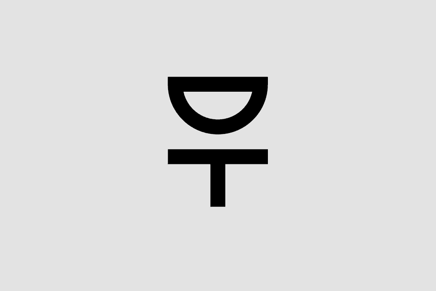 Design Torget
35. Sim Smith by Sim Smith
This is one logo that doesn’t want to stay in one place. The logo animation for this art gallery is designed by Sim Smith himself and depicts the rearrangement of the letters which form the name Sim Smith, portraying the illusion of an art gallery.
 Sim Smith by Sim Smith
36. The University of the Arts, Helsinki by Bond
Another one of Bond’s inspiring works, the logo animation for The University of the Arts is created, keeping in mind the energy of artists. At first sight it may seem like a simple dancing animation but after a closer observation you’d realize that Bond is trying to show a building full of artists who are ready to break the taboos (walls)!
 he University of the Arts, Helsinki by Bond
37. Riksteatret
This remarkable animation by the theatre company for their logo depicts a stage which stretches and contracts, with a letter at each corner, demonstrating that they can perform on any size of stage, big or small, spacious or not. Easy on the eyes and creative besides.
 Riksteatret
38. Impact a Hero by Mariya Dziadziulia
Even though this animation is unlike the mind blowing ones we just mentioned above, it has a charm of its own. The animation shows a rotating star which eventually shows a medal for patriotism, depicted through the logo’s red and blue colors.
 Impact a Hero by Mariya Dziadziulia
39. Echo by Truf Creative
The logo for Echo Captial Group uses shapes as in the AVID logo discussed above. The animation has a gradual left to right movement which gives the feeling as if we’re transiting from one end to the next while Truf uses negative spacing with lines in between the shapes to form the name ECHO.
 Echo by Truf Creative

Co-Founder & Strategic Visionary at FullStop
Co-Founder at FullStop, a branding, digital and software agency he started in 2012. Haris works across brand design, digital marketing, and custom development—helping businesses turn ideas into market-ready products.
Ready to transform your brand?
Our team specializes in strategic branding and digital solutions that drive real business results.


