39 Super Creative Logos That DO NOT use Golden Ratio
How can one design a logo to attract a massive lot of traffic towards their website? A golden ratio is a relationship between two or more elements for creating a logo, structure, painting, photography, and websites with ratio 1:1.61. This development was a trend for an extended period until the course shifted towards thinking outside the box of golden ratio success.
This has led the development of trademarks to gravitate layout to more hypothetically successful and unique designs and also making its way towards even higher demand than the golden ratio.
Is the chance of logos without a golden ratio worth the try? Worth it! Not only does it give a distinctive look to the emblem, but it also embarks its journey towards blocking out constricted thought.
Here are some logos mentioned without the golden ratio
1. STL digital Dental lab
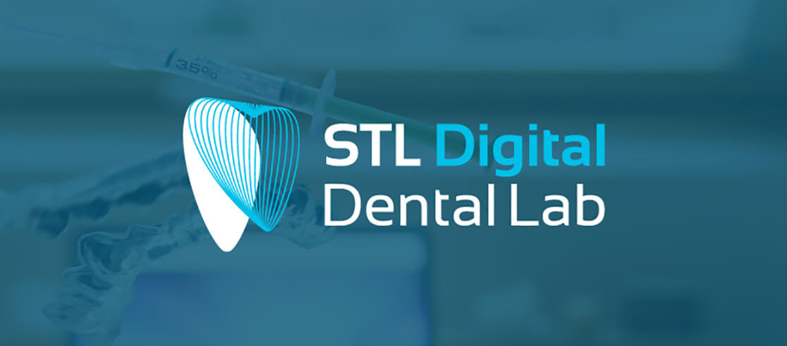
STL digital lab is a dental lab for surgeries, replacements, cavity removal, etc. of the jaw related functions. This laboratory embarked on its journey one year ago, currently based in Florida. The newly born dental lab has a 3D feel logo design with a denticule symbolizing dentistry. The logo comes in only two variant colors of blue and white.
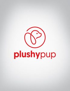
Plushypup Logo
2. Plushy pup
Plushy pup is a veteran departmental store for tamed animals, especially dogs. The custom logo service provider has magnified the pup face as a symbol of the store’s major working
3. Blood and treasure books
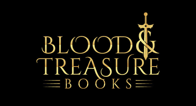
Blood and treasure books Logo
This logo was developed for an action drama premiered last year on CBS. The logos of B&T and B&B are not in any spiral connection. This leads to an automated circular relationship where B and T are both held inside a circle. The logo colors are dark and inky, symbolizing catastrophe.
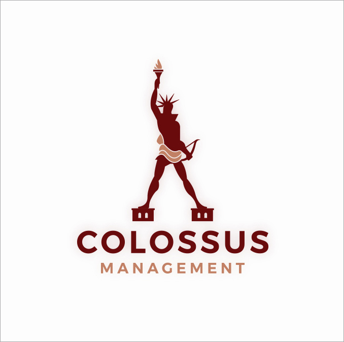
Colossus management Logo
4. Colossus management
This management is a private company with 2 Greek shareholders who established it to provide construction, real estate, and general public services. The logo innovated to incarnate a modern way of setting a statue of liberty with vibrant colors of maroon to lighter shades of same hues with building transparency in the background epitomizing construction and real estate.
5. Paddle out movers
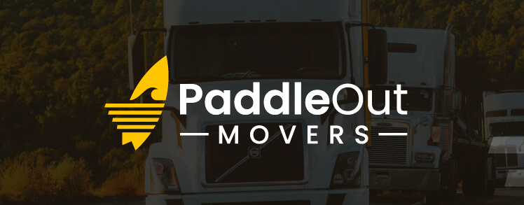
PaddleOut MOVERS Logo
At extremely affordable prices and always arrive on time, paddle out movers help you move furniture from one place to another under the supervision of qualified managers. The logo is a set of lively hues with automobiles transparency in the background manifesting transportations.

Zeorder
6. Zeorder
The logo is meant to give a dark and light color sense. The lighting style yellow letter Z is to signal fast service under a given rhythm. This also proposes a significant mark towards speedy ministries.
7. Purrsian princess
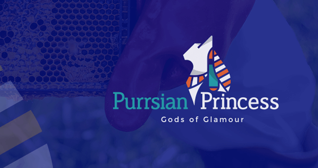
Purrsian princess
The logo is to visualize a prominent visionary towards Persian cats who were adored and loved in old times and still admired. The logo is presented with dark hues on light backgrounds and vice versa.
Pilates Plus Logo
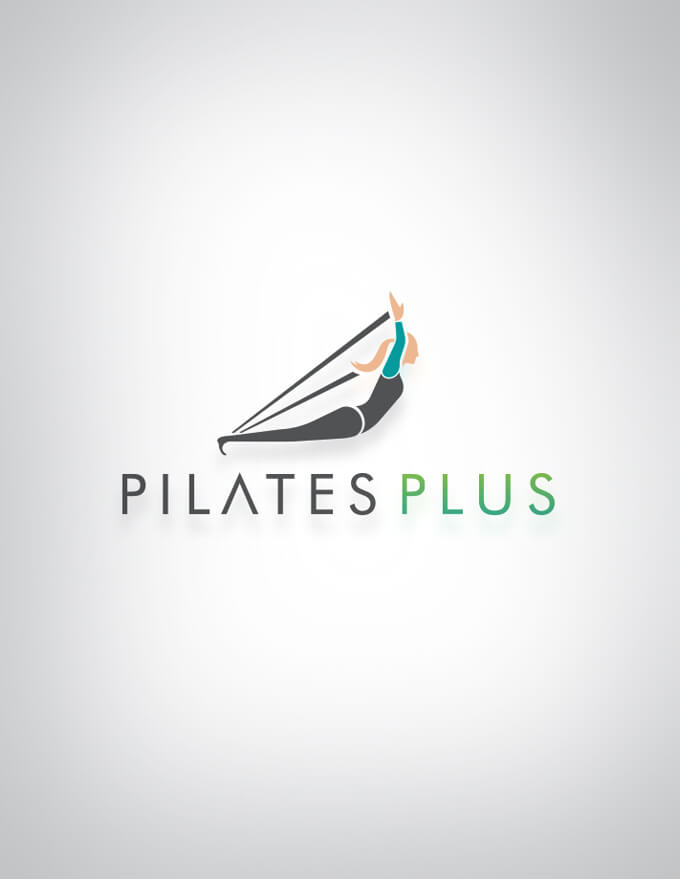
8. Pilates plus
This institute is a gym, situated in Los Angeles, which many celebrities have joined to pursue their workout journey. The symbol is a woman silhouette stretching in a gym suit signifying gym classes specifically for ladies. The colors are a mild blue and pink mix.
9. Webdrino
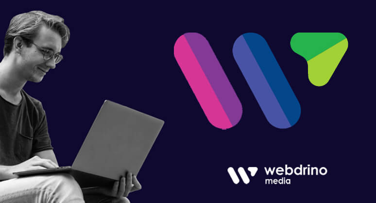
It is a media digital marketing agency that claims to provide many digital services like social marketing, website, apps, software development. The symbol is three different colors of not matching hues in letter W, stating the company is hitting different targets and fields to achieve their goals.

Bioflow Logo
10. Bioflow
It is a wastewater treatment company building methods for safety for both humans and animals. The symbol is a two-colored world where bio means life and signifies the importance of life. The word flow is in blue to symbolize water treatment through technological ways.
11. Bodelair
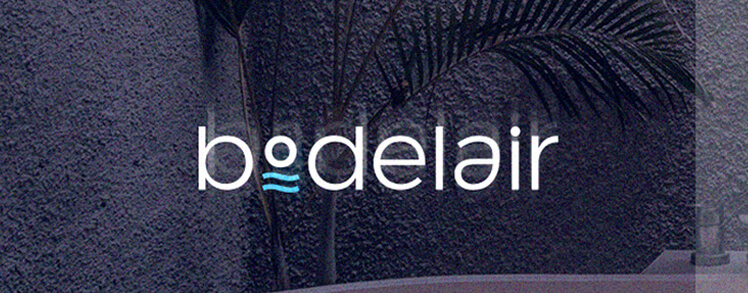
This logo belongs to a sanitary company, constructing bathrooms sinks, toilet seats, bad tubs with a long-lasting warranty. The logo is a transparent dark hue background, symbolizing a water tub with a slightly lighter shade of grey as in the context. The colors vary from dark grey to light grey and blue for optimizing different varieties.
Couch Tomato Logo
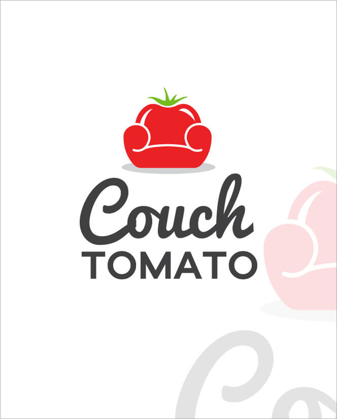
12. Couch tomato
Couch tomato is a café situated in Pennsylvania, established in 2003 and now expanded so forth of almost five cafes. The logo is a couch in tomato shape and colo, hence the name.
13. Dusplay
A multi-colored logo that states the artistic approaches of the customers to satisfy clients.
Earth GEAR & ECO CARTS Logo
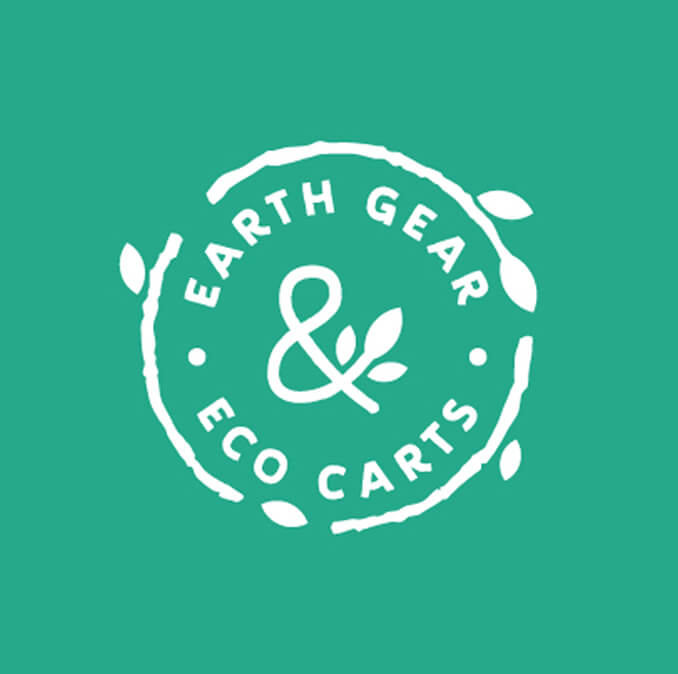
14. Earth gear eco carts
A client who approached the same logo design agency for a perfect symbol model. The company provides eco-friendly rental carts for transporting products. This, in turn, leads to making a green cyclic form of eco-friendly logo.
Epic Films Logo
15. Epic films
A filmmaking company with many blockbusters and achieved many international and national awards in the past years. As the name, the logo is an old-style symbol with a film reel and black color to signify times without color TVs.
16. Family mediation Australia
This is an organization that helps rebuild families by removing conflicts and disputes among two people or more. The logo is a showcase of a female hand and a male hand together to approach a new set of agreements after a clash.
17. Fortis media
It is a media and marketing agency with effective, successful plans for its clients. The symbol states the marketing agency with letter M, written with different heights to accommodate flaws as well as hard work.
18. Grasp the adventure
It is a traveling agency that mostly advances in exploring different countries and territories in bulks. Since the agency is making proceedings towards hilly areas with adventure packages, the logo also is a clipart of the mountain.
Gulf coast marine detail – Logo
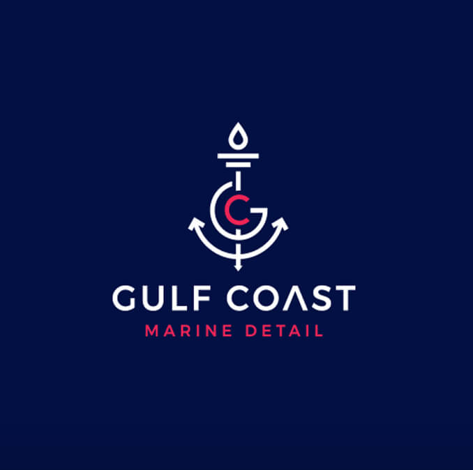
19. Gulf coast marine detail
It is a family-owned business of lending rental boats and traveling with safe boaters with two gulf coasts locations, one Bayou Vista, and the other in Corpus Christi, both in Texas. The symbol is consistently showing the gulf coast and hyper ring the watercolor, I.e., blue in different shades.
20. Helios Hawaii
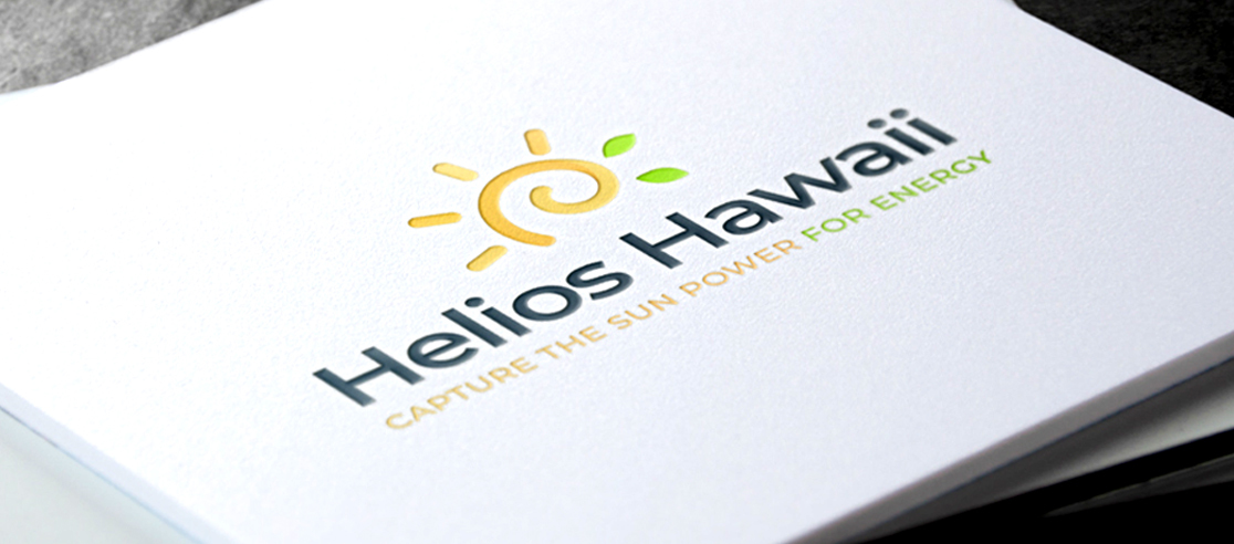
The company provides energy consumption methods and offers solar energy lighting equipment to hit two birds with a stone. It gives a modern look to your homes, offices, and stores as well as saving energy. The logo design is a colorful spiral circle in one go, exhibiting reserving techniques through the sun.
21. Jobslog
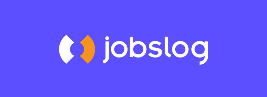
Jpbslog is an online website for posting resumes to find a job. The marketing agency is situated in Honolulu, Dallas. The logo is a half middle circle or the one that writes, signifying the employers trying to hire the job seekers symbolized by the other half central circle.
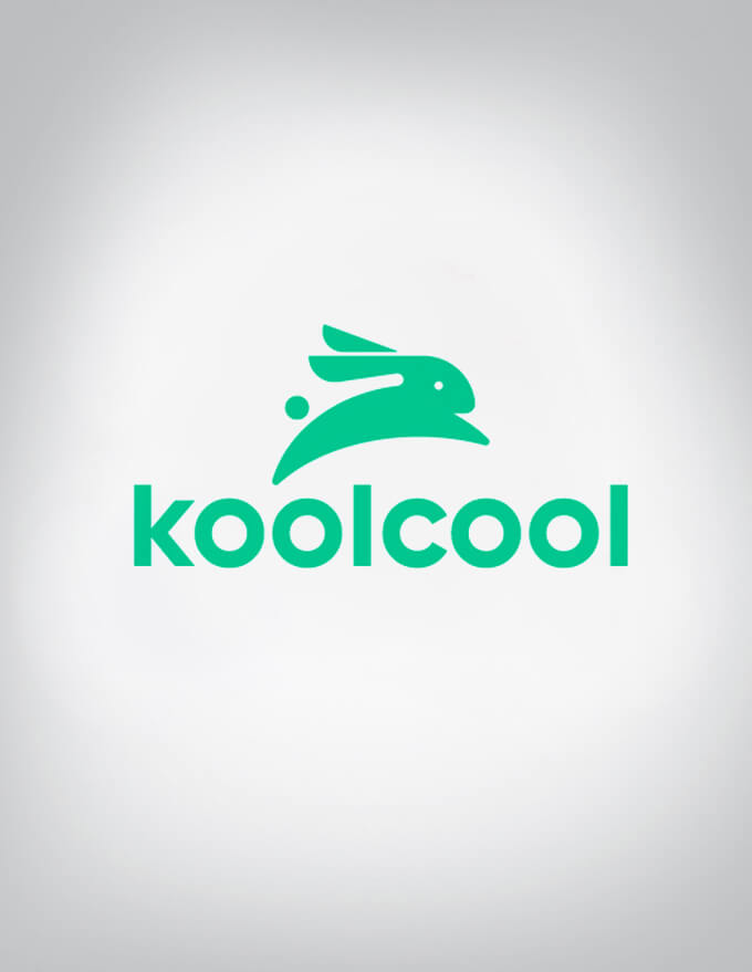
22. Koolcool
It is an online software application that identifies the location and lets you order a significant grocery online, with time duration kept in mind. The logo is a different set of bowls with food inside them to signal daily home groceries.
23. Marsa abroad
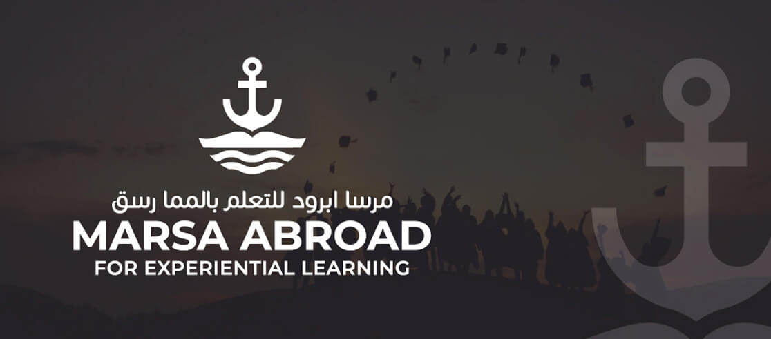
Marsa abroad is a Qatar experimental short study learning institute accepting students from worldwide. The professional logo design is an anchor highlighted in bright colors to embark on an international journey protocol.

Max gaming network
24. Max gaming network
A gaming store for e-sport lovers looking to purchase gaming equipment. The logo is a simple mindful triangle and circle, buttons from a PS remote, to signify gaming and MAX for the company name.
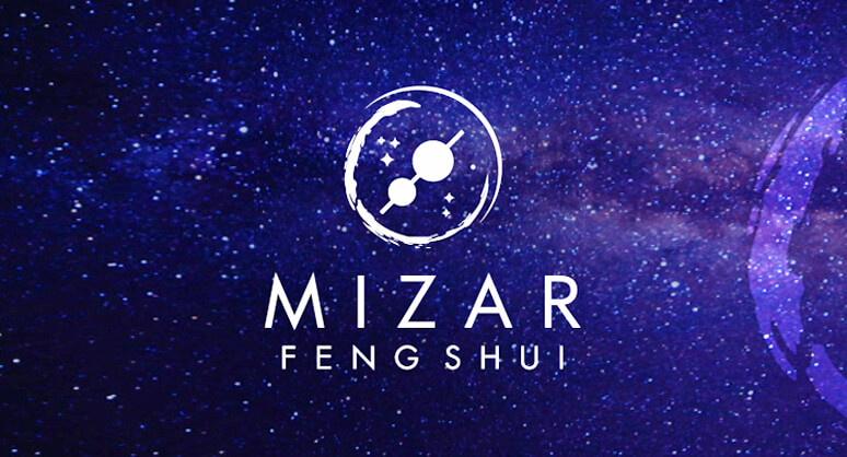
25. Mizar Feng Shui
Mizar Feng Shui Logo
A Japanese company provides a vast range of compasses produced for the eco-friendly environment and is recyclable. The logo marks are distant company name letters and a compass to specify the company’s main idea.

Nucleus Logo
26. Nucleus
It’s a private digital company that is accomplishing revenues through digital marketing. The designed logo is a dark background and promising blue hues to establish a professional first look insight.
27. Ocean

Ocean Logo
The logo is a light transparent beach wave and the company’s name written to expose the idea of beach themes.
28. Optio
This company is a marketing company that provides smart, fast, efficient, and e-commerce marketing. The logo designed by service providers is nine small circles put together in a triangle form, leaving one uncolored.

Pepar Logo
29. Pepar
It is a restaurant situated in Johor Bahru, hence the lightly transparent background with restaurants and people. The logo is pepper clipart signifying more accurately the motive of the company.
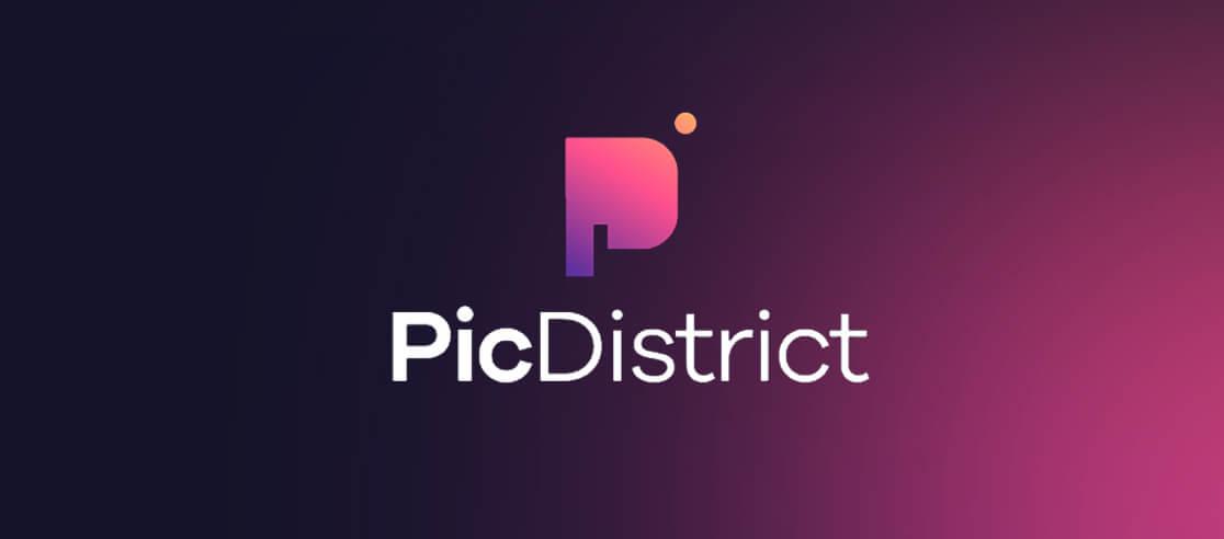
30. Pic district
Pic district Logo
It is a photo editing software. The logo is well designed to keep in mind the actual purpose of the app, the improvement of the picture quality.

Proper (travel with indulgence) red logo
31. Proper (travel with indulgence) red logo
This logo belongs to an airline traveling agency, stating in the logo that the service provided is with indulgence for the travelers. The varying colors of red to brown are observed, matching the attire of air hostesses and the primary color of the company.
32. Proper (travel with indulgence) green logo
Proper (travel with indulgence) green logo
An airline traveling agency, stating in the logo that the service provided is with luxury for the travelers. The vibrant colors of green are observed matching the air hostess’ attire and the primary color of the company
33. Rosenet explore the paradise with us

Rosenet Logo
This is a flower selling company with red rose clipart in the logo and ‘explore the paradise with us’ as their motto.
Sahelingo Logo
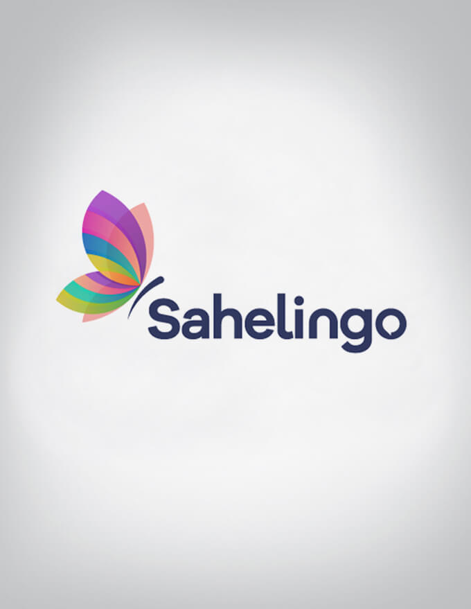
34. Sahelingo construction
It is a language learning platform to revive talents from lower developed African countries. The symbol is a multi-colored butterfly, aimed at attracting the young generation from websites.
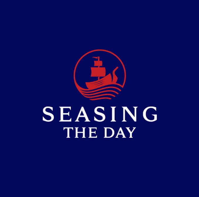
Seasing the day Logo
35. Seasing the day (we venture together)
A boat rental business as specified by the logo, humorously joining SEA and SEEING together to attract the audience with the transparent boat in the background.
36. Tastes of Australia tours
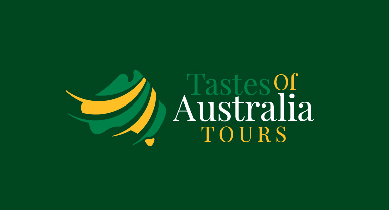
Tastes of Australia tours Logo
It is a team of tour guides, situated in Australia, accepting appointments from their online websites. The logo is the country’s national colors, beautifully mixed in a friendly format and without the golden ratio relative relationship.
37. Toreo fighting bulls

Toreo fighting bulls
Red bull clipart, with dark colors and an unflinching look in the background, is the logos main themes leading to the idea of bulls race still legal in some countries.
38. Wake design development
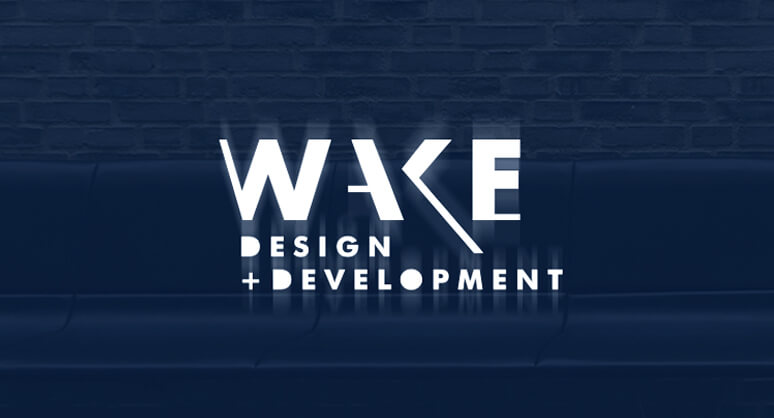
Wake Logo
A website development agency that is also aiming for social marketing and designing already developed websites. The logo is slanted capital letters of the word WAKE written in white with a dark background.
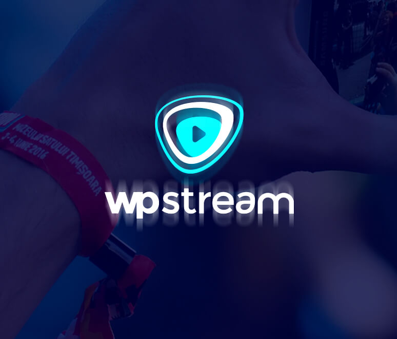
Wp stream Logo
39. Wp stream
WpStream is a video streaming Plugin that lets you broadcast live events. The logo is a play button that signifies a video player.
Final Words
There you have it! The world of logo designing is a lot more than sticking to golden ratios. We provide logo development and design ideas services for our clients until they express great satisfaction. Breaking down the social norms of golden ratio logos, the ‘non’ golden ratio logos are still in full demand and accepted worldwide with variations in the ideas, thinking outside the box.
Get a Free Quote
+1 845 3770255
Call on anytime
To discuss your project
Featured articles:
Topic Categories
Interested In
Logo, Branding & Creative Work?


 We’ll get back to you in 24 hours
to address your needs as quickly as possible.
We’ll get back to you in 24 hours
to address your needs as quickly as possible.
 We’ll prepare an estimation of the project
describing the team compostition, timeline and costs.
We’ll prepare an estimation of the project
describing the team compostition, timeline and costs.
 We'll perform a free website review
If you already have an existing website.
We'll perform a free website review
If you already have an existing website.


