A guide to responsive brand identities (Logos)
Technology, surprise pandemics, and climate change aren’t the only things that are new in the 21st Century. Evolution has taken the design world by storm as well so logo designers and brands alike need to be aware of the modern-day logo design process.
For starters let me tell you that it takes a lot less artistry and a lot more creativity for a logo design to meet the criteria of a responsive logo. What’s a responsive logo design? I’m here to clear the fog for you and not in a nutshell.
What is a responsive Logo?
With the rapid progress in technology and new variations emerging at the speed of light, there’s no longer a defined set of devices or material where a brand’s logo shall be placed. Your logo thus needs to be adjustable, flexible, and yet manage to maintain your brand’s identity!
Before jumping right to a more precise definition let me fill you in on past logo design principles. Ironically, it was sin # 1 to change the logo of a brand due to which you had to stick with whatever you’ve given your thumbs up to. If god forbid you decided to make a few “improvements” you’d have to run an entire campaign, advertising your new logo “explaining yourself” to the design/advertising critics who might be craving for something to point their finger at.
Companies globally were unanimous in their view that no changes can be made to a logo regardless of the size of an advertising medium. Basically the same logo used for outdoor advertising was to be compressed and used for your stationery.
Little did they know that breaking this rule would be the new norm in 2020!
Responsive logos are shapeshifters (not the Boggart you see in Harry Potter). As I mentioned above they can adjust themselves with some minor changes in size, color, and any other element which reduces the complexity of the original thing but doesn’t alter the brand identity!
For a responsive logo, you’ll therefore need more than just a logo designer, you’ll require the services of a logo designer who is also a visualizer. If you’re a logo designer and need one piece of advice it would be to:
- Read this article thoroughly
- Up your creative game
Mediums of communication and Responsive Logos
The sudden surge in multiple advertising mediums has given rise to the increasing need of responsive logos, and logo designers as well as clients, have to weigh out their options appropriately before finalizing a logo lest they face any unfavorable situation in the future.
Of course, it is entirely impossible to predict how technology might evolve in the distant future which is why a brilliant logo designer will create a logo that can be molded in several ways.
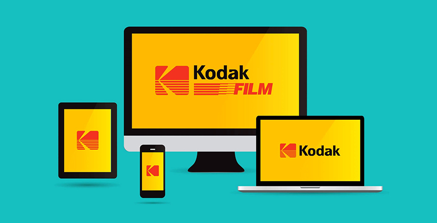
Let’s talk about the devices know might be staying for a long time such as mobile phones and tabs. The same logo which goes up on a billboard should be adaptable enough to fit an artwork or web banner created for a mobile phone’s screen without being transformed completely!
For this purpose brands have reviewed their previous logos, optimizing them into logos which are more web-friendly.
Now for the Responsive Logo Design Guide!
As a logo designer, you must already know the A – Z of designing a good logo but do you know the tactics of designing a responsive logo? If you do kudos to you but if you’re still perplexed, let me guide you through.
Here’s how you can design a modern-day logo that’s responsive yet creative:
1. Simplicity is the best policy
Even if your visual-studies course once taught you how to sketch complicated logos with intricate graphics, you need to block those thoughts. Why? The more complex your logo design, the lesser will be its adaptability to diverse mediums. In simpler words: it will be an unresponsive logo. So mostly a simple design is directly proportional to responsiveness!
The more ingredients you add to the pot, the harder it will be to separate them. In non-analogical words, don’t complicate things. Minimum elements mean maximum responsiveness to various mediums.
Fewer details ultimately lead to more adaptability, easier changes, and more digital-friendly logos.
2. Design Variations
This is where the visualizer in you is put to the test! You need to know how your logo and its elements might be used in the future. Design at least 4 variations, removing different elements of the same logo to see if it maintains the original identity or not after it has undergone the minor changes.
Here are a few examples of simple logos and how easily they have been adapted to adjust in the digital world:
Notice how Heineken started off with 3 major design elements. It is not as if Heineken has abandoned its original logo completely but has in fact assigned each logo a separate task. Confused? Using its name where it can, Heineken has broken the logo down, creating the star-logo out of their original one to remind their consumers that “we are an energetic and modern brand”. The star additionally is a convenient way of using the logo without taking up a lot of space in communications, sponsorships, packaging etc.
Heineken Logo
Observe how Walmart rearranges the elements of its logo design without actually changing anything! Untouched in terms of vector design, all they’ve done is a repositioning of the elements, to create a vertical logo, occupying less space aka vertical stacking.

Walmart Logo
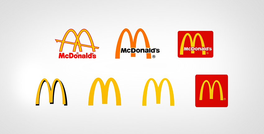
Mcdonalds Logo
3. Losing the words
TBH, this is correlated to how well your brand is established and the impact that your logo has made over the years as the brand’s identity.
In order to take a step towards eliminating the word mark or brand-name from your logo design, your logo needs to be a celebrity: recognized by everyone without spelling the name out. Here are a few stars which have managed to bid farewell to fonts, having established a prominent association with the brand name:

Pepsi Logo

Heinz Logo
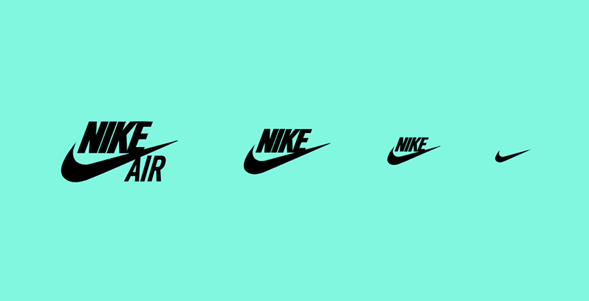
Nike Logo
Minor changes are legal
For a logo to be capable of adjusting in a small space such as a mobile screen, a visiting card or a pen, you don’t need to make drastic changes. Minimizing extra details will do the trick and you won’t be crossing the red line.
Decreasing the size of your vector whilst removing the text, increasing the abstract-ness of the logo like the example of Henz Ketchup above is one easy-way-out of making your logo flexible.

Walt Disney Logo
4. Switch to abstracts
You might have come across certain logos that are no longer “shiny” or graphical. As I mentioned initially that the requirement of a contemporary logo design is creativity > artistry.
Let me explain. Of course, we’re all artists, and creating abstracts is no amateur’s work, on the contrary designing an abstract that conveys the original idea or image 100% is the work of a true, creative artist. However, just like a detailed painting requires more intricacy, colors and the real-life visage, an image-oriented logo takes technically more artistic skills, time and attention to details.
The good news? That effort’s no longer in trend. Heavy graphics are not only a lot to take in for the human eye, but are also problematic when trying to adjust the logo in different mediums. Even printing the logo as it is can be a chore especially where gradients or unusual colors are involved.
So in order to save time, space and eventually any problems at all, the 21st Century has welcomed abstracts with open arms.

Apple Logo

Shell Logo
Logo Design and Technology: the never-ending battle!
With the growing popularity and acceptance of responsive logos by brands and logo designers alike, we’ve ruled out the chances of technology beating us for a long, long period of time.
The beauty of responsive logos is that not only do they keep the brand identity intact, but they’re also super flexible and socialize easily with changes in technology, subsequent to a few minor adjustments.
So when are you designing your very own responsive logo? We’d love to share it in our blogs one day!
Get a Free Quote
+1 845 3770255
Call on anytime
To discuss your project
Featured articles:
Topic Categories
Interested In
Logo, Branding & Creative Work?


 We’ll get back to you in 24 hours
to address your needs as quickly as possible.
We’ll get back to you in 24 hours
to address your needs as quickly as possible.
 We’ll prepare an estimation of the project
describing the team compostition, timeline and costs.
We’ll prepare an estimation of the project
describing the team compostition, timeline and costs.
 We'll perform a free website review
If you already have an existing website.
We'll perform a free website review
If you already have an existing website.


