Learn About Branding Colors & How They Can Transform Your Brand
From a worker’s yellow helmet to a bride’s elegant dress, colors easily communicate crucial details. Their profound global impact makes color palettes a vital component of the branding efforts of any company.
From developing a website to designing a logo, the color scheme for your brand will play a quintessential role in your marketing strategies. The consistent use of brand colors across all channels can result in a cohesive look-and-feel for your business, making it interesting and instantly recognizable.
To make your company stand out with the correct brand colors, this guide covers everything from the definition of branding colors to a step-by-step procedure for choosing your branding color and how to choose brand colors. In this blog, we have also analyzed few examples of successful brand colors and how they have helped them accomplish their goals.
Brand colors
Brand colors consist of a palette of five to ten colors used to reflect a specific business. Consistent and deliberate usage of brand colors can improve brand visibility and recognition.
A corporate logo, social media networks, website color scheme, business card template, print, and digital advertising are among the major brand color applications. Brand colors will also be utilized for the decoration of the outlet, employee apparel, product labels, and much more.
How consumers respond to brand colors
We all recognize that red is related to threat and green is linked to nature, but these connections are not limited and have additional meanings as well.
Color psychology is an inquiry into how shades influence attitudes and behavior. It provides a basis for understanding and uses color to their benefit, especially in terms of branding and marketing. As per a survey, 62–90% of a product evaluation is focused on colors, so it is crucial that your brand palette goes parallel with your brand objective.
How to choose brand colors for your business

1. Identify the personality of the brand
You need to lay the foundations before you think of choosing your brand colors. You ought to grasp the personality of your brand so that you can attempt to express it in color and convey it successfully to your customers. Otherwise, without a specific purpose, you’ll end up being baffled by the innumerable color palette choices.
Start with a few adjectives that characterize your business. Focus on aspects that differentiate you from your rivals.
If your organization is not renowned yet, the only way to read your industry correctly is to speak to any of your most passionate clients. Get the top clients to tell you what they admire about your business. Take a look at a collection of brand personality characteristics, and choose those that define your company the best.
If you have not established clients yet, your coworkers should perform the same exercise and complement it with some context study. You can also perform due diligence on your rival brand within your industry and define the main attributes that differentiate your brand from them. Use the main values to understand the brand’s vision to the target demographic of your brand.
2. Select a core brand color based on the characteristics of your brand
Once you have outlined the main personality characteristics of your brand, it is time to choose the one color that best encapsulates those characteristics.
That is where the psychology of color enters the picture. Color psychology can help us better understand the characteristics of personality that individuals typically connect with common colors. For instance, have you ever wondered why financial and technology companies mostly seem to have a blue color scheme?
Cool colors appear to provoke a sense of trust, commitment, and stability, whereas warm colors are much more evocative of excitement, energy, and positivity. Confidence and stability are absolutely important for major financial companies that have to persuade consumers that their hard-earned money can be trusted.
This idea is backed up by recent studies, signifying that customers have sturdy opinions on how well various color schemes work for different industries. But the psychology of color goes even broader than just cool and warm tones. It can go so far as to equate with specific hues some particular character traits of personality.
It’s worth noting that, among several other things, these color meanings are highly dependent on context, personal observations, and cultural identity. But for selecting your core brand color, they’re a terrific leaping point.
3. Look for inspiration
Look for color ideas before designing the colors of your logo. Browse through the palettes of the rivals to try and learn what helps them perform effectively. Scrutinize on what you can gain from their selections in shades and how you can separate yourself from the field.
Other fantastic sources of inspiration are online paint palette creators, where you can find suggestions for fascinating color pairings and compulsive colors.
4. Choose your primary color
The main color of your brand is the one commonly synonymous with your brand—picture Tiffany’s Blue or Pinterest’s Red signature.
Look for a particular color for the main color that better embodies your company, depending on the sense of color. In an attempt to discover the ultimate look, you should play with numerous colors and tints of the paint you have in mind, ranging from lush and dark to light and pastel or even dazzling neon.
5. Choose secondary color
When you choose your main color, choose two or five shades to go with. These colors can accompany the main one and may appear right next to it or separately. The secondary colors of a brand may drive in a few distinct directions:
Analogous scheme: There are similar variations to the main color. This ensures that if the main color is bright red, you will incorporate other warm colors like yellow and orange, which belong to a similar class of colors. In their presentation, analogous color schemes are typically harmonious and friendly.

Monochromatic scheme: There are various colors and tints. For instance, if your color scheme is blue, light blue and dark blue would be your secondary colors. Your central color can be improved and intensified by monochromatic color schemes.

Contrasting schemes: These colors are either similar colors or a choice of bright, similarly vivid shades. This scheme will help pop out the colors of your brand and typically offers a fun and trendy feeling.

6. Pick neutral colors
Neutral tones are typically white or black and are sometimes paired with shades of gray. It’s quick to concentrate on the primary colors while deciding on the brand colors and forget the neutrals. Neutral colors, though, are important since they are the ones responsible for most of your correspondence and will appear in the context of most of your properties.
7. Stimulate the colors of your brand
After you’ve selected your shades, place them together and try them in different configurations to ensure they match each other and express the meaning you were looking for.
In order to guarantee that they’re easily legible together, you can even measure the palette for usability. There are loads of web tools and browser extensions for usability that check the color comparison. Contrast Checker and the Color Contrast Analyzer are a few of the effective tools.
Read also: Color Theory and why it is Important
How to use brand colors

1. Add the branding colors frequently
It’s well known that buyers tend to shop from brands they understand. The best approach to create brand recognition is to continuously extend the brand across all of the collateral for marketing. In all infographics, papers, presentations, or social network graphics that your organization publicly posts, make sure to include your chosen colors along with your brand’s emblem and fonts.
This can be rendered even simpler with a brand style guide, meaning that everybody has easy access to the correct color codes, logos, and fonts. To maintain the brand name steady, you should also provide instructions on when and where to use unique brand colors.
2. Using the color of your core brand as a branding accent
There’s a 60-30-10 law in the design environment that implies that a vivid, prevailing accent color can be just 10 percent in every design. This appears to be a fairly strict rule for adding advertisement collateral to the company colors. Here’s how it will function:
- Your main brand color should be 10% of the design
- Your secondary brand color should be 30 percent of the design
- A neutral color should be 60% of the design
This will make the company sound advertised, but the architecture will not be overshadowed by the brand.
3. Building your template around the color of your core brand
You may alternatively reverse the script and render the branding a subject in your concept. For the visual appeal, create the template around the main brand color and utilize a secondary brand color.
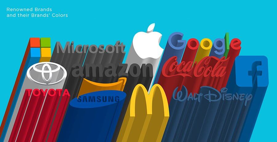
Renowned brands and their brands’ colors
1. Starbucks
The brand color of Starbucks is created on a family of greens and paired with four neutral colors. Their main color is that of the emblem of the Siren – an iconic hue named “Starbucks Green.”
The extended color scheme merges this primary green with other “fresh and inviting” hues, alluding to the rich history of the company. This involves an accent color and two greens that are supplementary.

2. Apple
Steve Jobs preferred white for two key purposes. Jobs was excited about architecture and knew that white was the color of purity according to his idea of intelligently design products. The second explanation was because of the rivalry. The prevalent color used by makers at the period was grey.

3. Instagram
The shades of the Instagram brand are a blue-to-yellow gradient, with a wide variety of pinks, purples, and oranges in between. This variation is a reimagining of his older, skeuomorphic logo of the company’s brand rainbow.
This rich color range is intended to invoke “warmth and energy” emotions. It is also a reference to the value of color in the filters of the app, uploads, and more.

4. The Guardian
Its navy blue color is more aligned with The Guardian. But colors play their roles in more than branding alone with a site this rich in content. By discriminating between forms of editorial material, they often act as navigational instruments.
Red indicates news stories, orange is for commentary posts, and brown is for style tends. Based on their use, each of these colors comes with a set of variants: dark, pastel, main, and faded. In color usage, these variations allow for versatility.

You may find it interesting: Embracing the Pastel Color palette
5. Google
One of the timeless logo styles that we all recognize by heart is from Google. The four colors of the logo (red, blue, green, and yellow) are equally associated with the brand, much like the design itself. These are the key colors of the brand, in addition to white, which is prevalent on Google interfaces as well.
Darker variations of the main ones are the alternative Google colors. These are accompanied by tertiary light green and light blue and a number of grays that act as neutral colors, such as in the written text, in delivering details.

6. McDonald’s
There is a science behind the primary colors of McDonald’s. Red strengthens you, raises your pulse rhythm, and as a consequence, your appetite. Yellow is synonymous with being joyful, plus it is from a distance the most noticeable color to find.

7. Cadbury
Rumor has it that the royal purple of Cadbury was picked as a tribute to Queen Victoria. Cadbury first wanted to patent the color back in 2004, but this sparked a chocolate battle with Nestle, which claimed it was not distinctive enough to own it. Cadbury won the trademark in 2008, showing that the classic colors are worth battling for.

8. Coca Cola
For logistical purposes, Coke’s recognizable red was introduced in the market. As per the company, they began coloring their barrels red from the mid-1990s so that tax authorities could differentiate them from alcohol during transport.
But for other purposes, it was also a smart decision because we now know that red may be a catalyst for impulse buyers.

You should also read:
End Note
I hope this article can help you make better choices. Still, don’t forget your gut feelings above all. The biggest consideration of colors is their emotional relation, so when settling on your brand colors, don’t forget your own emotions.
Get a Free Quote
+1 845 3770255
Call on anytime
To discuss your project
Featured articles:
Topic Categories
Interested In
Logo, Branding & Creative Work?


 We’ll get back to you in 24 hours
to address your needs as quickly as possible.
We’ll get back to you in 24 hours
to address your needs as quickly as possible.
 We’ll prepare an estimation of the project
describing the team compostition, timeline and costs.
We’ll prepare an estimation of the project
describing the team compostition, timeline and costs.
 We'll perform a free website review
If you already have an existing website.
We'll perform a free website review
If you already have an existing website.


