How to Create a Strong Impression by Using the Visual Hierarchy Principles?
Read all about the visual hierarchy principles and create the most engaging design of all times. Unravel the best tips for perfect designing.

Disclosure: This article may contain affiliate links. We earn a small commission at no extra cost to you.
What is Visual Hierarchy?
Before moving the principles of visual hierarchy, it’s important to understand what it is. Visual hierarchy is a set of principles that can enable even a non-designer to create engaging and exceptionally amazing content.
Yes, it’s true!
So, how do you define it? Well, visual hierarchy allows the designer to create the best design by working on important aspects.
When someone looks at your design, they must get the entire idea behind it within a few seconds. As difficult as it may sound, but it’s not so hard to achieve. If you’re following the order and are paying attention to the important parts, then a great design is bound to be created.
No matter if it’s a brochure or a business card, it must deliver the message to the audience. Apart from it, the design must be aesthetically pleasing to ensure that the audience is not bored by looking at it.
So, how can you do it?
By simply following the golden rules!
What are these golden rules? Let’s shed some light on them to help you create the best designs of all times.
Visual Hierarchy Principles
We have highlighted about 12 principles of visual hierarchy to help you achieve greatness in each of your designs. Let’s move to them without wasting any more time.
Size
Size matters!
The size of the design element matters the most. The bigger the design element, the better attention it gets. There are more than one element in every design, but not all of them are equally important. For instance, in a business card, often the name of the person is the most important element. Hence, you would have noticed that it’s always highlighted by being the biggest element in the card.
So, by working on the object’s size and scale, you can enhance the visual importance of an object. Similarly, you need to check which objects do not hold much importance, so you can reduce them in size and scale.
Make moderate choices and do not lose balance in the design. It’s important to pay attention to important design elements.
Example

If you look at the size of both the design elements, you will instantly realize that the bigger one may have an important role to play. Similarly, you can simply reduce the size of unimportant elements to increase the visibility of the important ones. Using the right size is extremely necessary to ensure that the design looks tasteful.
You may find it helpful: A Brief Overview of How to Create an Effective Brand Style Guide
Color and Contrast
The better the color choice, the better attention it receives!
Colors have visual importance, which is why some colors are constant for some purposes. For instance, red, green, and yellow for a traffic signal.
When you’re designing something, you need to work on the imagery and colors. On the other hand, it’s also important to note that you cannot overwhelm the design with a huge range of colors. There’s a balance needed even in the colors section of the design.
You need to be experienced enough to use the right colors and contrast in the design to ensure maximum visibility. It’s up to the designer to use the best color scheme for the design to ensure that everything is in harmony with one another.
Example
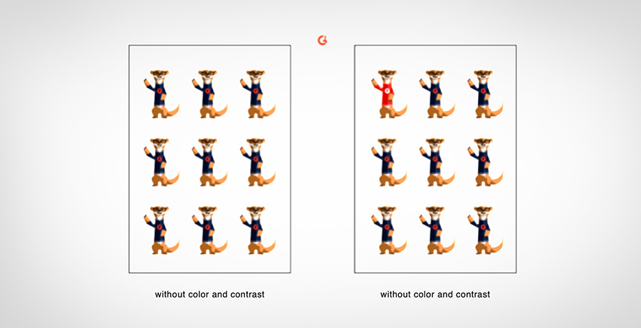
Using high contrasts help in increasing the visual appeal of the image. By utilizing colors and contrast, the perceived distance of elements can be altered. In this example, the second image with color and contrast highlights one of the design elements among the rest. In short, you can draw the attention of the audience to the point where you want it.
Typography
Another critical aspect of visual hierarchy is the typeface selection.
The fonts, style, italicization, weight, and width of typography play a huge role in enhancing the appeal of the design. Consider the example of an important document, do you write the whole document in the same font? Definitely not!
Each section in the content is highlighted by its importance. For instance, you would use larger fonts for the headings and smaller fonts for the content.
Unless you have worked on the typography of the design, it will always look unorganized and unbalanced.
You can create type hierarchies by adding different text sizes, spaces, and weights in the design. It’s totally up to you how you want to work on typeface hierarchies for excellent visual appeal.
Example

Take the example of Slack’s website where they have used large fonts on the banner to draw the attention of the audience. They have further created a call to action, while, other content under the heading is written in small. Typeface selection matters the most.
You may like it: What Makes a Good Logo? Ultimate Guide 2020
Proximity
When it comes to the principle of proximity, grouping like items becomes easier. In web design, several elements on the page require to be separated or grouped down. For instance, the widgets, sidebars, etc. are there separated with space with one another. Proximity helps in grouping down the same type of content in one place and other types of content in other places. Hence, it becomes easier for the person to find everything easily.
Example

In this example, FedEx has sent out a strong message that no matter how far or close people are, they can send anything to them. Using the map creates a bigger picture and sends out a greater message. It shows that FedEx is a global service.
Rule of Space
If you want your design to be aesthetically-appealing, then you need to make sure that you add enough negative space to it. The designers usually opt for this method to draw focus to one point. It helps users to bring their focus on important things pretty easily.
Page-Scanning Patterns. When the designers want the audience to scan the page in a particular order, then they make the use of page-scanning patterns. Different languages are written in a different pattern, hence, a separate pattern is used for every design. It’s up to the designer to create a design hierarchy that is best for all audiences.
F-Pattern. It’s the most common type of pattern that the designers utilize in their designs. The pattern is similar to the one when we read books or anything else – From left to right along the top. F-Pattern is the best for heavily text-based designs.
Example

It’s a text-based design in which using the F-pattern is used for the audience to perceive the message easily.
Z-Patterns. Z-Patterns are extremely beneficial for heavily image-based designs. Since the brain processes images pretty faster, therefore, the designers use this design to make the scanning easier for the audience. The direction is like from top left to right, then diagonally down to the left and then to the right forming a Z on the screen.

This example is great to illustrate the Z-pattern as it’s mostly image-based. The users will be easy to scan the page and get a hold of the message.
Alignment of Elements
Proper alignment of elements is extremely necessary for the design. No matter if you have a plethora of text or images on the design, it’s important to align them perfectly to make them aesthetically appealing.
As mentioned above, the F- and Z-patterns are used for alignment to ensure that the design is not randomly scattered through the page. If that’s the case, then the whole design can lose its appeal. If the design is simple, then aligning them in the center is enough. But for text-based designs, F-pattern alignment may be the best choice.
Example

In this example, the element is aligned in the center to appropriately deliver the message to the audience. It’s aesthetically-pleasing and looks balanced.
Rule of Odds
By using the Rule of Odds, the designers place the most important element in the center with equal neighboring objects on either side of the center element. Using the odd-numbered groups is aesthetically pleasing, which is why it’s more appropriate to use this technique.
Example
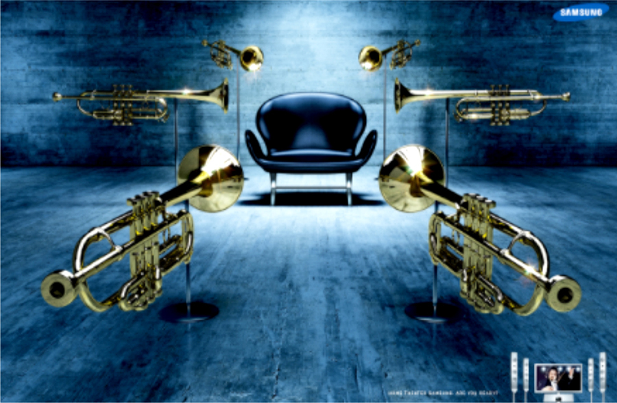
In this example, one can get an idea that the chair is the main design element. If you look at both sides of the element, there are equal elements to ensure a balance or harmony in the design.
Interesting for you: Pepsi’s long history of logos: A lesson in modern logo design from the past
Perspective
If you want to add the illusion of depth in your design, then perspective is the one you should work on. A designer plays with the perspective until an illusion of separation and distance is created. Not only it brings the focus of the audience to the important element, but also adds a visual appeal. Perspective is one of the most important visual hierarchy principles to enhance the overall design.
The designer can also create perspective by enhancing the size of the important elements as compared to those around it. Adding a foreground layer, blur over a background, or drop shadows further help in adding an illusion of depth.
Example

As mentioned above, we can create an illusion of depth in the design by enlarging the important design elements. You can look at the image to get an idea of what you can do to increase add perspective to the design.
Rule of Thirds
Bringing balance to the overall composition is extremely necessary for the designer. Using a sort of grid helps in achieving the balance to improve the design. The Rule of Thirds is used to bring this balance into play. Usually, the designers separate the image into nine sections or two horizontal and vertical lines to find the right balance.
Mostly, the designers utilize the modular grids, but there are alternate grid designs too. Apart from the vertical-horizontal grid, the designers also utilize the diagonally-directed composition for their designs. Some designers ever like to break the grid, but don’t get overwhelmed by it as it can come back at you with the worst reaction.
Example

It is an example of the modular grid design in which the important elements are placed within the focal points in the center of the frame. If you see properly, negative space is there as well that creates an aesthetic appeal to the overall design.
Repetition
It’s important to create unity and cohesiveness in the design. Unless you do so, you can never create a mark in the minds of the audience and can leave them confused altogether. Using the same fonts throughout the design with consistent colors and styles creates a sense of cohesiveness in the design.
Everything must go together in the design to leave a mark in the audience’s mind. Being a designer, this point is extremely important for you to consider.
Example

In this example, the repetition creates unity and cohesiveness in the whole design. If the same style, fonts, etc. are continuously used throughout the design, it starts to appear wholesome.
Conclusion
If you’re looking to create the best design, then following the visual hierarchy principles is the best option for you. No matter if you’re a new designer or an old one, if you love to play with a design, then you can try it out. Using the right things at the right time is important and delivering the message within seconds should be your priority. If your design covers everything, then you don’t have to worry about the rest!

Co-Founder & Strategic Visionary at FullStop
Co-Founder at FullStop, a branding, digital and software agency he started in 2012. Haris works across brand design, digital marketing, and custom development—helping businesses turn ideas into market-ready products.


