An Art Design Logo: The Perfect Solution to Your Business Branding Needs in Current Times
What Is Art Deco Logo and How Came Into Being
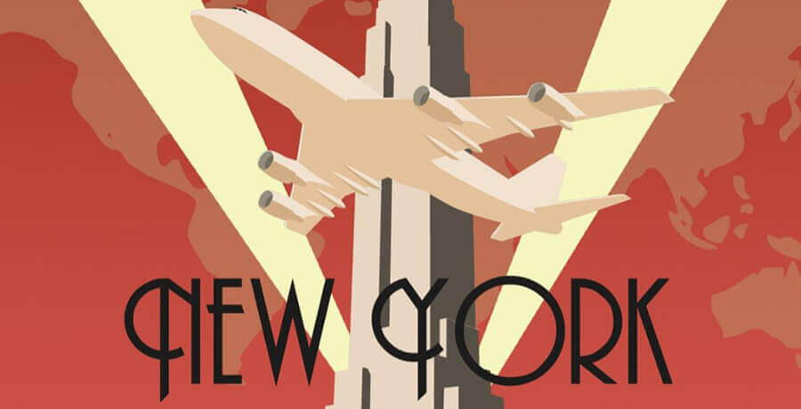
The art deco logo and its design found their inception in an iconic movement that spread in France following World War I. In the 1920s, the Parisian art community assembled to display an exhibition highlighting the best of arts. Yes, it was the same decade when the ‘The Great Gatsby’ found its fame.
With attendants numbering a whopping 16 million, the goal of unleashing decorative arts resulted in one of the most famous stylistic movements of the decade, which came to be known as Art Deco to the world.
When Art Deco Logo Took the World by Storm
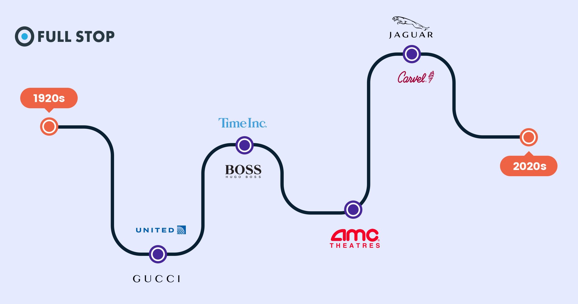
A decade later, art deco took the world by storm after this concept was widely adopted across the US and Europe region. Much of the success of this modern style is the result of its depiction of sophistication and wealth.
The modern style also infiltrated almost every medium. Very soon, this art was widely utilized in graphic design and across furniture, the digital world, and video gaming. It was only a matter of time before businesses worldwide started using this art to enhance the image of their brands.
How Art Deco Applies In Branding
Art Deco has been used in branding for a very long time. The 20th century was a witness to this unique art being used to brand businesses. The Roaring 20s and the Great Gatsby are prime examples.
How Art Deco Logo Helps Brand Your Business
When I take to net surfing, I see that in the current times, history is repeating itself in the sense that many companies are adopting this art to brand their businesses. This concept is certainly not outdated so far.
I would suggest that Art Deco logos be utilized as a means of creativity to further the cause of a brand. If you are new to branding, it would surprise you to know that a large number of creative experts apply this art.
So especially with the resurgence of Art Deco, it is safe to deduce that this style will suit your company best when it is utilized for new branding purposes. Use this art to make meaning in the lives of people in this tense and stressful environment.
Just take a look around you and explore the different famous brands. Most of them reflect logos that draw on thick strokes and geometrical shapes and figures. They also use heavy and rigid lines accompanied by a combination of colors matching the lines and symmetry used.
When I explore this form of branding, it is evident that aspects and elements mentioned above may be overused. I feel Art Deco will address this shortcoming as it offers a style that is minimal and clear.
Customers these days tend to buy economical products, but sales will propel high if you offer something that exudes a luxurious feel. The golden and linear designs used by Art Deco, especially in hotels, restaurants, gift, and food businesses, reflect a luxury that customers would crave in their lives.
This style proved to be popular during the early 20th century, and this is a fact. So why not try this today. We did not go through a world war, but we just witnessed and still are witnessing a global pandemic. The economic backwardness of millions of people is a crucial feature similar to one seen during the 1920s.
Businesses that Need an Art Deco Logo
If you want your business to adopt a form of branding that goes a long way in persuading customers to buy your products and become loyal clients, then this style is for your company. The impressive feat of Art Deco lies in its power to create eye-catching designs that are unique in nature and helps a viewer associate with your brand quickly.
In my opinion, the time is ripe for applying this art to design modern logos that will brand your business. Trust me on this. The characters of Art Deco, with its black and golden combination and the pairs of larger images accompanied by more minor texts, will offer a unique logo that will give an attractive and appealing look.
So if you are looking forward to availing of these benefits, then opt for the Art Deco logo. If you still have any doubts, I will give you another reason that will convince you straight away!
Branding is always successful when different styles and influences are merged to allow troubled people to celebrate modernity with style. In the era of the post-pandemic world, this style will give optimism to the troubled public and a chance to relish an attractive lifestyle.
Once your logo makes a strong link between your business and luxury, richness, and delight, your sales will take a hit.
I feel businesses now have the power to lead by example. If an Art Deco logo can be used to highlight an end to the gloomy days of miseries and troubles, the brand will be a major success. Make a difference in the lives of people by offering them a strong glimmer of hope.
25 Examples of Art Deco Logo
I will now offer a collection of 25 popular examples to inspire you to design your logo.
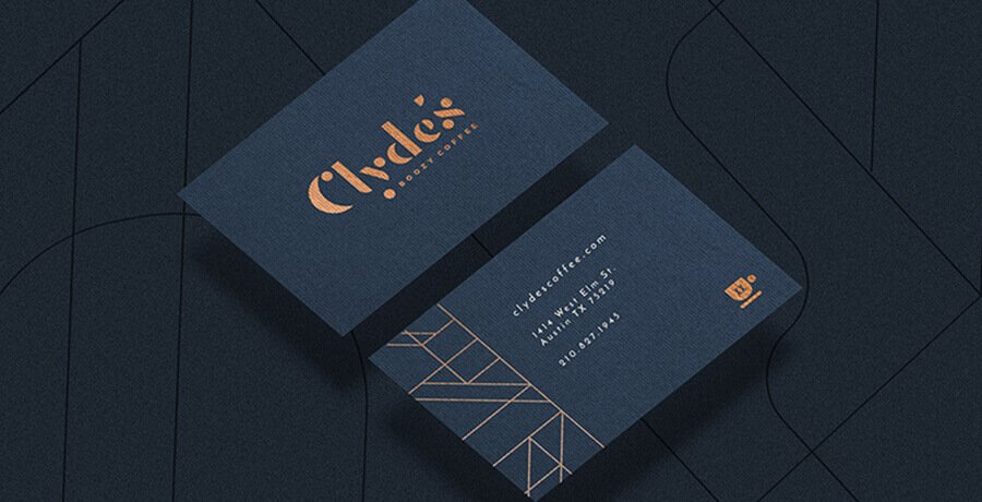
Clyde’s
This happens to be a coffee cocktail bar concept that found its inspiration in an infamous criminal named Clyde Barrow. Though Clyde was widely recognized as someone who engaged in bank robberies, this style still became a hallmark as it received immense admiration for depicting a luxurious lifestyle.
Amazing? The brand exhibits a mix of art deco but continues to unleash an aura of splendor.
This is one logo that has lasted through time and will likely continue to be a significant source of inspiration for future logos for a long time in the future.
You may also like: Flat Logo Designs – All the Inspiration that You Need for Your Brand
Sweet Stars
I selected this logo to showcase art deco for its simplicity that can speak well of a brand. The word sweet has been blended exceptionally well with a pattern of grain strands.
The logo, in short, has been composed using a combination of symmetrical figures with colors that matches its purpose. Despite being simple, the logo is also modern and offers a retro image at first glance.

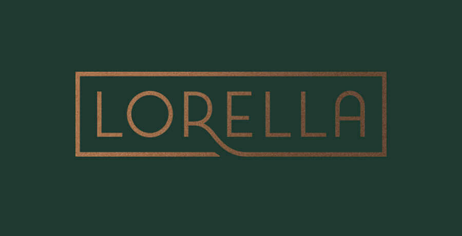
Lorella
This pick is an amazing example of a logo offering a simple solution that reflects the modern era. On a closer inspection, it can be seen that the letter R has been extended to provide a golden concept of keeping a brand style to the minimalist level.
The color matches well the golden letters, and it can be termed as a logotype that depicts a brand in a manner most appropriate.
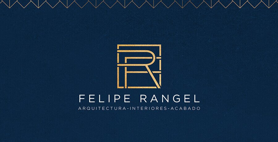
Felipe Rangel
This logo, meant for an architecture company, uses a monogram that offers an elegant look to viewers. It also has an additional set of frames that, despite being based on an apartment’s sketch, does much justice to the logo.
The initials of the architect are drawn to offer an attractive look that persuades lookers to recognize the luxury of the services being provided by the company.
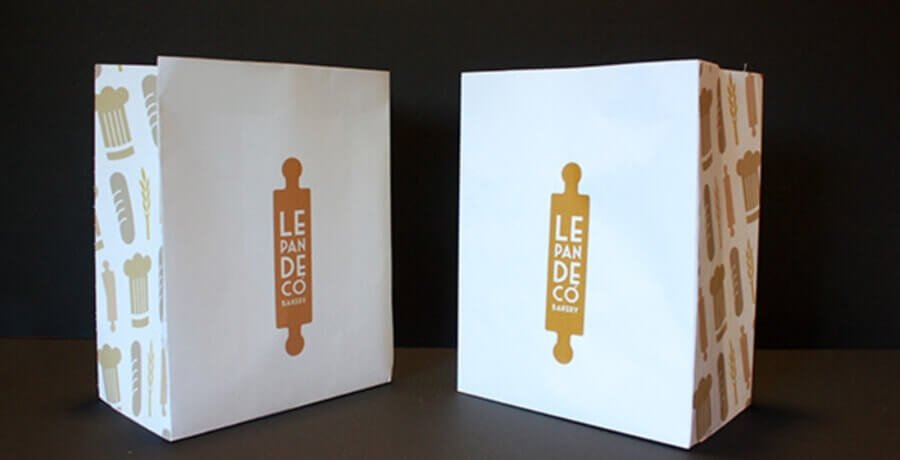
Le Pan Deco’
This logo has been picked for its luxurious look that offers an intricate design. It relates to a bakery, and hence the design suits well the business story of the brand.
This logo is also effective because it has a dough roller combined with a simple typeface that depicts the brand well. In short, it is a perfect example of inspiring a bakery business logo.
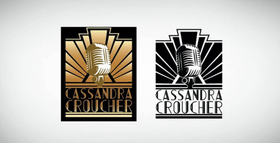
Cassandra Croucher
Finding an art deco logo that mesmerizes viewers is never an easy task. It becomes all the more difficult when you want a striking piece of art that appropriately depicts a musical element. However, this task seems to have been very reasonably accomplished when Cassander Croucher requested a logo that focused on music.
This logo draws on design elements that are molded with each other with a bold display of features. The best part about the logo is that despite the seemingly odd coloration utilized, the logo makes an impressive appearance.
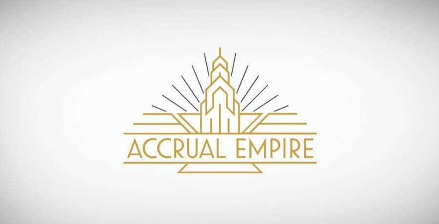
Actuarial Empire
This logo is a perfect example of an art that makes an exciting start for companies wishing to launch their branding campaign. As the word empire suggests, it perfectly fits the description of a company aspiring to grow steadily into a vast network. The name reflects a business consulting firm that thrives on assisting other businesses to prosper.
Geometrical lines have been well chalked out to display a geometrical shape that amplifies a strong branding campaign. For many, it would be easy to remember and recall the company associated with this logo.
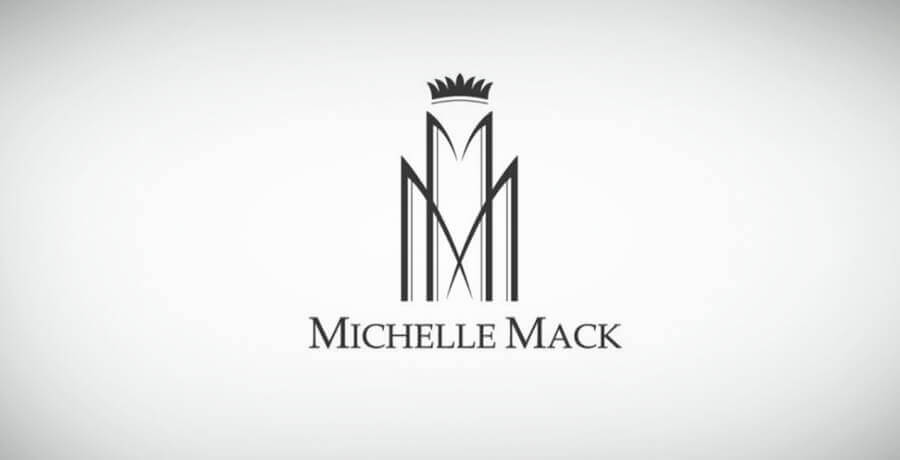
Michelle Mack
This fine piece of work emerged in the post-war period. It consists of a perfect symmetry that is frequently found in other elements of Art Deco logo designing. The way the two Ms are positioned speaks well of a geometrical figure molded to depict an aura of grandeur.
Furthermore, an icon that matches the shape of a crown gives a royal feeling helping people recognize that this business is one of the top in the market.
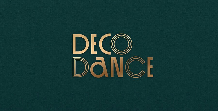
DecoDance
This logo was designed for a dance bar in the USA. The Roaring twenties vibe inspired this move. The logo consists of green and golden colors, which have been utilized here to offer a luxurious look to the logo.
The logo also makes use of a unique pattern of circular and semi-circular letters. This helps it offer authenticity and playfulness. This style also resonates with richness.
Cin Cin
This logo is from another bar found in Singapore which deals with a rich boutique offering. This logo is also unique because it utilizes a wood mark where thin lines have been diminished to allot more prominence to other elements.
Like the above one, this logo made use of gold, intending to offer an elegant look that reflects wealth and power.

Sala Soiree
As many experts agree, a combination of dark blue and golden colors offers a fantastic look which appeals to the viewers. This logo does the same to provide a refined look.
Drawing on beautiful ligatures, the words and symmetry have been paired with a circular frame with an intricate look. The design is a brilliant piece of art that reflects a brand in its true spirit.

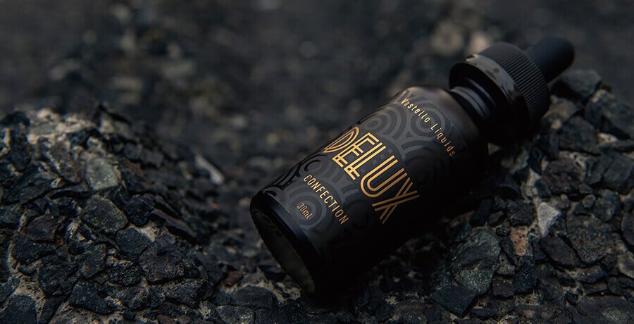
Delux
This logo pertains to the manufacturers of electronic cigarettes. This logo is elegant because it selected a combination of black and gold combo, but it decided to go with a typeface made up of iconic gold rods.
This design has a classic Art Deco pattern and highlights the brand effectively in theater ceilings and window frames.
An interesting read for you: All about Emblem Logos and why your brand needs one?
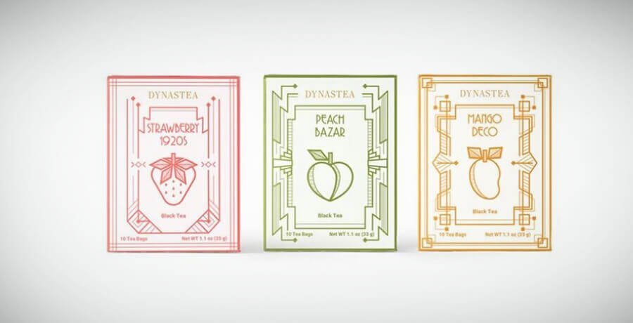
Dynastea
I selected this as an inspiration for tea brands but didn’t consider the original idea to be the result of digital theft. Though it is a brilliant inspiration for packaging, it can be used as a modern art example.
The inspiration has been influenced by the movements that rocked the art world a few decades back, yet the colors are different from the original ones. Green, coral pink, and yellow may be considered atypical but combined with the fruit icons, and the logo offers a unique and cool look which is a far cry from a conventional and straightforward design.
Luux
This seemingly simple logo design goes far away in resonating femininity and beauty that people desire. The typography is smooth and straightforward, but it still unleashes an art deco design that reflects the essence of luxury perfume.
This Swiss brand has successfully incorporated grace through a pale rose. The gold color further enhances the luxury of its perfume product.

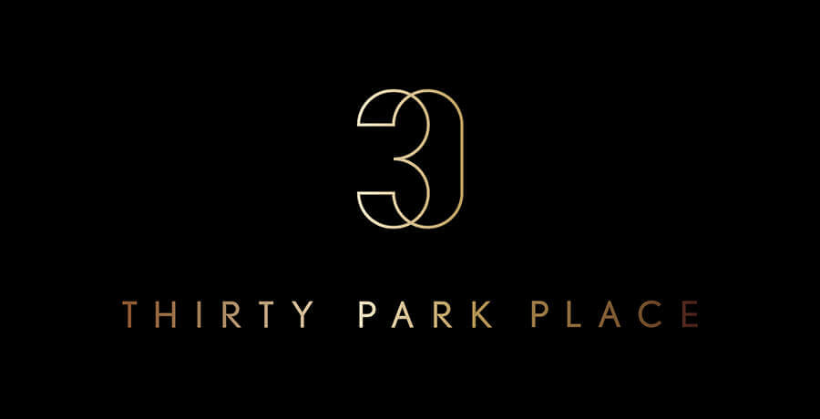
30 Park Place
This logo belongs to a luxurious residential building in the critical city of New York in the US. This logo, apart from signifying luxury, also denotes glamour. This logo has been inspired by art deco and offers an elegant style.
Though the logo is simple with a modern application, it offers a unique and rich design familiar with a rich and expensive lifestyle.
Casa de Nora
I have picked this logo to offer inspiration to restaurant cuisine businesses. This logo pays tribute to corn. This logo provides a lesson in history as corn was the essential ingredient in Mexico in early times before the arrival of the Hispanic people.
The logo draws on an elegant logotype with a frame consisting of three corn cobs. The logo does justice to cuisine restaurants and reflects the taste of a population that relishes the centuries-old meal.

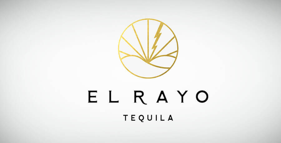
El Rayo Tequila
To offer you an example of a serif typeface logo that suits a brand, I have picked this logo. The sleek but elegant typeface used here consists of a golden frame to offer an elegant look.
The name means lightning, and the typeface of the words suits this aspect of nature. Hence, despite being simple, the design offers the viewers a mesmerizing look who will accept the brand’s message immediately.
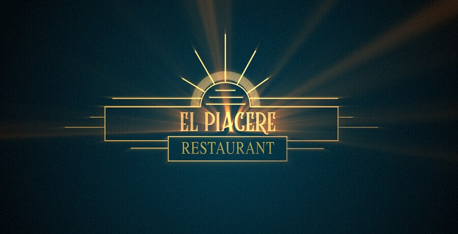
El Piacere
This is a restaurant logo that has utilized excellent striking features. Golden aesthetics have been used to denote luxury and a rich lifestyle, and this color can be seen across the entire vibe, which reflects richness and luxuriousness.
The logo also offers a brilliant lightning feature that pierces through the symmetrical shapes on the logo.
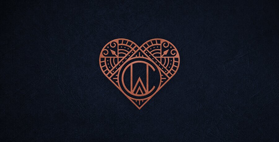
CW Monogram
This logo draws a familiar design of the heart with a monogram. However, the symmetry used for the words CW is unique, and it offers an appealing look. The background color amplifies the connection of the brand with luxury.
The designer had designed the logo for a company that offers gift cookies as its product. This unique logo has helped build a strong brand due to its connection with the cookie business.
La Luce
The words make an exciting statement as they mean ‘the light,’ which suits a wedding photography business well. This logo is for a wedding photography studio, and it makes a strong business connection with its light and sophisticated wood mark.
Additionally, the logo is also a good reminder of how important storing and preserving fond memories through craft is for people.

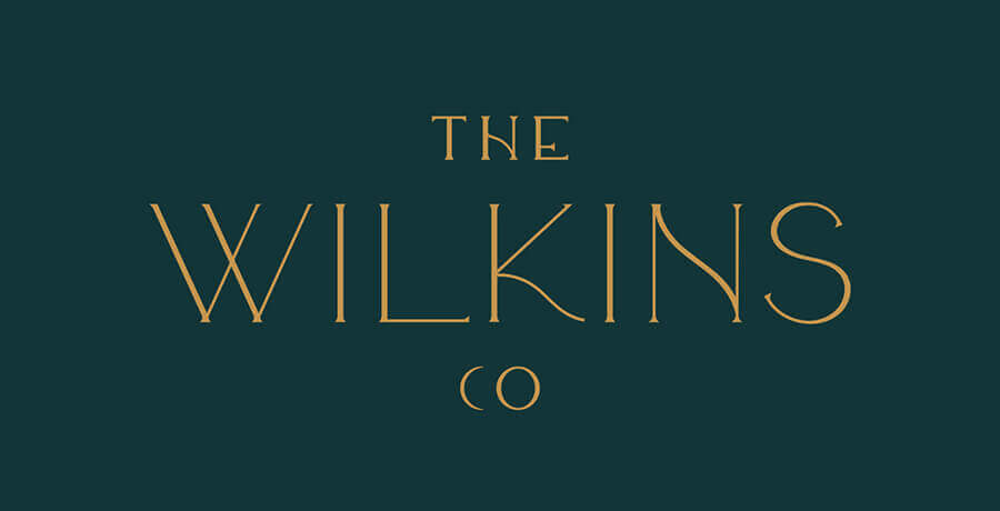
The Wilkins Co
I want to offer another example of a simple and elegant logo that has been used for a photography business. This logo has used subtle font serifs to provide a look of taste. There is a combination of golden and dark green colors that reflect charm and attraction.
This logo, in short, is a refined one and looks best when it is used on business cards.
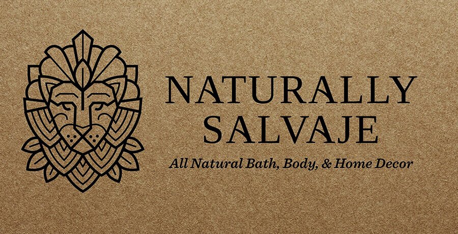
Naturally Salvaje
To offer you a brilliant example of how art deco can be used in a company’s branding, I will provide you with this example. This logo does justice to the business of Naturally Salvaje. This is accomplished as the logo makes a strong business connection with handcrafted skincare and natural products.
Every element in this logo adds value to the branding process, and if you remove even one aspect, the value of the logo will fall. This logo also helps people understand how the concept of multiple styles is important for enhancing a brand’s image.
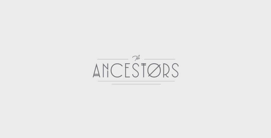
The Ancestors
It is important to understand that wild and crazy use of images and icons will not help brand your business. What you require is a pattern, and to explain this aspect, I will offer this example. This logo helps show what a brand is all about.
Though offering a plain look to many, this logo has additional design elements that make the logo look more appealing. This pattern is a success as it helps explain a brand with a simple design.
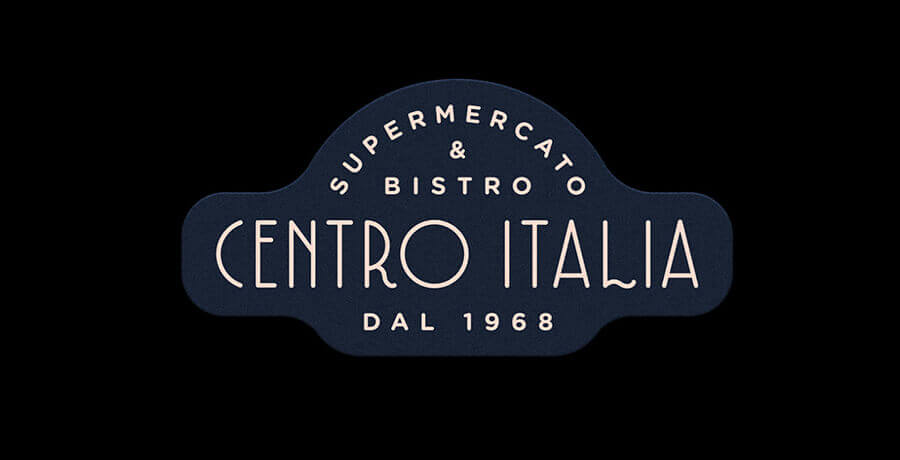
Centro Italia
Inspiration from decades-old logos can also be used to make one for recent times. To help you understand the importance of such logos, I will explain one logo that dates back to the oldest Italian supermarket in the history of Berlin in Germany.
This logo itself is an inspiration from the Italian signage, which offers the viewers a vintage feel. You can see that the design is clean but still offers a fancy look that links with richness immediately.
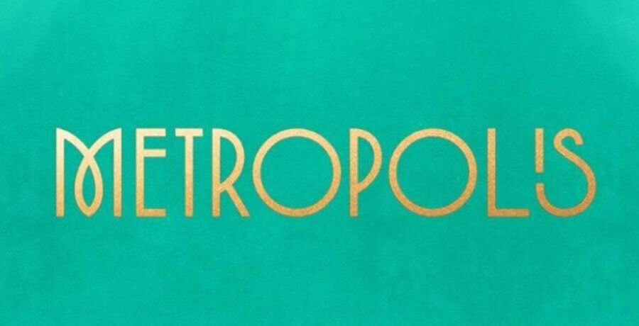
Metropolis
To offer a last inspiration in this blog, I have selected a widely popular example. This logo is a classic example of what it takes to brand a business to the highest level of sophistication. The lines and patterns used in this logo make it attractive and interesting, thereby appealing to the viewers’ imagination.
This irresistible design has a pop color which makes it unique and stands out from the crowd. It is a far cry from the gold and black colors combination. This means this logo, despite being unique, does not fall short in the sophistication standards by any means.
You may find it interesting: 39 Best Animated Logo Inspirations in 2021
Conclusion
So with the Art Deco logos, the specific of the past century looking towards resurgence, it is time to utilize this art in current times too. In the past century, the success of this art can be attributed to the post-war period and the economic depression that enveloped the western sphere.
The current times aren’t much different. Though we can’t compare the recent times to the miseries wreaked by World War I, economic uncertainty still looms large. This era is one of the interactive designs that help a brand grow by highlighting an aura of extravagance.
Avail Your Very Own Favorite Art Deco Today
Connect with FullStop to craft a logo that makes a strong appeal. Don’t worry about the selection of the different elements. Whether you use them scarcely or extensively, we can help protect your brand with strong features. This is because we are experts in making your logo look glamorous with a distinct look that will make it stand out from the crowd.
What better way of achieving this task there could be other than to brand your business and its products and services through an Art Deco Logo?
-

Waqas D.
Waqas D. is the co-founder of the branding and website agency, FullStop™. He supercharges brands by crafting memorable logos, brand identities and engaging websites. Besides thousands of startups and medium-size businesses, FullStop has worked with likes of Microsoft & L’Oréal. View our portfolio or get in touch.
Get a Free Quote
+1 845 3770255
Call on anytime
To discuss your project
Featured articles:
Topic Categories
Interested In
Logo, Branding & Creative Work?


 We’ll get back to you in 24 hours
to address your needs as quickly as possible.
We’ll get back to you in 24 hours
to address your needs as quickly as possible.
 We’ll prepare an estimation of the project
describing the team compostition, timeline and costs.
We’ll prepare an estimation of the project
describing the team compostition, timeline and costs.
 We'll perform a free website review
If you already have an existing website.
We'll perform a free website review
If you already have an existing website.


