7 Golden Rules to Learn By Heart to Design a Logo
If you’re a logo designer, then you must have learned it from somewhere or must have worked on it on your own. Logo designing is not as easy as putting the font and color together. If you want to be the best logo designer, then you have to think out of the box. Beating the competition and gaining more customers is the ultimate goal of any business, so if you want them to achieve their target, you should show extra-ordinary work.
No matter how far you want to go in designing an exceptional logo, there are always some standard points that one should not miss. The logo design rules are something that every designer knows by heart, so if you want to be the best, you must stick with them.
The golden rule for logos is simple but quite effective. Half of the work can be done by simply following the standard procedure in all your logo designs. So, if you’re ready, let’s head to learning them all!
Golden Rules of Logo Design
The golden rule for logos is the same for all regardless of what type of logo you’re designing. Here are the logo design rules that you must know of!
One Color for Logo
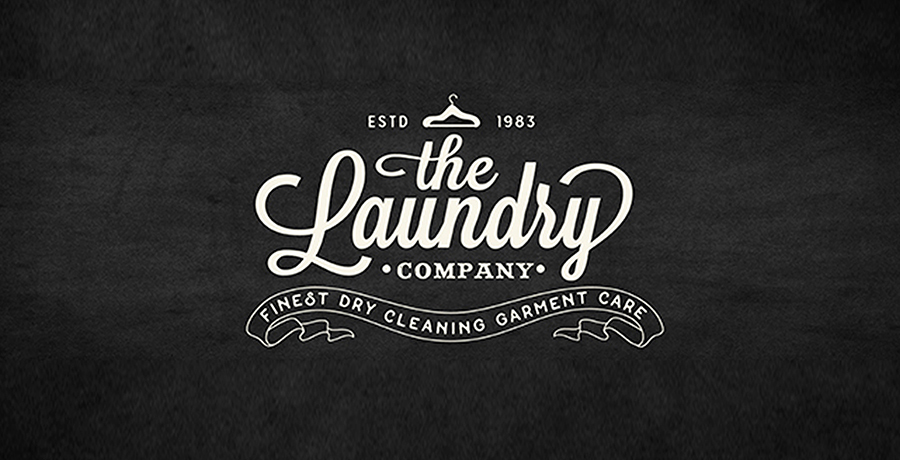
So, what does it mean to stick with one color? One might think that it should depend upon the brand and other factors, but it’s not the case. Sticking to one color is important for your brand if you really want to avoid the fuss in the future. There are many brands in the market, especially the big ones that stick to a simple yet alluring color scheme. Too many colors do not go well with the brand identity until and unless your brand is as colorful as your logo. The logo will be engraved on your company’s entrance, on business cards, stamps, and whatnot. You need to make sure that it looks simple and decent regardless of where it’s engraved.
![]()
Prioritize Simplicity
Simplicity is always the first preference for any brand. Ever wondered why? The simpler the logo, the better message that it gives out. One of the most important things about the simple logo is that customers can easily remember it. By remembering your logo, they can identify pretty easily. If you take the example of the best companies in the world, you will find one thing that is pretty common in all. SIMPLE LOGO!
So, if you’re planning to get your business in the market, it’s best to start with a good and appealing logo. Too many patterns, text, or textures can steal the real beauty of the brand. Use minimal colors and a simple texture to allow better recognition and more importantly, VERSATILITY!
You should also read: Can a Logo Help Your Brand to Increase Customers’ Trust?
Choose Font Wisely
One of the most important golden rules for logos is to choose font wisely for your brand. Sometimes, it’s not the logo, but the font that catches the attention of your audience. The symbols and font should be in balance in the logo if you want something pretty to come out of it. Many popular fonts are widely used in logos because of their versatility and beauty. One of the problems that usually arise with amateurs is the poor choice of font. So, are you willing to pay the price for not using the right font in your logo?
Less Special Effects
A logo is not a movie, so keep it easy when it comes to special effects. An inexperienced logo designer usually finds special effects and all pretty fascinating and that is where the brand loses its reputation. A logo needs to be simple. Little effects here and there are fine, but turning your whole logo into a pattern of transitions is definitely not the right choice. Professionally speaking, this type of logo looks amateur and is a turn off for customers.
Sketch It Again and Again
You will not get your logo right the first time and that’s why you should keep sketching until you get it right. Sketching can help you get more ideas about what you can put in your logo. Every professional logo designer makes sure that they have more than one idea in their hands to ensure that they do not miss something important. Logo making is not as simple as it looks, the logo must capture the very essence of your brand. So, it’s one of the most important golden rules for logos.

Make it Appropriate
A logo represents the brand, so when it comes to the appropriateness, you should never compromise. The characteristics of the logo are defined by the logo, hence, one must look for how they can do it most simply.
Does your brand showcase a friendly characteristic or a friendly one? Regardless of the characteristic, your logo must show all of it. Your logo must also be ethically correct. It’s important to pay attention to these aspects if you really want your logo to become everyone’s favorite without a doubt!
An essential read for you: How to Make a Great Logo? 11 Killer Tips to Make Your Logo Stand Out
Must be Unique and Distinguishable
There are plenty of businesses in the market, literally hundreds and thousands of them. If you want your company to stand out among all, then it’s important to be as unique as possible. Copyright issues can also arise if you try to copy other brands. Not just this, copying logos can further confuse your customers. So, make sure that your brand’s logo is unique and distinguishable. It will make your logo stand out in the market and will ensure that your brand looks legit. Poor designing and copying can communicate the right message to your audience.
Importance of a Logo Design
![]() Now that you know everything about the golden rule for logos, you must know the importance of logo designing as well. Every logo speaks for the brand and therefore, it’s important to pay attention to what you’re putting in it. A company is never complete without a logo and a poor design can ruin your reputation in the market.
Now that you know everything about the golden rule for logos, you must know the importance of logo designing as well. Every logo speaks for the brand and therefore, it’s important to pay attention to what you’re putting in it. A company is never complete without a logo and a poor design can ruin your reputation in the market.
Having a strong logo design can trigger certain emotions and memories in the audience’s minds as well. People make judgments based on how legit you look and a logo can play a huge role in doing it. Here’s why you should get an exceptional logo for your brand.
- It creates a brand identity. A logo is all you need to make sure that your customers remember you and identifies you easily. Your logo tells your audience about your brand, your products/services, and so much more. A logo tells your audience how a brand can help them with their need. If you want people to remember you exactly for who you’re, then make sure that your logo is up to the mark. This is the first of many logo design tips that you must follow – be versatile!
- Draw people to your brand. If you follow the golden rules of logo design, then you must know how to get the attention of your audience. Using the right color scheme and font can help you capture your customer’s attention. A logo can allow your audience to purchase your brand. A logo should be welcoming enough to invite new customers to your brand. Not having a good logo can even lead you to lose any potential customers, so make sure that you’re not forgetting your brand’s logo.
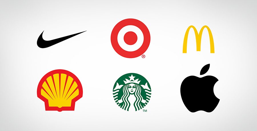
- Helps you stand out. One single logo can bring you all the attention of the world. Consider the examples of Puma, Nike, Adidas, McDonald’s, and all others, what do you think of them? These brands stand out in the market, especially based on their logo. The simplicity of the logo is what makes it stay on top of their customer’s minds at all times. They did not put a lot in their logo yet they managed to make a mark on their audience. Sometimes, it’s not about how much you put in the logo, but what you put in it. A simple logo can send out your message more clearly than the other ones, so it’s best to stay subtle while being amazing.
- Increases brand loyalty. When it comes to changing your logo, this should be out of the equation. Your logo matters, especially when it comes to your customers to remember it. Brand loyalty cannot be developed so easily and one must think like a consumer to achieve this. Do you want your customers to stay confused forever? Do you want to find it hard to point you out in the crowd? If you keep making changes to your logo, then the problem will never go away. Make sure that you are consistent with using your logo so that people can easily memorize it. Creating familiarity is important for the logo.
- The logo is the face of the brand. Consider your logo to be everywhere when it comes to building a brand. No matter what you put out in the market will have your logo printed on it. Do you want people to recognize you as a bad person? Do you want to miss your chance to create a positive first impression? Definitely not! Your logo speaks a lot about your brand and if you want people to hold a positive image of you, then make sure your logo says the same. A simple logo has the potential to tell your story to the audience, so it’s best to let your brand’s message out with a good logo.
Are the Golden Rules for Logo Design Enough?
The golden rules are not limited to these, there are plenty of them that you should consider before designing your logo. However, these seven rules are enough to get you started with your first logo. No matter if you are an experienced logo designer or a newbie, you must learn these rules by heart to make sure that you provide quality to your clients.
Understanding a brand is the key to designing an exceptional logo design. If you’re not paying attention to the core values and principles of the brand, then you can never capture the true essence of it. When you’re designing a logo, it’s important to follow the standard procedure and then mix it with your creativity. The logo that you design for a brand should directly speak to the audience.
Logo designing is no longer the same, there are a lot of variations today. Gone are days when there was a need for complexity to make sure that your logo looks aesthetically pleasing. Now, when it comes to logo designing, simplicity is the only way to reach your audience’s hearts and minds.
If you wish to be the best one in the market, make sure that you are putting the thought into making your logo easily recognizable. Use creativity to bring uniqueness to your logo rather than adding side effects to it.
You may find it interesting: Need Inspiration? 10 Best Logo Samples to Inspire You to Create Your First Logo
What’s the Take?
If you want your logo to be the best, make sure that you’re following these rules. Every professional and new logo designer needs to keep these rules in mind to make sure they don’t lose track. Designing a logo is not a piece of cake, so it’s important to put your thought into it.
Never miss the chance of trying something unique or taking a risk, but make sure that it’s worth it. Listen to your clients and more importantly look at what consumers want from you.
You need to grab the attention of your customers and that’s not possible until you give them what you want. You need to make sure that you meet customer’s expectations. The brand message should be clear and appropriate in case you want your audience to remember you forever. These golden rules for logo design should be followed by every other designer.
-

Waqas D.
Waqas D. is the co-founder of the branding and website agency, FullStop™. He supercharges brands by crafting memorable logos, brand identities and engaging websites. Besides thousands of startups and medium-size businesses, FullStop has worked with likes of Microsoft & L’Oréal. View our portfolio or get in touch.
Get a Free Quote
+1 845 3770255
Call on anytime
To discuss your project
Featured articles:
Topic Categories
Interested In
Logo, Branding & Creative Work?


 We’ll get back to you in 24 hours
to address your needs as quickly as possible.
We’ll get back to you in 24 hours
to address your needs as quickly as possible.
 We’ll prepare an estimation of the project
describing the team compostition, timeline and costs.
We’ll prepare an estimation of the project
describing the team compostition, timeline and costs.
 We'll perform a free website review
If you already have an existing website.
We'll perform a free website review
If you already have an existing website.


