Is Your Logo Design Good or Bad? Analyze the Logo Quality of Your Brand
A quality logo has several features. Here's a guide to tell you about logo quality and to improve it in no time. Re-do your logo design.
Before I start writing about how your logo is good or bad, here’s a piece of advice that you can use.
Logo quality can make or break your brand!
Seems pretty scary and harsh, right? But it’s the truth. Any brand that did not pay attention to their brand’s logo quality has made the worst mistake ever.
As a business owner, you definitely want the best for your brand. But, imagine this scenario – people ignoring your brand because of your logo quality!
As disastrous as it can be, you can turn your game upside down if you only how to lift your game.
A quality logo is not just an image that you put on the face of your brand. It’s like a door that welcomes your customers and if the door is misleading, customers will be very critical if to enter it or not.
If you don’t want your castle to fall, then keep reading the article to solve all the issues related to your quality logo once and for all.
Let’ move to the important discussion without any further ado!
The Role of Logo in Branding
![]()
Before you analyze your quality logo, you need to learn about what you’re assessing.
Put yourself in the shoes of your audience and try to remember how many brands you can easily recognize by just looking at their logo. Once you do, ask yourself the famous ‘why’ and ‘how’. If you’re able to answer that question, you have full right to skip to the next heading. If not, this is your chance to learn how logos work!
A quality logo plays a huge role in setting a place in your audience’s mind. If you want them to remember your forever, you first need to start working on building your brand before moving to the complex marketing parts.
If your marketing is extra-ordinary, but your brand’s aesthetics are not aligned with it, it will all go in vain!
A quality logo is the first thing that your audience is going to remember about your brand. It’s not just an image, it’s a symbol that showcases your brand’s core values and message.
If you want to convey your message to your audience, it’s important that you do that with your brand’s logo. An image can be easily remembered as compared to long paragraphs.
Your logo tells people if you can be trusted as a brand. Might sound unrealistic, but it’s the most realistic thing in the world of branding!
Have you ever looked at the quality logo of Cartier, Ferrari, or any other high-end brand? How does it make you feel?
Before you think of your audience, you have to think as an audience to see how a logo can make a difference.
Will you instantly recognize a change in the world-class brand’s logo if you have grown up watching these brands on TV, on roads, on billboards, and so on? You definitely will!
That’s the kind of impact a simple quality logo can have on your brand!
If you’re consistent and delivering the right message with your brand’s logo, then you’re on the right track!
Don’t rush to make a logo for your brand because it’s not some basic graphic design that can be changed frequently. A logo is forever. Although you can put in some changes with time, the color scheme and design should always stay consistent to avoid any confusion in your audience’s minds.
If you want brand identity, then making an exceptional logo design for your brand is the first step towards it!
7 Mind-Blowing Ways in Which a Logo Can Help
I have given you the basic idea of how a quality logo can uplift your brand, but if you’re planning to get some details, then here it is for you!
Communicates Brand’s Message & Values
If you want to talk about the essence of your brand to your audience, then a logo is the way.
Is your brand powerful? Cheerful? Friendly?
No matter what it is, it can all be showed with a simple logo design.
Even a simple typographic change can take your brand from low to the top.
Take the example of the ‘Bank of America’. The logo design has the brand’s name written with bold letters in a sans-serif font. It depicts security.
![]()
On the other hand, take the example of ‘Coca-Cola’. After all these years, the brand is still using the same old font.
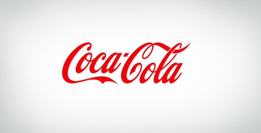
The question is – why?
Because it shows that this brand is a classic!
So, if you want to communicate with your audience about your brand’s values and message, start by doing it with your logo design.
Grabs All the Attention
Consumers don’t already love your brand. You have to work really hard to even grab their attention for a few seconds.
If you want to keep your audience hooked to your brand, then there is only one way.
Work so hard on your logo design that they are unable to keep their eyes off of it.
Make it worthwhile and pay for quality logo, not quantity. Put your brand in the box and see if your logo can impress your potential customers within 2 seconds. If not, then you have a re-do on your hands!
This all seems pretty frustrating, right? It is!
But at the end of the day, it’s all worth it!
It’s important that you take your time with the logo design because once it’s out, there is no going back. Also, make sure to use any elements in your logo design wisely so that there is no chance of sending out the wrong message to your audience.
Acts as the Brand’s Foundation
I am again asking you to put yourself in the shoes of your audience and ask yourself a few questions.
Think about any two brands of your childhood or adulthood and try to remember when they were formed. Make sure you are a regular customer of these brands.
The idea behind this exercise is to enlighten you about what actually matters to your audience.
There are rare chances that your audience will be interested in knowing when your brand started or who the owner of the brand is. All they care about is quality and cost-effectiveness.
So, do you remember when they were formed?
Now, try to remember their logo!
I am pretty sure that you can at least recall a few of them if you’re their regular customer.
Everything else comes after you’ve created a brand identity in your audience’s mind and it cannot be made unless you’ve made a good long-lasting first impression.
A quality logo is your best bit to stay in your audience’s hearts and minds for a long time, so why miss your chance? Work on your foundation and then move to the next big step.
The colors to the font that you choose for your logo play a huge role in setting up your foundation. Make sure to make the most of it!
Sticks in the Minds of Consumers
Every brand has different goals, but one goal is common among them all.
To stay remembered!
Without this goal, there is very little chance that you will transform your strategy. Unless your brand ‘looks’ nice, nothing else is going to work for you!
It’s a sad reality, but it’s a reality in the branding world!
Your quality logo needs to be so mind-capturing that your audience has no way but to check out what you have to offer. Also, your job does not end with preparing a logo for your brand.
Once you have made your logo and it’s out in the market, it’s important that you stick to it. For instance, if your brand involves packaging or other forms of marketing, then you need to make sure that only one type of logo is displayed throughout your marketing channels.
Staying consistent with your logo is important to create a strong image in your audience’s minds. If you’re not following this advice, then you are doing it all wrong and you need to change your strategy at once!
Aids in Building Trust
It’s the same consistency that will help you in building customer loyalty and trust. All your consumers are after one thing only and that is; consistency. If it’s missing from your brand, then it’s hard for you to gain customer’s trust and loyalty.
As your brand grows, more and more people will come across your brand that will start to form a sense of brand loyalty.
Your logo helps consumers to remember your brand and therefore, they attach their feelings with it. If you’re serving them right, then chances are you’ll forever be remembered in a good name.
It’s not just a piece of graphic, it has consumer’s feelings attached to it.
Separates You from Competition
The market is more saturated than it ever was.
Almost all industries have hundreds and thousands of businesses, which is why it’s more important than ever to have a separate identity.
If you want to stand out from your competition, then a logo design can serve as the best possible tool. If you’re wondering how you can do it, then just utilize this opportunity to send out your message to your audience.
A message cannot be copied or fabricated. It’s tailored to the brand’s vision and mission. If you speak from the heart, the message will reach your audience’s heart.
Use your logo to make a great impression on your audience.
Here’s How to Check If Your Brand’s Logo Needs Redesigning
![]()
Now that you know why a logo holds so much importance in branding, it’s time for you to evaluate if you’re doing it right.
If you’re in the business for a long time, but still you are unable to see a change, then your logo might be the case.
Here’s how you can check if your logo needs designing or not.
Ask Questions…
Do You Have the Same Audience?
What is the core reason behind your marketing and branding?
Simply to get the attention of your audience and to save a spot in the market.
Every branding strategy is unique and talks to a particular audience. Imagine if you were only communicating to the adults, but now your brand is ready to talk to the young people as well.
You will definitely need to work on your logo if it gives out the message to the adults only. Your quality logo needs to stay relevant to the audience’s perception to make sure they adequately perceive the message.
If you want to connect with your audience, then you need to change your logo to communicate your message to your new targeted audience.
Do You Have the Same Competition?
Once you change the direction of your brand, the whole strategy changes. Imagine if you were at the top level of your game during your time, but now you have decided to change the course of your game.
Once you do it, everything changes!
Even if you plan on adding a new category to your brand, it changes your competitors in an instant. As time changes, you need to stay updated and relevant with your targeted audience to show them that you’re still the best in the market.
A quality logo redesign can turn out to be a great way to show that your brand is still worthy of praise.
Is there Business Expansion?
Another point in your business life when you definitely need to consider logo redesigning is when you decide to expand your business.
Expansion can be in terms of region, products, categories, and so on. If this is the case, then it’s best to look for some logo redesigning options.
Your old logo might not be so diverse to convey the change, so make sure to spend some time on it!
Do You Have an Outdated Logo?
An outdated logo is the worst that you can do with your business. If you want your audience to remember you forever, make sure that you’re as per their expectations.
Although they are plenty of brands in the market that are old but are still in the market for a reason. One of those reasons is that they accepted the change and rode with it.
So, if you have a job at your hands if you have an outdated logo of your business. FullStop can help you in making a logo design that’s updated and as per your business plan.
Can Audience Easily Identify Your Logo?
Some logos are incredibly complex and hard to remember. If your logo is one of them, then you know that it’s time to change it.
A quality logo is the most memorable thing about your brand, which is why it should never be that hard to remember. Your audience will recognize your brand based on your logo. Make sure it’s simple, catchy, and appealing to the maximum!
Does Your Logo Speak to the Audience?
That’s the real deal here!
Is it a quality logo with a message or is it just a piece of art?
If your logo does not convey your message, then it’s a waste. You have to make sure that your logo tells your customer what they must be looking for in a brand. A logo should be enough for them to make their decision!
So, does your logo speak with your audience or not?
Examples of Good Logo Designs
It’s easy to talk about logos for hours, but where does the real inspiration come from?
If you want to be a leader in the market, then you need to take inspiration from the best ones. There are hundreds of brands that have worked relentlessly to be where they are today.
If you want to get to a point with your brand where your logo speaks for your value, then here are some inspirational logos for your assistance.
See how they use their logo as a tool to communicate with their audience.
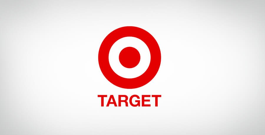
Target
What’s better than using the actual target for the logo? But that’s not it.
The bold choice of color and the appealing simplicity of the logo design is what captures the mind of its customers. It’s a minimalist logo design with a simple ‘target’ icon.
The target icon involves the use of three white and three red rings. It also has negative space out of the icon, which sends out a strong message to the audience.
The color red is the actual depiction of attention, passion, and importance in the world of branding. Apart from it, the white in the logo shows virtue, health, and cleanliness.
It’s all the philosophy of choosing the right colors for your brand. Target is a great example to know how to use the right colors in your logo design to make a huge impact!
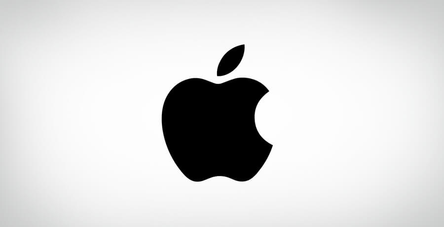
Apple
The first logo design of Apple came out in 1976 and since then it has passed through various variations. The half-bitten apple logo design took the world by storm with its high-end products. Today, Apple is one of the most easily recognizable phone brands in the world with huge sales every year.
The logo is pretty simple and elegant that gives off sophisticated vibes. The bite on the Apple logo depicts ‘byte’ in devices. It’s a small addition to the design, but it has a huge meaning to it.
Apple’s logo design is not just a piece of art because it involves some part of its products as well. The logo stands corrected with Apple’s personality and conveys it pretty well. The simplicity is all you should be rooting for in your logo design!
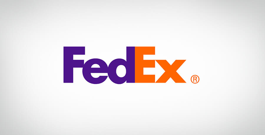
FedEx
FedEx has a pretty iconic logo design if you have noticed the hidden arrow in it. From the choice of colors to the typeface, everything is aligned with the brand’s personality.
The arrow in FedEx’s logo design sends out the message of precision, speed, and movement. As a logistics brand, these traits tell the customer exactly what they will get from the brand.
The colors used in their logo designs are heavily used in their packages as well. The company has different aspects, therefore, they use a different color for each of them. Thanks to color psychology!
For instance, the Ex in FedEx Freight is in red; whereas, it’s green in Ground one. I give 10/10 to FedEx for such minimalist creativity that has added volumes to their overall brand’s personality.
LG
A winking happy face is all anyone sees when they look at the LG’s logo design. Not to mention the company’s logo ‘Life’s Good’ and how it perfectly sits with LG and a wink face.
The story of LG’s logo design does not end here. The G in the logo design is represented as an on-button, which clearly shows it’s an electronics company.
LG’s logo design is the epitome of cleverness!
The quality of logo design depicts the company’s value with the choice of color. For instance, the red circle in the design shows the company’s values regarding endurance, friendship, and community.
LG is the best logo design to learn that you don’t have to add extra elements to the logo to send out your message. It can be as simple as a winking happy face!

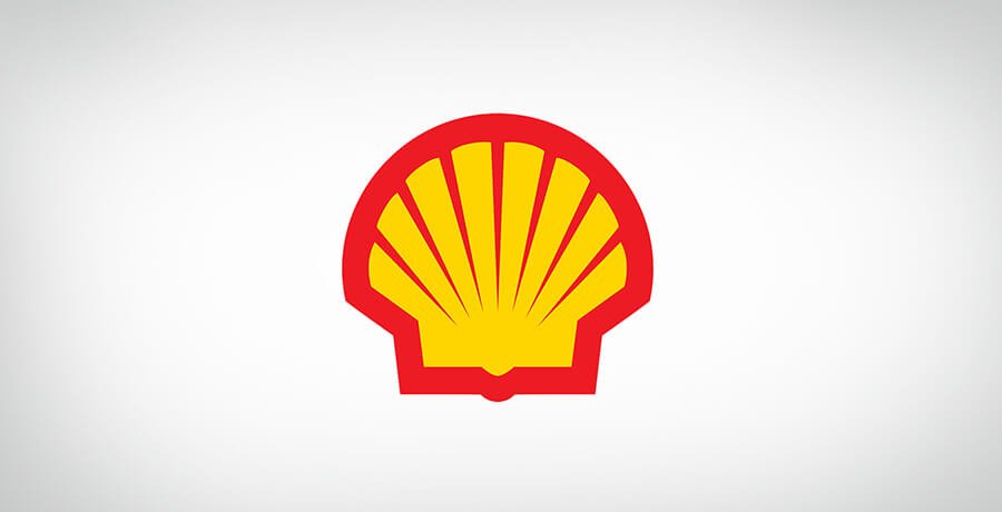
Shell
Last but not least in the list is Shell’s logo design. Started with a simple black and white logo, now it’s a standalone mark without any text in bright yellow and red color.
The choice of colors is definitely iconic and shows cultural significance as well. The logo has a bold font and sends out a strong message.
This quality logo is an example of how you can show your cultural significance, history and still be aligned with your company’s values.
Examples of Bad Logo Designs
Now that you know what you need to do with your logo design, you need to know what not to do with it.
You must be thinking why do you need to know that? Well, the examples will make it clear for you!
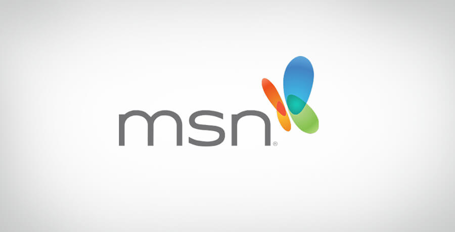
MSN
MSN’s logo is the best example of how you should never take crucial things away from the logo design. The new logo does not have the butterfly body and the wings were also rounded off to make them appear like stretched ellipses. You definitely don’t want to take inspiration from this logo design!
Gap
The new logo with black letters and next-to-a-little-blue-box-design is a true logo disaster. The first logo with white-on-blue was widely loved by Gap lovers.
Another worst thing is that Gap did not announce why they are rebranding and just came up with this logo design, which could have confused customers.

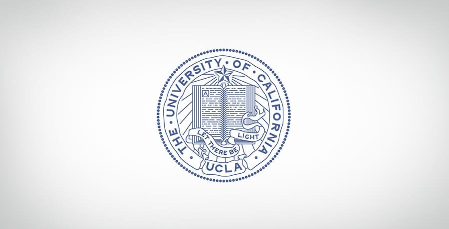
University of California
Modernizing the logo is fine, but some thought must be given to rebranding. The new logo design was dubbed as a ‘toilet bowl’ by everyone. Pretty humiliating, right?
It is another logo design disaster that needed attention.
Starbucks
Starbucks might be everyone’s favorite, but its logo was not always a lovely one.
The Starbucks logo design launched on its 40th anniversary was not taken as good by its customers. The logo design consisted of an enlarged siren image in green. Some design experts also critiqued Starbuck’s design after its launch.
![]()
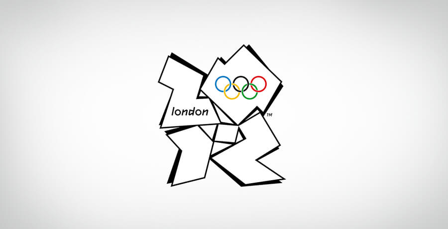
London Olympics 2012
The logo was a disaster because it did not show any of London’s landmarks. The logo had clumsy typography and those weird shapes could give anyone a headache. The logo design was enough embarrassment for the designers once it was revealed!
Final Thoughts
A quality logo design is more than just art. It speaks with your audience and is a wonderful option to grab their attention. Having a good logo design is necessary for every brand if they wish to succeed in the future.
Don’t take your logo lightly and make sure to build it in the best possible to communicate your message. Take inspiration from the top brands in the market who used their logo as a tool to engage with their customers.
It’s time for you to take the decision and transform your logo as per your company’s values!

Co-Founder & Strategic Visionary at FullStop
Co-Founder at FullStop, a branding, digital and software agency he started in 2012. Haris works across brand design, digital marketing, and custom development—helping businesses turn ideas into market-ready products.
Ready to transform your brand?
Our team specializes in strategic branding and digital solutions that drive real business results.