Logo Types Explained -A Detailed Analysis of 7 Different Logo Types
Understand the different types of logos and what meaning each logotype offers to your brand so you can pick the best one and give your marketing a boost.
The moment of truth has arrived. You've worked long and hard planning for your business and now it's time to finally take off. But there is just one very important component that you need to decide upon. And that of course is the logo that best defines your brand.
When doing the job accurately, a great logo design paves way for every organization's success. Your logo is what will assist you in nailing those positive impressions between your brand and its selected target audience. It can be thought of as a visual cue that engages customers across the board.
But here another question arises. And that relates to what kind of logo will go above and beyond others in terms of fulfilling a business's goals and objectives.
While the number of decisions to stress upon when finding the perfect logo for your brand may arise in millions (hue, images, font, size, layout, color palette, and more), the actual process is not as daunting as may seem.
And to assist you along your journey of logo selection, we're compiling an entire list of main logotypes with brief explanations. This way, the process is relaxing, painless, and entertaining. So let's take a look!
Mascots
Termed by many to be a family-friendly variant, the mascot is an image that serves as a fabulous visual representation for your business. They can be considered as an image that relates to a particular character or even a person.
You can consider mascots to be a business's spokesperson that includes a considerably large chunk of the entire brand's advertising. And that means a lot of marketing is centered on it.
Some of the greatest advantages of adding a mascot include instilling your brand with that fuzzy, heartwarming feeling. It’s a relatable factor that tugs at the audience involved. Did we mention how big of an attractive feature they are for kids too? Just the thought of a giant man in a panda costume outside a restaurant, waving at kids, is enough of a persuasive factor to win over kids.
Examples of leading brands that have incorporated mascots into their logo design include the likes of Kellogg’s, KFC, and Pillsbury.
![]() Mascots
Mascots
The emblem
The term emblem itself is such a distinctive phenomenon that radiates impressive and traditional vibes. Emblems have managed to break through the many tests of time, emerging as a strong form of logo design. Be it stunning monograms or the royal stamps of the monarchs- history has plenty of examples of emblem use.
Emblems generally comprise a distinct typeface that is curated to fit into a limited border of its own. You're more likely to find an emblem in a university or an established government organization perhaps.
The advantages that surround emblem logos relate to their aura of professionalism, scalability, and great importance for a brand. Above all, emblem logo designs have a more detailed flair with great emphasis on specificity. You can't play around too much with this logo design so choose wisely before adopting them into your logo.
As far as examples are concerned, common brands that have used the emblem include Starbucks, Superman, Harvard, and Harley Davidson.
 The emblem
Logo symbols or pictorial marks
Pictorial marks have several different synonyms attached to them. Many refer to them as logo symbols or brand marks too. You can best consider logo symbols as icons or even graphics-based creations. And it's probably the first thing that comes to people's minds whenever they hear the word logo. Good examples include the bluebird logo symbol of Twitter or the renowned play button from YouTube.
Pictorial marks are so symbolic that once a brand gets recognition from its target audience, its best remembered through the icon that it’s affiliated with. Just the image alone can allow many to correlate a business with its logo symbol.
Keeping that in mind, new brands are faced with a challenging decision of choosing the right image that coincides with their business's objective.
Certain things to consider before choosing your pictorial mark include,
- Do you wish to adopt a playful demeanor on the brand's name with the logo symbol?
- Are you looking to invoke an emotional response with the audience?
- Are you making the final selection based on a deeper meaning?
![]() Logo symbols or pictorial marks
Logo symbols or pictorial marks
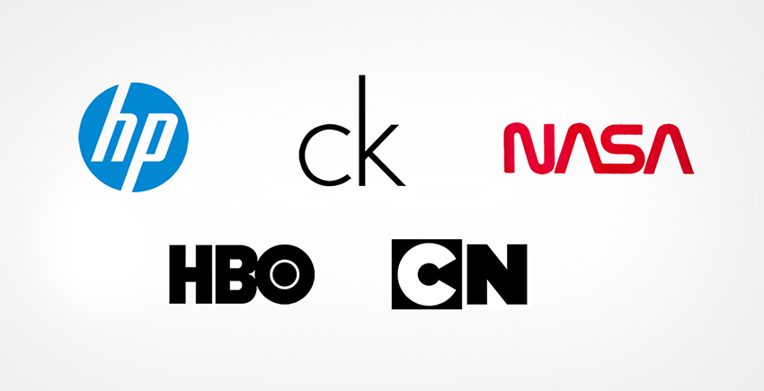
Monogram logos or Lettermarks
Whenever the term monogram or lettermark logo arises, you should think of abbreviations. This particular logo design is typography-based and takes upon abbreviated initials for the company or brand involved. And believe it or not, a simple tactic like this can spruce up a logo in more ways than one, giving you a no-frill and no-fuss design by miles.
What makes the world love monograms so much? Whether it's FedEx, BMW, CNN, IKEA, or TCS, monograms can assign a simplified and catchy aura to any long business term. Above all, the more simple your design, the better suited it is for monogram logos. And in case you're a newbie that's waiting to be heard, monogram logos can be designed, up and running in no time.
Just remember to take extra care of the typeface used and extra detailing that can give your logo that innovative spark.
 Monogram logos or Lettermarks
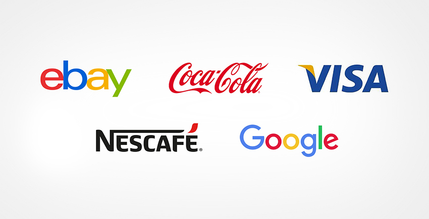
Wordmarks
Logotypes or wordmarks are quite similar to the above-mentioned letter mark/monogram design. They can be perceived as a logo that's solely based upon fonts and one that primarily focuses on the brand's name.
Be it VISA, Coca-Cola, Google, and more- there are plenty of known brands that simply can't get enough of wordmarks for their marketing, and the best bit is that it works!
Catchy, memorable and a hint of strong typography is enough to give any business that pushes towards strong recognition. Just be mindful of typography here too because the font style you choose must be in line with what your brand plans to offer.
Avoid cluttering up your space or going extreme as neat, clean, and chic always manage to succeed.
 Wordmarks
Abstract logo design marks
Have you ever looked at the Adidas logo and thought about what their image represents? Does Pepsi's logo design make you wonder how impeccably the flow of color and pattern can be merged into one?
Both these brands and many more take on the meaning of abstract logo design marks. These manage to symbolically convey the brand's image without relying upon any cultural implications that arise with a particular image's use.
There are a million combinations of color as well as the form that can mingle together as one, generating the right kind of emotion over your brand. Nike's swoosh logo for example manages to allocate the feeling of movement and activity with just one stare.
![]() Abstract logo design marks
Abstract logo design marks
Combination marks
From Burger King, Lacoste, and Doritos to Toblerone and Taco Bell- combination marks behave as strong market players for numerous logo designs. As the name suggests, they can blend both graphics and text into one for that winning combination.
They offer the versatility of a whole new kind, making it easy to rebrand while instilling users with a clear and defiant message across all boards. Once you've conceptualized how you wish to combine wording with symbols, make sure it's neat and coherently flows together as one. At the end of the day, no one has time for excess.
 Combination marks
Infographic - A Detailed Analysis of 7 Different Logo Types
![]() 7 Different Logo Types - Infographic
7 Different Logo Types - Infographic
Embed This Infographics
Courtesy of: FullStop
Once you’ve decided the type of logo you want for your brand, you can reach out to FullStop to make it a reality.
With a detailed analysis of different logo designs, it's now your turn to come up with a creation that stands out over all others. Be sure to stay on top of current market trends while maintaining freshness and innovation. Your end product should be a logo that best symbolizes your brand.

Co-Founder & Strategic Visionary at FullStop
Co-Founder at FullStop, a branding, digital and software agency he started in 2012. Haris works across brand design, digital marketing, and custom development—helping businesses turn ideas into market-ready products.
Ready to transform your brand?
Our team specializes in strategic branding and digital solutions that drive real business results.


