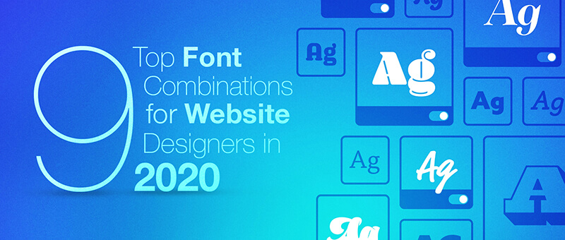
9 Top Font Combinations for Website Designers in 2021
Understand the mechanics behind choosing best font for website and improve the legibility of your text that eventually improves the user retention rate.
Disclosure: This article may contain affiliate links. We earn a small commission at no extra cost to you.
We have almost reached the first half of 2021, and we have seen some new trends in font combinations in web designs. While some designers used the latest technology to create innovative fonts, others went treasure hunting to resurrect past typefaces that have some relevance in the modern world. As a result, we have plenty of options to consider when it comes to designing websites in the near future. Here are the top 9 font combinations for website designers in 2021 that you can check out.
But first, what do I mean by font combination?
Font Pairing 101
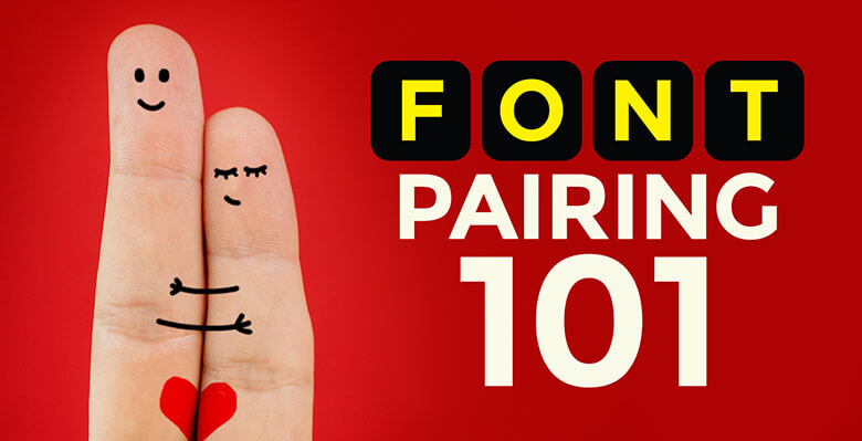
Combining or pairing fonts means using two or more different typefaces on one project (in our case, web design). While any number of fonts can be combined on a project, best practices dictate that we stick to two or three typefaces. These fonts should be harmonious without losing their particular style characteristics. Which means there should be sufficient contrast between lettering style.
Designers often pair fonts that have similar moods and complementary shapes. They help draw the readers’ attention to the message being conveyed instead of competing with each other for attention.
You need to maintain readability and balance in the typography of a design, which is why you shouldn’t use more than one novel or challenging font in a combination.
Choosing fonts is all about keeping your finger on the pulse of the latest trends. All fonts are not the same, and they also serve different purposes. That is why as a designer, you need to stay wary of how web fonts are being used and where the trends are shifting.
This helps to keep your clients and your audience on the same page. So without further ado, here are a handful of font combinations that you can consider incorporating in new websites.
1. Serif + Sans Serif + Script
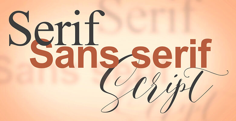
To start off, I select a font trio that sets the right tone. These three fonts, when combined, communicate elegance and give a classic touch to your project. This is not an innovative combination. In fact, designers often pair these three fonts because using noticeably different styles always works. Compare this with, let’s say, a combination of two or three sans serifs, and you will get a clunky look because readers can’t make out the difference between typefaces. The lesson here is that you should use font pairs or trios that have the same mood or feel, but unique lines and designs along with shapes that complement each other.
2. PT Sans Narrow and PT Sans
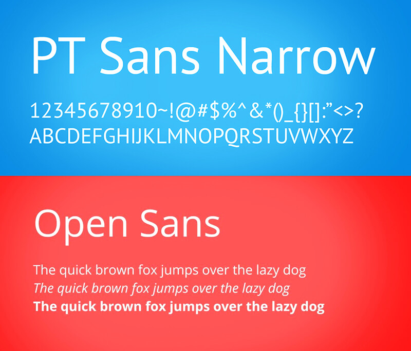
Here is another combination that works amazingly well for almost all websites. The beauty of these fonts is that you can use them for both short-form texts as well as long-form content because they are easy to read and legible. However, this doesn’t make them boring at all. In fact, the combination of PT Sans Narrow and PT Sans is great to readers’ attention on home pages and landing pages.
3. Slabs + Simple Sans Serifs
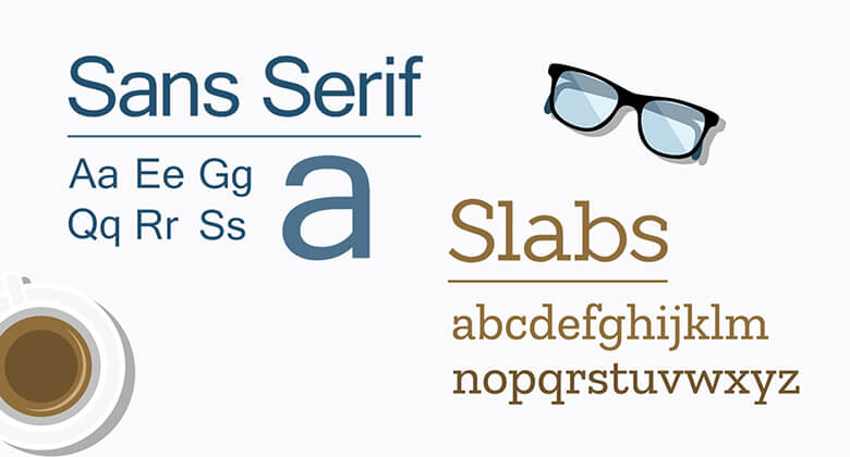
What I like about slabs is that they are so ‘in your face’. They are great for making a generating impact. They are great for artsy websites, and musicians, artists, and photographers can use slab fonts on their web pages and other promotional materials.
Combined with a simple sans serif font, slabs offer a toned-down yet classic look that is almost always effective. A great way to combine these fonts is to use slabs as an artistic element while writing all the text in simple sans serif. With the right spacing, this combination draws the reader's attention and keeps them engaged with the content.
The right spacing is necessary with fonts like slabs. You need to give the text space to breathe, so to say. I suggest that you use slabs or slab combinations against light backgrounds or totally white backdrops.
4. Cinzel and Raleway
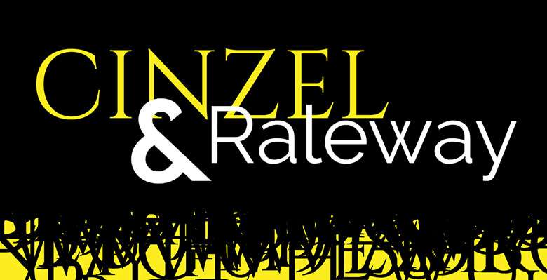
Next up, we have the pairing of Cinzel and Raleway. The former is all caps, which makes it suitable for short-form texts like headers or slogans. Raleway, on the other hand, is a bit more traditional, which beautifully complements the boldness of Cinzel. Food and drink websites will find this font combination effective. In fact, it can also work the other way round, i.e. Raleway for headings and Cinzel for body text (think of daily specials or chefs recommendations at restaurants and cafes).
5. Tiny Serif + Sans Serif Caps
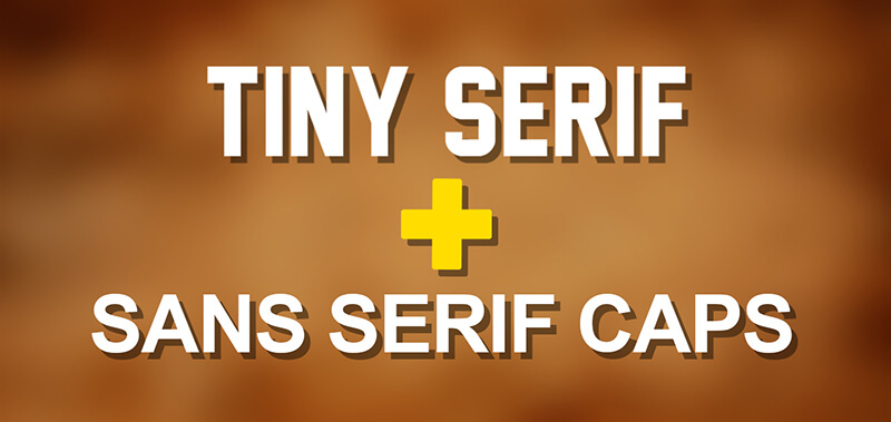
There is nothing innovative about all caps fonts, especially serifs. However, you cannot deny the visual allure of the simple serif line beneath and the vivid contrast between the big type and the second line (picture the BBC Earth logo). The combination of the tiny serif and the all caps sans serif is a trend that you can follow. It is easy to read, and both typefaces have similar stroke widths. This pairing is ideal for websites where you need to think about backlighting.
6. Open Sans and Roboto
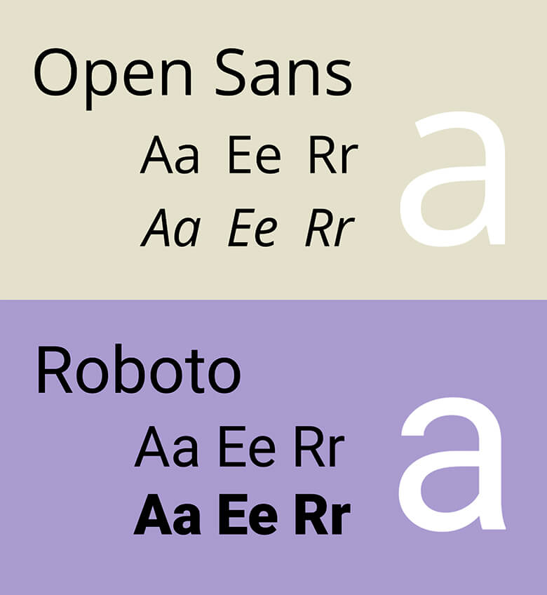
This is another combination that works together extremely well because both fonts are crisp and legible. For websites, you can consider using the Open Sans header as a point of emphasis and then Roboto for the body text. It all also works wonderfully when you swap the fonts. In this case, consider using Open Sans regular and Roboto medium fonts.
7. Caslon and Myriad
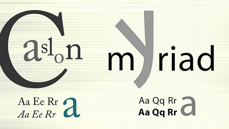
If you want a font pairing that combines old charm with a modern, chic style, try the Caslon and Myriad combo. Consider the fact that Myriad features on the Rolls Royce logo, while Apple uses the font in all its corporate communication.
8. Merriweather Light and Lato
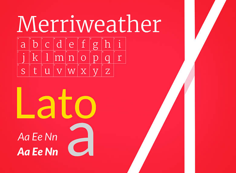
This combination is clean, professional, and versatile. The combination also communicates trustworthiness. You can use the pair for your homepage, as well as for websites that require scrolling down the text for more information.
9. Noto Sans and Fjalla One
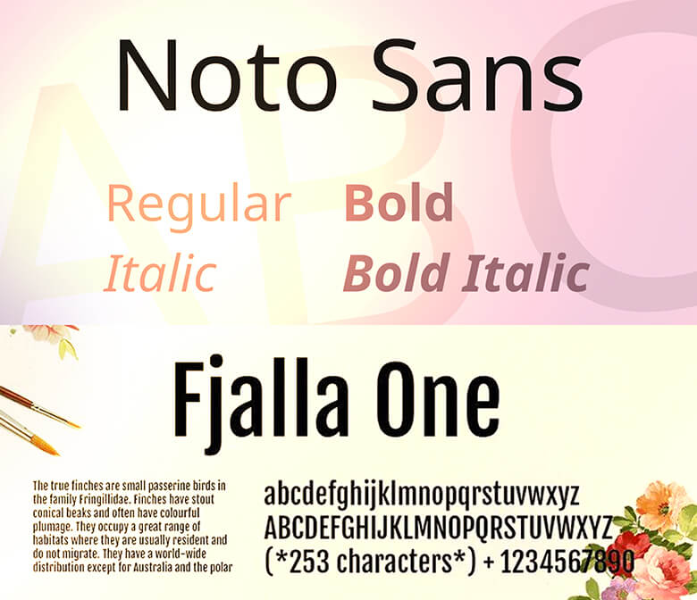
Noto Sans is quite a universal font. Fjalla One, not so much, but you can use it for headlines and pair it with a contrasting font. Fjalla One and Noto Sans work great for website landing pages as well as blogs. Moreover, the font pairing also works well for long-form content that you break down with subheadings.
General Font Combinations
While these specific font pairings are great for websites in 2021, let me also quickly list down some general combinations that you can consider.
For example, you can combine novelty fonts with monospaced styles. When paired well, they give off a ‘chaotic’ feel and work for websites where you need some shock effect to grab readers’ attention.
Also, consider the fact that you may not require pairing at all. You can also use multiple styles within the same family, such as sans serif. Combining fonts for the same family makes websites easy to read where all the text elements are in harmony. Consider pairing a bold or lack variation with a light variation for best results.
You can also experiment with sizes. For example, oversized sans serifs with smaller sans serifs to create a layered style. This covers both the aesthetic as well as the information aspect in web design projects. The key is to use simple sans serifs, keep the letters and reading oversized text to a minimum, and use a simple aesthetic for the rest of the design.
Combine this with a bright background color, and you have the perfect design on your hands.
Importance of Fonts in Website Design
For both web designers and business owners, picking the right website font is one of the most important decisions in the branding process. Your website primarily needs to grab the attention of your potential customers and get your message across, but poor choice of the website fonts can ruin these efforts.
What I mean is that the fonts you choose should add to the clarity of the design. Sometimes, many designers may make the mistake of keeping icon/symbol and font too close or too similar, and both elements end up competing with each other and confusing the viewers. On the other extreme, some designers keep them so far apart that viewers find it hard to focus!
Moreover, good designers need to know the personality of the typefaces they use. You don’t want your viewers to ignore or misunderstand your message, do you? That is why the selected font must reflect the brand’s characteristics (more on this below).
Professional designers, on the other hand, take their time to compare different typefaces to find one that resonates with the brand image of the company.
Plus, you need to ensure that the website doesn’t have too many fonts. This also creates confusion for the viewers. It is better to use one or two fonts in a website to make it comprehensible and memorable as well.
What is a Bad Font?
When it comes to design and creativity, ‘good’ or ‘bad’ are mostly subjective terms. Designers consider some fonts to be bad, not because they look ugly, but for a host of different reasons.
Sometimes, people just like particular characters in the entire typeface, or a particular variant that irritates them.
More than that, some fonts are considered bad because they have overused to the point of nausea. Popular and trendy typefaces are prone to contempt because designers get tired of seeing them all day.
Then there are standard fonts on our phone and computers. Again, because they appear and lot and are grossly overused, they end up on many designer’s worst font lists.
How to Pick the Best Font
Now that you know what bad fonts are, let’s close with some pointers on how you can pick the best font.
Keep Your Target Audience in Mind
Think about who is the website for. Your target audience can help you choose the right fonts for the website. The target audience of a fitness club will be different from a law firm, and this will be reflected in the choice of typeface.
Stay True to your Company Values
Along with your target audience, the choice of fonts must also represent who you are as a business. For instance, do you want to appear dynamic and innovative, or traditional and reliable?
So that’s about it. These are some of the best font combinations for website designers (and for other projects as well). Let us know the comments which font combinations you have found appealing this year? And which ones have worked for you in the past.

Co-Founder & Strategic Visionary at FullStop
Co-Founder at FullStop, a branding, digital and software agency he started in 2012. Haris works across brand design, digital marketing, and custom development—helping businesses turn ideas into market-ready products.


