Why is Minimalism a hot trend among Logo Designers in 2021?
Let’s examine the reason behind popularity of minimalist logos and what particular emotions they exude in the heart of the viewers upon the first look.
Imagine a Zen garden…
Pleasing arrangements of rocks, pruned trees, and bushes, water features… and there you step in the miniature stylized landscape…
How does it feel?
I’m sure your heart is saying “My perfect solace.”
A few months ago, I was discovering some traditional Japanese aesthetic ideas. It was quite a revelation when I discovered more about the concept that looks quite foreign to us yet is not.
I’m talking about “Minimalism.” What was a part of Zen aesthetics has made its way to the art and design concept. And when I talk about art and design, the logo comes under the same umbrella.
Why Minimalism gathers immense appreciation?
Here a question arises, why minimalism is loved and embraced by logo designers? The answer is divided into three parts. Minimalism beautifully entails:
- Shizen – Absence of artificiality; it is unforced
- Kanso – Redefined clarity by the omission of the non-essential parts
- Koko – Austerity; the modernism
From Japanese aesthetics to Marie Kondo, everyone approves of minimalism. The three elements; Shizen, Kanso, and Koko give minimalism the real soul.
If I put it in simpler terms, the concept of minimalism is loved because of its simplicity. Let’s dig deeper and find out why it is the hot trend amid logo designers.
1. Minimalism boosts the notion of clarity
 Boosts the notion of clarity
Tell me, when was the last time you visited someone’s place and it was all messed up?
Sigh! I am sure you don’t even want to recall that day. The uneven arrangements are not pleasing to the eyes.
Oh and you talk about me? I am a claustrophobic creature. I am sure, most of you are.
We human beings share an extreme dislikeness for tight places. Not owing to minimalism is next to wearing skin tight jeans that make you feel all-packed.
A cluttered design fails to convey the right message. Not only it makes you lose focus, but is quite displeasing to the eyes.
Everything is interconnected, if the primary message gets lost, then the customer’s trust in your product or service shakes up to.
The best part about minimalism is that real details are not lost when you scale it. Here, I can share an example of YouTube’s logo.
 YouTube’s logo
Can you feel the clarity?
Before it got immersed into the beautiful concept of minimalism, the logo was all jam-packed. It seems like the red box is trying to kill the word “Tube” and the word “You” just escaped right in time. (Giggles)
Kudos to the design for saving it from a dungeon. In the new logo, the “play button” is describing the very essence.
If I dissect it, I’d say:
- The new logo conveys the message
- Anybody can understand what the brand is all about due to the presence of this play button
- The type-based logo is scalable now; whether you enlarge it or zoom it out, the details won’t get lost.
2. Minimalism draws attention to the core matter
We lose the meat of the matter when something takes our boat into 5 different directions.
Let’s play a quick game: You just have to see the image for 3 seconds and remember all that you saw.
Ready?

I’m sure you can’t.
Now, look at this one for 3 seconds and remember the elements there:
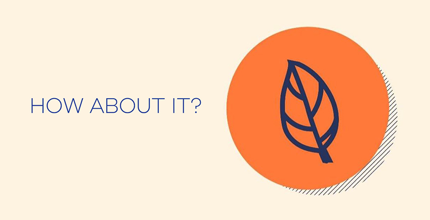
I can hear you saying “what? It’s just a leaf.”
Exactly my point! When your mind wanders in 5 different directions you lost the gist of the message. Similarly, when a design is cluttered, you fail to concentrate on one message.
This is exactly why the logo designer prefers to go with this trend. Minimalism doesn’t kill the essence of the message. The buyer concentrates on one thing and gets to the real message.
3. Minimalism lowers the intricacy yet upturns comprehension
Hello designer: Just once, can you please decrease the size?

Oh, this is something a designer hears from a client every now and then. And I can relate to how designers feel at that very moment (wink wink.)
This is exactly why logo designers prefer going with Minimalism. The versatility it offers is like no other. A client demands a logo in thousands of different sizes to print on T-shirts, billboards, letterheads, etc. So, think about how bad it will appear on various sizes if the logo is cluttered?
You can’t imagine that!
No matter what it is, be it complicated relationships or complicated logos; nothing works.
Designers prefer breaking relationships with unnecessary confusion and clutter, therefore they hold onto minimalism. When they leave awful gradients and a typhoon of shadows, it paves the way for easy-peasy printing.
Talk about unnecessary elements, I can easily quote the example of Horn Creek. The logo down below contains unnecessary elements due to which there is a scalability issue. But we completely changed it and removed all unnecessary things.
 Horn Creek Logo Before
This is how it looks like now.
 Horn Creek Logo After
Isn’t it impressive?
Even if you scale it in multiple sizes, the logo will remain versatile.
4. Minimalist logos are easily recognizable
We all have something different we are recognized for. That differentiation sets us apart and makes our life worth living.
When I talk about logos, if they don’t have something that sets them apart, it’s just nothing but a mixture of shapes, fonts, and colors.
Amid 5 different competitor logos, if yours isn’t easily recognizable then it’s of no use for you. In the hustle-bustle of life, we don’t have time for complex things. Therefore, when it comes to logos, they should be recognizable.
If you see big brands, they have one thing in common: Their logos are recognizable yet pleasing to our eyeballs.
I don’t even have to say a word for this logo. Audi’s logo is famous for its simplicity. You just show people four rings, the first thing that will come to their brains is “Audi.”
 Audi Logo
Now, see, it is linked to the brand positioning. When you hammer a buyer’s brain with simplicity, your name gets etched into their brains forever.
You know what I mean, right?
5. Minimalism leaves no room for errors
If I flood you with data and ask you to give a speech on a certain topic, what would you do?
God! You will mess it up like me. Your mind will control you and you’ll start giving vague statements.
Okie Dokie. If I ask you to describe yourself in one line in front of a huge crowd, you’ll happily say it without any error. You will be on point and your line will have weightage.
Similarly, when we put too much information into a logo or any design, there are more chances of making mistakes. However, when we confined ourselves to a certain limit, there won’t be any chance of making errors.
At this very moment, I want you to look at your logo and analyze if it is conveying too much information. If you feel like there is a tornado of information in a logo, get your logo axe and kill the unnecessary elements. Or if you need assistance, we can help you with the same.
6. Minimalism is timeless
Your logo is not your wardrobe that needs an update every season. Do you know that simplicity is timeless?
When you overcomplicate things, they lose their beauty. So yes, simplicity always wins the game and rules the heart.
Complicated logos rely more on the fad while simple ones follow the notion of “being timeless.”
If you check out McDonald’s logo, you’ll see how beautifully it describes the element of being timeless.
 McDonald’s Logo
I can easily relate this logo to happiness, simplicity, liveliness, and guilty pleasures. This logo is truly timeless, even a 2 years old kid can recognize it.
But yes, one thing is for sure, making a timeless logo isn’t a one-cup pantry. So many brains, multiple brainstorming sessions and a dozen of attempts go into the play to bring such logos to life.
7. Minimalism is marketable
There is a purpose behind every design. If that very design fails to serve the purpose, tell me what is it good for?
Imagine having a logo that looks way too bad on your marketing collaterals, how would you feel?
It gets way too difficult when you have a complex logo. Neither it looks good on your website, nor does it look in print. Hence, minimalism saves you in the long run.
When you have a simple logo, it gets easier to market it. It fits well with a variety of applications and mediums without losing the originality.
Consistent branding is the need of the hour. Anything that doesn’t fit well cut the primary message into multiple pieces. Talk about logos, when they are functional and support your marketing efforts, your brand gathers all the positive responses.
This is exactly why logo designers feel like to stick to this trend that always offers a win-win situation.
Do I even need to name the brand here? I guess not!
Nike’s logo has all what it takes to support the branding efforts of the company. Tell me, do you dare to make one?
8. Minimalism evokes the right emotions
I get attached to certain places and things. I am sure, you too.
Talk about brands, people are emotional and yes I am not the exception. We associate things to pleasure and pain.
I remember a saying from Tony Robbins,
 “And always remember the ultimate truth: life is not about money, it's about emotion.”
-Tony Robbins
If you dig deeper you’ll understand that every decision we make is based on our emotions. Now, please I don’t want to get into the talk of “Oh, I don’t have emotions,” “My decisions aren’t driven by emotions.”
Accept the fact, emotions play a vital role. Our purchase decisions are influenced by how we feel about a particular thing.
For instance: You see the logos of two brands. One is pretty noisy while the other one is clear and versatile.
Before even knowing what a brand does you’ll make your perception. Your subconscious mind will ask you to focus more on the clear one.
Why?
Mate! We are hardwired like that. Well, who likes nuisance after all?
Hence proved, it is imperative for a logo to evoke the right set of emotions. Since our decisions share a relationship with our emotions, logo designers concentrate on minimalism to help you stay focused on one primary message.
Tell me, what emotions does this logo evoke?
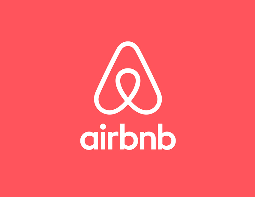
To me, it says, “It’s time to go for a long-awaited vacay!”
The best part amid all is that minimalism doesn’t stand for something that lacks substance. If you closely analyze the logo, you will discover that the designer has played smartly with the geometry.
The logo is divided into 4 parts:
- A head that denotes people
- A symbol for the location
- A heart to spread positive vibes
- Lastly “A” for Airbnb
The cheerful vibes this logo gives is hard to ignore!
Emotions Mate Emotions!
Another example that approves of what I said earlier is of Gucci:
 Gucci's Logo
Oh, I am getting expensive vibes☺.
Jokes apart, the classiness, the unification and a feel of luxury this logo gives is truly unexampled.
No matter how many people make its second copies, they can’t beat the loyalty of those who have an emotional relationship with this brand.
If the example seems too expensive to you, let’s bring to some medium point. Would you eat any other burger in the name of Big Mac, offered by a burger chain?
You won’t! Because the emotional relationship you have with it doesn’t permit you.
Final thoughts
This entire piece is a reflection of my love for Minimalism!
I’m sure most of you must be saying that minimalism looks like a piece of cake. Well, my friend you never get to know the real depth of the sea unless you start swimming.
The simpler minimalism looks, the more difficult it is to achieve. It’s not an easy task to come up with a minimalist logo and disowning a variety of gradients, shapes and colors.
Now, it’s easy for you to understand why logo designers take this hot trend pretty seriously.
How could I forget mentioning, minimalism is here to stay. So yeah don’t think of it as your Dalgona Coffee that is the talk of the town.

Co-Founder & Strategic Visionary at FullStop
Co-Founder at FullStop, a branding, digital and software agency he started in 2012. Haris works across brand design, digital marketing, and custom development—helping businesses turn ideas into market-ready products.
Ready to transform your brand?
Our team specializes in strategic branding and digital solutions that drive real business results.


