13 Don’ts of Logo design every startup must know
It may seem like a walk in the park but logo design isn’t as easy as it looks. It’s not about what’s pleasing to the eye but what can represent your brand and convey your vision to the world! Doesn’t sound something ordinary now, does it? Investing on a logo design is the first step to a startup’s success – of course the quality of service or product is what truly retains your consumers but a logo is your identifier.
Just as it’s significant to know what a logo should have, it’s equally important what you should NOT do with a logo design. Here are 13 don’ts of logo design you need to remember like the back of your hand when getting your brand’s identity created:
1. Don’t Copy Paste
Accept it! As soon as we need to get something designed we start looking up references. Google it, copy and paste, that’s what we usually do. “Oh but I think you should make something like Pepsi’s logo for my brand”. Well, that’s the number one don’t for logo design. Your brand identity shouldn’t remind anyone of another brand otherwise you’re basically just giving them a brand recall of the one you copied, without even getting paid for it! Taking inspiration seems reasonable but imitating a logo is a big NO! You could actually get sued for it as a matter of fact if your logo matches a popular logo too much. Now you don’t want to go losing money before you even started making it, right?

Don’t Copy Paste
2. Don’t change too much
Following changes in technology and advertising trends, logos do evolve and that’s understandable but changing your logo completely or drastically is just frowned upon and confuses your audience. As a brand you’re not giving your target market enough time with one logo to get accustomed to it and recognize your brand. That’s one more don’t you’d want to add in when getting your logo designed. Give it a lot of thought and get a logo designed which can stand the test of time!

Don’t change too much
3. Don’t be so “in your face”
The irony of your logo being your brand face is it shouldn’t literally be the face of your brand! Shun that thought out of your mind of using pretty images. So if for instance you’re a restaurant you don’t need to ask the designer to include an image of a dish or a burger. That’s just tacky! Additionally images tend to either pixelate at some point or the other or just don’t adjust well with certain mediums of advertising. Stick to abstracts and fonts that can get your message across.

Stick to abstracts
4. Don’t suffocate your logo
Avoid adding too many elements in your logo. The more minimal the better. Negative space is essential to avoid your logo being unreadable and cluttered. There are several ways to give your logo some breathing space like reducing the elements or increasing the space between your actual logo and the frame.
Don’t suffocate your logo – Negative space is essential
5. Don’t complicate things
There’s no logo guide or rule which says you’ve got to use every tool you know to design your logo. The best logos are simple yet creative with a brand story. Adding too much gradient or drop shadows, strokes or any other unnecessary element creates chaos. Trust me! I’ve come across designers and clients alike who don’t think a logo as served its purpose until it is overflowed with elements. “Maybe a little more drop shadow” or “I’ll add some stroke to this”. Don’t ruin the dish with every ingredient you can find over the shelf (pun intended).

Don’t complicate things
6. Don’t use too many colors
Firstly, as a start-up you’ll need some brand guidelines and once those are established you need some logo guidance. Are you a luxurious brand? Purple might be a good option. A sports brand? Maybe your message can be conveyed with a simple black. Colors stimulate emotions and thoughts and each color has a personality. Choose your color wisely and don’t make your logo look like it just drowned in a clown’s makeup kit!

Don’t use too many colors
7. Don’t ignore the font
So basically every aspect of your logo design has its own significance. As much as you may think fonts aren’t a big deal and can just be very simple or very fancy you don’t want to trap yourself in that illusion that your font matters less. Don’t use Comic Sans or Papyrus since they are just outdated. On the other hand don’t use a font that doesn’t suit the persona of your brand just because it’s “trendy” or “looks pretty”.
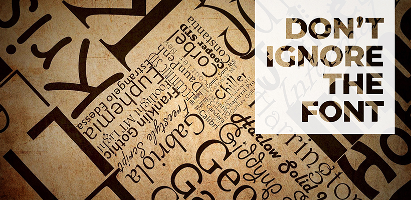
Don’t ignore the font
You may want to read “Top 15 Fonts for Logo Designers – That Never Fail!“
8. Don’t be generous with the fonts
Have you ever come across a successful brand with a highly recognizable logo that has multiple fonts? Highly unlikely, right? In fact I can’t even think of any. That’s because having more than one font may confuse your brand’s image and give your logo’s design an overwhelming look (and I don’t mean that in a good way).

Don’t be generous with the fonts
This post will guide you through in this “10 Must-Have Ingredients of a Great Logo Design“
9. Don’t get carried away
We often think making a logo complicated or “difficult” might make it more successful. At the end of the day your aim is not to keep your target market focused on trying to comprehend the logo, you’d want them to move on towards your brand or service. Additionally we may sometimes find ourselves overwhelmed by our logo, trying to adjust minute details because “it’s not quite there yet”. Relax! As long as your logo conveys the brand’s message and looks decent, you really don’t need to overwork the designer. Get a second opinion or a whole panel’s if you want, instead of trying to figure out what the problem is all by yourself.
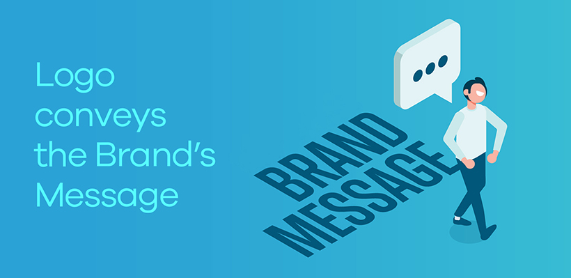
Logo conveys the brand’s message
10. Don’t make it stubborn
As mentioned earlier your logo should be futuristic. Not only that. It shouldn’t be a design which cannot be adjusted if requirements arise. Ever seen some logos evolve over time without losing their recognition? Take the Shell logo for example or Pepsi. These are flexible logos which have smartly adapted themselves to changes in the advertising world. Avoid having designs made which are too rigid and have variations designed to see how the logo can adapt to various mediums of advertising.

Don’t make it stubborn
Do you know what is a responsive logo? Here is the post for you “What do start-ups need to know about responsive logos?“
11. Don’t ignore research
You can’t skip it! The more you research on your target market and competitor brands, the more your logo will connect with the audience and represent your brand appropriately. No offense, but it doesn’t matter for instance which color you like, will your TG like it? It’s practically sinful to think your brand revolves around you. You just can’t ignore the feedback of people who can make or break your business.
12. Don’t be too “trendy”
Don’t just get a logo designed because you’ve seen it “trending” on social media. Trends come, experiments happen and they go away just as easily. It takes a simple loop hole in the trend or people getting bored to turn popularity into a disaster that could be declared inappropriate in the future. Gist of the matter is gradients may for instance be trending but if it doesn’t quite fit your logo’s requirement, don’t squeeze it in because it’s “trendy”.
13. Don’t hire a cheap designer
Had I been going for a chronological order, this would have been the first DON’T! There’s a world of difference between a $10 logo design and a creative professional logo design so this is the wrong time to be Uncle Scrooge! You need to invest on your logo and I just can’t stress that point enough!
Hope you’ve made some notes about what NOT to do for your logo before starting a venture. Good Luck!
Get a Free Quote
+1 845 3770255
Call on anytime
To discuss your project
Featured articles:
Topic Categories
Interested In
Logo, Branding & Creative Work?


 We’ll get back to you in 24 hours
to address your needs as quickly as possible.
We’ll get back to you in 24 hours
to address your needs as quickly as possible.
 We’ll prepare an estimation of the project
describing the team compostition, timeline and costs.
We’ll prepare an estimation of the project
describing the team compostition, timeline and costs.
 We'll perform a free website review
If you already have an existing website.
We'll perform a free website review
If you already have an existing website.


