Your book will be judged by its cover – how should yours look like?
Your content isn’t all that’s important – a good book needs an even better cover design.
You’ve got to be impressive, but not just with what you write. Ironically, the idiom “don’t judge a book by its cover” lacks implementation when it comes to actual books. Yes my dear authors, never get tricked into believing that it is only what’s inside the book that truly matters.
Similar to products, book cover designs too can either pull customers or push them away at first glance. Your book cover design is the packaging of an amazing story (I hope).
In my honest opinion, I think this is for the best. After-all if you can lure people towards your book with visual appeal aka a creative book cover design, you’ve sold your book even before they know the entire tale!
Even avid readers/bookworms can’t go through an entire book in 10 minutes and that’s precisely how long someone would take to purchase a good book (at a bookstore or online) – people believe what they see. Remember that.
Your book needs to catch your readers’ attention before they flip the page and go through the prologue. Let the cover call your book-finder towards it – the ultimate aim of every author, right?
So, what should your book cover design look like?
Before I guide you further, remember that a book cover is your book’s first impression so you really need a cover that can “speak” to a random searcher, communicating effectively what your book is about? On top of that, it needs to grab attention without whistling (if you know what I mean).
It’s human nature. They search for what they know but can’t resist anything unique.
Professional book cover designs: Let experts do their job!
I know I’m traditionally supposed to lecture you at the end about this but there’s no harm in being a bit unconventional. As an author, your job or as you say passion, is to write a good book.
A professional design agency or designer can’t dip their pen in your ink. Well, what makes you think you could do their job better? I’m not being harsh here, just truthful (polite tone).
You prefer taking a business partner out to coffee rather than brew it at home, no? Don’t you prefer going to a designer for your wedding outfit or a grand party rather than watching DIY videos or buying it from the shop next door?
I am assuming your book must mean a great deal to you. Much more than a wedding or a café meeting.
So, the first thing you must learn is acceptance. Accepting that you need a professional book cover design. Nevertheless, that does not mean you aren’t part of the process. From the beginning till the end of the story, this is YOUR book and only YOU know it best.
“Aspiring authors, get this through your head. Cover art serves one purpose, and one purpose only, to get potential customers interested long enough to pick up the book to read the back cover blurb. In the internet age that means the thumb nail image needs to be interesting enough to click on. That’s what covers are for.”
~Larry Corea
So, what are you reading this for and what’s the actual purpose of my blog?
As the author and sole owner of your book, you need to know what your book cover design should look like. You can’t leave it entirely to a professional – you are still the captain of this ship, steering the designer towards a certain direction.
Of course no one can give you a definite answer of how your book cover design should look like but I can surely be of some assistance. So here’s your checklist before you embark on the design adventure:
Does your book cover design complement the genre?
Are you writing “A Tale of two cities” or “A brief history of time?”
The simplest part of getting a creative book cover designed is knowing your genre – now I know there is no way that you wouldn’t know whether you’re writing fiction or non-fiction.
However, when it comes to design, it’s easy to get distracted by what simply “looks good”.
It isn’t just about catching someone’s eye. It’s about catching the right pair of eyes.
Oh no, don’t get freaked out. What I’m trying to say here is, your creative book cover design should reflect your genre instead of misleading your readers. Embrace it, wrap your book cover design with it. You don’t need to escape what you’ve written.
Picture an image of a wizard’s hat on a book that’s about the solar system just because you wanted someone to reach out for your book! I’ll add some spark to that imagination – the unfortunate person will see that you wasted 5 minutes of his/her precious time, probably loathe you and never pick a book with your name on it.
Let me explain better with examples:

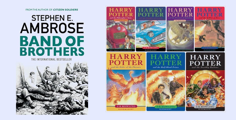
As different as night and day, aren’t they
That’s because one book is about pilots of the U.S who were engaged in war research while the other one is about a wardrobe that opens up to reveal a magical land. Can you judge these books by their covers? I believe so and they’ll probably live up to your judgment.
Wouldn’t you be devastated to find Mr. Thumnas and Lucy’s fictional tale within a book cover that shows the launch of a rocket?
Uniqueness must never be compromised
I’m not retreating from my earlier claim: yes your book about the Subcontinent’s history shouldn’t look like Harry Potter and the Philosopher’s stone. Well, it shouldn’t remind the book shopper/searcher about another author either – and by that I mean another book cover.
While taking inspiration isn’t a foul, too much of it can result in a red card – you’re out before you even begin your career (and not sold-out). Trust me, as a passionate reader I would strongly despise any author who replicates the cover of my favorite book. A book that reminds me of another cover would never be my first choice, off the shelf or online.
Uniqueness isn’t just about replicating someone’s work though. A professional book cover design communicates the gist of your story and your content surely must be unique, right? I sure hope so. As an author of a particular genre you can even have your own unique style for the covers and I’m not talking solely about sequels here.
Sidney Sheldon, the name is known to many who love a good mystery novel. Notice how all 3 covers of books that have no relationship with one another (in terms of content) have a few things that remain

consistent. The font and an element that is somehow essential to the story yet doesn’t lift the curtains on the theme or plot. That’s a style that Sheldon’s books own – they leave a person curious to know more. The font too is on the feminine side because Sheldon’s books don’t really have heroes – they have heroines.
The books that I can spot from afar. (Look up)
The romance specialist, Judith McNaught’s works are renowned for romantic adventures, tale of eternal lovers and grand mansions as well as exotic places. All this can be reflected in her book cover designs. Observe how each one will reveal the place where the magic is supposed to happen in the novel.
Even if you’ve never picked up a McNaught, you can still see how she has a definite style for her book cover designs.
However, both Sheldon and McNaught have a fixed genre, hence they can own a style and add it to each book cover design. If one fine day Sheldon decides to visit the land of Narnia or write a book about the first ever U.S invasion, these covers would make for a good joke, nothing more.
Pick a theme and visualize

The idea is right there staring at you but you refuse to look.
The best cover inspiration doesn’t necessarily have to come from other professional book cover designs. You needn’t look far from your own piece of writing.
Professional cover designs will usually reveal a thing or two about the theme of a book.
Shuffle your thoughts – not new ones but the ones that are about to enchant readers once they sit with your book in their hands and a hot mug of cocoa – got a bit distracted there.
I’m not nullifying all the inspiration seeking tactic here but it’s true that most creative book cover designs are the ones that actually illustrate a theme or an idea within your story.

Dan Brown’s Da Vinci Code here, partially reveals the eyes of Leonardo Da Vinci’s famous Mona Lisa. It’s quite evident to a first-timer that the story will have some association with the painting but what?
This is actually a very clever way of portraying the book’s sub-genre – mystery.
Here comes my personal favorite – book cover designs of Stephenie Meyer’s Twilight series checks all the boxes in cover designing “rules” and trends. Using analogy as a weapon to portray her theme, Meyer has kept the design minimal yet interesting enough to be picked and flipped over. The queen protects the pawn – I’m sure you can gauge the dominant figure in this adventure.
Of course injecting creativity is much easier for fictional books as compared to non-fiction writing but there’s no thumb rule – just be relevant.

Get a load of this cover design. I’m being completely honest when I say I haven’t read a word beyond the cover of this book, yet the book cover design is subtle and creative without any nonsensical imagery. The Rubik’s cube with a world map syncs amazingly with the title.
This brings me to the next chapter of your learning process. (Continue please)
Your title is the best tool – write it well, design it better
Pardon me for not bringing this up earlier but I’m really not a fan of chronological orders. Your title is your brand name and one that will be an integral part of your book cover design.
Focus on coining the perfect name for your book. You want your book to stand out and fit into a bookshelf at every home-study? You’ve got to work on your title! Why am I suddenly diverting from my topic you may think. Well, I’m getting there – patience my writer pals.
Firstly, your title needs to be “distinguishable”. There are over a 100 books on the World Wars. They can’t all be titled “What happened in the World Wars”. Remember, how I spoke earlier about people loving the element of uniqueness? That applies to your title as well.
“It’s not what you say, it’s how you say it”
The role of your book’s title doesn’t end here. As your book enters the designing phase, make sure your title pops out. Doesn’t really matter whether your buyer is from Amazon or likes to visit a conventional bookstore, your book cover design must reveal the title in big letters (I mean that quite literally).
How you show the title comes only second to the title itself – how does it sound and how does it look? Both are important!
Don’t merge your title with other elements. Here’s a short list to tally before you finalize your book’s title design:
- Use a font that’s easy to read but also complements your genre
- The title should be dominant – a size that can easily be noticed even as a thumbnail
- Let the title stand out – don’t create a competition between your title and other design elements
Here are a few best-sellers to show you how it’s done:
Colors should be used with caution
Now colors can truly make or break your book’s look. I’m sure any professional will make sure that colors don’t go haywire when your cover is in the design phase but I think you should know the basics too.
Colors can draw attention to your book when used correctly (extreme emphasis on this word).
Your choice of colors should reflect your genre. In fact colors are another great tool at your disposal to communicate the genre of your book before readers can turn a page. However, “with great power comes great responsibility” and you need to make sure that these colors don’t drown your title or convey a contradictory image of your book.
Blue might bring back childhood memories but if it creates a clutter on your cover, you must let go of it. Black for instance might not be a suitable choice for a romance novel that has no mysteries or vampires to cast a dark shadow.
Make sure your colors don’t affect readability in any way. This stands true for not just the title but also for the summary or any other text that isn’t there “just for fun”.
Research is key my friends, to creating the best book cover design. Unless I know much about YOUR book I can only lend you a generic helping hand.
As psychology suggests, warm colors tend to stimulate energy while cold colors like blue or green depict serenity.
Remember, colors should attract not repel your customer so they should be easy on the font and easier on their eyes. This is where the neutral rescue team (gray, white, black and beige) can help balance out a creative book cover design where colors are aplenty.
Minimalism never loses charm – don’t let clutter takeover
When I say don’t let clutter takeover, I don’t just mean your book covers but also your mind as an author! Your writer’s heart might tell you to include all nuances of your storyline on your cover – ignore it.
As I mentioned previously, all you need to do is select a theme. Pick an element from your story that’s worth the emphasis. Ask your designer to work on that and just that. Minimalism never fails to attract when it’s done right.

The two book cover designs above belong to the same title/book. Thought there is nothing wrong with the previous edition, publishers saw the need to follow trends. Crowded illustrations that were all over the book still has a very vintage air to it.
Nevertheless, as the last decade saw a shift towards minimalism, revisions were made to suit contemporary demands.
Invest or Regret? The choice is yours to make.
That’s a lot to take in I understand and my words may seem too blunt but I’m here to tell you the truth excluding any sugar coating.
I’m assuming you have a great vision. You want to become the #1 bestseller. Well, every great journey requires some investment to travel, right? Get a professional book cover design from experts on the field. You can contact me and I’ll make sure your book cover design is in safe hands.
-

Waqas D.
Waqas D. is the co-founder of the branding and website agency, FullStop™. He supercharges brands by crafting memorable logos, brand identities and engaging websites. Besides thousands of startups and medium-size businesses, FullStop has worked with likes of Microsoft & L’Oréal. View our portfolio or get in touch.
Get a Free Quote
+1 845 3770255
Call on anytime
To discuss your project
Featured articles:
Topic Categories
Interested In
Logo, Branding & Creative Work?


 We’ll get back to you in 24 hours
to address your needs as quickly as possible.
We’ll get back to you in 24 hours
to address your needs as quickly as possible.
 We’ll prepare an estimation of the project
describing the team compostition, timeline and costs.
We’ll prepare an estimation of the project
describing the team compostition, timeline and costs.
 We'll perform a free website review
If you already have an existing website.
We'll perform a free website review
If you already have an existing website.


