Beware; These Designing Mistakes Can Jeopardize Your Brand
New into the designing or business world? Here are a few design mistakes that you need to avoid to risk your brand reputation.
Mistakes are inevitable; everybody is entitled to make mistakes. Nobody can deny to the fact that everbody makes mistakes, and design is full of tiny pitfalls that can be easily missed. Thankfully, the designers usually learn from their failures and then ultimately become better at it. Therefore, it can be said that not all the design fails are not that bad at all? Or are they? That is up to you to decide.
If you are an aspiring businessman who is looking to make a big name in the business world, then here is your chance to learn the best. Learning from the mistakes of others is what you can do best for yourself or your business. There is an extensive list of failed products in 2020; what you and I can do is learn from these brands' mistakes and see what they could do better?
There is no denying to the fact that sometimes products and designs that look aesthetics on paper often fail to deliver to customers. These products had all the promise and the world and died for a number of reasons.
As of now, I am bidding goodbye to this decade; I would like to talk about a few notable changes that I have seen in the past few years. The previous decade saw the rise of subscription services, the Kickstarter supported gadgets, and radical new ideas popped up to disrupt all the industries on the planet. Risky ventures were pretty common, which resulted in various flop designs and a failed business. Nevertheless, safe to say the in terms of the designing world, the decade had a lot to teach. But are you ready to take on the right notes from it? Let's see.
There are tons of technology failure examples available out there, as the 2010s saw many designs and tech flops. However, what sets them apart is the lesson they teach us.
Without any further ado, let's discuss some crazy design fails.
1) "Where" design fail
The location of your design can make or break your copy, and you would not want to send off a wrong message by placing the design on your copy wrongly, would you? Looking at this cover of "Where" magazine shows us just how vital composition and layouts are in graphic design. In this cover, the photographer did a fine job by capturing the right picture at the right moment, but what about the cover design?
No matter how great the job is done, all the good work goes in vain if the image is not rightly placed. I mean, the woman in the design looks so happy carrying huge boxes of the shopping trip; it's a shame how she has to be slandered by a design fail.
Now the question arises… what is the better way of positioning this image in the design? Should we move a little left? Or right? or maybe the size should have been a little smaller.
The cover would have been perfect if the designer had not placed the photo lower so that the E does not look like an O. It could have been easily achieved, and even the reader would not have missed seeing the bottom of the third box. Moreover, the designer could superimpose the title as well over the head of the model as long as it did not cover much of her face.

2) Microsoft Zune
2000 was the year when people were plugging their earphones in their iPods and enjoying the new gadget, flaunting it in front of their friends. Generation Y can reminisce those good old times. Nevertheless, Microsoft also tried to launch something in competition with the iPod, which sadly was a colossal flop.
One of the main reasons why it was a flop was because Zune came pretty late to the party. Apple had already gained the public's attention and was the showstopper for five years, and then Zune made its entry. Apart from this, there was not much of innovation in the design that could be seen. Zune was everything that the iPod was offering, nothing different.
It would not be wrong to say that Zune was not a bad product. It failed only because Microsoft could not make bold changes to make it stand out in the market. It was one of the many products that failed in the last two decades.

You may find it interesting: 25 logo blunders that will make you laugh
3) Significance of kerning
Not many people would have an idea about what "kerning" is, but sadly it can be affirmed that neither the package designers of the Holiday Lights were aware of it. Well, at least that is what the package shows.
Let me give you a little heads up about "kerning" to help you identify the mistake in the package. Kerning is the design term that is used for the spacing between letters, which makes the text more evident and readable. Not everybody can do kerning better as it is pretty technical with some accurate measurements, pixel guidelines, and variations for various letters. This is why it is essential for designers to have a complete understanding of it so these mistakes can be easily avoidable.
Nevertheless, the sad part is most non-designers are not aware of kerning; hence they fell into problems like these. One of the designs of the product that failed in the market is the famous Wig and Pen.

4) Parting words
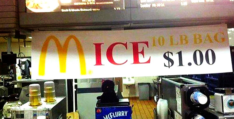
One of the many mistakes that graphic designers often make while designing a label or logo is they usually prefer breaking the word, which results in giving the design a whole new meaning. Such as that, have a look at the above example; what do you see there? What's written? App? Rent? Ice? Ships? Is the poster for the Application to Rent an Ice Ship? Or what?
Well, you would be surprised to know what precisely the poster says. The poster here is about Apprenticeship… I mean, why would they do that.
Breaking up words that should not be parted is a classic design fail; there is no doubt about it. But breaking up one big word like Apprenticeship into four different words that are incidentally their own words is some next level epic mistake. However, here is a little more information to shock you even more. What makes this ad sadder is that the ad does not only help enticing people to work with them, but they are also a company that specializes in graphic designing. I mean, WOW!
However, I do not mean to discourage the designers from using this technique; there is a smart way to break up the word. When it is done well, the method is pretty useful.
A pro tip- if you are planning to break words in your design, do it with caution. Whenever you can, make sure you do not create real words with kerning and keep your message simple. The shorter the message, the easier it will be for the people to comprehend it.

5) Facebook Home
Facebook is our go-to-place to keep up with the news and gossip around; however, you may not have noticed it yet, but in 2012 Facebook tried and failed to expand its dominance in social media. Facebook Home was turned into the home screen of the user's phone into their Facebook news feed, which did not really impress the customers. According to most of people, only Facebook freaks could enjoy this update.
The new Facebook design was clunky and was impossible to customize, and it was also reported that the design used relatively larger data and battery. Later after a few weeks only, they released Facebook Home, and the cost of two-year subscriptions was shifted from $99 to $0.99 and resulted in disbanding the whole team working on the project.

6) Art of communication
One of the largest parts of graphic design is visual communication; it is the graphic designer's job to make a more understandable message for the viewers. What is the point of having a message on the poster if it cannot be rightly delivered? Poor designing choices can jeopardize the whole message.
You buy three and get two free if you buy one and get one free; sounds pretty confusing, eh? Your message should be easy to read, and its meaning should be grasped at one glance only. Nobody today has time to give 2-3 look at the message to understand what exactly is being said. The overall layout of the message is pretty poor, and along with that, the confusing asterisks repel the customers rather than attracting them to the store.
For one thing, the overall setup looks like an equation, and who even wants to do the math when they are out on the streets? Please let the equations stay in the math textbooks only. Moreover, the second part of the poster is smaller in size, which looks more like a clarification for the first part rather than a separate sales concept. While it is a pretty simple and honest mistake, these minor issues experience designers knowing to sidestep.

7) Say what you mean
I mean… nobody deserves to die like that? Or maybe wishing death upon someone equals to crossing the line, isn't it? Designers are not only supposed to look good, but they are also responsible for sending over the right message and look out for contextual mistakes. While designing the book cover, do not do what the designer of "Deserves to die" did. By looking at this cover, one gets the message that "Lisa Jackson," the author of the book "Deserves to die."
The fusion of the book title and the author's name both right at the same place does not give the accurate meaning. Make sure you are not combining them in a way that has an unintended purpose. The way this book cover is designed, the mistake could have been easily avoided by placing either the title or author name in the two different places. However, later when the mistake went viral, the publishers eventually caught on and fixed the mistake using different typefaces and colors.

An important read for you: How Design Empowers Brand Storytelling?
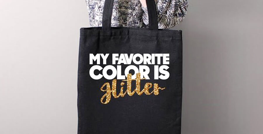
8) Use Cursives smartly
I do not mean to be blunt and too straight forward, but not everybody today can do cursives the way they should be done. Most of the brand failures reasons were the poor use of cursives on the logo or label design. The ambiguity behind cursive writing has long been the rival of well-meaning designers; however, only a few have suffered from its evil snares like designer Bella Chic.
If you look at the design first, you will not be able to guess the word "Glitter" right. Given that firstly the cursive G is relatively high, secondly, it is too close to the L, and the T is quickly overshadowed by the bold white letters above. Glitter is not the apparent interpretation of the sparkling lettering. However, it is surprising that these mistakes went unnoticed until the design was released.
Nevertheless, later the designer apologized for the product that failed in the market and corrected all three typography errors without changing much of its design.
9) Understand the hidden meaning
You may be surprised to know but not just a copywriter but a graphic designer also needs to be a proofreader. They need to double-check to ensure their designs do not give away any irrelevant and secondary meaning.
This exactly was the case with the mass media conglomerate Thomson Reuters. Unintentionally they created a design that looks more like a Venn diagram [Oh!!! Not another math problem, please] showing how little they value partnership, performance, trust, and innovation. All the wrong messages that an organization would never want to send to its customers or employers.
In the designer's defense, the design was never meant to turn out like this; instead, they planned to use playful graphic shapes and colors, but it all backfired pretty severely. However, one tiny mistake and the whole designing world keeps coming back at you for the stupid error. It is better to go with a designer who can grasp such an error at an early stage than jeopardize your branding.

10) You are wrong even when you are right
Are you scratching your head in confusion, trying to understand what do I even mean here? Well, yes, this one is quite tricky. When the poster of Ready Player One was released, people criticized it for showing a freakishly long leg, and rightfully so. I mean just look at it.
At first, the image gave the impression of being doctored but later, it turned out it was actually accurate. The Twitter fan Captain Disillusion dissected the photo to prove that leg is entirely proportional to the rest of the body; however, it looks long only because of its odd pose and angle. There is nothing wrong with the image but the human eye.
The critical point to take from this advertisement is that one of the designer's main jobs is to ensure the poster looks fine and makes sense more than actually being fine. In the current perceptive world, how people perceive the work is more essential than factual information.

11) Absence of visual hierarchy
What's the point of the logo design if it cannot be accurately read or understood? If you are a designer, then you must be familiar with the concept of visual hierarchy. The idea aims to help a user distinguish the order of visual importance. The notion concerns not only the text size but also the alignment, placement, and color of the text.
If these principles were observed in the image mentioned above, you would be able to read what's written on it. The photo above shows what happens when there is no proper contrast available. White text on a neon background does not make the text readable at all and would just frustrate anyone whose glance falls on the packaging.

Take away
Failures are a part of business life; various recent product failures in 2020 proved the year was a lot worse than it actually was. There were many successful products that failed at first but later, when the audience accepted the overall concept, they were a huge hit so maybe the year or decade was not that bad?
Good ideas that failed gives us the lesson to not to use scare tactics. One silly design fail can ruin the entire reputation of your brand. Moreover, anybody can tell that all the design mistakes mentioned above prove that these are the folks who overestimated their design skills. Therefore, it is better to trust a professional person for the job. The real design talent lies in comprehending the risks well enough to tiptoe around them.
If you are an aspiring designer or a business owner, then you must know, the necessary skill set of a good designer includes color theory, do's and don'ts, kerning, and comprehensive knowledge of fonts and an eye to avoid common mistakes.
Now that you are aware of some epic design fails, you know what to avoid while designing and how to hire a great designer. Know that your graphic designer is your ticket to ensuring everyone discusses your next campaign for the right reasons.

Co-Founder & Strategic Visionary at FullStop
Co-Founder at FullStop, a branding, digital and software agency he started in 2012. Haris works across brand design, digital marketing, and custom development—helping businesses turn ideas into market-ready products.
Ready to transform your brand?
Our team specializes in strategic branding and digital solutions that drive real business results.

