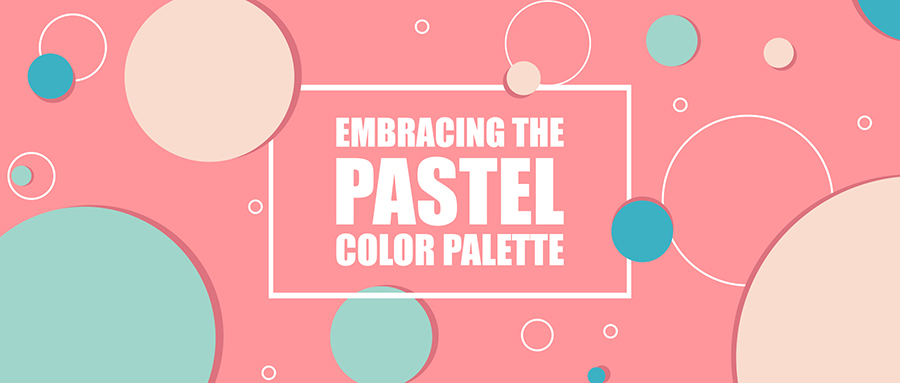
Embracing the Pastel Color palette
All about what are pastel colors, the multiple pastel shades which are used in advertising and how pastel color schemes have become popular due to their greater impact in branding.
In a world that changes its opinions with every season (or even before), there has been a sudden shift from vibrant and bright tints to muted, subtle and soothing pastel colors. Some might blame the change of seasons for this movement but that’s just a myth in my opinion. Brands and graphic designers alike have started to realize that pastel colors have a longer life span with rapidly evolving advertising trends and so the pastels are back in fashion (literally and metaphorically).
The Pastel Family
Before I introduce you to the PASTELS, for those of you who aren’t aware of this color fam need to know exactly what are pastel colors? Pastels are shades which are generally light toned, subtle and soothing. Confused at times with neutrals (black, white and beige), pastels are lighter shades of vibrant primary, secondary and tertiary colors. To be blunter, pastel shades are variations of colors which have been blended gorgeously with white to produce an extended family of that color.
Pretty Pinks
Used to portray a girly touch, pinks are a favorite in pastels for brands that want to exhibit a feminine persona. Truth be told, pink itself is a pastel variation of red but it can often take a sharp turn with its brighter version. You’ll find a pastel pink element in designs which need to communicate a soft or innocent vibe. It’s a great hit in baby shower invites or announcements such as “congratulations it’s a girl” or even breast cancer campaigns!
You’ll often see artworks which are primarily bright with a touch of pastel pink to soften the image. The same can be seen with many sanitary napkin packages. Take a look at this one for example:
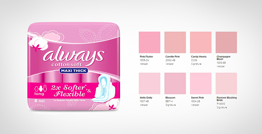
This packaging is the perfect example of multiple pastel shades of pink working together to create a packaging which gets the message across: “this is a female oriented brand and these napkins are softer and more flexible”.
Blending darker shades of pink with pastel shades is the cliché that cosmetic brands don’t want to abandon and there’s a good reason too. A pastel scheme blended with darker shades provides an attractive, balanced packaging which women fall in love with at first sight.
I've also mentioned some shades of pastel pink you can see in the above image that can come in handy for a woman centric brand or for a graphic designer working on an artwork.
Another good read for you: Basic Elements of Design You Should Know About
The Blessed blues
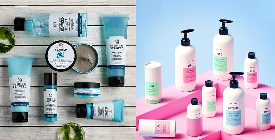
You think blue and your mind drifts towards cold, cool and masculine products. However, blues have little bias when it comes to using their pastel color schemes for product packaging, campaigns or other artworks. As with pastel pinks, lighter shades of blue are mostly used to deliver a message of softness, however in contrast to pinks, pastel shades of blue are used mostly for “it’s a boy” templates or decorations, but there are no restrictions.
A pastel color scheme with blue shades are highly recommended by psychologists for a tranquil vibe in a room or even offices. The breezy blue color supposedly lowers the blood pressure and pastel shades of blue are great anger management catalysts.
Skin care brands use a variety of pastels inclusive of blues to give the illusion of a soothing, calming effect (and there target market is mostly women). Here are a few examples of how pastel shades of blue can be used to get the brand’s message across:
Serene Green
We all know the compatibility of green with nature and that’s how its pastel shades work as well. Pastel colors derived from the color green mostly indicate a peaceful, natural aura. You’ll find a lot of herbal products having a green theme. However, it has been tried and tested that lighter shades or more precisely pastel shades of green have a more in-touch-with-nature impact along with a soft image as compared to darker shades.
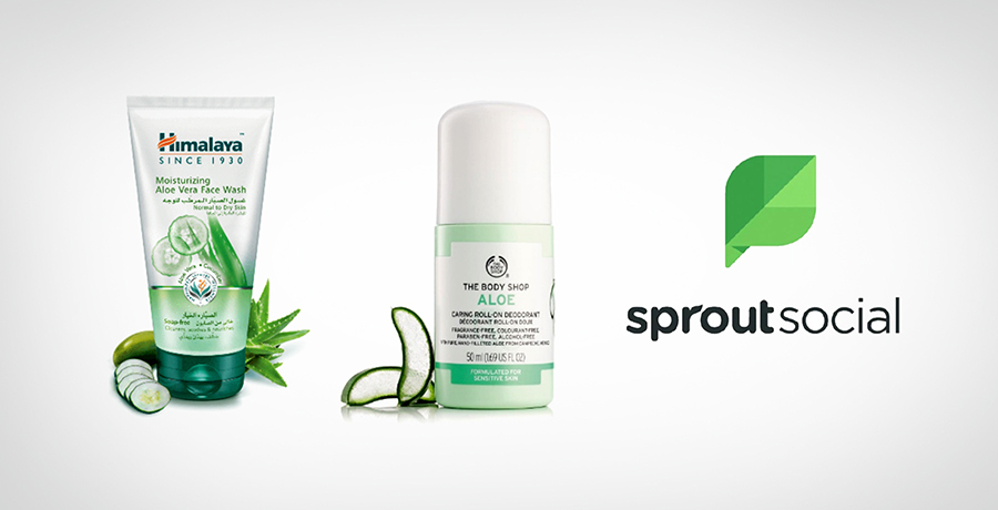
What’s common in both the products shown above? Apart from them being infused with aloe Vera of course. Both their packaging is a different pastel shade of green, attempting to portray a very herbal yet soothing look which primarily is what an aloe Vera gel is popular for: it’s soothing, anti-inflammatory properties.
Pastel shades of green are also a hit for kitchens and living room walls since they are expected to bring a feeling of happiness and good vibes to your homes.
Since these brands connect people or groups of people they have incorporated nature’s green pastel shade into their logos and color schemes to represent global linking.
Oh my Orange!
Known best for its ability to stimulate an appetite or exhibit a sense of fun, pastel shades of orange serve the same purpose but with a softer touch. While serving the purpose of indicating fun and entertainment pastel color scheme with oranges in the mix (not the fruit) also portray freshness and vitality in campaigns, logos, packaging and artworks while not being too hard on the eyes. In fashion, pastel shades of orange take the lead as compared to brighter “in-your-face” tones which tend to give an overly dramatic image.

The logo above is a fine example of how pastel colors or shades of orange can hit your senses and tell you that this is the place you need to go for a mind / body refresh!
You may want to read: Color Theory and why it is Important
Pastel Color schemes: When the family gets together!
It’s not always a one color show you know! The pastel family works together or with their bold and bright ancestors to give us some brilliant logo designs with exquisite color compositions. Take a look at these logos for instance:
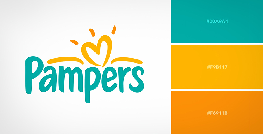
Whether you have a child at home or not, you still might be familiar with this brand. For formalities however, I’ll let you know that Pampers is the most popular diaper brand for toddlers and claim to be the softest most comfortable ones that exist. Hence, you can see how pastels shades of green (mixed with blue) and orange have been used to support that message.
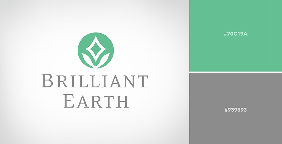
Here’s another visual example of how pastel colors can be merged with neutrals. For those of you who don’t know, Brilliant Earth is a global leader in ethically sourced fine jewelry. Do I need to explain why their colors are so tranquil and not flashy?
The bottom line is, pastels aren’t back. They were always there, with or without their parent colors! Brands have started to go pastel even in their instagram grids and Facebook posts to keep it light but only if their brand persona doesn’t get affected. Is your brand going pastel this year?

Co-Founder & Strategic Visionary at FullStop
Co-Founder at FullStop, a branding, digital and software agency he started in 2012. Haris works across brand design, digital marketing, and custom development—helping businesses turn ideas into market-ready products.
Ready to transform your brand?
Our team specializes in strategic branding and digital solutions that drive real business results.


