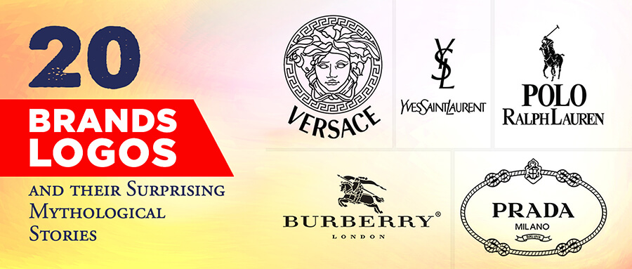
How Logos Affect Brand Equity
Branding and Brand Equity is no joke and logo design is a part of it. How do logos affect brand equity? Learn how to influence customer’s decisions.

Ever wondered why people go crazy about popular brands?
Or why that fellow of yours continues to buy expensive Apple products when android has the same features to offer at cheaper rates?
The answer is Brand Equity. It’s what makes customers loyal and brands stronger. How does it work?
What creates brand equity? How do you maintain it? What affects brand equity? And what role does a logo play in it?
All of these questions come naturally to us when learning about the subject. Today we’ll be talking more about how logo design affects brand equity.
But first, let’s define the term itself for the sake of clarity.
What Is Brand Equity?

Have you witnessed someone choose a certain outfit over another just because of the brand name on it?
We think we’re immune to that sort of decision making until our favorite brand pops up on the shelf.
You’re prone to think that way because the brand of your interest happens to exist in another industry.
We’d be making fun of a friend for buying an overpriced jacket because of the brand name, all while reaching for an expensive vegan food item in the grocery store telling ourselves it’s truly organic, and walk right past the section offering not so aesthetic lot of vegetables on discount.
A lot of us choose popular brands over unknown ones for gifting even if the latter offered better quality products.
All because we can bet our money on the fact that popular brands will be appreciated more by the recipients of our gifts.
If you offered two identical pairs of shoes to a sports person for the same price, one without a name and the other with Nike’s logo, which one do you think the person would buy?
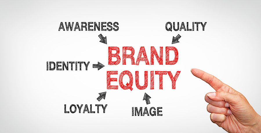
Brand Equity is that value people associate with your brand’s name regardless of the features, product, or service offered.
Brand Equity is what determines which businesses can charge a higher price for almost anything and which ones cannot despite having the same quality and quantity to offer.
In other words, brand equity is a measure of how much people value your brand’s name.
It is what makes people pay a higher price to some companies for products that cost half the amount when bought from other sellers in the market.
And perhaps even quarter if a street vendor happens to offer them.
It is also why many would readily buy replicas of certain brands just to have that name on a product they use.
That way, strong brand equity can also make your product a status symbol.
Take Rolex for example, a lot of people willingly buy replicas of Rolex watches over original watches of other less known brands.
The same is the case for Ray-Bans, Levis, Gucci, and so many other brands. Possession of any of their products symbolizes a good social standing in many circles.
This brand equity thing looks like a lucrative business doesn’t it? How do you make it work?
Let’s find out!
How Do You Build Strong Brand Equity?
There are many components of branding that contribute to brand equity. First and foremost is of course your product’s quality.
If you’re at the initial stages of business development, you need to offer surprisingly good quality while maintaining a decent appearance in the market to lay the foundation of strong brand equity.
Give as many people a taste of your quality as possible. Once a great chunk of people become your recurring customers, you need to start investing in reaching those customers digitally and create a following.
That group of people is going to be your first batch of loyal customers. Keep them engaged, and hype them up whenever possible to build a connection.
To create brand equity you need to build trust and a good impression. Consistency in maintaining quality builds trust, so does a sense of connection, that’s obvious, but how else do you make people trust you?
Especially when they’re looking at you for the first time? How do you convince them to take that first step towards you? All of that comes down to impression.
To attract people and convert them into leads or customers, you need to look like you’re worthy of all that attention.
You may also like: Pepsi’s long history of logos: A lesson in modern logo design from the past
Why Do You Need A Logo?
A logo is an important part of the bigger scheme of building a strong impression and a brand personality.
It is the face of your brand identity, and it reflects how much thought you’ve put into your brand. Moreover, a logo tells more about your brand than an entire Wikipedia page can.
It shows what you stand for, the type of attitude you possess, and in most cases, what you have to offer or what you do. All of these things play a massive role in developing brand equity.
Your logo sets your first impression, and although the first impression may not be the last, it sure does determine whether the person you’re targeting will want to take their first step towards you or your competitor.
Logo design is an art. You have to carefully craft a compelling image that fits every part of your strategy and stands out wherever it’s put regardless of its size.
What Type Of Logo Design Builds Brand Equity?
A logo can make or break your appearance. When a potential customer looks at you, the first thought that comes to their mind whether conscious or subconscious is “Can I trust this company?”
![]()
Your logo design plays a great role in answering that question for them. In the era of online shopping and a digital connection with customers, you have to appear authentic.
In a world full of scammers and even more so, spammers, you must look like a genuine, not so desperate brand to be able to gain the public’s trust.
The question is what makes you look authentic? And how do you do that with a logo design? Here’s a simpler version of an answer.
People associate transparency with authenticity. And transparency is associated with a detailed description that adds up.
The more consistent information you put out there about yourself, the more authentic you will look.
The same applies to your logo design. Research suggests that the more information your logo gives about you, the more people will be willing to trust you.
And it makes sense to have a descriptive logo because it attracts the right audience when they figure out what your business is all about at first glance.
Apart from your name, your logo should describe what you offer, the impact you aim to create, and a bonus point if it reveals your experience – especially if you’ve been in business for long.
Should Logo Designs Always Be Descriptive?
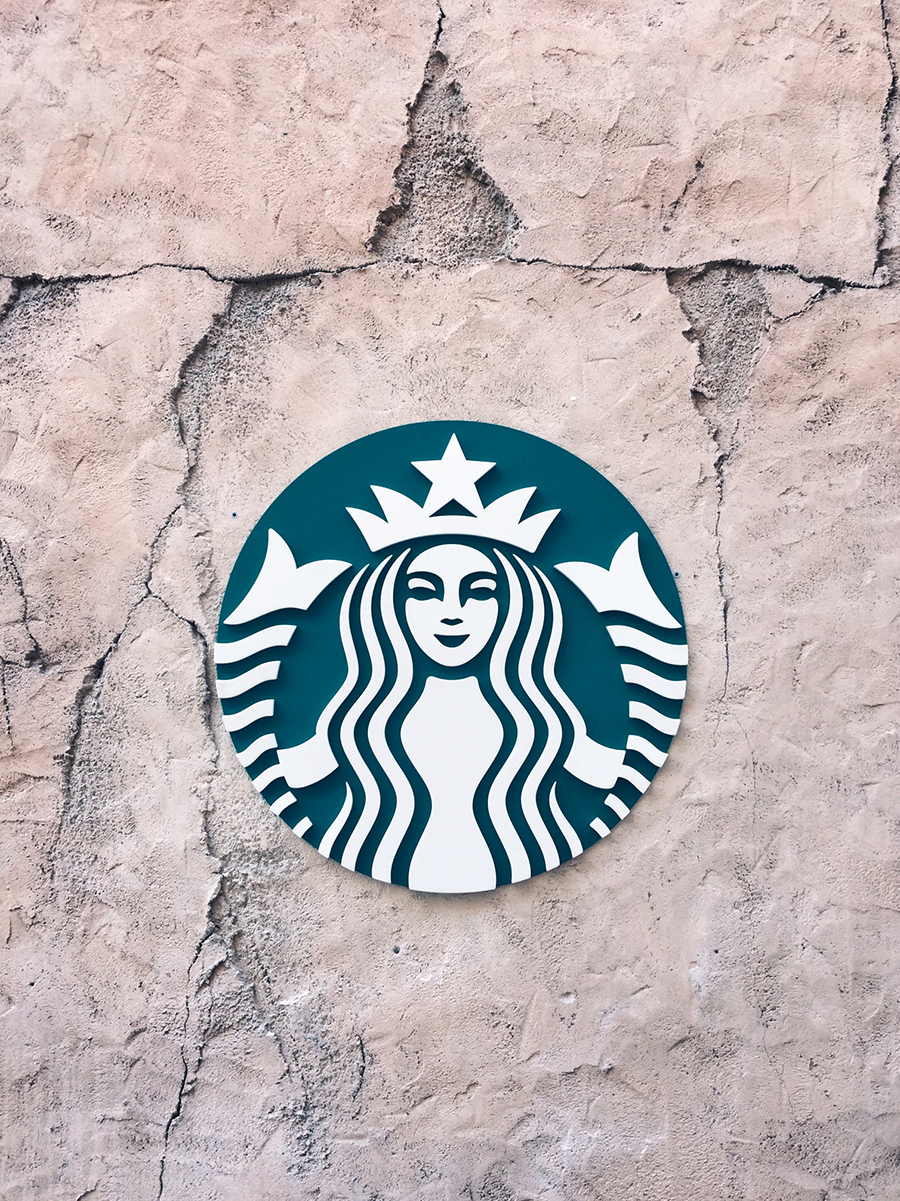
It sounds contrary to the popular belief when I say logos should be as descriptive of you as possible because most of the popular brands have very minimalistic and simple logo designs.
In many cases, they carry no description of the company and are recognized purely based on the brand’s popularity in the market – such as Apple. Meanwhile, descriptive logos tend to be a bit complex.
![]()
But hear me out on this. When you’re well known in the market, your logo only serves as a mark of ownership because it is recognized by people already.
The simpler it is, the more it stands out in this case. That gives you more visibility to keep your image alive and leaves room for more product lines or expansion.
But when you are one of the small to medium-sized businesses that are barely known in their own circle, you have to be descriptive.
People should be able to tell what you’re selling, and what you aim to do just by looking at you. That gives them the autonomy to decide whether they’re interested or not without having to talk to you.
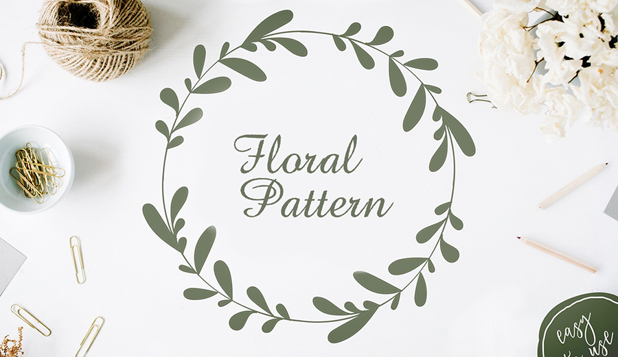
It saves both parties time and hassle in the long run. For example, if you’re a coffee shop, you might want to add objects like a coffee cup or a similar shape in your logo to attract coffee lovers looking for a quick take away.
If you’re a flower shop or a plantation business, having flowers or floral patterns in your logo design like the following image can be helpful.
A descriptive logo, as we talked about it earlier, is associated with authenticity in people’s minds, which means, the more details you add, the more trustworthy and credible you will appear.
This makes a descriptive logo the best way to go about when you’re focusing on brand equity.
However, as much as descriptive logos help you appear authentic you should know when to be descriptive, and when to keep things broad.
There are times when descriptive logo designs happen to limit your opportunities and even backfire. If you have a wider range of products or services to offer, getting specific can be hard.
When you have more plans in the pipeline, a descriptive logo with highly specific details can narrow down your avenues.
In such a case, you must leave out certain parts of the description. For example, Dunkin’ Donuts made their logo a little less descriptive by removing the coffee cup from it.
Why? Because they had expanded their menu and started offering other items alongside donuts and beverages.
In other cases, the attempts to make a logo descriptive can clutter the whole thing to no avail. This is where you need to know the difference between a cluttered logo and descriptive logo designs.
Descriptive Logo Vs Cluttered Logo
There’s a massive difference between having a descriptive logo design and a cluttered one. A lot of people mix the two and end up with designs that don’t reach their optimum potential.

To be clear, a cluttered logo design is where you have too many objects in a logo design, and an unnecessary number of colors making it hard to distinguish the dominant hue or the theme of your design.
Cluttered logos never stand out, and when they do, they are rarely ever able to successfully convey the brand’s message, let alone quickly registering in the minds of onlookers.
A descriptive logo on the other hand has details that complement or enhance the dominant objects and colors in the design.
Description enhances a logo and makes it easier to process for the viewer meanwhile cluttered logo is rather overwhelming and harder to understand in a quick look.
Here’s an example, the 2D drawing below is more descriptive for a logo than a simple text saying “Coffee”.
![]()
The elements that make it more descriptive are the wisps of steam above the cup and the saucer beneath. These are complementary details that make it more descriptive.
At this point, choosing a couple of colors, giving it a 3D appearance with shading, and adding the word “Coffee” in it will make a perfectly descriptive logo.
The line is crossed when you try to stuff more objects into the circle around it or pay no heed to the required breathing space between objects – For example, putting Coffee beans beneath, a croissant on the side, a fork and a spoon on the other side of the cup. Maybe even a couple of fruits above it.
Those are all related objects, but they take up space, divide attention, and would hardly be discernible when the logo is shrunk to the size of a standard Twitter display appearing in the feed on your small screen of the phone.
On the other hand, if you remove details like the steam, the saucer, and the handle of the cup, it won’t be descriptive of anything. No one will know what the actual theme is.
Now, how many objects to add can be sorted out by viewing your logo on different platforms in different sizes, but the success of your logo can only be determined by consumers.
You should also read: 09 Reasons Why Only Stupid Business Owners Use Ready-Made Logos?
What Do Consumers Think About A Descriptive Logo?
Overall, people love descriptive logo designs, and it helps you build brand equity, but does it work every time? How a descriptive logo influences your prospects depends on what they make of it.
![]()
An eyelash brand will see a positive effect on their sales with a descriptive logo design showing beautiful eyes, and it will increase their brand equity. Is it the same for the palm oil industry?
Not so much. Researchers suggest that if your product or service caters to a need that is linked to a negative emotion, a descriptive logo will have adverse effects on your sales.
The palm oil industry might remind people of deforestation. While many other industries contribute to deforestation, the palm oil industry has been in the limelight for it.
A descriptive logo, in this case, would only remind the consumer of its effects on the environment, and they will cut down on the product usage while buying a myriad of other things that directly contribute to environmental hazards.
![]()
It makes sense for people to want to make a responsible choice and I stand by it. However, ethical production is not the main driver of such decisions on the consumer’s part.
It is observed that businesses offering products or services related to mourning, funerals, and other tragic events face negative effects of descriptive logos too.
Any sort of description in their case can be a direct trigger for their target audience. And those negative emotions can and will drive them away from the product or service.
At the end of the day, it all boils down to the context, how your design works with the circumstances, and what type of appearance influences your target audience positively.
After all, you have to keep the big picture in mind.
Big Picture Is Important For Effective Logo Design
When it comes to brand equity the collective effect of several components of branding makes the actual difference.
If you try to measure the potential of each of the individual aspects of marketing and its effects on brand equity, it might feel like the results are not worth it.
However, the synergy between all the elements of your marketing strategy outweighs all the drawbacks and makes your brand equity stronger than you might’ve imagined.
![]()
The logo alone cannot do all the work. Your tone while interacting with customers, your promotional activities, the design of your premises, the interface of your digital spaces, and the whole company needs to be immersed in the theme inside out.
Each activity, department, and team in your business needs to keep the collective goal of your organization in mind from the top to the grass-root level and align their plans accordingly.
This close-knit synchronization is what depicts strength, intellect, consistency, and reliability. Another aspect of the big picture is to keep the dynamics of society in mind.
Where does your company stand? What type of social, political, economic, cultural, and worldly issues surround your company and exist outside of it.
![]()
Seeing your business as a part of a bigger picture helps you work your way into a better situation, spot opportunities, and prevent a great amount of loss.
Your brand envelopes your business, and that envelope deals with the outside world most of the time. It should be tailored to meet the challenges as well as appear attractive.
It needs to consistently cover the entire business across all units and aspects. Any hole in there can leave your business vulnerable and make you appear inconsistent, or maybe even tattered.
So your brand needs to be tightly weaved to maintain strong brand equity and impress your target audience. That along with targeted descriptiveness will amplify the effect of your logo.
Effects Of Targeted Descriptiveness On Brand Equity
This part of logo designing is a bit complex but once you get the hang of it, it’s a life hack you will always want to use.
What do I mean by targeted descriptiveness? It involves choosing to add more details to certain parts of the logo while keeping others vague and simple.

The idea here is to enhance the parts that evoke your desired emotions and suppress the ones that tend to trigger negative feelings.
That way, your logo can appear descriptive all the while keeping attention away from the aspects of your brand that can be a turn off for the customers. So you’re essentially targeting certain points to add more detail.
Another way to be selective about it is to eliminate objects that may be a turn off altogether, or only add the ones that describe some other aspect of your company.
A lot of A/B testing goes into getting a successful logo design created through a targeted approach. Which details do your customers like the most? And what is your logo better off without?

It is for you to discover. The best way to do it is to get feedback from samples of the population that matches your target audience of customer segments.
At the core, you must know what a descriptive logo actually does to be able to strengthen your brand equity.
What Descriptive Logos Actually Do
A descriptive logo mainly brings out the actual personality, character, and offerings of your brand in front of people who haven’t seen you yet or for a while.
No descriptive logo is inherently good or bad. Its job is to describe you accurately. What determines its success is how people react to it.

What some groups of people find triggering might be the wittiest expression from another group’s perspective.
Your logo’s appeal is subjective however you’re not getting your logo designed just for the sake of art. You’re targeting a certain group of people, and you want your logo to stick around in their heads.
People react to your logo depending on whether they like what you described or not, and whether the way you did it suits them or not.
So if you happen to get a cold shoulder or a not so good response without anyone having tried any of your offerings, then its time you either change your logo and describe a different aspect of your business or try another group of people who are more likely to react positively.
It might even take a few logos until you find the type of design that boosts your brand equity and gives off the exact vibe you always wanted your audience to feel around you.
You may find it interesting: Startup Owners Beware: Logo Design is not a DIY Exercise
Final Thoughts
You need to have a holistic approach to marketing so you can truly build strong brand equity.
Your logo design plays a massive role in making or breaking your impression because it is the face of your brand. And when you’re focused on brand equity, you want your design game to be strong.
The more descriptive your logo is, the more authentic your brand tends to appear. Normally, a descriptive logo has a positive influence on your prospects.
However, you need to know if the industry you work in or what you have to offer in general is linked to a negative or tragic event, cause, or phenomenon in the customer’s mind.
In such a case, you have to keep your logo less descriptive or selectively descriptive if you know what you are doing.
The best strategy is to always keep the big picture in mind and everything will automatically fall in place.
At the end of the day, it’s all about increasing the value of your name. And you can do that with a highly targeted approach in terms of both, the audience and their emotions.
If you want to save yourself the hassle of learning, figuring out, and then applying that knowledge to your logo design, hire a professional from FullStop.
You will get customized logo designs that satisfy all your needs from skilled logo designers, and the process will be much quicker than making your own logo design.
You won’t have to go through the repetitive cycles of trial and error to get your perfect logo. That will save you a lot of resources in the long run.
Plus you will save yourself time and energy to focus on other aspects of your marketing strategy to step up your game.
Contact now and enjoy a good time collaborating with our top-notch logo designers.

Co-Founder & Strategic Visionary at FullStop
Co-Founder at FullStop, a branding, digital and software agency he started in 2012. Haris works across brand design, digital marketing, and custom development—helping businesses turn ideas into market-ready products.
Ready to transform your brand?
Our team specializes in strategic branding and digital solutions that drive real business results.