Luxury logos – crafting an opulent look
“One day I’m going to own a Rolex”
“I just want enough money to ride in a Ferrari and call it mine”.
Have you ever heard people talk this way about certain brands?
Unless you party with those who are already walking talking ambassadors of luxury brands, you’ll know what I’m saying.
The real question is:
Do you intend to give your brand an extravagant identity? A look that clearly says “think about me if you can afford me”.
The reality is harsh my friends and I love being real. As brands we all wish we were a Gucci or a Louis Vuitton. However, you don’t need a magic spell or a miracle to reach the top of the pyramid. You just need the right investment, branding strategy and of course a perfect luxurious logo!
Oh, did you think a luxurious logo design was something secondary for your brand’s success? Big mistake – but not one that can’t be corrected. Your luxury brand logo is one of the most fundamental advertising and branding tools that can either make or break your brand.
Your logo is what makes your otherwise simple brand identity a “label” to show-off.
So, how do you make sure your luxury brand’s logo looks – luxurious enough? You can’t drape it in silk or adorn it with diamonds, then what is it that makes a luxury brand’s logo seem extravagant?
It’s always easier to learn from logos that have become international standards for brands to follow.
What makes a luxury brand’s logo look luxurious?
-
Chanel and Louis Vuitton – The art of Monograms
The reason I continuously highlight some leading fashion brands in any blog that’s related to luxury logos (or even just logo design) is that their logos are the epitome of how simple yet elegant luxury can look.
Another interesting similarity between these two brands is that their logos have never seen any evolution. They were so futuristic that they worked then and they work now!
These luxurious logos have actually created a benchmark for future luxury brand logos – especially in the fashion industry.
Designed when the brand was found (1910), Coco Chanel’s logo is a monogram in itself. So Ted Baker for instance had to make a monogram that wasn’t entirely part of their original logo design, but Gabrielle Coco Chanel was apparently ahead of her time.
The Chanel logo with its two reflecting intertwined Cs has been a part of the brand’s perfumes and bags since the brand’s inception. You can’t help but admire the art of simplicity to create a luxurious logo here.
The Cs facing opposite sides, linked together, resulted in a perfect monogram and there’s lesson #1:
Think about how your logo can be used on your products when you’re willing to take your brand levels up in the game. Remember, you are catering to a class where knowing “you” are carrying a luxury brand isn’t enough, the world needs to know too! This is why monograms such as that of Chanel and Louis Vuitton will literally dominate their own product designs.
![]()
Often brands tend to take too much inspiration from Louis Vuitton’s logo – you may find it hard to differentiate, though of course any true LV fan can never be fooled by plagiarized logos or even replicated products for that matter.
The luxury brand logo of Louis Vuitton dates back to the time when Louis Vuitton Malletier started his own shop and named it after himself. His son George is accredited to the monogram logo that royalty loves to display.
Notice how simple yet contemporary the luxury brand logo turned out to be.
Using a simple capitalized serif Italic for the L and a rather straight version of V, the logo that was created sometime in the early 19th Century is an inspiration for every fashion brand (high-street or not) in the 21st Century!
If you’re suddenly feeling inspired and thinking of getting a monogram designed to take your luxury brand up a notch in the fashion gig, you can always contact me and I’ll try my best to craft a luxurious monogram logo that accelerates your brand’s success.
![]()
-
Bentley – emblems are trusted for high-quality
Luxury doesn’t just exist in fashion you know. The automobile industry is a battle ground for who can offer the most luxurious experience to customers. Apart from the quality of course it all really depends on your branding:
They’ll be driving your brand forever
Or
You’ll drive them away!
Just remember, a luxurious logo makes a promise to customers – a promise of high quality and power. How? You’ll see in just a few lines.
Truth be told, everyone has a preference in automobiles owing to their experiences – at least those who can afford to have likes and dislikes. You’ll find mixed reviews for multiple automobile companies.
But, there are some who don’t need reviews anymore.
If you’re not amongst those who live in their own bubble, you are probably familiar with the famous Bentley emblem.
In fact, you’ll see most luxury automobile manufacturers with an emblem as their luxury brand logo. A well-crafted emblem speaks to the high class brand conscious cream like anything.
Let’s hit reverse and drive back to Bentley’s example – a favorite of the aristocrats.
FYI, Bentley is a deluxe car brand that is renowned for its handcrafted opulent automobiles. Even if you see a Bentley for the first time, its emblem will give you a heads up on the car’s value – if you know what I mean.
Showcasing a winged “B”, the logo gives you the feeling that you’ve just stepped into the territory of power, speed and needless to mention, extravagance. If you’re driving a car with the Bentley emblem, you’ve got commendable and highly expensive taste – oh yeah!
Assigning colors to your luxurious logo
I’m still on the same road here. Luxury logos for cars or automobile companies are all about style, elegance and something that makes the buyer think “this is my ride”.
Here Bentley gives us something more to incorporate into our branding. The color of “B” varies from car to car (even calling these models a car seems demeaning). The color red is assigned to more urbane, classy models while green is allotted to speed that is race cars and black is gifted to those that excel in power – you’ll often find underworld leaders in movies owning a Bentley with a black emblem.
That brings us to lesson # 2:
When crafting a luxurious logo, make sure the design does not only communicate the affluence but also enhances the appearance of your product and has the ability to become a symbol of aristocratic pride.
-
Rolex – tell them like it is with symbols
If there’s one thing most luxury brand logos are famous for, it’s their ability to appear classy and elegant without a single ornament. However, that doesn’t apply to every brand of affluence.
If you want your logo to tell people “I’m a royal” then you might as well do it!
The key is to make the logo look like a million dollars without making it seem – tacky.
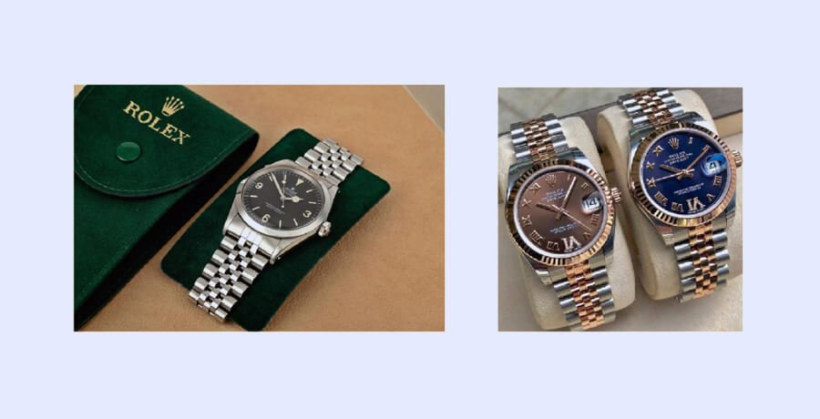
Giving that mindset a dose of inspiration, Rolex gives us a logo that I personally will always admire. Simple and in-your-face.
![]()
Rolex uses the symbol of a crown in its logo – the crown that tells you about the royal persona of this brand. From sportsmen to business tycoons, fashion designers and movie stars, Rolex is what gives them their time check.
The golden hue is self-explanatory while the green color gives us the feeling of prosperity. “A crown for every achievement”. The entire colors scheme syncs well with the slogan – let’s not even mention the crown itself.
What does it teach us? Lesson # 3:
You can be minimalist yet declare who can really afford you with your luxurious logo. You don’t have to be offensive – just realistic and of course wise when you’re branding with such a blunt logo. Hence the slogan that states that Rolex is a reward for achievers.
Rolex created an identity for itself since its inception with the crown and a modernized version of the Garamond Typeface.
Once again you need to look into the future. How can this luxury symbol become an adornment for your products?
-
Bvlgari (Bulgari)– depicting power with minimalism
When crafting a luxurious identity for your brand, you need to bear in mind that the class you cater to isn’t a huge fan of clutter. Ironically, they admire a brand that’s minimalistic in its approach.
You’ll often see just a string of pearls around the neck of the CEO’s wife – a string worth a million dollars because it was designed by a luxury brand.
You get my point, no?
The same holds true for the brand’s luxurious logo. Minimalism attracts the buyer. It creates the illusion that a brand has class but a simple word mark without thought into it doesn’t do the job well.
The most recent logo of the luxury jewelry brand came into being in 1934 when the actual owner left the inheritance to his two sons. I say he would’ve been proud. They refreshed the logo with an even more luxurious approach.
Linking the brand to ancient Rome, they switched the letter “u” with “V” – a symbol for “u” in the classic Latin alphabet – pretty classy, no?
But, there was another reason why “V” was so appropriate instead of a “U”. The company owners’ original family name was Voulgaris.
Just reminded me of Valar Morghulis – if you’re a Game of Thrones fan you’ll know. Hey! I’m just keeping the interest level high.
Even though the font used is a simple Serif typeface, the letters are highly capitalized to portray power, influence and dominance.
![]()
Lesson # 4:
The luxurious logo design of Bvlghari thus serves as a classic example of how you can stand out with minimalism. Almost every famous luxury brand has of course walked pretty much the same path when they opt for a minimalist approach. Think simple but think different!
-
ZALES – the element of creativity in luxury
While Bvlgari reached out to history (Roman and their family’s) for a distinguishable yet simple logo, the iconic luxurious logo of ZALES has a more creative touch to it.
These famous diamond jewelers celebrated 90 years in the business in 2014 – three more years till 100!
But, I’m here to talk the logo design. You need to see their logo first:
![]()
I bet most of you already see it but for those who don’t I’ll fill your cups. The logo uses what is a simple Serif font in capital letters – nothing so different there – but…..
….take a look at the A. It’s apparently a simple font but when you really “look” the A holds a little triangle which actually forms a bigger triangle with the negative space and black/white color play. I’m sure you know by now what the upside down triangle signifies – a diamond of course!
Lesson #5:
Even in luxury brands where your luxurious logo shouldn’t be overcrowded, you can inject creativity to make your logo a class apart. You needn’t look very far from your very own product range or forte.
What else can make your logo look like a million dollars?
Elegance is the one element you must not miss when crafting a deluxe identity for your brand. An elegant logo can convey multiple traits – grace, power, luxury and finesse.
Your logo will always depend on the nature of your brand which brings me to the first element that you can use for a luxurious logo that communicates an elegant look.
Nature
If your brand has anything to do with nature my friends, then you need to think naturally (bad pun sorry).
When used in the right way, elements like trees and greenery in your luxury brand logo can emanate a graceful aura. I don’t speak without evidence. Look below:
![]()
Any skincare collector would know the importance of these brands in their life. However, they too belong to the class of products that are not only formulated but designed for the elite.
While Neal’s Yard makes his logo look luxurious with an emblem and a classy serif font, Tata Harper includes a golden color over green backdrop, merging the elements of nature and luxury. Do you think your brand can use a logo like this? Contact me and we’ll cook up something amazing together!

Lines and Script
Luxury and elegance have a close-knit relationship with script fonts and line art. If you don’t want to go for the serif fonts and emblems there’s always another way around.
Line work is trend that’s rapidly spreading across the world of luxurious and elegant logos. Still perplexed? I’m not asking you to include actual lines in your logo – just work with them! Line work can result in some very creative yet deluxe looking logos.

Observe the two luxurious logos above very carefully. What’s common in both these luxury brand logos? Give up?
Both logos are very simple yet highly creative. They both have used line work (though Exhilarate uses solely line work) to form their brand’s initials! The E of exhilarate is made with the woman’s hair while the jewel in Sebstien’s logo highlights an S.
Script too has always been associated with luxury and sometimes you don’t even need anything more than the word mark in an Italic script font!
![]()
Just remember, luxury and elegance go hand in hand. Whenever you’re thinking about giving your brand the luxe makeover, step into the shoes of a luxury brand owner. Think about your luxury brand logo as a product in itself and you’ll get there soon.
-

Waqas D.
Waqas D. is the co-founder of the branding and website agency, FullStop™. He supercharges brands by crafting memorable logos, brand identities and engaging websites. Besides thousands of startups and medium-size businesses, FullStop has worked with likes of Microsoft & L’Oréal. View our portfolio or get in touch.
Get a Free Quote
+1 845 3770255
Call on anytime
To discuss your project
Featured articles:
Topic Categories
Interested In
Logo, Branding & Creative Work?


 We’ll get back to you in 24 hours
to address your needs as quickly as possible.
We’ll get back to you in 24 hours
to address your needs as quickly as possible.
 We’ll prepare an estimation of the project
describing the team compostition, timeline and costs.
We’ll prepare an estimation of the project
describing the team compostition, timeline and costs.
 We'll perform a free website review
If you already have an existing website.
We'll perform a free website review
If you already have an existing website.


