New Premier League logo: Learning from their mistakes
Are you into sports and soon launching your own team or designing a premier league new logo? You need to read this and learn what mistakes to avoid at any cost.
Disclaimer: All opinions in this blog are based on technical, design aspects and do not arise from any emotional trauma resulting from the rebranding of my favorite league’s logo. (Please believe it)
Rebranding is a phase which brands fear entering and for valid reasons too. Little or no harm comes to a brand which has yet to penetrate the market or stand side by side with its competitors. Why you may ask? It’s because this brand is still in its experimental zone, less known to its target audience who would have no idea if the brand changed its logo design or even its name!
The same perks however are not enjoyed by a brand that has dominated minds and hearts alike since almost a century! To simply say that rebranding the logo is difficult would be an understatement, it’s a risk to the very image of the brand.
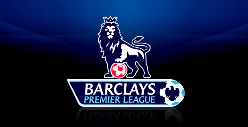
One of the biggest rebranding mistakes that has probably made it to the pages of rebranding history are those of the Premier league logo. Before I start playing the blame game let me just fill you in. For those who may not know, the biggest football league was left with no choice other than rebranding since it needed a logo without the name of a long-time sponsor: Barclays. However, the new premier league logo ignited some unfavorable reactions from fans who could not bid farewell to their favorite lion.
Rebranding the Premier League logo backfired for one or all of the following reasons (take notes):
1. Football fans are ironically emotional
Isn’t football considered to be a macho game? Here’s the irony: football fans are deeply emotional when it comes to their favorite club or player. More than cricket or tennis fans I’d say. Considering the fact that football was once nearing its end in England, the Premier League possesses even more symbolism and significance for fans across Europe than those present in any other continent or country.
The crucial point is that this emotional attachments aren’t just linked to the players but to the brand itself so the new Premier League logo was bound to attract a lot of emotional dispute amidst fans. They were accustomed to their favorite lion with a football and change isn’t very easy to accept!
2. Looking for a good reason
Apparently the reason for the big Premier League logo rebranding was to snip out their ex-sponsor, Barclay’s name out of the logo. The question arises as to whether such a drastic and dramatic change, as evident in the new Premier League logo was actually necessary? Almost a century old brand such as the Premier League needs a strong reason to change its face! There’s no denying the fact that the oldest Premier League logo evolved with time as well but those transformations were based on improving an immature design, not deleting a sponsor’s name.
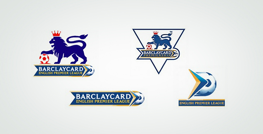
From left to right, this was the initial transformation that the premier league logo went through and for good reasons too! Any designer can clearly see the maturity in finishing and colors as well as the illustration as the logo evolved.
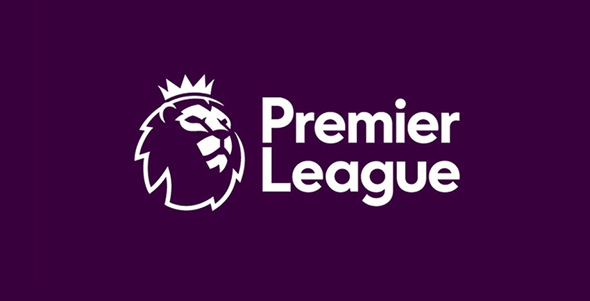
Nevertheless the only thing relatable about the brand new premier league logo with the logo above is that they didn’t replace the lion with a tiger or a bear. Fan or no fan, anyone who has seen this logo took one glance at it and knew what this was about and that’s where changing a logo so drastically could turn into a death sentence for any brand. I’m still not revealing the new logo: saving the best for last.
3. The X Factor should not be missing
What really is this X Factor? No one can really define it, but one can surely judge a logo based on whether or not it stands out .i.e. does it have that X factor needed to make an impact? The previous premier league logo had become a water mark in the minds of the league’s fans and taking away their favorite lion illustration needed a replacement which could score a major goal! They probably missed. This was reflected not only in the logo design itself but also English football fans who were devastated at the remarkable resemblance of the new logo to The Lion King!
4. Remember your roots
Never forget your brand story, origins and history. These are factors which ultimately create your brand’s personality and become your brand’s identity. The Premier League logo’s lion was supposed to be a symbol of royalty, the crown depicting it perfectly and fans associated this logo with their own “noble English roots”. Even though the new premier league logo still illustrates a lion’s face with a crown, the head gear has gotten subtle while the lion has a more abstract, cartoonish look thereby make an impression that the league is probably trying to let go of the “royal image”.
And now for the grand finale. Here’s presenting to you the new Premier League logo
What are your thoughts on this?

Co-Founder & Strategic Visionary at FullStop
Co-Founder at FullStop, a branding, digital and software agency he started in 2012. Haris works across brand design, digital marketing, and custom development—helping businesses turn ideas into market-ready products.
Ready to transform your brand?
Our team specializes in strategic branding and digital solutions that drive real business results.

