All you need to know about hand lettering
Are you still confused about the regular hand written letters and hand lettering? If yes, then read further and educate yourself with the basics of hand lettering.

Disclosure: This article may contain affiliate links. We earn a small commission at no extra cost to you.
What do you think of when we say hand lettering? The traditional way of taking out our writing pad and writing pen to craft a perfect letter for our loved ones? Right? For you, it may be that, but in marketing terms, it is so much more than that. The question is, what actually hand-lettering is? Well, without any further ado, let's clear your confusion about these letters and see what they are actually.
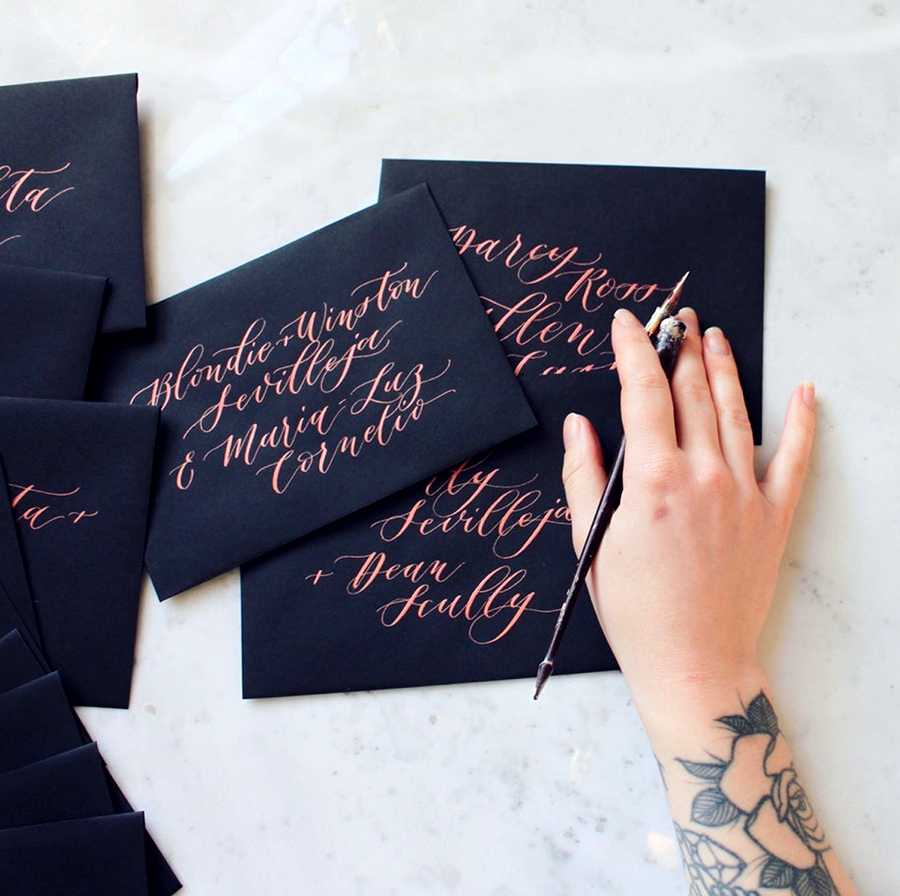
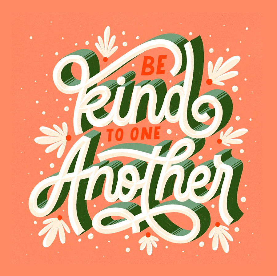
Hand lettering is the crafting of artistic writing; it is more related to drawing and painting rather than formal writing. You need to have a great deal of precision, creativity and patience to form these letter as they are created by repeating various shapes. When it comes to actually using the words in the writing, there are a plethora of block letters to cursive simple to advanced letting techniques which includes bound lettering, fake calligraphy and brush lettering. The fusion of different handwriting styles embellished with decorative features and assembled to create complete sentences. It means during scrip lettering sky is the limit for creativity with the handwriting as long as you are complying with the basic rules. If you are still confused about what hand lettering is, this hand lettering guide will explain everything you need to know about it.
You do not know it yet but from the magazine covers to restaurant boards, subway advertisements to movie posters, the hand-drawn lettering has tremendously leached into the popular culture fabric. One of the main reason for its popularity is that it engages words with a more visual way to showcase new and innovative ideas. You know the hand letter is pretty skilled if you can interpret it in 100 different ways each interpretation conveying an entirely different meaning.
You may think that hand-lettering is just fancier word for the regular hand letters; however, this is not the case, both practices do include writing, but that's the only similarity between the two. In order to achieve your lettering goals, there are some skills that one must possess, it is not as simple as writing a regular letter; even that is not easy for most people. However, the good news is no matter how bad or messy your handwriting is; there is always a room for improvement with the few tips and techniques you can be a pro too.
To be successful in this field, you need to be armed with a bit of information about the materials, pens, practicing techniques along with the letters as well. However, you should not be worried if you do not know a thing about it; in this lettering guide, we will walk you through everything and more. So without dragging it anymore, let's jump into the secret world of letters and discover the new techniques and tips.
How long does it take to be a pro at hand lettering?
Well if you are in a hurry you need to relax a bit as this is not the skill that can be learnt or taught in a week or so. If you wish to be a master of hand lettering, then it requires a series of techniques, and then you will be good at it. One thing that you must realize is there is no hard and fast timeline for learning this art, but by starting with the easy fonts to draw most of the artists can begin in a matter of minutes**. The continuous practice of the creative lettering will only improve the basic skills, and the complete growth of your efficiency will depend on how much time you can give to the hand-drawn lettering**. Most people like to work on the fancy lettering because it is fun and then later get motivated to practice it regularly.
Difference between calligraphy and hand lettering
You might think they both are the same thing which they are, but there is a minute difference between them. If we talk about calligraphy, then we all can agree that it is beautiful on its own, right? It is more concerned with redoing the fonts that are already established; on the other hand, the artists of hand lettering have a bit more of the creative license within their work. You can say that calligraphy is more of penmanship and the hand-lettering is the art of drawing letters**. The main difference of the hand lettering is not the end result but the whole process.**
Things you must consider when you are hand lettering
While you are hand lettering, you can do almost anything that helps you craft artistic and attractive designs with letters. However, in order to ensure striking results, there are a few things that you must consider. There is no denying to the fact, practicing anything daily can make you a master of it, particularly when you are at the beginner's stage. Following are a few rules that you must stick to right from the start.
You may find it interesting: Basic Elements of Design You Should Know About
1) A perfect environment
You cannot expect your creativity to kick in while you are in the loud hustling room, in most artist's cases, they think better when they are in the pure solitude and alone with their thoughts. However, things can be different for you. With regards to the environment, one thing that you must adhere to is to have enough room and light. A well-lit room with the tidy desk will get your creative juices flowing and help you practice for longer.
2) Posture
The way you sit can determine a lot about your practice since you will be practicing a lot; therefore, it is important to cultivate a good posture from the start. Sitting with your back straight does not only prevent unnecessary back pain, but it also helps you maintain the perfect distance from your paper and ensure you have an overall view of your hand lettering.
3) The way you hold your pen or pencil
The best way to hold your pen or pencil is to hold it in between your forefinger and thumb or to keeping the point at some distance between your fingers and point. This way, you will prevent your fingers from cramping too rapidly and ensure you have enough control.
4) Do not be in any hurry.
Everything that is done in haste results in destroying the overall image. You must approach every letter with plenty of patience. The hand lettering falls or stands by the symmetry and precision of the image that your letters create. You will see the improvement in your work with the regular practice; remember, practice is the key.
Basic equipment for creating phrases
1) Coated paper
The hand lettering pencils, markers and fine liners will always perform perfectly on the coated paper. A smooth surface allows the pencil to slide smoothly and makes it easier for the designer to draw precise and straight lines. It would be best if you use the coated paper, particularly for printing only even when you are printing out the practice sheets.
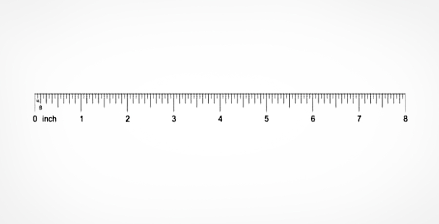
2) Geometry set ruler and square
A set of geometry, along with the ruler, will allow you to draw lines in grids and guidelines to ensure that your phrase looks symmetrical and straight.
3) Pencils for sketching and drawing
An HB pencil is perfect for grade sketching your phrase. However, you must make sure you are not pressing it too hard while you are sketching, so do not leave light pressure marks behind when you rub your sketch lines out.
4) Erasers
An eraser lets you rub out all your sketched lines, letters and grids, once you are done with your work. Do this only when your coloured lettering pens completely dry out it helps in preventing the creation of ugly streaks.
Interesting for you: Book Cover Design Tips: what you need to know?
Essential supplies needed for hand lettering
We all know that the best food is made out of the best ingredients; the same idea can be applied to the hand lettering projects and fonts. The kind of tools you use on your hand lettering has a huge impact on the project quality. Since there are a plethora of tools available out there, ranging from the good quality to the bad ones, we have listed down a few of the products for your ease.
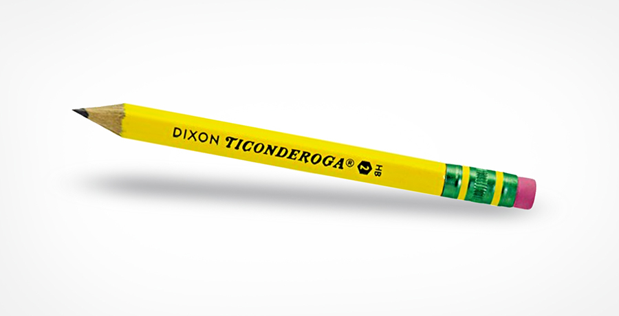
1) Dixon Ticonderoga # 2 Pencil
Well, we still do not know why they are called number 2 when they are clearly the number 1 pencil that works the best. We all have used these pencils back in our high school, trying to solve tricky math questions. From the perspective of creative lettering, these pencils are perfect to use, particularly when you are sketching a rough copy of your design or experimenting with the different letter styles of the drawing.
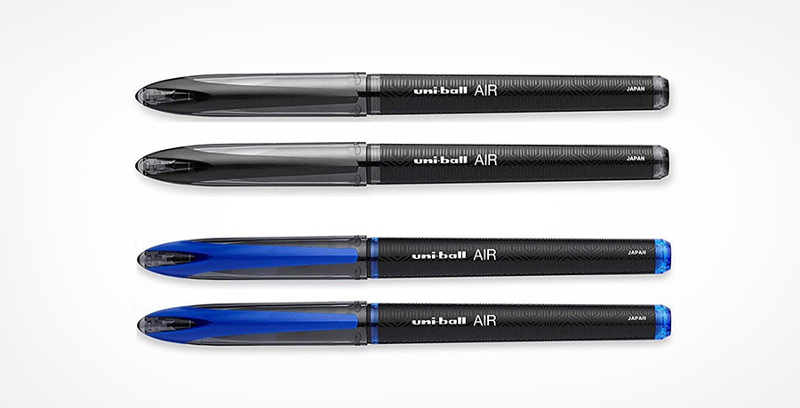
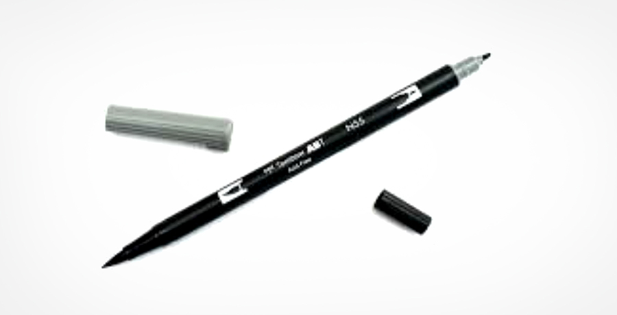
2) Uni-ball pen
No matter how much we age, we all have this eternal love for buying stationery, and when it comes to hand lettering, we are in heaven as it requires a lot of stationary tools. Nevertheless, we all can agree to the fact that nothing beats a classic. Most of the artists go for the uni-ball pen when they are ready to ink their drawing. That is because these pens have got the fine and steady tip and the comfortable handling that everyone loves as it draws quality and dark lines. The best thing about it is you can easily buy these pens from your nearby stores.
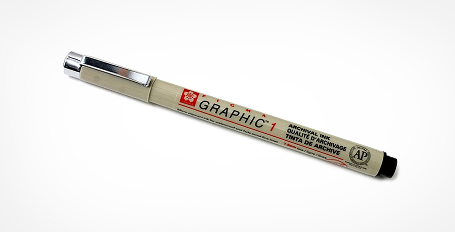
3) Sakura Pigma Graphic 1 pen
If you are planning to do fancy lettering, then fine tip marker pens like Sakura Pigma Graphic 1 should be your first choice. Particularly if you want to have a thicker line quality than the uni-ball can offer.
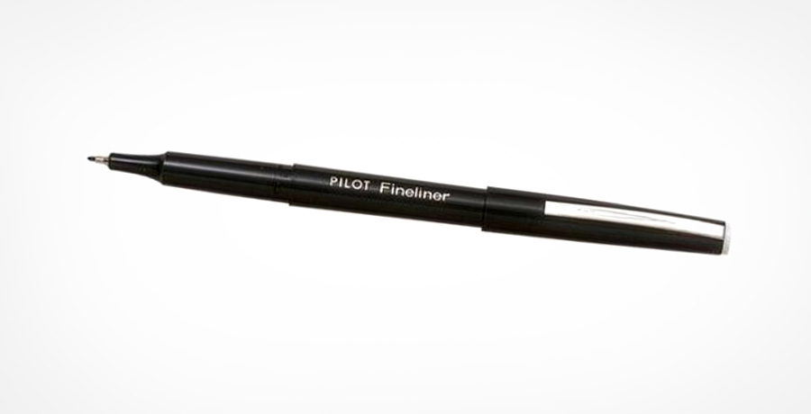
4) Pilot Fine liner marker pen, fine point and black
This is one another fine tip market that is best for drawing thicker letters or the letters that do not need much of the attention to detail.
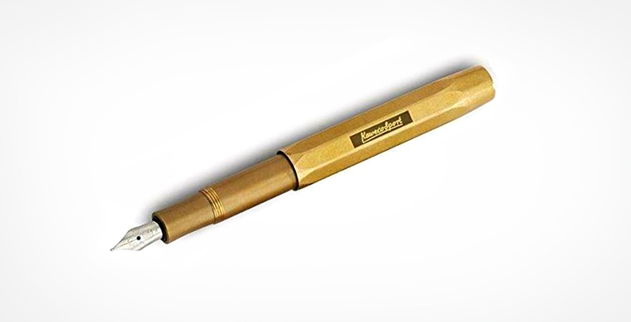
5) Kaweco Sport Pen
If you are more into calligraphy, then Kaweco Sport Pen can do wonders for your lettering games. Unlike all the other pens that need a messy dipping well, the ink cartridge is actually inside the Kaweco. The nib of these pens is fancier than the regular pens and a pretty handy exterior.
6) Pilot Parallel Pen
It is one another kind of calligraphy pen that produces a different kind of line quality. Moreover, this pen has a particular parallel plate nib that makes it easier for artists to draw thick lines or paper-thin lines with different strokes. With just a slight flick of the wrist, you can blend a single stroke from thick to thin.
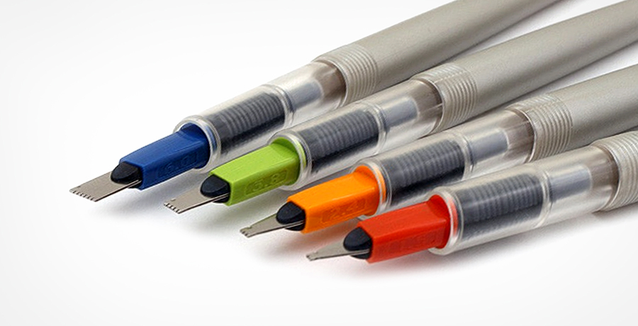
7) Tombow Fudenosuke Brush Pen
This pen has a softer tip kind of brush pens and have actual feature of brushes at the nib, unlike conventional pens that have a pretty rigid nib. Such pens are perfect for the letter drawing styles if you are looking to give a fun and witty touch to the letters then these pens are the perfect choice for you. Same as the calligraphy pens, the cartridge is inside, it is a feature that allows you to completely control the ink-flow without having to dip into the ink pool.
You can buy all sorts of pens from GoldSpot.
8) Ruler
This is something that you probably have lying around your house but if you do not have any and need to buy one then go for the stainless steel ruler with cork backing. It makes hand lettering pretty easy as you begin to sketch out your guidelines and the letter edges.
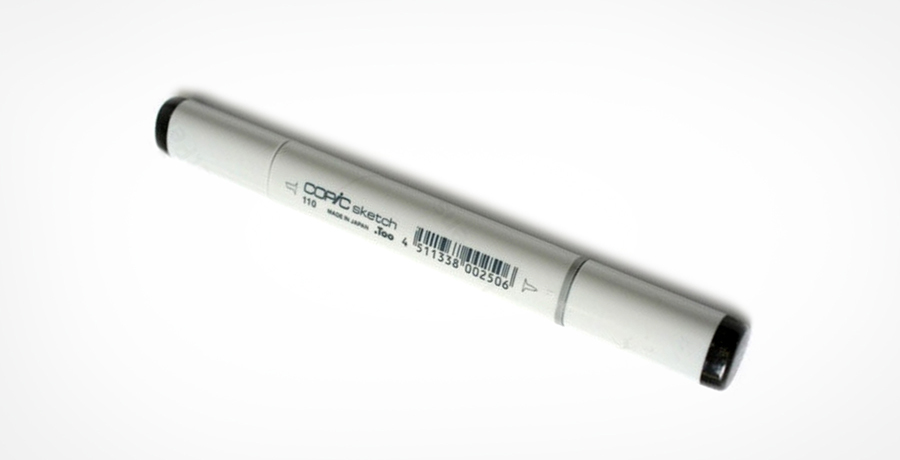
9) Copic Wide- 110
In case you like to play with the new textures and experiment with the broader stock effects then Copic Wide- 110 is your safest choice. The massive nib of this pen lets you craft thick words in the snap, and after handling it, you will know the purpose of the nib is to support the stuff on the bigger paper piece. These marker pens are pretty versatile and, only with the pen's edge, you can draw fine lines or by using the whole pen thick lines.
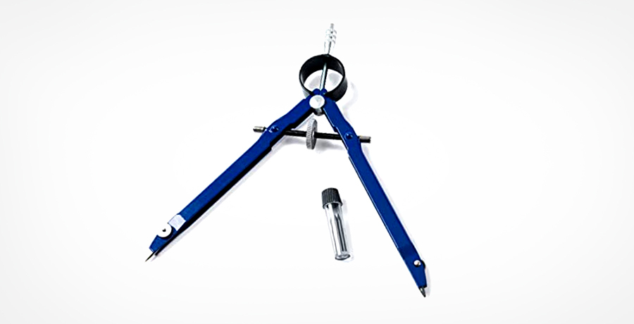
10) Drawing compass
Here is another tool that you must not have used after your high school, even in the school it was not much of a use. You really need a compass if you are drawing letters on a particular curve. This is something that any compass can do, but if you are purchasing one, then go for the more professional model as compared to the regular ones you have used in the middle school.
11) Lightbox
They are perfect for tracing your rougher pencil sketches over with the ink. Simply turn on the lightbox, get your sketch down, and then put a new piece of paper over it. You will see your lines visibly as you trace your new copy.

12) Computer Paper
When you are at your initial stage, the basic computer papers are perfect for your needs. You can make as many mistakes as you want as they are easily disposable. However, you would need to upgrade to more professional-grade paper once you start doing more professional designs.
An essential read for you: How Design Empowers Brand Storytelling?
Letter Anatomy
When you are done with procuring of all the supplies, it is time you focus on the lettering anatomy. The designers of font create the fonts and letters by complying to certain guidelines. These are not symbolic rules, but the actual lines on the page that allows the artists to find out the shape and size of the letterforms. Here we are going to discuss a few rules and guidelines that hand letters use to inform their craft.
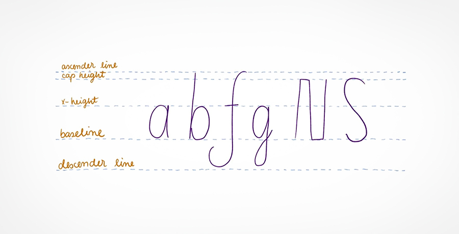
1) Baseline
It is one of the most important parts of the overall guidelines, quite simply it can be stated that the baseline is where all the different letters sit.
2) Midline
It goes by many different names which include the Median Line or the X-Height. It can be stated that the Midline acts as the first boundary for the lowercase letters. A lower case letter such as x, for example, would be drawn from the baseline up to the midline.
3) Caps Height
It is the upper limit of all the uppercase letters such as the upper case N extends from the Baseline to the Caps Height.
4) Descender
Some particular lowercase letters such as q, g, and y possess loops or longer tails that drop under the baseline. The line where these tails fall on is called Descender.
5) Ascender
It is one of the most challenging parts of the overall guideline. It is the kindred spirit to the Descender, and it presents as the upper bound for the lowercase letters that come above the Midline. A few of the lowercase letters that reach the Ascender are h, b and f. The tails of these letters can climb above some uppercase letters.
Lettering Family
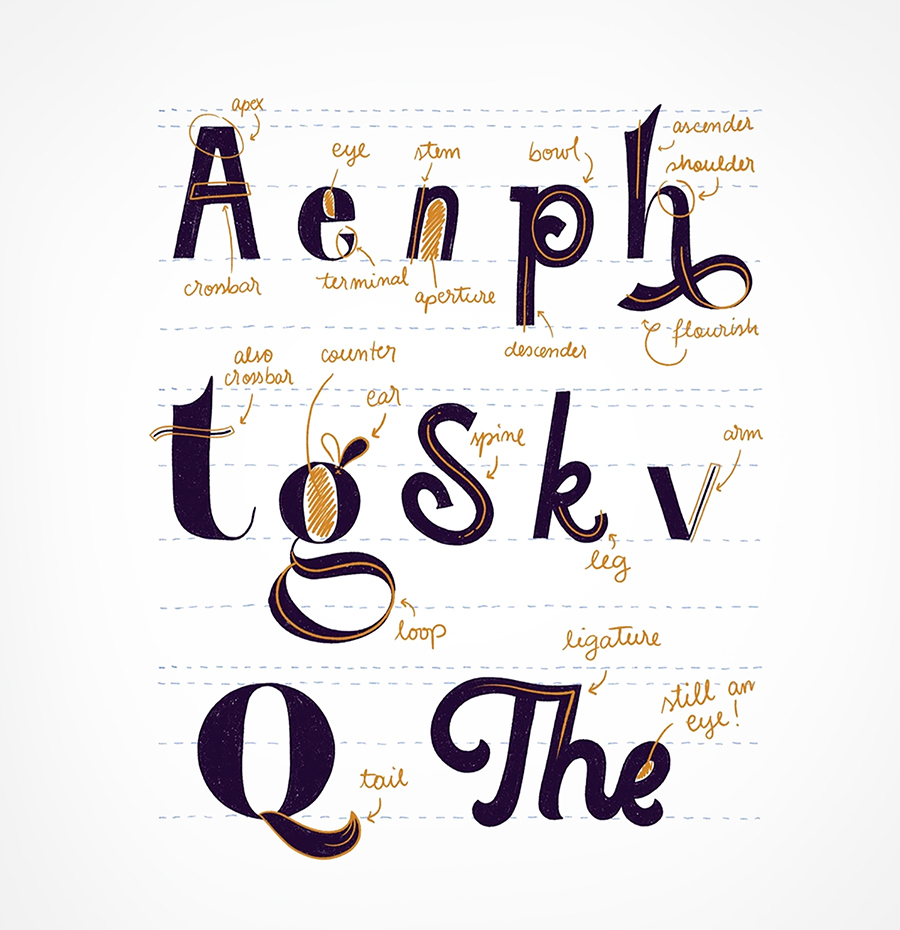
To be able to play basketball, you must be familiar with the basic rules and terms of the game, right? Similarly, to fully comprehend hand lettering, there are a few terms that you must learn by heart. Mostly these terms describe the physical part of some certain letters. You may not know, but there was a name for the bar across a capital A. The dot on the letter i or the circle on the lowercase e. There are a whole lot of stories that we are unaware of; however, various parts of all the letters and how they all are related to each other will allow you to become more deliberate as you create letters of your own.
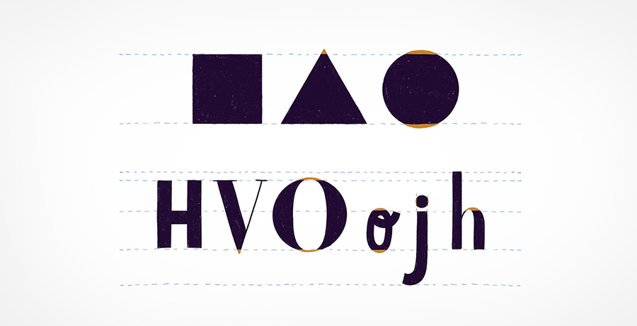
1) Serif
You may have come across this word in your high school while deciding which font to go with for your boring biology paper. Quite simply, we can explain this font as the tiny line that is linked with the end of the stroke of a letter. A typeface that has used this font is known as Serif font.
2) Sans- Serif
You may be surprised to know, but Sans-serif is the typefaces without any serifs. The letter on this font does not have any small tails, the most widely known use of this treat: now you know that the most hated font "Comic Sans" is actually short for something like "Comic Book Sans Serif Font".
3) Apex
It is the meeting point for two different strokes at the top of the letter. Such as the apex is the point of capital A. It is on you how you want to make your apexes; it can be rounded, sharp, and blunt, depending on the vibe you would like your letters to have.
4) Crossbar
It is the horizontal lettering stroke that passes the uppercase A and H. The stroke that goes across the lower e is also known as the crossbar. You can experiment with your crossbar by making it lighter, thicker or uniquely angled.
5) Script
You may have already learnt about writing script in your middle school and then never used it again except for signing your name; nevertheless, it does not hurt to go over those concepts again. The script is a fluid type of lettering that impersonates the cursive handwriting. Most of the letters are connected in a flowing and elegant style.
6) Bow
It is the rounded bottom section of the uppercase B.
7) Open Bow
Since the bow of the capital B is usually integrated with the main vertical stroke, the open bow is the perfect representation of a bow that does not connect and instead stops in the middle.

8) Stem
It is the name for the main vertical stroke of the letter, all the other stokes branch out from the main letter stem.
You should know about Color Theory and Why it is Important
Conclusion
There you have it; the beginners guide on how to get started with the hand lettering. The most important thing to grasp through this post is to stay calm and do not be in a rush and gradually expand your skills as you move forward. With time you will be the champ of hand lettering and will be writing more guides on this subject. You can never say you know 100% about hand lettering, the more you know about it, the more you will realize how much you still do not know. It may sound negative at this point since you are the beginners, but this is what makes lettering so much exciting and fun. Make sure you are using your lettering ideas to create something innovative and out of the box.

Co-Founder & Strategic Visionary at FullStop
Co-Founder at FullStop, a branding, digital and software agency he started in 2012. Haris works across brand design, digital marketing, and custom development—helping businesses turn ideas into market-ready products.


