31 color combinations that every designer must know about
Discover the best color combination theory and how it amplifies your brand's appeal amongst the consumers and communicate the right message across all branding platforms.

Disclosure: This article may contain affiliate links. We earn a small commission at no extra cost to you.
Choosing the right color combination for the design is one of the most daunting tasks, it may seem pretty easy, but it is not as simple as you think it is. The color schemes that you choose for your proposal has a big impact on the project success; it can make it or break it. Applying the good color combination to your design can be an exceptional way to set the tone or mood for your project, whether it be on icons, logo or business cards. Whatever your purpose is, whether you are trying to arouse the feelings associated with the killer landscape, a lovely sunset or an energetic scene bursting with colors, it takes the third eye to bring together the flawless hues to send your message to your audience.
There is no denying to the fact that the colors are a vital part of the way we perceive the world that we so often take for granted. Give a thought about it, how a bright yellow attire of someone and the blue-ish, grey, gloomy sky above us make us have the power to mold our views about others and even the situations we find ourselves in. Therefore, one of the most prevailing tools in the designer's cache is using the colors that go together. Color combinations are the determining factor in keeping the viewers engaged and sending a prompt message on their way. Once you go wrong with them and it is out in the market, there is hardly any way to go back and make the things right.
Different color combinations give rise to different moods as the color psychology theory suggests. So why not we help you choose the right color scheme for your project so that you deliver the right message to your audience? Sounds good, right? Without any further ado, let's educate you about some killer color combinations.
1. Sunset glow
There is nothing that can beat the stunning color palette that the sunset creates. In the sunset color combination, the sun’s burning orange on a beach adds a gorgeous contrast to the bold purple of the sky and the sea reflection. This is one perfect color scheme when you want to create a lively factor to your design.

2. Restrained and cool
The blend of dark ash greys along with the greyish blues, create a color cool and restrained color palette. If your brand is looking for the ways to send away a cool and calm message, then this is the best color combination. The mixture of these two colors is perfect for a somber design theme. For mattress and furniture brands who wants to promote deep slumber, they can use this combination and win the market.

3. Bright accent colors
Different tones of blue and violet merged with some eye-popping red is the perfect color combo for the various brands. The contrast of the intense blue background and the red-orange twangs promptly draws the eyes to all the right places. Give your brand an exclusive look through this creative contrast.

4. Classic and Retro
If you are looking to create a subdued look, then there is nothing better than using the combination of bold colors from mild red to orange. This color combination gives a pretty vintage look to the brand, and we all know how crazy people today are for antique and classic things. Try out this color scheme to make your brand stand out in the market.

You may find it helpful: Color Theory and why it is Important
5. Natural and Earthy
The combination of peach-ish shade with the dull grey gives away the flawless natural and earthy look. The cool color combination gives away a pretty down to earth vibe, in case your organization is looking for the combo to deliver humble vibes to the audience, then you know what to do [read: use the color combination of peach and dull grey]. This color combination is ideal for designs related to sustainability and nature. It comes pretty handy for projects that focus more on environmental consciousness.

6. Audacious and vibrant
The seamless and eye-catching combo of coral red and turquoise blended with the other shades of blue is both daring and bold. Most designers avoid using bold colors to appear loud and attention-seeking, but if used right, they give away quite edgy and modern looking design.

7. Mediterranean blues
If you wish to give your design more of a natural look or your post is all about travel then use the color combination of greyish blue with the steeped dark blue and range of browns. This blend of colors evokes the feelings linked with the magical and mysterious Mediterranean setting.

8. Sophisticated and calm
The mixture of blacks, mauve and greys give the audience a calm and sophisticated sense. If your brand is looking to send out a serious and chic message, then using the color scheme would do it.

9. Purple tones and tints
The different shades of the reddish-brown mishmash with the deep Tuscan red and old lavender attract you with its depth and warmth**. This combination is the paradigm of the classy piece looking for the dash of richness and energy**.

10. Dark purple and blues
The bold and mystifying color combination with the radiant blue scent follows a contemporary web design trend which is the use of dark background colors with the bold accent and bright colors.

Interesting read for you: Basic Elements of Design You Should Know About
11. Inviting and lively
The color scheme of the logo/ website or the icon should be attractive and sparkling. The beautiful combination of the green-yellow, pastel brown, hot pink and lavender grey is ideal for the design looking to portray an inviting and bouncy image.

12. Classic look
In order to have a vintage retro look that educes a bit of nostalgia, a combo of mildly de-saturated blue and orange is perfect. The combination gives away a flawless classic look, to bring back all the old memories associated with the brand.

13. Red and lively
The combination of the red polish flag along with the dark pink over the light bluish background is what makes the website look fascinating and eye-catching. Refine the use of the minimalist color scheme with the different shades of a similar kind.

14. Vivid and retro
The real mixture of the vivid yellow, pink and red make the flexible and attractive palette. The designers can use it to its full capacity and reminisce the old times with the new and contemporary designs. Only those who know how to keep the perfect balance of traditional and modern look can win the audience today.

15. Bright and Fresh
Give the fresh breath of the colors to the viewers by using the pretty dark pink flowers on the crest of the long light green stalks; it indicates the new beginnings that spring brings. This color combination is feminine yet bold. Perfect for today's independent women who are free to conquer the world on their own. The color pattern sends out the message of hope and resilience.

16. Classic 70s
If you are looking to create a vintage image, the addition of Volkswagen on the beach will send out the perfect classic vibes. It is not only pleasing to eyes but creates the ambiance of the timeless eras.

17. Elegant yet approachable
The current era lives on the mantra of “less is more”, the minimalistic approach of the designer calls for the elegant and approachable strategy. The artistic blend of the skin tones along with the dark imperial blue and ruby makes the best color scheme for the designs with nuanced messages. Aloof yet approachable, classy yet fun, these are a few of the grey-area messages that are effortlessly sent with the attractive combination.
18. Gothic architecture
The contemporary artists like to touch the new and creative areas, just by the addition of the cathedral picture you can give the creepy and spooky feels to the post. As much of the less is more mantra we follow, there are some situations where the designers have to go a little fancy and out of the way.

You may find it interesting: How Design Empowers Brand Storytelling?
19. Sleek and futuristic
The ideal mixture of the sapphire blue, grey and peach-ish orange make a perfectly modern and sleek color scheme. The color combination projects the earthy tones, and human touch effectively alleviates a futuristic image, the metallic and cool colors.

20. Texturized and dynamic
Burnt sienna, dark charcoal and a pinch of pale red-violet make the color scheme must-have for the people looking for the dynamic yet ahead of its time feel and look. The color combination is versatile enough so it can be used in the projects ranging from contemporary corporate reports to magazines and editorial content in general.

21. Minimal yet warm
Complying with the culture of being minimalistic use the combination of eggshell white, taupe brownish and dark vanilla together to provide unfussy yet inviting design. The gust of peppy color throughout the design makes the design welcoming and elegant simultaneously.

22. Clean and Energetic
The different tones of blue and violet are pleasing to the eye and induce both peace and energy at the same time. Artfully combine blueberry and sky blue with mauve to give life to eye-pleasing and refreshing color combination, it is suitable for any design which aspires to whip up positive emotions.

23. Colorful vibrancy
The equal mixture of the bright yellow along with the burnt orange, candy pink and lavender adds a fresh breath to the scene and gives an enthusiastic and light-hearted look to the design. It is the perfect color scheme when you are looking to give an energetic look to your project.

24. Urban skyline
If your idea calls for the modern looking and vibrant color scheme, then there is nothing better than adding an image of the cityscape. Use the blend of different blues along with the greys with the light hint of orange and you are good to go.

25. Blue jeans and old car
When your brand needs to portray a classic yet trendy image then going for the blue jeans and an old car can be the safest option. You can present the unique combo of the dark green and dark blue with the soft yellow and de-saturated dark red.
26. Relaxing and unruffled
Nothing beats the vibes that a beach shore gives, with the wind running through your hair. If you wish to create this image then go with the range of greens with the grey undertones, it works perfectly with the series of various project.

27. Corporate and traditional
Not every business or organization appreciates loud and vibrant designs; some like to stay simple yet professional. For such businesses, the blend of different shades of green-brown and blue are perfect. They convey both reliability and professionalism. Create a color combination chart of these colors and make use of it all.

The best read for you, you gonna like it: A complete guide to visualisation of Shades through this Color Thesaurus
28. Trendiness in full bloom
It has been made pretty obvious that nothing beats the combination of blue with other colors; a pint of blue makes the design more trendy and fashionable. The fusion of ocean green, sea green, and aquamarine effortlessly speaks the concept of freshness and life, time along with fertility at the same time. However, they should be completely in sync with the aim of the design.

29. Twilight Moon
Since Halloween is around the corner, create the perfect Halloween theme with the combination of different range of oranges and black. This color scheme is seamless of all the Halloween related and fall season design.

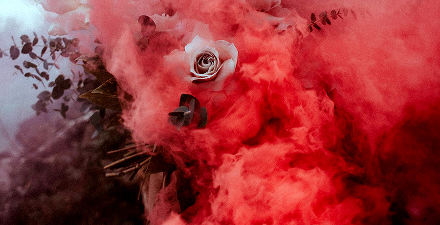
30. Rose-red and blueberry
The impeccable combination of red with the different range of blue with the call to action button invites the visitor of the site to buy your service/ product. It develops plenty of visual interest and immediately draws attention to itself.

31. Rich and colorful
If you wish to attract the attention of the visitors in the milliseconds than trying using the rich and attractive colors, it will end up creating a dramatic effect. The vibrant and rich color combination leads to the stunning yellow, blue and punk in the attractive yet minimalist design. This combination can be used in lively yet professional projects.


Co-Founder & Strategic Visionary at FullStop
Co-Founder at FullStop, a branding, digital and software agency he started in 2012. Haris works across brand design, digital marketing, and custom development—helping businesses turn ideas into market-ready products.


